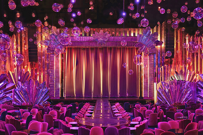
“Our goal at Voltaire is to have the most elegant and intimate nightlife and superstar artist experiences in Las Vegas,” Voltaire founder Michael Gruber said in a statement. Voltaire at The Venetian Resort Las Vegas is a unique venue, accommodating 1,000 people, it fulfills Gruber’s vision of a luxurious environment that offers a unique and refined evening’s entertainment. Capturing the essence of the aptly named house show, Belle de Nuit, Voltaire’s space is designed in an Art Deco motif that envelops the entire space. Belle de Nuit is a standalone show, but when Voltaire has a resident performer, Belle de Nuit adapts to be the pre- and post-show entertainment wrapped around the headliner’s show. The inaugural residency headliner, Kylie Minogue currently alternates residency shows with Christina Aguilera. Designed by TONY award winning theatrical scenic designer Derek McLane and renowned lighting designer John Featherstone of Lightswitch, Voltaire is truly a space that sumptuously immerses both the performers and the audience in a shared and intimate experience not found elsewhere.
Derek, tell us a bit about the, would you call it, scenic design of Voltaire.
DM: It’s an interesting project in that scenic design doesn’t really quite describe it, because that typically is what’s on stage. This was part architecture and part interior design for the space. Really creating a completely new theater space out of what was previously a sort of conventional, Broadway-style theater space. It was a vast, utterly plain space before with black painted sheet rock walls. Michael Gruber, having seen my design of Moulin Rouge on Broadway, asked me to do this project. Moulin Rouge was designed so immersively; I not only designed the scenery on stage, which is pretty extensive, but also every square inch of the auditorium. That idea excited Michael, to bring that type of immersive design into this space.
He wanted to transform this into something completely different that didn’t need to have as many seats, [previously it was 1,600, now Voltaire’s capacity is 1,000] it would feel much more like a club, and a space that had a feeling of exclusivity. He wanted Voltaire to feel like a place where you were very intimate with the performers on stage. It was a place to drink and eat a bit, and that it would feel like a party and much more like a kind of cabaret, nightclub type of space than the theater that it was.
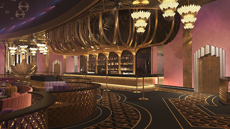
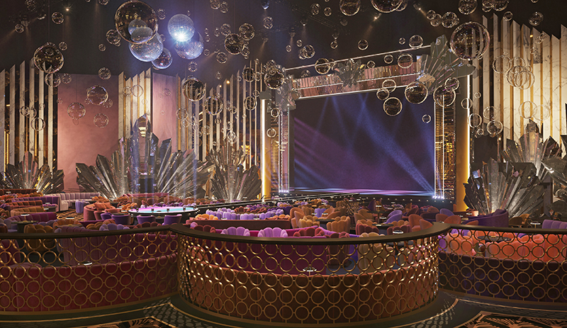
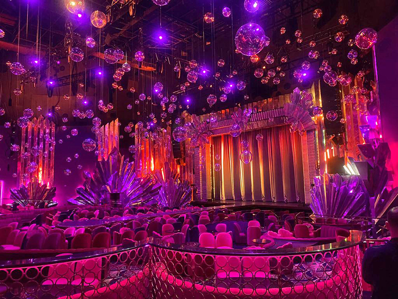
There was really nothing intimate about that room when I first walked into it. We did a complete gut job; we took out the floor of the orchestra and built a new floor with a series of flat levels so that it feels tiered. We took out all the seats and we made all custom seating that feels much more like a lounge. It’s a combination of banquettes, sofas, and thickly upholstered armchairs. We also put a significant runway into the space coming out to a satellite stage, that is well out into the middle of the space. Also, because the space was so vast and so tall, we created a sense of a much lower ceiling with several hundred glass bubbles on a Glow Motion automation system. When the audience comes in, they’re quite low over your head, so they create a much more intimate scale to the room and then they do fun things during the show where they rise up and can all move. Those are the structural changes that were really important to the room. Also, we put a massive significant bar on the back wall of the theater, it’s a pretty imposing structure that really, I think, changes the character of the space.
What was the overall design aesthetic you were going for in the space?
DM: There were two ideas that I melded together. One was an Art Deco influence. The other was 70s disco. They’re related already as a lot of 70s disco design was based loosely on Art Deco anyway, so it’s not as far-fetched as it sounds. That 70s aesthetic was sort of 70s glam. So, Voltaire is really a hybrid of those two things. It uses a lot of mirrors and a lot of very bold Art Deco shapes. There’s what we call starbursts, an Art Deco abstracted design based on a maple leaf that we’ve made three-dimensional, but out of mirror. So, there are quite a few of those in the space and they’re quite dominant when you come in, as well as some really tall vertical ridges of giant beveled mirror going up into the space separated with deep lavender velvet.
As I mentioned, the furniture is upholstered, it is a lot of velvets and heavily textured fabrics in aubergine, reds, oranges, and pinks. Different colors that are all related so that there’s a lot of energy and warmth to it. I wanted the seating to feel club-like but also a little bit eccentric so that it felt like the seating areas are not all the same. They have a little bit of different character depending on where you’re sitting and that’s part of the energy of the space. Then the bar itself in the back of the room, features this giant highly reflective brass tree structure that comes up from behind the liquor shelves and branches out over the bar and it’s got a black mirror ceiling above it. That is flanked by more vertical mirrors and velvet. John’s done a beautiful job of spreading some precise down lights through the branches of this stylized tree structure.
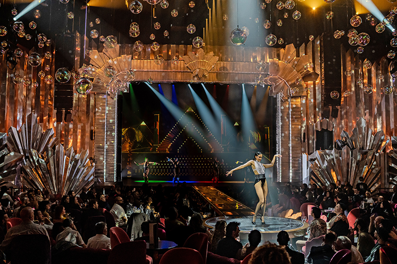
John, you’ve worked with Derek before on projects like Hans Zimmer. Tell us the lighting scope of work that Lightswitch provided for Voltaire.
JF: Lightswitch did the architectural and theatrical lighting design. Derek asked us to get involved, because again, it was a project that had multiple overlapping needs and frankly, if Derek’s involved in a project, I’m all in. I think one of the things that was interesting about this project from our standpoint, what was this notion of ‘how in a cluttered market space like Vegas do we create something that feels different’. Everybody that goes into the room, their reaction is universally the same, ‘There’s nothing else that feels like this’. And that is true, there is nothing like Voltaire, frankly anywhere, much less in Vegas. Plus, it’s a space that needs to breathe and have multiple personalities. It was a really interesting challenge from a lighting standpoint.
We also worked with the artists in mind. At the time when we were doing the design, it was only Kylie [Minogue] who was confirmed, but because of our background in concert touring, we had a pretty good idea of what people were going to want and what they were going to need at least as a base coming into Voltaire. Every artist brings their own supplemental elements that suit their show. I think it’s wonderful that both Kylie and Christina [Aguilera] have really leaned into Derek and Michael’s intent with it feeling like a different kind of residency. It feels like each of the artists—in their own particular way—it feels like they really belong in the space.
Derek mentioned Moulin Rouge, which is really interesting because with Moulin Rouge, at least to me, you can’t find the edges of where the show stops in the theater. Voltaire feels the same way. You are in something, not watching something. The show comes out and wraps its arms around you. That gave us an opportunity to really take the same holistic approach to the lighting design. So, the first fixture you see when you walk in the lobby needs to feel as embedded and integral in the show experience as the upstage most fixture on stage. It needed to be as seamless as Derek’s vision. One of the things that was great on this project was that it was one creative team working on the whole guest experience. The reviews and the feedback have really leaned into that. People say, ‘I walk in the door, and I feel like I’m in a different world. I feel like I’m in this world of Voltaire’. Derek, and Michael Gruber and his team really created this sense of a whole evening’s experience, and it’s wonderful to watch the audience respond to that. We were all curious with this notion that ‘does everybody show up right before the headliner and does everybody leave right after the headliner?’ They don’t. They come for the Belle de Nuit performance, they are the ‘opening act’ on headliner nights and the main performance when there is no headliner. Audiences come to see them and the headliner and then stay after for the DJs and more Belle de Nuit. People really get this idea of an evening spent in this space, Voltaire is a whole evening out.
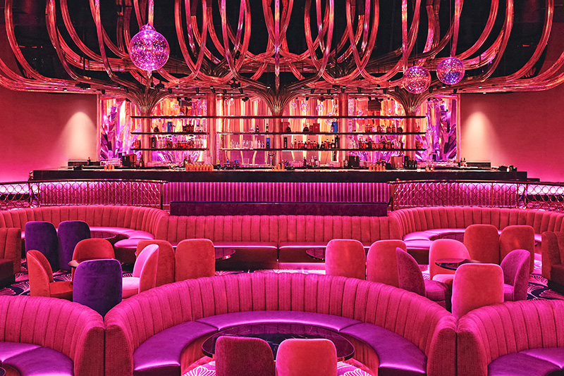
There’s a lot of reflectivity in the space between all the mirrors, decorative elements, and the glass bubbles. Talk about how you light in a reflective box.
JF: In many ways it really is a mirrored box. It was really important to lean into lighting in ways that were thinking about how lit surfaces would respond in multiple ways, not only directly but also indirectly. What you can do with the mirror is find interesting things to reflect in the mirror. For us it was a real conceptual shift, and a very enjoyable conceptual shift to think about how we suffuse the space with color, how we use these beautiful glass spheres as surfaces; how we tickle light on these mirrors. The surface on the walls takes light incredibly well, as well as reflecting it. So, you can tickle the walls with color and have them reflect another color and get this incredible depth. Because you’re seeing the reflection of one tone and then the surface lit with the second tone, so you get these incredibly deep, rich looks on the walls.
For the architectural lighting, a lot was based on staying out of the way of the bold architectural statements that were part of the visual vocabulary of the space. For example, there’s already a lot going on with the bar; this tree-like structure around it is astonishing. The architecture itself is already doing a lot. So, with the architectural lighting of the space, we talked a lot about keeping it a quieter voice.
That’s often the case in an entertainment-type environment because the visual vocabulary of the physical pieces is already telling you a lot. The architectural lighting design was handled by Norm Schwab and the San Francisco Lightswitch studio. They used a lot of warmer colors. We tried to guide the eye using color temperature and then leave opportunities for color to be a conscious decision that’s motivated by performance. Essentially to have a space that has this really warm copper-toned, welcoming soft light. Generally, so much of Vegas is daylight color temperature to keep people awake, with steely blues. We wanted to step into Voltaire and have it feel warm and antiqued and really comfortable. So, the architectural system takes that as its overall ethos. Then the performance lighting system has something to push back against.
What that let us do, for the times when the house DJs are playing and also some of the softer, quieter moments both in Belle de Nuit’s performance and also in the headliner’s performance, is create the sense of you being in something, not watching something. That can be influenced by color changing fixtures we have behind the starbursts on the walls. We have light that comes down and filters through the glass spheres. The fact that most of them are on winches lets the room breathe anyway, so that we can sort of have light filter down through these really beautiful glass spheres, which have a very slight dichroic coating on them. You get a little bit of a color shift and a little bit of a sparkle from the spheres, but still have the physical objects be quite close to the audience. Then as the performance begins, they fly out and breathe, and they kind of breathe in and out with light filtering throughout the performance.
Throughout the process we found—certainly with the architectural design and with the base looks for the building—if we didn’t like where we were going, we were better off turning things off than turning things on. The first few times we were experimenting, it got really bright in there really quickly because of the reflective surfaces. Obviously, whatever we were doing lighting-wise was being amplified and exaggerated by the surfaces. Michael and Derek rightly wanted the space to feel comfortable, warm, inviting, but also intimate and for us to have places to go with the lighting to reveal parts of the space and parts of the performance area throughout the evening. We didn’t want everybody to see everything when they first walked in. The architectural lighting is a study in restraint and careful control, then there’s a lot of color changing accents in the room. There are these really beautiful, stacked circle dimensional railings which define each of these areas. They’ve all got color changing LED tape, but in many venues that would be doing full RGB chasey stuff from the moment guests walk in, we don’t. We keep it just a warm amber glow and then as the performance begins, you get a sense of things coming to life around you. One of the great notions with Voltaire is, it’s constantly changing its personality.
For the lighting for the performance areas, it’s not a small range of automated fixtures. What we wanted to make sure—and this was important to Michael Gruber as well—is that performers come into a facility that feels like you have all you need to do a show. Maybe you bring in a few bells and whistles, but when major headliners come in, the room itself is set up in a way that isn’t disruptive to the space. So, it’s a sizable range of automated fixtures that give a lot of flexibility for what are really four very different modalities—Voltaire, the space itself; Belle de Nuit, which is very film noir, directional light; strong side light dance influenced. Kylie’s show, which is bright and poppy and dynamic; and then Christina’s show, which is more natural, starker and a little more angular. All four of those exist basically within the same lighting system, so it is a very flexible system.
What’s an element of the room that you are each really pleased with?
DM: The thing for me that’s really a home run are these starbursts, the maple leaf shapes. They have a certain amount of authority to them. When you come in, they’re complicated enough that you don’t get bored looking at them, but they have a bold enough shape that they feel like a significant design element. To me, there’s a lot going on in there, but they’re the design anchor of the space. Whether or not the patrons realize it, I think it reminds them of Art Deco and of disco. I don’t expect anybody’s necessarily consciously aware of that, but they get that vibe. The Lighting Programmer, Benny Kirkham said it’s like if you went to an Art Deco disco in Blade Runner. It’s an interesting way to draw all of those elements together.
JF: I’m just pleased with the way it feels like a distinctive space. I think one of the things that I enjoy so much working with Derek, and I think one of the things that we immediately grasped working on Hans Zimmer, is neither of us are departmentally protective nor possessive. What we both want to do is create unique, distinctive, and memorable experiences for our audiences. Voltaire works so well because the space is so pretty under work lights, but it comes alive under the lighting when the space is ready for guests. Likewise, if you took all of this amazing architecture out that Derek designed, it would just be another lighting rig. So, it’s two departments working together to create an experience. I’m most proud of the fact that people walk in, and don’t say, ‘The scenery is amazing. The lighting’s amazing.’ They say, ‘The space is amazing.’ That’s what we were challenged by Michael Gruber and the team at Venetian to create—a distinctive space. To me, I personally feel I’ve done my best work when people come away talking about the show and the experience. I think people do that with Voltaire. Everybody I’ve talked to just says, ‘Wow, this room’s amazing.’ That’s the audio, the architecture, the furniture, the scenic design, the visual design, the lighting design—all of that playing together and speaking with one voice and that’s not super common. It’s certainly not easy to accomplish. I feel we all have done that at Voltaire.
Who were your vendors and key gear choices, John, and how was their support?
JF: The systems integrator was 4Wall Entertainment, who did their usual excellent 4Wall job. They handled some really pretty complicated networking for an architectural system that need to interface with a performance system and also enable headliners to bring supplemental stuff in. 4Wall did a great job. The theatrical consultants, Auerbach Pollock Friedlander handled the automation and the rigging systems. In terms of fixtures, it’s a split between two of my favorite manufacturers, Elation and Robe. The Elation Fuze Max Profile is our workhorse fixture. And then we have a lot of Robe MegaPointes, Paintes, and T1s.
Who was your scenic vendor, Derek? I know you did a lot of testing to find the right mirror elements to work in the space.
DM: We used a shop in Rio de Janeiro, Brazil—Vertical Rigging Solutions. Vincent Schonbrodt is the gentleman who runs that shop. They did a remarkable job. Not only did they build it well, but the critical thing was they did the experimentation and the prototyping that was so essential. We spent at least as long on the prototyping as we did making the elements, and that was indispensable. A bit of a happy accident in our sampling process was that we quickly learned that using real glass mirror was going to be way too heavy and expensive to install. Given the size of these pieces, it was just going to be absolutely insane. They did samples of fiberglass with this extraordinary, mirrored chrome paint. Everybody thinks it’s an actual mirror, but it’s not. The way it works is there is a mirror reflective surface where you see reflections in it, but because it’s a paint product on fiberglass, it’s a tiny bit light absorbent. It’s not as specular as an actual glass mirror. Colored light will influence it, whereas colored light on an actual mirror I don’t think would have any effect whatsoever. I’m sorry John, I made it so complicated for you.
JF: We love complicated, Derek. I’ll take complicated any day of the week. That layering is really exciting and lovely to lean into. Normally, one never has enough time on site, but we had some time at Voltaire to lean into the programming of this and being able to balance it and finesse it. That was great. What’s interesting, and what I also find intriguing about mirrors, is the straight-on view to a mirror is almost always not the most interesting. The interest is in the oblique new way you’re seeing something unexpected. Voltaire really, really resonates with that. It feels like you are in a hall of mirrors, but you are in a hall of mirrors where you never see yourself and you never see other people. You just get a sense of the space around you. It really is quite remarkable.
One of the things that we enjoyed about the project was getting this sense of curating light in ways that were so unique. We’re so used to working in black boxes. This is why when Derek talked to me about a mirrored room, I was very excited. Derek’s created this world in which the lighting lives, but this show has very few beams because we’re playing against a projection screen on stage and against the mirrors. So, any attempt to get a beam would’ve been foolhardy anyway. It’s a far more—not in a psychedelic way—but a far more liquid kind of use of light, that it feels truly like we paint the space with light. Derek’s created this fabulous vista for us that would be suffused with light.
It required a different way of thinking about fixture selection and fixture placement. There are very few traditional rock show beam lights in Voltaire. It’s interesting watching LDs for the other acts come in and they’re used to having a room full of some kind of beam fixture. There are very few in Voltaire and they’re like, ‘this feels weird’. However, once they come into the space, they’re like, ‘Oh, now we get it.’ I think sooner or later somebody’s going to come into Voltaire bringing in what they think is their traditional rock beam show, and frankly, it’s not going to work very well because it’s not what the space does or what the space requires you to do.
For us, the solutions were based on, as I said before, when in doubt, turning stuff off, which is usually the way that I tend to work anyway. Also, not just be focused on the stage. We’re so used to designing in worlds as well where we’re focused on the stage. I walked more laps of this space than any other building I’ve been in, which was really important because the audience is wrapped around. You had to think about not only what the light was doing on the performer, but what it was doing on the wall and how did that play with the bar and how did the structure above the bar feel like it was integrated into the overall aesthetic of the space because it’s all part of this environment; the experience of being in Voltaire.
Is there something that you’d advise another designer about designing a showroom space?
DM: The advice I would offer is how the audience is king. When you’re working on a space like this, something I do for any project I am designing, whether it’s a play; a musical; or a venue in this case, I think, ‘okay, I go see a lot of shows; I go to nightclubs, what do I want to have when I walk in and sit down and watch a show?’ I try to, in a way, put myself in the position of somebody who just forked out probably quite a bit of money to buy a ticket to see one of these things, so what makes it feel like a satisfying experience. I try to keep that in mind. That’s one thing. The other is really try to be clear in understanding what the goal is. What are we trying to achieve here? The clearer and stronger that point of view is, I think the more successful the project is going to end up being. That applies to just about everything; just try to have a strong point of view going into it. As long as that point of view is a valid point of view, it’s going to make the whole endeavor more successful.
JF: I think this is universal advice—the audience doesn’t care what egos were in the room when you were doing the design process. The audience comes to an experience to have a distinctive experience, and we are the trustees and guardians of the audience’s money and time. We need to respect and honor that by working together, collaboratively, to come up with the best solution for the audience. Derek, like I am, is a big proponent of the no such thing as a bad source for a good idea. Everybody needs to work together and focus on what is the real win that you’re trying to get. ‘What are you trying to design the environment to be and how do you want people to feel?’ It often surprises me how often I ask people that question, and they can’t answer it.
‘How do you want people to feel?’ I had conversations about that with Derek and Michael Gruber and they were both clear about how they wanted people to feel. Derek, I’m certain you were crystal clear designing Moulin Rouge, you knew how you wanted people to feel. I think that’s why Moulin Rouge resonated with Michael Gruber; why it’s such a great show and why audiences love it. Because there’s a very distinct emotional souvenir that people get. So, my advice is before you start picking lighting fixtures, before you start thinking about scenic, be really clear about how you want people to feel. Otherwise, it’s just going to be another one of a multitude of venues. We all answered the question together on this project and that is why Voltaire is an experience like nothing else.
VENDOR VIEW
Joseph Tolle, Senior Project Manager, 4Wall Entertainment, Systems & Design
On working with Lighting Designer John Featherstone and the Lightswitch team:
Working with Lightswitch is always exciting. They’re consistently pushing the envelope to deliver a product that is impactful, and Voltaire was no exception. John and his team are incredibly collaborative, and their incredible attention to detail and vision truly elevates a project from design to integration. They’ve created a unique and immersive environment for the audience, and it was a pleasure for our team to help execute this project.
On the production solutions 4Wall provided at Voltaire:
The control requirements for this space are a bit unique to most projects. On any given day the space is used for everything from rehearsals to corporate events, in the evenings it has performances of often multiple different shows and then later at night it transforms into a nightclub lounge. So, how do we make that work? Well, the primary architectural lighting control is handled through the combined efforts of ETC’s Paradigm and Mosaic control systems which provide user control throughout the day, for rehearsals, technical work, and other multi-purpose use where the house lighting console (grandMA3) is not in use, but we still want some more elegant lighting looks. The interface for this system also provides handoff control and lockout controls when the grandMA3 takes over for a performance. From there, the masterful programming of the Lightswitch team really shines during the show, where that house console is running the Bella De Nuit show before seamlessly merging to the secondary console for the headliner (currently Kylie Minogue or Christina Aguilera), and then back to the house’s grandMA3 console again as the lounge comes to life for the after party.
On some of the challenges for this installation:
Renovating a space is always interesting. These venues each have their own quirks, and some are more apparent from the start, while others you find along the way. Showrooms like Voltaire can be a challenge because you’re trying to adapt, reuse, and improve existing infrastructure—on top of adding new things. In this case, we upgraded the dimmer rack processors (ETC Sensor+ to Sensor3) and reused/retooled the existing circuiting for power distribution and new theatrical and architectural lighting, in addition to adding a significant amount of network and DMX distribution that previously didn’t exist.
Networking is another fun challenge and delicate ballet we find ourselves in as the industry continues to redefine and push the boundaries of control system architecture, and this project was no different. More than ever, integrators and house technicians need to understand how to deploy, manage, and troubleshoot complex network systems throughout commissioning and even on the fly during rehearsals or shows. That only amplifies as you add in more layers on control, consoles, and equipment.
On why 4Wall was the right vendor for the Voltaire installation:
Any integrator or distributor can deliver gear, but at 4Wall, we are hands-on throughout the entire process. Whether it’s working through design changes, coordinating with trades onsite and/or crawling under the stage to troubleshoot a network gateway during tech rehearsals—we do all we can to deliver the best product and service possible to every project. While the ‘it takes a village’ cliche feels like a cop out, it’s true. One of our greatest assets at 4Wall is the depth of our team. From Sales to CAD and Engineering, Project Management, and our technicians—everyone here plays a huge role in building successful projects. We are also grateful to have excellent industry partners in our vendors and manufacturers, and this project would not have been a success without their support. Many thanks and our unending appreciation go out to all the folks at ETC, Robe, Elation Lighting, Pathway Connectivity, GLP, MDG, ACT/MA Lighting, Lex Products, and Chroma-Q.

