Designing a Musical about Making a Movie
Making the movie Jaws was an ambitious undertaking; making a musical about the making of the movie Jaws was equally an ambitious undertaking. The filmmakers may not have had a real shark but they at least had a real ocean. The design team for Bruce had neither for the Seattle Repertory Theatre’s world-premiere of the musical. The show’s marketing read in part, “a musical journey of perseverance, creativity, risk, and resilience”, in reference to the making of the movie. It is a description that could as easily be applied to the making of the musical. The Covid shutdown delayed the planned opening, but offered time to delve deep into the design, yet shortened the tech time once they had the go to raise the curtain.
Two Coasts, Two Sets
The show itself, Bruce (from the nickname of the oft-malfunctioning robotic movie shark) looks at the then-unknown Steven Spielberg’s battles with weather, water, delays, budgets, and studio heads to make the film. Covering the auteur’s voyage on stage called for multiple locations, first in Los Angeles’ many studio offices and then moves to the seaside docks of Martha’s Vineyard. The challenge to evoke these vastly different locales—including an ocean—was the scope of work presented to Scenic Designer, Jason Sherwood and Lighting Designer, Jeff Croiter.
“The first third of the show is a series of scenes in a series of offices,” explains Sherwood. “There’s something like 15 different locations in the first 30 pages of this script. My first thought was, ‘How do we really do that?’ The whole thing basically reminded me of a big telephone game. When talking about it with [Director / Choreographer] Donna Feore, we knew we wanted the whole thing to really move like a film. We wanted it to go from here, to here, to here, snapping around. So, I was seeking a device—scenically or with lighting—some storytelling device that would allow that extreme fluidity but also ground us in some specificity in a real way. Planning a movie like this is very rigid, it’s very Hollywood, very structured. Of course, trying to make Jaws was ultimately much more complicated than that.”
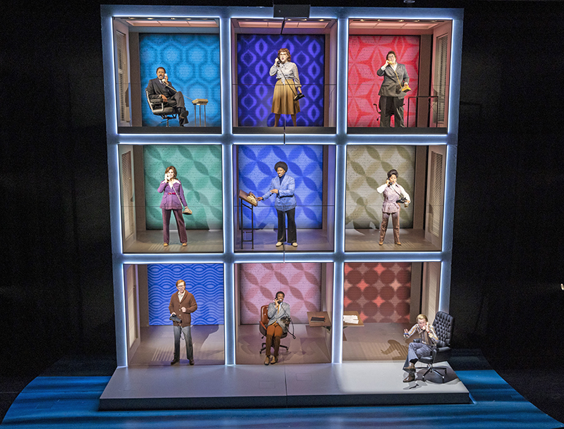
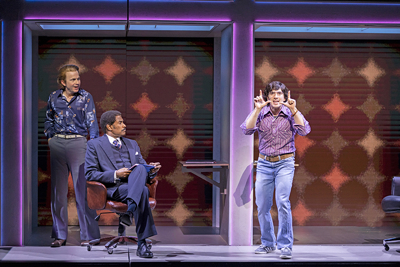
To find the device he wanted for the Los Angeles scenes, Sherwood began looking at a range of references of ‘60s and ‘70s offices, Hollywood backlots, what it looked like to be in a studio office at that time. “I got excited about doing something that would really have a big period reference point to it,” Sherwood recalls. “So, we started looking at Hollywood Squares, the classic game show. I thought it was an interesting visual allusion, because we could tell a lot of the audience exactly what time period we were in, and also give the whole thing a little bit of a cheeky wink but also really facilitate the quick transitions.”
Sherwood decided to make the back of the “squares” of the offices structure be a surface for projection and video. “We always knew there wanted to be that kind of element, but what did that mean?” says Sherwood. “Especially in a musical that’s talking about making a film, but we didn’t want it to be film footage. We instead had the idea that the Spielberg character, at the center of this story, is able to affect the space in a way. That back surface became a place to highlight the artists working inside of these little individual boxes. Like when Joe Alves, the production designer of Jaws, who famously created the shark animatronic called Bruce, starts drawing and imagining what the shark might look like, those drawings appear on that back surface. It’s a visual of how all these creative people were doing their work inside of the rigid organizational structures of Hollywood.”
The Hollywood Squares structure became one tent pole of the design, and Sherwood started working with LD Croiter on the office block. “It was three levels high, nine boxes, had spiral staircases on each side, it had tons of set electrics in it and LED video for the rear wall,” Sherwood describes. “It was really fun to collaborate with Jeff on that piece. We had each box outlined with LED, there was an overhead, practical lighting fixture in each square that would create a top-light solution, and then there was this little cove that had a series of lights that Jeff could use to front light and catch faces. There was a system of side light that would come in through windows on the side that had blinds in it, and there were audio monitors for the performers. It really was an interdepartmental unit, and that is very satisfying when you ultimately pull it off.” Croiter and Sherwood also worked with Projection Designer Shawn Duan for Bruce.
Going on Location
The musical, which ran 1-hour 40-minutes with no intermission, moves from Hollywood to Martha’s Vineyard after the first half-hour of the show. To depict the scenes of the location shooting for Jaws, Sherwood asked himself and his fellow designers, ‘How do we get from L.A. to Martha’s Vineyard?’ Martha’s Vineyard, to me wanted to be the complete opposite of Act 1 in Hollywood,” points out the designer. “No right angles, no sharp lines.” The creative team worked on the transition from Hollywood to the location shoot and came up with an audience-wowing moment. Sherwood explains, “We took the Hollywood Squares unit, chopped it in half and had a huge musical moment in the show. The whole thing splits open and tracks off stage, which reveals a whole entire other set. It was pretty great, for us to do that work, and to have it land so well; the audience was always very excited by that moment. Narratively it is the end of the prologue and now this group of people are actually going to make this movie, and we designed this big visual shift to accompany that. I think it helped raise the stakes of where we were going next in the act.”
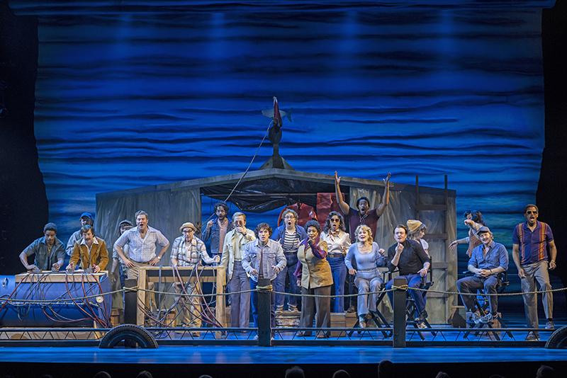
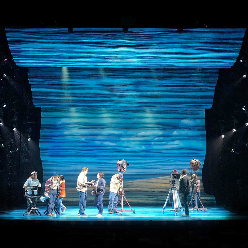
Visually the set went from squares to curves, aesthetically it was a big statement by the creative team. “To go from Hollywood Squares to this big, curved wave, it was like a huge clutch moment for us,” Sherwood states. “Figuring out the language as a team—projection, lighting, and scenic—was a real aha moment, because this wave surface all of a sudden becomes a projection surface. Sometimes we used it as water, sometimes as sky, but it also became a surface where we would see these acts of creation, these sort of moments of inspiration from the filmmakers. I think those were real linchpin moments in us figuring out how to go forward.” The set was built in house by the team at Seattle Rep theatre, which included sculpting the massive carved foam wave/sky wall.
About the Martha’s Vineyard scenes, Sherwood says of the design, “We wanted to feel like you were always outside. It was the first movie to be shot on the open water; up until then they would shoot in huge water tanks. Also, when you’re in these Eastern coastal towns, you’re always looking at water and sky.” All the elements—weather, water, tidal changes—played into Sherwood’s design process for Act II. “The elements became the hardest part about the shoot,” comments Sherwood, “so I wanted to make it feel like that was a pressure. I started drawing this big sculptural wave that would have a huge ceiling piece that almost covers the entire playing space; that went down into this back wall; that turned into this big floor. At times, it could look like horizon, it could look like we were on or next to the water. When we need to go from place to place on Martha’s Vineyard, I added some simple elements. This worked because wherever you go, even if you’re inside on Martha’s Vineyard, you’re aware of the water beyond, you’re aware of the sky beyond. You’re on such a small piece of land.”
From Office to Ocean Light
Croiter also approached his design work with two different aesthetics between the two halves of the show for the lighting. “The first part of the show has a little more color, more vibrancy. It’s a little bouncier in the cueing and definitely more cinematic in the way I approached the design,” he says. “The second half flows a little bit more and is a little more seamless. It still has a cinematic quality, but we’re not jump cutting the same way we were in the first part. Much of the color for the first part comes from the projection and video design. The color palette came some from me and some from Shawn’s projections.”
Of his approach to the Hollywood Squares style offices, Croiter describes, “It’s nine color squares and very dynamic; ‘dynamic’ being the keyword. At times, all nine squares are lit up, and they wanted to look very different from each other. Even when we bounced from one square to the next, the contrast was very important to tell the difference between individual spaces. The first half of that first act is more color fields and then, as we get more into the story, the backgrounds in the squares become more blurred reality. The lighting becomes a little bit less colorful and a little bit more real as we get closer to going to Martha’s Vineyard. It’s less about bouncing color all over the place and more about the setting—if we’re in the production office, that’s lit with fluorescent fixtures. Each ‘office’ had a faux fluorescent fixture, above the playing space that we created. It was something that looked like a fluorescent fixture but with color-changing LED tape, so that when we wanted the whole cube to be a bold color, we could do that, but then when we also wanted it to be a realistic office, we could skew in that direction as well.”
When the show moves to Martha’s Vineyard for the second half. “It is more real; and by that, I mean still ‘real’ like musical real, not play real—to me, there’s a distinction. It’s like a little pushed reality because there’s also people singing. The lighting definitely breathes with the story and with the music, but it is more realistic in tone in the second half. I looked at pictures of Martha’s Vineyard, and even stills from the movie, to just find that outdoor quality of light, which is a little colder. From the stills, it seemed like an overcast summer. Of course, it was sunlight, but it wasn’t that yellow, warm sunlight. It was all very hot and harsh for the exterior scenes. In the interior scenes, when we’re in a bar, it’s more intimate; there’s a lot more color. There’s also a scene in an editing studio in a motel room, very small and that is warmer. Those are some of the warmer scenes because they’re more intimate, but again, dynamic was the key word for me on the show. We don’t sit on any one thing for a very long time.”
Light through the Waves
Within the massive wave/sky wall Sherwood’s design left slots for Croiter’s overhead lighting positions. “The wall was beautiful, and was also a projection surface so, it was definitely a blend,” points out Croiter. “We had light from LED fixtures below that skimmed up the surface; that looked dynamite, and we could do all sorts of colors. Then the projections lit most of the front of it the majority of the time, though there were times that projections did a swath of it and then lighting covered the rest of it; and there were times that lights and projections were on at the same time. It was never only projections, there was always a lighting element. Since the wave came over as a ceiling, we skimmed light up from below with LED strips and then all of it was front lit as well, and side lit with [ETC] Lustr IIs. We even had some gobo rotators, which I haven’t used in so long, to make a water effect on the ceiling pieces because the ceiling wasn’t a projected surface. That was all lighting.”
Croiter opted to not put any conventional luminaires over stage, explaining, “It was all moving lights, because so much of it had to be in places that were difficult to access because of the ceiling. And there were some carved foam elements on the floor of the stage so you couldn’t really get a ladder up there to focus lights without a lot of trouble. It was the first time I’ve ever only put moving lights overhead. I was like, ‘You know what, it’s going to be all moving lights over stage, and it’s going to work,’ and it did.”
Among the moving lights called for in Croiter’s lighting design were 29 Vari-Lite VL2600 Profile luminaires. He also used four Robe BMFL FollowSpot units, though he notes, “These were not operated remotely. These were the Robe BMFL FollowSpots that the operator actually sits at and manually runs. They worked really well. We put them in the catwalk where, at almost any other time, I would’ve put a 10˚ Source Four ellipsoidal up there, which is fine, but this BMFL was brighter and changed color very easily. I love them as followspots.” The moving lights and ETC LED Lustr II luminaires, along with the LED video panels for the office block walls were rented from PRG.
When asked if there was a lighting solution on Bruce he would highlight to other lighting professionals Croiter replies, “I would say the LED tape mounted to the fascia of the office squares. The most bang for the lighting buck came from that solution. Once we sat down to cue the show, I was in love with that solution. I think everybody underestimated how important, and how big a statement, something so small would make. Those squares were giant; they were really tall and flat. Without the LED tape I think it would’ve been a bit boring and the lighting would have been way less interesting. It was a very simple LED tape solution, but it took a long time to install because it was all individually circuited. But when it was done, it was so worth it, really just, my God what a difference. So, if I could offer a piece of advice, don’t forget to light the scenery, because really, at the end of the day, that’s what everyone remembers. I think the most interesting element was how we lit the set for that first part of the show and how surprisingly successful it was.”


