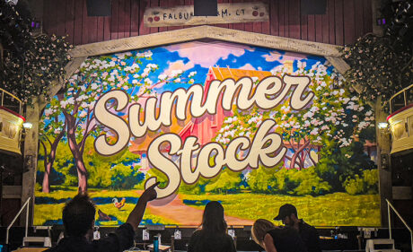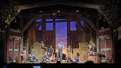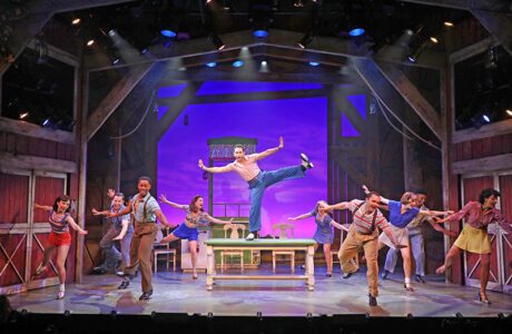
This August, Goodspeed Musicals—which is in the process of celebrating its 60th Anniversary Season—produced the world premiere of Summer Stock, a fun, new song and dance musical based on the 1950 Judy Garland and Gene Kelly film of the same name. Brimming over with many well-known songs, this high-energy musical features direction and choreography by Donna Feore, a beautifully versatile barn set by Wilson Chin, and an evocative lighting design that hits all the right notes from Jeff Croiter—all on the postage stamp-sizes stage of the Goodspeed Opera House. The engaging cast, led by the talented tapper, Corbin Bleu, sells the story of putting on a Broadway-bound show in the family barn all while chasing the audience’s cares away. Chin and Croiter, both of whom have designed several shows at Goodspeed, spoke with PLSN about their experience of turning an opera house stage into a barn that turns into a theater.

Wilson Chin
Scenic Designer
Talk about designing for such a small space.
This is my fourth show in that space and it’s always so tough to figure out how to make it all fit and not make it feel like you’re doing a show in a walk-in closet. To make it feel as spacious as possible, especially for a big dance musical. It is a fun challenge each time. At Goodspeed, you literally use every inch of the space. Backstage is so crowded. Also, it’s not a fly house, so any drop that flies in—we have four—are all roll drops that double up. Things like our blackout drop is also our star drop and because it’s a roll drop, it couldn’t be an LED drop. So, we do that old-fashioned trick of punching holes in a blackout drop and then bounce light off the blue sky drop. So, lots of doubling of things like that. Most of the scenery was built by Goodspeed with Tom Carroll Scenery building additional scenic pieces like the kitchen counter and Mrs. Wingate’s wall.
How did you approach the design of the barn itself to have the flexibility to change locations?
I was hired before the book writer, so we designed off an outline. We didn’t know what the scenes were, but we got a general idea of the locations. The design was based off the idea of real flexibility. We knew we wanted to have certain locations, so it just all needed to be a space that could be transformed easily while still being open for all the dance numbers. Everything needed to be as open as possible. Seeing the locations, I thought the envelope of the show should be this barn that they keep talking about. I could design it in such a way that it feels like we’re outside the barn, but also inside of the barn by having these big doors upstage that could open and close so you can feel like you’re enclosed but also out in the open. That was, I think, the key decision—set it all within the barn.
Then any location would just have one or two elements that could track on. Mrs. Wingate’s is literally just a sliver of a wall. The bedroom is just a bed. There used to be a big curtain that dropped into the bedroom, but we realized we didn’t need it. Also, Donna, [Feore] the director, because she’s a choreographer as well, was very happy to accomplish all the scene changes with the actors moving things around; that’s my aesthetic as well. I love it when it feels like the show is being controlled and that the actors are creating the movement of the show. By doing that, it frees us up from automation tracks and locking us into positions onstage—and offstage. Anything could be anywhere; it gave us that flexibility.
The use of the beam roof trussing gave the barn a soaring feeling. Talk about creating that sense of scale.
There’s forced perspective going on. As you go upstage, it just tightens in so that it feels a little bit deeper than it is. While the walls come in, the height never changes. It stays high all the way upstage and creates that feeling of height.
The stage never felt cluttered or over-whelmed with people or objects. Talk about working with Donna Feore on the transitions and keeping open space.
Because she’s a choreographer, she really thinks all about transitions. Figuring out how they move because transitions are choreography of scenery, and places. I think her mind really works beautifully in that way. But it was tough because our ‘in One’, where all our entrances are, was no deeper than three feet. So, it was a little bit like a train because you could only fit one thing at a time. We had big haystack towers—those would take up a whole entire wing. So, you literally had to move out the haystack to allow the kitchen to come through. It’s a tricky space.
The show curtain is beautiful, it really brought the audience into the show.
Goodspeed has an incredible scenic arts department. I’ve worked with them before, and they love painted drops; it’s what Goodspeed is known for. I knew I could give them the most challenging show drop to do; one that has all this color, all this detail, this specific 1950s painting style to it. I knew they would not only do it perfectly, but they would also love doing it and just have fun doing it. And they did do it perfectly.
The barn really looked like an old wooden barn, is that all paint?
It’s supposed to be a worn out barn that’s seen better days, so we use a mix of real wood and paint treatments. We used a lot of rough sawn lumber, so it has that kind of furriness that gives a texture of aged wood. Also, the scenic artists—who are great at scenic treatments—also did some pieces of that had the texture of wood, and I was really happy with it.
Talk about incorporating lighting solutions into the set.
Lighting in that space is just as difficult as designing a set for that space because of lighting booms and all the positions. Jeff [Croiter] knows the space as well, if not more than I, so I had a lot of trust in him. And he did, I think, in me. The star drop, was something that I’ve done before in that space. I think he was… I don’t know if he was dubious, but he knew that because we had no space, we had to do the black drop with holes in it trick. He was happy with the way it turned out, we both were. I also put lanterns everywhere, which was a Donna thing. Because we have all the scenes outside on the porch at night. That was our way of creating a very romantic, middle-of-the-night feel while still being ostensibly in a barn.
What are some tips or hints you’d give to others tasked with designing a whole musical on a postage stamp-size stage?
The less moving parts—the less stuff comes on and off—the better. If you can figure out a way to do a scenic envelope that can contain the whole show, that I think is best for a small space. Also, pulling out all your forced perspective theater magic trickery to make the space feel bigger. All that perspective work helps when the stage is literally the size of a walk-in closet.
Is there an aspect of the set you’re particularly pleased with?
I love our show drop and our show portal, just because I think when the audience walks in, they’re hit with all this color and scale of the Summer Stock title. It really tells the audience what they’re in for, it’s going to be big, it’s going to be colorful, it’s going to be happy, it’s going to be just fun.

Jeff Croiter
Lighting Designer
Talk about how you approach your lighting design in order to have the flexibility to change locations with lighting.
I try to build as much flexibility into designs, especially for a musical, as possible. There are multiple locations and interiors, exteriors, multiple times a day, and not a lot of space to hang lights. I’ve been working at Goodspeed since the late ‘90s, so I know how to work in the confines of that space. Of course, the tools at lighting designers’ disposal now, compared to the ‘90s, makes it easier to have that flexibility. Also, Goodspeed is famously restrictive in the amount of power they have. Meaning back then, even if you got the gear, even if you could fit the gear, you couldn’t plug it in. So, if you were lighting a cyc back then, that was it. You got great cyc lights and ate up a third of your dimmers. But now it’s LED, so now there’s room. Most of the important lights in the rig are LED, so they can do a lot of work and don’t take up all the space in the world. Yet, it isn’t all LED there’s a healthy mix of LED and conventional equipment. I have learned over the years how to balance them and in cues you don’t see the differences. Coming off a few shows where it was all LED, it was actually pleasant to go back into this incandescent world, which Goodspeed is. For Summer Stock it works in its favor.
It must be great to work with a director choreographer who really understands and does transitions so well.
Oh, absolutely. I love working with Donna because her work is fun and dynamic. Much of the transitions were talked about and planned out ahead of time. So, once I showed up to start seeing run throughs and when we got into tech, we knew what we wanted to do. Now, of course, not all that works 100% of the time, but at least having a plan going into it means that when we need to adapt something, it’s less difficult. But what was nice is that certainly the three of us, and stage management—everyone working on the show backstage—we all knew what we were trying to do. So that’s definitely helpful. The idea, the hope in something like this is that it’s fairly seamless and very entertaining. I think we realized that here.
Speak about designing and the technical challenges working in such a small theater.
A little bit of what I was saying before, you can’t fit the amount of gear that you want; the amount that one might want to light a show of this size. Plus, there isn’t space over stage. It’s not very tall. So, even the lights that you have don’t cover as much area as if you were in a taller space. You don’t have a lot of air, which is challenging. Also, with scenery moving in and out of the wings offstage, you can’t have booms there in the way. In a show that’s a dance show, you want that sidelight. But we did find ways to make that work. We stuck some strip lights in the wings because they were the skinniest thing we could use; they did a lot of our sidelight.
Again, because of the moving scenery, there is no, ‘in One and Two and Three’, there’s not a lot of room but if you lose half of an electric like that, you’re at a disadvantage. So, we found a way through the technical direction department and through the electricians to squeeze everything together, by just inches. It all fits by inches. You know something interesting though, a giant Broadway show, with millions of dollars worth of scenery, in one of the biggest theaters in New York still only fit by inches, flying past lights with only a half-inch clearance. So, it seems that scenery expands to the space you’re given. So yes, Goodspeed is tight, but if it were bigger, I’m sure Wilson would fill it with beautiful scenery, but we would still be as tight.
Talk about the sky backdrop and the star drop, Wilson mentioned that the star drop is “just holes punched in the blackout drape.”
Yes, holes in a drop, that’s it. That’s the thing about working at Goodspeed. I don’t know if it would work if it were bigger. If that were twice as large, it might not be as effective because I’m not sure the light would spread up and down effectively, but it was small enough that it did work and was an effective star drop. For the sky drop, for budget reasons, Wilson used a Goodspeed stock drop, which was from a show that I had lit originally. So, I knew the drop very well, and I knew what it could do. We used it very differently though. It was originally made for another show, and it was taller. Wilson adapted it to our show by flying it in lower and cutting the bottom off. You get to see more of the sky than we had in the other version of the show. I’ll say this, Goodspeed has some of the best painters around, and it’s a beautiful backdrop, like a translucent backlit backdrop. For Summer Stock, anytime we found ourselves on an empty stage, I never ran out of ways to make that drop look different and look good. Between sunrise and sunsets and musical number dynamics et cetera, that drop did a lot of work.
What are some tips or hints you’d give to others who are tasked with doing a big musical on a postage stamp size stage?
Versatility. Think about hanging equipment and choosing colors that can work for many locations many times of day and have a plan before you sit down to start to do it. You don’t have to have everything down to the last cue planned out but know the direction you want to go from one scene and one moment to the next. Have an idea. Then at least if you have a starting place, it’s easier to adapt to what the realities are. You can’t walk into a place like Goodspeed without knowing where you’re trying to go. There’s not enough time and there’s just not enough equipment. You really have to be prepared to hang just what you need and know why you need it, how you want to use it. There is no hanging an extra system of anything just as a cover your ass system. You have to be pretty versatile and prepared.
Any final thoughts on designing Summer Stock?
When we were hired, there was no script, so I didn’t know exactly what I was getting myself into. I trusted two things. One is that I love working at Goodspeed, and I’ve done a lot of new musicals at Goodspeed, So I know that if they’re going to do it, there has to be something to the work. They’re not going to just pick anything. And two, Donna. I enjoy working with Donna, so when she calls and asks me to do something, I try to make that happen. There was something about it that even though there was no script, I knew that I wanted to be involved. And I am very glad I did.


