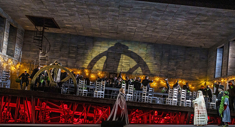
Lighting Designer Anne Militello, making her Lyric Opera debut, recently lit the company’s production of The Flying Dutchman. The inventive set, by Set and Costume Designer Allen Moyer is a large rectangular box, which Militello describes as “no lighting designer’s dream set” and placed a big challenge on the LD. She could have just as easily flooded the scenic box with front light and called it a day, but she opted to go with very little front light, and the results are stunning. Having to think ‘how to get light into the box’, Militello took time to share with PLSN her solutions to this one rather confining creative challenge.
Talk about working with director Christopher Alden and his approach to The Flying Dutchman.
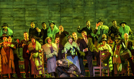
The first iteration of this was for the Canadian Opera in about 1997, almost 20 years ago. I worked with Christopher in New York, and he always takes some very creative, or fresh approaches. He’s very innovative and never traditional. The lead in this opera is the captain of a ghost ship that’s banished to sea for eternity. He gets to come back every seven years to find salvation to stay on land if he can find a woman to be true to him and love him. In the opera he’s got one last chance. In this version, the captain is a Jewish escapee from a Nazi concentration camp that hides in a village that happens to be Nazi-controlled. Everything goes haywire with those two worlds—that’s the crazy spin on this story.
Tell us about Moyer’s set and the challenges it presented to lighting.
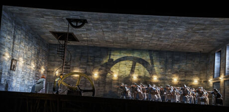
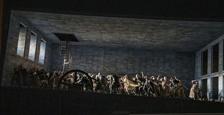
The set is a gigantic 60’-wide, 20’-high tilted box with ceiling and walls around it except for the open front on the audience side. It’s no lighting designer’s dream to have a ceiling overhead where you can’t get any light in. I thought, ‘I’m going to take you up on this challenge’, and I was really excited. I decided that this was a dream box that we were looking into, that I could do some gestures within that box that were unconventional. I had the concept that this was a box by artist Joseph Cornell with a lot of dream imagery in it.
What was your approach then to the lighting?
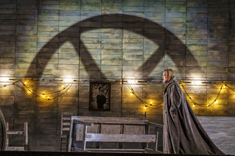
I decided I didn’t want to use much front light, so I asked Allen to cut holes in the two side walls that could open and close at times. There are doors of course, on one side for the cast to come and go, but otherwise there was a tiny hole in the ceiling and small hole in the floor for the big gesture of the ship’s wheel. Because it’s German, I was inspired by the early German Expressionists and worked a lot with shadows. I could have lit the whole thing really brightly, and just pumped in a lot of front light, which is popular in European opera; to have big, one-note gestures of light. I do that towards the end of the opera when everything is revealed that the Dutchman is a Jew, and his fiancée is engaged to another man; things get ugly and flat. Then I pump it with a lot of flat front light.
But the rest of the time it’s just shadows and texture that come in from different angles. It’s a lot of shadow play that accentuates the mystery. Things are shrouded. The truth isn’t always there. There’s a lot hidden in the darkness. However, I can get light into the box—up lights from the orchestra pit, sidelight from the box booms, lights through those openings when they’re open. There’s not a lot of lights on my plot, it’s deceiving. This opera comes around often; this is, I think, the 13th production of it. Every time it comes around to different opera houses the Master Electrician sees the plot, they’re like, ‘Ah, easy-peasy.’ But it’s not, it’s so fussy. Trying to get in with all the angles. Because not only is this a box, the walls of the set that have the windows are slanted, and torqued. It’s just deceiving because the angles are not what they appear to be when you look at the set. That makes positioning those lights difficult, trying to tail things down or rope off ladders; every opera company has a different way of mounting these lights. It’s never the same, so it’s fussy.
You mentioned creating shadows and textures, tell us more about how you did that.
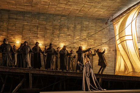
I texture in the form of gobos, which is a nasty word by a lot of people’s standards, but I don’t shy away from them. I like them. I can use the texture. I still have, and use—thank God there aren’t very many left in this world anymore—GAM Film/FX. [Film/FX units fit into an ellipsoidal’s drop-in iris slot and have a continuous metal scroll of clouds, water, etc.] I don’t know what’s going to happen when they all die. I’m going to hang on to the ones I have. Fortunately, Chicago Lyric Opera had some in a dusty drawer that we used! Because there’s this big storm scene at the beginning when the two ships come together during the storm and the ghost ship has a glimpse of land, I’m using projected clouds now from a 20K projector just coming in from the front, on top of the Film/FX units. Storm clouds that move that are in [ETC] Source Four tungstens with HPLs; not in [ETC] Lustr LED ellipsoidals. They really provide a sepia tone when we dim them and take them out of focus. It’s abstract. Very simple in terms of technology.
I say simplicity not only in technology, but the simplicity of the use of shadows and how—wherever I can get them. The big shadow of the ship’s wheel just looming over everything, which is this constant reminder. So, using simple imagery, which is something, again, that has nothing to do with technology. It’s just about basic gestures and light that make powerful images, emotions, and messages. I think in this show, there’s nothing that subliminal, but it does have subliminal meanings. So, your brain does a lot with this show.
One of the biggest challenges for any opera house now is the lack of color scrollers that I had in 1997, because there weren’t Lustrs yet and back then, we couldn’t afford moving lights. There were barely any used for theater. ‘What can change color other than scrollers when you hardly have any lighting positions?’ If you’ve got very limited lighting positions and you need to change worlds, those are what you need.
So, what did you use for color changing?
I found scrollers. As many as I could get. I’m also using 5kW tungstens, originally 4kW HMIs; it depends on which town I’m in. They’re hard to get too. Those come through one side and really are the workhorse of my sidelight through these top windows on stage left. They have to change color, so we’ve got the last few large format scrollers. The first time we did the show, in the wedding scene I just let the scrollers roll through all the colors. Since we couldn’t afford to make custom scrolls, we went with scrolls they already had built. It’s when everything goes crazy and goes out of control—I just let it do a live scroll. It’s very surreal, very Dada-esque.
Were you using LED luminaires and moving lights with your scrollers?
Now, with scrollers going away, I’m doing it with some Lustrs and moving lights. We’re half scrollers, 25% LED Lustrs, and 25% moving lights. Now, it’s not so easy; I have to take a lot more time to cue what used to be a simple live scroll through random colors. I’m still working on how to cue those to try to make the color changes happen without any interference from going through the center of the color wheel; it’s just not so easy. The workarounds that they say are easy, are not doing it for me, yet. So, I’m in the middle of struggling with that. That’s a big switch. I miss scrollers. I think I should buy them all up myself and keep them in a time machine and maintain them every year and then buy up all the gels in the world before they’ve all gone away. Then I could have scrolls for this show, because like the Dutchman coming back, this show keeps coming back.
Did the finish of the set and colors of the costumes help with your color choices?
The box is very rich. It’s just wonderful what he did with a simple, big shoebox without a lid, but there’s so much to it. It’s a beautiful painted scenic, with worn blue wooden slats that are just so textured incredibly with paint that help me when I light them with—or without—texture. The paint treatment, it’s this bluish cool blue, well, it’s not even cool blue. It depends on what kind of light is on it, but they just become so rich, these walls. The paint color that he intuitively chose was able to change into any color I gave it. It was amazing. Not many blues can do that.
[Moyer] did the costumes in those same tones, which strangely enough don’t just blend into the walls. They really come alive just because of the textures that he uses and the nuances of the costume variant colors in that same theme; It’s just brilliant. Then there are, what look like simple scenic gestures—where he placed this large ship’s wheel and one side of the set is made up with ropes, so we’ve got fans blowing through the openings to make it look like the sails of the ship during the storm. Simple gestures. He’s a genius. He and the Director, Christopher Alden—they’re amazing artists, and I’ve just been lucky to have this journey with them.
We’re all challenging in our own way. There’s always a little creative tension around putting this up because we have such a short time to do it. It’s got to be right. We’re all passionate about this, so it’s not an easy, relaxing time. We’ve got to get to work, but it’s so creatively fulfilling and wonderful in its way.
Are there any crew or assistants that you’d like to call out for this production?
This was my debut working at the Lyric Opera House and the wonderful thing about the Lyric is that they have wonderful staff and crew. Lighting Director Chris Maravich is the lighting supervisor here and has been wonderful and the assistants have been amazing as well. I’ve been blessed to have really good assistants in all these opera houses, and Assistant Lighting Designer, Bridget Williams was my assistant on this one. If I say anything, I don’t have to worry about it getting done; she and Chris made sure it gets done. It’s magic and the crew here at the Lyric is a wonderful union house; just such hard workers and the impossible just gets done.
If you were speaking with another designer, what’s something they might find interesting about your design?
They might find it interesting that I’ve chosen to keep the color scrolls. When you change color now, you’ve got one moving light, you’ve to be mindful about going from one color that you want to the next color that’s appropriate for the next thing. You might have to take it or try to find another path to get to that color that’s not so hideous. The fact that the simplest technology is the best. I think that’s fascinating.


