 Broadway’s Here Lies Love is a groundbreaking musical about former Filipina First Lady Imelda Marcos’ astonishing rise to power and subsequent fall at the hands of the Philippine People Power Revolution, with music by David Byrne and Fatboy Slim. Developed and directed by Tony Award winner Alex Timbers, it made its world premiere at The Public Theater in 2013, debuted at London’s Royal National Theatre in 2014, and played at Seattle Repertory Theatre in 2017; all critically acclaimed and popular productions. The creative team on Broadway includes three-time Tony Award nominee Scenic Designer David Korins, Tony Award winner Costume Designer Clint Ramos, Tony Award winner Lighting Designer Justin Townsend, and three-time Tony Award nominee Projection Designer Peter Nigrini. All have literally transformed the Broadway Theatre into a dance club where the audience is immersed in the story. Korins and Nigrini shared with PLSN some insight into the scenic and projection designs that are not merely settings but integral to the storytelling itself.

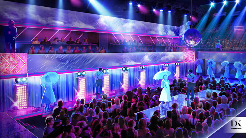
A rendering by David Korins for Here Lies Love at the Broadway Theatre.
David Korins, Scenic Designer
Talk a little bit about how your scenic design, really the whole scenic environment design, supports the style of the show and the narrative.
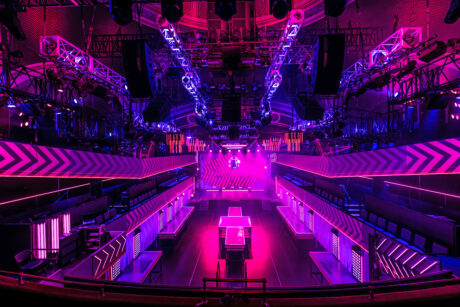
The look of the show was created based on the original David Byrne idea of seeing if he could tell this story of the rise and fall of this dictator in club vernacular. The set is the theater and vice versa. A lot of people talk about the club-like experience of the show, and we certainly deliver it. But really, at the heart, what we are doing is presenting a Broadway musical. Just as Cabaret takes place inside of the Kit Kat Club, Here Lies Love takes place inside of Club Millennium, a 1980s-style club. There are moments of high theatricality; moments of deep, serious drama, and there are moments of actual club environment. So, the projections, the lighting design, and the scenography all have to toggle between telling straight-down-the-barrel theatrical narrative storytelling, and then have those moments where it can transport you into the club, the way that any great musical does. And we have all the technological firepower to do that, yet always at our heart, we are in a musical, and so everything is ultimately in service of the story.
The show has done previous, smaller productions, what has changed on Broadway?
As I mentioned, it started with David Byrne’s idea of could we basically set it in a club-like environment, so way back in 2011/12 we took the scenery concept with an early version of the show up to MASS MoCA. We wanted to see if we could actually prove out the concept, that people could be standing inside of this box and that the action could be happening in and around the box. Once we proved that concept, we got a production at The Public Theater. Part of the original premise was that people were going to both stand inside of the experience, that scenery would move through and around all the standing audience, but that also there would be seated audience members on the side and galleries looking down into it, and that is something that we had at The Public. The Broadway design today is essentially a version of what we had there except, obviously, we are 10 years older, so we’ve learned a tremendous amount more about what the show wants and what it needs.
What is new to Broadway is that we’ve added a kind of lower lounge area and we’ve connected the set on one side to the mezzanine. We have put a catwalk where normally the balcony rail for lighting would be, and that allows for a lot of the staging in some of the seminal moments to happen up there. It also connects house right to house left, and it brings the performers directly up to the people in the mezzanine. That catwalk is quite important visually and narratively. The scenes up there are many of the important moments in the story, and for those scenes on the catwalk, the mezzanine becomes the front row. That is also an example of there being a number of different ways to see this show, which is really pretty extraordinary. You can be on the floor, on a side gallery, in the front mezzanine, the rear mezzanine, and they’re all very, very, distinctively different experiences. It’s been really interesting to see how people interact with it; the show is extraordinarily different depending on how you see it.
What is something people may not realize about the set design?
The actual square footage of this design is probably the equivalent of somewhere between four and six Broadway shows. I think it’s deceptive because of the simplicity of the paint job and the finishes of the design. I don’t think they fully understand the profundity of the engineering that went into this. And it is amazing the extreme amount of architecture that [architectural consultant] Mitchell Kurtz and his associates did. Mitchell has been with the project since the beginning at The Public. We have worked together for 10 years on what could work, how to make it legal, how to make it permit. Remember, the audience is sitting on the set and standing inside of the set. So, everything that you need to do with regard to running lights, safety, emergency access, fire egress, all of those systems have to be built into the show. So not only do we have square footage that wraps around the entire audience, seated or standing, but we also have all that level of technical information and truly legal work and engineering work and architecture work that all went into the set design.
 Were there some unexpected challenges?
Oh my God. Have you ever renovated a home and thought, “Oh, we’ll put a bathroom there,” and you open up the wall and you realize there’s something else inside that wall? At every step of the way, even the best laid plans, we were met with challenges. We had to strip the entire front of the balcony rail away. That of course is where Broadway shows have their front of house lighting and projection position, but our front of house at that level became our front row. So, in taking all that out, we went all the way back to the original architecture, which is beautiful. Then were building a catwalk as a playing space right up against it and the curve of that didn’t match up to the drawings at all. Which is of course because no one had ever seen it. It was always a rough guess. No one had ever put weight-bearing scenery up against it, and no one ever needed to because it was a front of house lighting position, and now it’s an actual playing space. So, a lot of those things we had to figure out and solve.
Is there a specific moment that you particularly love, scenographically.
I’d say it might be what we call the flotilla, that final piece that tracks along the stage from one side to the other when we go to Aquino’s funeral at the end of the show. To me it is one of the most breathtaking moments I’ve ever seen in the theater. It’s so beautiful and so extraordinary just how we instantly as the audience are cast essentially as mourners gathered at a funeral. Literally the lyrics are, “As I watch the procession,” referring to the funeral procession, and we all are literally watching the funeral procession, including the casket tracking across stage in this rainy funeral setting. It’s so simple looking, scenographically, but it’s so unexpected. Especially given that you’ve been looking at this fixed stage for the past 85 minutes of the show, and then in the last five minutes it tracks across the stage to show you a total coup de theatre, and it’s all tied to narrative, which I think is just really special.
What would you tell another designer about this immersive set design?
I think that there’s so much talk these days about immersive design, environmental design, experiential design. I, of course, in my career have done a lot of that, not just in the theater, but in general. I know in practice the nuances between those three things. This design is so unbelievably rich and extraordinarily ambitious that I think 85% of the problems that we managed to solve in this show have nothing to do with what you would call ‘traditional’ set design. So, what I’m proud of, and what we solved, myself along with my associate Amanda Stevens and our whole team, is the challenge of designing and building an entire theater inside of the theater, and then integrating it into the set design and environment for this Broadway musical. The challenges within that were myriad and extraordinary.
I feel unbelievably humbled that I was given the opportunity to even be faced with this challenge and I feel incredibly excited that we rose to the challenge and met it. I think people talk a lot about trying to accomplish environmental design, or we’ll seat a couple of people on stage, so the audience is going to break the fourth wall, but on this show, we’ve not just broken the fourth wall, we’ve shattered it into a million pieces. It just doesn’t exist anymore.

The projection design by Peter Nigrini gave conveyed time as well as narrative context.
Peter Nigrini, Projection Designer
Talk about your projection design approach where visuals are so essential to the narrative.
The central question was, how can image tell a story? Because in Here Lies Love with more or less no book to speak of—the book is the sum of the lyrics, Alex [Timber’s] staging, and the projection design. If you took the projection design away, you’d have no idea what’s going on. So, the first question, in a lot of cases is, how to integrate with scenery? How the scenery functions—to some degree—was driven by early questions. When the director, David Byrne, David Korins, and I were asking, How do we tell this story? sometimes the answer was, we need a place to put an image. We need a way to build an image that contains the actors and this piece of projection content long before we knew what the physical shape of the space was.
What’s changed in the Broadway version?
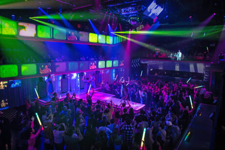
It was a very interesting process to turn this from what was previously a fully immersive experience into a hybrid between a proscenium production and an immersive production. It’s still immersive, but the focus of the room has changed. And because there’s a seated audience in the mezzanine, they have a fixed vantage point. So, a lot of compositional things that we had built relied on constantly shifting focus. We had a long conversation about where the tech tables would be; up until now, we had rolling tech tables that could roll around the dance floor so we could be at any vantage point. This time around we realized we should all settle in the mezzanine, where the new portion of the audience was. It was like, ‘We know how it works from the dance floor; we’ve done that four times before. Here’s where these people are going to sit and only see it in this direction. How do we make sure that they’re being differently, but equally served?’
How do you feel that this new perspective works for the show?
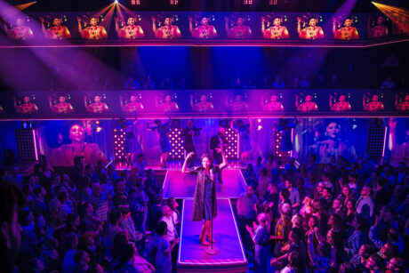
Early in the tech process, we had a great moment of fear—something we’d known all along—a huge portion of the audience is in fact now having more or less a proscenium experience, a fixed view. The basic question of whether we could mix those experiences, we were very nervous about. Now that we’ve had a few weeks of audiences, we discovered that mixture of experiences is exciting. It’s exciting for both audiences, that they all see each other and acknowledge each other. And those people who have chosen that they don’t want to be on a dance floor and want to sit in a theater seat to watch a show get great excitement out of watching the dance floor. And vice versa. Also, there’re times when the mezzanine becomes the populace that some of the characters are performing to. For example, When Imelda finishes the show and sings standing on what was the balcony rail; she’s in the middle of an arena. No one is more than 45’ from her, and there are 1,200 people there. You can’t do that in a proscenium theater. That basic transformation of the room is incredibly exciting.
Walk me through the technical elements.
In this system, it’s a lot of very flat screen surfaces. We’re using a Rose Brand, silver front-projection screen material in several custom sizes, that once it’s implemented, feels architectural and is a part of the room. That’s something that dates to the original production, over ten years ago. Then there are 27 projectors, the vast majority of which are Panasonic ranging from 10K to 30K along with four Barco UDX-4K32 projectors. There’s also a fun rear projection material that we made ourselves out of vinyl strip curtain, for warehouse doors, that we custom painted. We turned those strip curtains into an RP screen that surrounds the audience.
There’re 52 Samsung flat panel monitors that are assembled into one large video surface. It’s all driven by disguise vx 4 media servers. In addition, there’s a Panasonic PTZ camera package with eight cameras, along with two wireless Sony handheld camcorders. It’s a huge system. It’s by an order of magnitude larger than the largest system I’ve ever designed. I’m quite confident it’s the largest projection package that anyone’s ever put on Broadway. Twenty-seven projectors alone is a huge lift.
How do you deal with camera switching?
All the camera switching is done in disguise. We can take all those inputs straight into the media servers, so all the switching is pre-programmed. We’re doing a fair amount of camera signal processing—applying LUTs to the cameras, color correction, etc.—all in disguise as well. That’s something that I’ve increasingly been doing, and excited about for other projects. We’re doing a similar thing with I-Mag; it’s about camera processing. We can start thinking about camera shots in a cinematic way, like, ‘what’s the color space? How would we color grade this shot? How do we make this camera feel diegetic to the story we’re telling?’ In this show, I-Mag has become a huge part of it because the reality of wanting to do an immersive project like this is, not everyone’s going to have the same view. The more you break with a proscenium convention, the harder it is to give everyone the same experience. Our feeling has always been we don’t have to give everyone the same experiences as long as they’re all getting an equally good experience. What’s great about this piece is it always had it in its DNA, this idea that the capturing of these people, and the use of cameras, was part of the way we were telling the story. Hopefully if we’ve done our job well, all those cameras just feel like part of how our story is being told, but also solve some sightline problems.
How are you affecting the live camera feeds?
We’re doing some working in disguise native; we didn’t use Notch on this show. Mostly it’s color, a lot of noise overlays, applying LUTs, and various bezeling. A lot of it’s about setting the period since we travel from 1945 to 1986 in this production. A lot of how you know when it is, is coded in how the media’s presented. Like going from black and white to color, looking at what pixel grain you might expect at various time periods, like 16mm film grain. It’s a lot of overlaying, shaping, and coloring.
 Who was your team on this production?
You couldn’t do this without a great team, and I had a great team. The Associate Projection Designer is Robert Figueira and the Assistant Projection Designer is Zoey Crow. The Projection Programmer is Ido Levran, Production Video is Asher Robinson, and the Deck Video/LX is Adam Bishop. In terms of the content creation, it was all done in my studio, and that great group of people include the Lead Animator, C. Andrew Bauer; and Animators Dan Vatsky, Kate Ducey, Lacey Erb, Lisa Renkel, Ryan Belock, Johnny Moreno, and David Bengali.
Also, I would like to say, from a technical perspective, we hear a lot about the projectors and the media servers and not so much about content creation. I run a content shop. All the tools and procedures for creating content are a huge technical undertaking and need an incredible staff of animators. I don’t personally know how to make that stuff anymore than David Korins knows how to use a MIG welder, but there’s a whole team of artisans who are the animators who do. They’re the modern scenic painters where there’s so much detail, craftsmanship, and artistry that goes into their work. Just like a great set designer is lost without a great scenic painter. That’s absolutely true of projections designers and the animators. There’s a small army of animators and content creators over the last decade who have made Here Lies Love as rich and full of visual experiences as it is.
How was PRG’s support for your design?
They’ve been great. The amount of equipment required is so far beyond any shop order I’ve ever written, and one of the things that’s been great about PRG is just how deep their inventory is. There was a lot of horse trading and substituting, but with their scale, their inventory is incredibly deep. They were great at working through that substitution process and developing a careful understanding of the system. Ultimately, I’m looking for a shop that I have an engineering partnership with between myself, the production engineer, and the shop. If a shop isn’t cognizant of what my ultimate aesthetic goals are and can’t work that into their side of that conversation, it gets incredibly difficult. PRG was great about trying to come to the table with substitutions that were viable and workable. Because in the end, it’s a rare show where I can have everything exactly that I want.
Is there anything else you’d like to mention about Here Lies Love?
I think the magic that projection design brings to this show is the amount of information we can communicate and the speed at which we can do it. It’s like we need you to know what time it is. Well, we can do that with a font choice where we don’t ever tell you the date, but you know the date because the font suggests a time period. It’s about the theater becoming an increasingly visual language. Maybe a play doesn’t need to be written in verse anymore. I think that that’s the big theater-making thing about this show; the way that we’re using images as part of the basic book of a musical.
 Production Team
Scenic Designer: David Korins
Projection Designer: Peter Nigrini
Associate Scenic Designer: Amanda Stephens
Assistant Scenic Designers: Richard Ouellette, Javier Ameijerias
Associate Projection Designer: Robert Figueira
Assistant Projection Designer: Zoey Crow
Lighting Design: Justin Townsend
Costume Design: Clint Ramos
Sound Design: M.L. Dogg and Cody Spencer
Lead Animator: C. Andrew Bauer
Animators: Dan Vatsky, Kate Ducey, Lacey Erb, Lisa Renkel, Ryan Belock, Johnny Moreno, David Bengali
Projection Programmer: Ido Levran
Production Video: Asher Robinson
Deck Video/LX: Adam Bishop
Vendors
Video: PRG Video
Scenic Shops: PRG Scenic Technologies, Empire Technical Fabrication, Daedalus Design & Production, Cigar Box Studios
Scenic Arts: Infinite Scenic
Engineering Consultants: McLaren Engineering Group
Architectural Consultant: Mitchell Kurtz Architect PC
Gear
Video
1 disguise gx 2c Media Server
3 disguise vx 4 Media Server
14 Panasonic PT-RZ970 Projector
4 Panasonic PT-RZ31K Projector
3 Panasonic PT-RZ21K Projector
2 Panasonic PT-RZ12K Projector
4 Barco UDX-4K32 Projector
52 Samsung QH/QB Series Display
8 Panasonic AW-HE130 PTZ Camera
2 Sony PMW-200 Camcorder
2 Teradek Bolt 3000 Kit
Imagine Communications Platinum MX Routing System
Barnfind BTF1 Series Matrix Frames
Cisco SG550 Series and CBS350 Series Switching
Ubiquiti EdgeMax Routing and UniFi Wireless


