
Lighting designer Lap Chi Chu is based in New York and Los Angeles, where he is Professor and Head of Lighting Design at UCLA’s School of Theater, Film & Television. He is also now a Broadway lighting designer. He has an impressive list of credits including Morning Sun, for which he received a Lucille Lortel nomination, and 72 Miles to Go…. He has designed at The Public, NYTW, Signature Theater, Roundabout Theater, Geffen Playhouse, Oregon Shakespeare Festival, Berkeley Rep, The Goodman, and Shakespeare Theatre Company among others. His list of awards is also extensive, including having received an Obie Award for Sustained Excellence in Lighting Design, Lucille Lortel Award, Los Angeles Drama Critics Circle Angstrom Award for Career Achievement in Lighting Design, Ovation Award, multiple Bay Area Theatre Critics Circle Awards, a Drammy for Best Lighting. His can now add his first Broadway credit for Camelot, playing at Lincoln Center Theater (LCT).
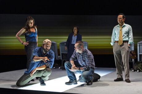
Though he had previously designed The Wolves at LCT, Lap has now done three shows there, having recently designed Camelot and The Coast Starlight simultaneously. Keith Bunin’s The Coast Starlight is a modern, more minimalistic piece directed by Tyne Rafaeli, that follows six unrelated travelers on the 1,000 mile train journey from LA to Seattle as they reckon with life choices. Lap’s lighting evoked the movement of the train and the emotion of the play. Along with Lap, the creative team also included sets by Arnulfo Maldonado, costumes by Ásta Bennie Hostetter, and projections by Ben Pearcy 59 Productions. Melissa Chacón was the stage manager.
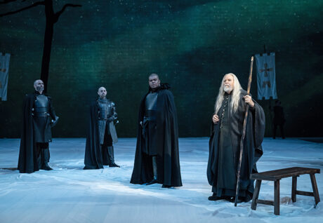
Upstairs in the Beaumont Theater, Lap designed the lighting for the currently running Broadway production of Lerner & Loewe’s Camelot, directed by Bartlett Sher, with a fresh book by Aaron Sorkin, based on the original book by Alan Jay Lerner. Despite a deceivingly sparse scenic approach, the musical is still lyrical and softer in approach than The Coast Starlight. The creative team includes scenery by Michael Yeargan, costumes by Jennifer Moeller, Hair & Wigs by Cookie Jordan, and projection design by Ben Pearcy 59 Productions. Camelot is stage managed by Charles Means.
Lap certainly got his daily steps in hitting the staircase between LCT’s Broadway house, the Vivian Beaumont Theater and it’s downstairs off-Broadway house, the Mitzi E. Newhouse Theater. While the two shows were running, Lap took a moment to stop on the landing and speak with PLSN about his approach to designing both productions at essentially the same time.
The two shows present very different environments. The situations that the characters are in are very different, yet both productions rely heavily on the lighting to help the audiences understand the context of the scenes. Talk about, how as a designer, you approach your design to fulfill that role of giving context.
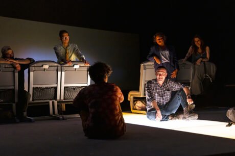
For The Coast Starlight, it is a moving train, and the style of the play is very presentational. It’s basically a lot about all the things unsaid between people, so it’s abstract to begin with. We could do anything we wanted with the lighting, but trying to not do the obvious thing, and to get to the feeling of what a scene wanted to be. For example, we had a scene where they walked into the observation car of the train, where they finally see the sky. Instead of illustrating the sky for us, which we tried, we actually settled on something different, where the floor became very bright and just changed the environment; where it felt like they opened up. We did that by basically having a lightbox onstage. We had a lot of Astera tubes, which were a lifesaver for this show. It’s actually made the show cost-effective. It costs a lot to power that lightbox in a revolve, so with the Astera tubes, they’re all wireless, and they’re all pixel mappable. We put the Astera tubes down there, in the floor to light the scene. They did so much of the heavy lifting for The Coast Starlight. It made things architectural at times, and it makes things fantastical, and then it could be theatrical as well. Lincoln Center had never used them before, but after me being there, between Camelot and Coast Starlight, I think they’re loving those Astera tubes.
They are under the plexiglass in the floor?
Yes, originally, it was going to be a lot of LED, powerful LED tape under there, but it was too expensive to get power run under there. The Astera tubes are responsive, they’re wireless, quite stable, and they’re bright, and pixel mappable, which is a lot of what I do. So that is on The Coast Starlight.
And on Camelot?
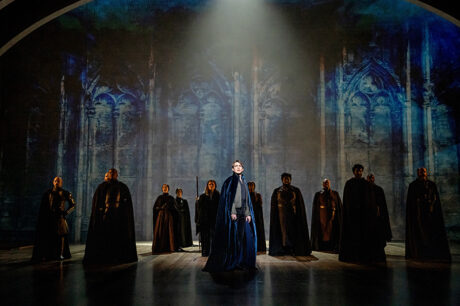
Camelot is about idealism. We wanted it to be very pretty, and we also had a very large stage. For that design we have a lot of [ETC] Lustrs, and a lot of big moving lights; the MAC Performance Ultra, and the Vari-Lite VL 3600 are our main workhorses. We had, I think, about 80 of those types of fixtures. To be able to single source something with a few lights—we really wanted these big fixtures to do that, instead of piecing a lot of things together. Our stage ended up being a 70-foot deep, open platform, so really, to carve it up at that kind of throw distance, these things were fantastic. I just have shutters. I tend to be rather graphic in my design, so it’s about trying to make this big space into a small space, essentially. To make it look simple, it required these larger moving lights. Also, we had some of the Best Boys, the PRG Best Boys for followspots; they’ve been great for us.
What do you mean by being graphic?
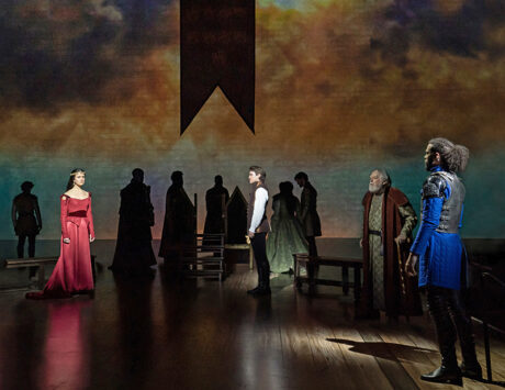
Meaning, a lot of shapes, a lot of templates. For the storytelling, it’s a tale of a forgotten time, better times, a prettier land, a more idealistic time. So we had light to help do that, and we sort of had a second cyc to work with to do that. We had a cyc, we have a lot of [Chroma-Q] ColorForces and [ColorBlaze] TR4s on the cyc. It also had video that was more of a traditional cyc back wall. But we also had a raked, 70-foot-long deck. Since it was raked the audience could see more of the floor and we could use that as a second cyc. For the big entrance of Sir Lancelot, it is just one man singing, but we have all 70’ of that floor used as a cyc, so he is singing in the sky, as it were. It was about trying to make this large space look like one idea and simplify it. And those big fixtures helped. Otherwise, it’s just a lot of Lustr Source Fours to make these really colorful landscapes that is our floor.
For this Camelot, there’s a sparser scenic design, yet you must evoke a lot of locales, how did you approach that in your design?
I knew I wanted to use a lot of the stage, even when geographically, the scenes weren’t on that part of the stage, just to treat it like a big cyc. It being a musical, I mean, it’s just so fantastical, that you could have all this other information happen onstage, on other parts of the stage. When you have a big chorus number, like ‘Lusty Month of May,’ with a big dance number like that, you end up using the whole stage. But again, for smaller scenes, you could still use the whole stage to tell the story with the lighting. The music tells you how big or small to go, or how dark or how light to go, in some ways. The music really informs it, I think.
Is there a lighting cue that you’re particularly pleased with, and why?
Oh, it is definitely Sir Lancelot’s entrance, where it’s just a single man on a large stage, coming over the distance. We used a full cyc of LED, the Color Forces, just to have him come over the horizon, and then, a single Best Boy just uplighting him through haze. And then, he got to use the entire stage floor as a cyc. He was singing on the cyc. That’s what that 70-foot-long deep stage gave us. It was just the ability to really show off color. Like I said, I did a lot of pixel mapping, but having a stage so deep means I can do a lot of detailed gradients of colors, gaining from one to the other. Also, Lustr colors are just fantastic. To have a bigger playground for all those lights were just a dream come true. I mean, I always faded colors, but to have a greater distance to fade color was just fantastic.
I love the Beaumont space, and certainly Michael Yeargan is the scenic designer who really knows, perhaps best, how to work in that space. Talk a little bit about your collaboration on this production.
That was a lot of fun. What a fantastic collaborator. And he also doesn’t crowd the stage with scenery. He doesn’t need to. He very much understands that this part or that part might be a video or a lighting part to do. What he does is just very suggestive and it’s very compact. And yes, it’s still a big space, and there’s still a ton of scenery, but it’s very suggestive, and he allowed for a lot of architectural solutions to be done with lighting.
Ben Pearcy of 59 Productions did the projections for both shows as well, tell us about that working relationship.
Well, that was fantastic also. I knew Ben from way back, when he was an associate of Ken Billington’s, back when I was in grad school and he was in Ken’s office, so he is a lighting person. That gave us this quick shorthand dialogue, just both understanding, “Okay, video will do this part, lights will do this part of the same image.” So, it was a great collaboration, because he understood perfectly well what lights do as lights, and what projectors do as light, and we both knew what each wanted to do.
And PRG supplied the gear for both shows?
Yes, they were great. They’ve been very supportive and made sure everything was right and got us what we needed.
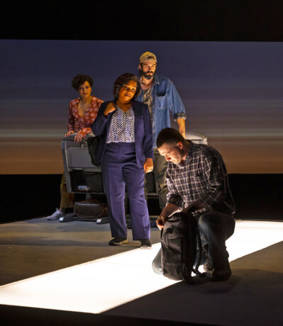
Let’s talk more about your Coast Starlight design. What I’ve seen in the show appears, again, very minimalistic. Again, a lot of the heavy lifting for the lighting.
Yeah, this is the one that we ended up with really leaning on those Astera tubes. We wanted to create movement as it was on a moving train most of the show. But it’s an odd balance between providing movement and stillness at the same time. Because once we’re on the train, we want a control of that, of how to have movement read or not read. Some kind of a physical movement, the revolve, the lighting but also knowing when is the time to stay still for a bit and let them tell their story. This play is very much about stillness and movement, which is a big reason why I ended up pixel mapping a lot of stuff. It was about being sensitive to where all the actors’ beats are, when we should be still, when we should move. So, we wanted that ability to go between the movement and the stillness, we knew we needed to find control of that ability.
Along with the Astera tubes, what were some of your key equipment choices?
Again, a lot of Lustrs, because I tend to use a lot of color, and a lot of specific color. They are really great. You don’t have to deal with a lot of gel now, and you can be so much more specific from every angle you have control of the color. Also, the moving lights were [Martin] MAC Performances, and we had a lot of LED strip lights [ColorBlaze 72 TR4s]. Everything we had was so that it was variable, everything could move, could change. It was a very important part of telling a story on a moving train.
For Coast Starlight is there a lighting cue that you really liked, and why?
When we lit the entire scene with nothing but the Astera tubes in the floor. I talked about stillness and quiet, creating stillness and quiet…that did. It was a moment in the play where our protagonist just has a quiet moment to himself, he’s dealing with some PTSD. And to express that by taking everything out but Astera tubes in the floor, and just playing an entire scene from there, without movement, that was a really powerful key moment. That’s really what maybe exemplifies our controlling stillness and movement, and a cue completely based on the needs of the play.
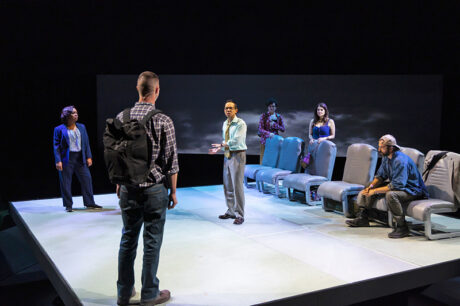
Tells us about working with scenic designer Arnulfo Maldonado.
We were lucky enough to have done this show together at La Jolla Playhouse, pre-pandemic, and to now get to revisit it. It was in the proscenium back then, and now we are in a thrust. This was actually better for us, because when you’re in a proscenium, you have a sense of left and right, especially when you talk about a train moving. But since we’re so stylized, you could not rely on that, you couldn’t imply that in a thrust. So it actually did something for us, helped us to get away from the literal logic of a train traveling up and down the coast. The set was largely unchanged, but we knew we wanted to make this expanding gesture at the end, but it needed to be done differently for the thrust. That was one thing that we ended up doing differently. All along we realized we wanted to expand at the end. That was a big gesture for the play at the end, when they get off the train, finally. We opened up the cyc at the end when we were in the proscenium, but not everybody has that same view in the thrust. So here we added fiber optic stars over the entire set. That was a lot of labor to put a lot of fiber optics in the air, but it really helped that feeling of opening up at the end. It was all separate points; a lot of runs. Actually, at the tail end of focus, after we did focus, we had what we called the trimming day. They had the run the fiber optics all between the lights, so we had a day where we turned on everything, including the video projectors, to see what fibers were in the way, and then they would go and trim them. That was so much labor, and the crew at Lincoln Center made that happen.
Tell us a little bit about designing two different shows at Lincoln Center at the same time.
They have such a great staff and management team there. Certainly, being able to run up and down the stairs is great; you’re not running down the block. And they have different teams of electricians in each space, so the crews’ attention was not split, which is very nice. Both shows are so demanding. Yes, one was a lot larger in scale, but the other, Coast Starlight, is just so intimate in character development, it was a lot of attention to detail. Doing two shows at Lincoln Center was special and, certainly, the team there made it easier. I also want to give credit to the programmers who are fantastic on the shows. Usually, I get to be pretty technical, but they were so good at what they did, I could really concentrate on the storytelling. I could entrust them with how to do something, making it better and better. And they really got the story, too. So yeah, it was a great collaboration with both programmers. For Camelot it was Victor Seastone and for Coast Starlight it was Alyssa Eilbott. And I’m so thankful to my assistant associates on the show, Alexander Freer on Coast Starlight, and on Camelot Bailey Costa and Mextly Couzin. When I had to run back and forth, up and down the stairs, between the two shows, they held things down in each show for me. I could not have done either of the shows, much less the two of them, without all of their help. It was a great experience.
Production Teams
Coast Starlight:
- Lighting Designer: Lap Chi Chu
- Production Electrician: Clark Gaessar
- Programmer: Alyssa Eilbott
- Associate Lighting Designer: Alexander Freer
Camelot:
- Lighting Designer: Lap Chi Chu
- Head Electrician: Bruce Rubin
- Programmer: Victor Seastone
- Associate Lighting Designer: Bailey Costa
- Associate LD (Followspots): Mextly Couzin
Gear
Coast Starlight:
- 1 ETC Ti Console
- 70 ETC Lustr Series 2 Ellipsoidal
- 21 ETC Source Four Ellipsoidal
- 51 ETC Source Four PAR
- 16 Color Kinetics ColorBlaze 72 TR4 RGBAW
- 12 Martin MAC Encore Performance CLD
- 16 Astera Titan Tubes, Wireless DMX Control
- 2 Universal Fiber Optics Fiber Illuminator
Camelot:
- 1 ETC Ti console
- 228 ETC Lustr Series 2 Ellipsoidal
- 150 ETC Source Four Ellipsoidal
- 28 ETC Source Four PAR
- 15 Chroma-Q Color Force II 48
- 41 Color Kinetics ColorBlaze 72 TR4 RGBAW
- 4 PRG Best Boy HP Spot
- 37 Martin MAC Performance ULTRA
- 10 Vari-Lite VL3600
- 8 Martin MAC Encore Performance CLD
- 4 Ultratec Radiance Hazer


