Lighting & Video Companies
Christie Lites & Fuse
Venue
Various (Tour)
Production Team
- Production/Lighting Designer & Director: Matt Arthur/Matt Arthur Design
- Lighting Programmers: Niel Holloway, Daniel Richardson
- Lighting Crew Chief: Paul Runnals
- Lighting Techs: Paul “Socks” Eaves, Paul “Moose” Moss, Darren Knoor, Shona Knoor
- Camera Director: Steve Price
- Video Systems Engineer: Harry Watkinson
- disguise Programmer/Operator/Notch Maintenance: Matisse Desmedt
- Notch Programmer: Kyle Reseigh
- Video/LED Crew Chief: Topher Davison
- Video/LED Techs: “Fast Tommy” Cesaro, Justin Carrol, Michael Boggs, Oliver T
- Remote Camera Operator: Patrick Hall
- Tour Director/Bryan Ferry Manager: Millie Thompson
- Production Manager: Adam King
- Crew Tour Manager: Sarah Greenhalgh
- Stage Manager: James Hayward
- Riggers: Jeremy Hoff, Matt Zimmer, Roy Bickel
Production Companies
- Lighting: Christie Lites/Ian Gordon
- Video: Fuse Technical Group/Mike Drew
- Remote Camera: Luna Remote
- Drape Manufacturer: Hangman UK
- Mirror Balls: Mirror Ball Paul UK
- Video Content Creation: Anna Boberg, Ferry Gouw
Gear
Lighting:
- 2 MA Lighting grandMA3 full Console w/MA2 Software
- 74 Martin MAC Viper Profile
- 17 Martin MAC Viper Performance
- 17 Martin MAC Viper Wash DX
- 94 GLP impression X4 Bar 20 LED
- 2 Robe BMFL FollowSpot
- 4 Half Mirror Balls, 55cm
- 6 Reel-FX DF-50 Hazers
Video:
- 254 ROE Visual Vanish V8T Panel, 1m x 1m
- 16 ROE Visual Vanish V8 Panel, 1m x .5m
- 1 Full PPU/Vision Mixer Package/Screen Processing, etc.
- 1 disguise Media Server w/Notch
Designer Insights by Steve Jennings:
For Roxy Music’s 50th Anniversary Tour, we spoke with Production and Lighting Designer, Director Matt Arthur about his start working with this iconic band that has inspired so many others artists in the music business it can be said. Arthur first started working with Bryan Ferry in 2015 when designer Rob Sinclair asked him to program and take care of touring his initial design. “This theater-based, three-truss show incorporated crushed red satin drapes all around with mid stage legs, truss borders and a center parting upstage drape on a traveller track ,which opened to reveal a white cyc behind. Plus a mirror ball that flew in and out on Kinesys.”
Being the “man on the ground” over these years, notes Arthur, management asked him to take on the role of designer in 2018.
“This time, I evolved the design, first by exchanging some generic fixtures for LED ones, specifically exchanging [ETC Source Four] key lights for [Martin] MAC Aura XB’s to avoid both the time and danger of the focus climb each day. I also added some set pieces, a new drape based off the set pieces (hidden behind the red curtains and in front of the existing white cyc), and boosting the mirror ball tally to two for the 2019 run—all the while staying true to the theatrical feel we had initially.”
This was Arthur’s first time designing for Roxy Music with the original lineup, but all the songs and 90 percent of the musicians were very familiar as they were all part of Bryan Ferry solo shows over the years. “And of course the relationship with Bryan himself has grown over the years, so it was a fairly seamless transition. Playing large arenas meant a big step up in production for both size and feel. As this was the 50th anniversary, I knew I wanted to use video, primarily to showcase the treasure trove of truly iconic Roxy imagery over the years alongside knowing we needed everyone to feel connected to the band, even from the back seats. So it has totally evolved from being an intimate theater show to having a large “open plan” look to fill the larger spaces. Bryan, his son Isaac, and Manager Millie Thompson were all very involved with shaping the final outcome of the show, specifically about the content, over the year or so before our first show.”
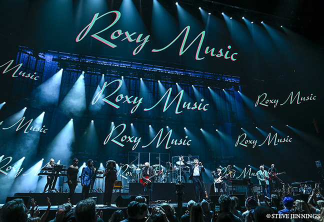
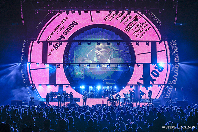
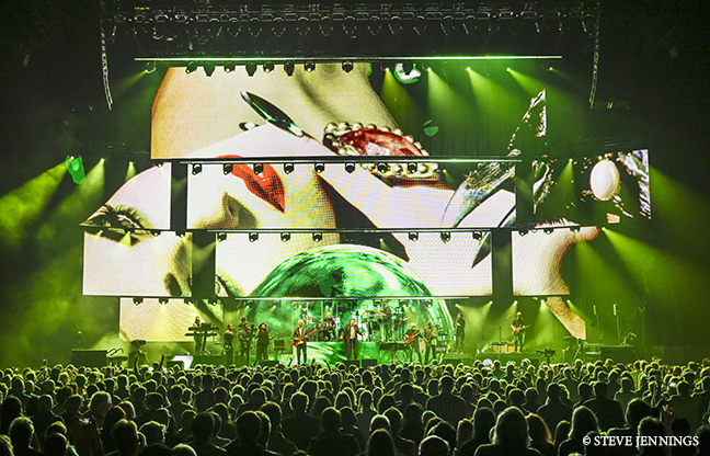
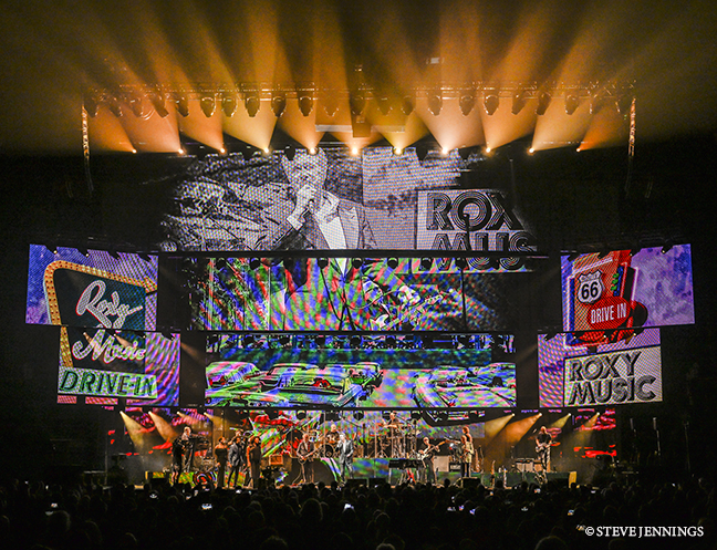
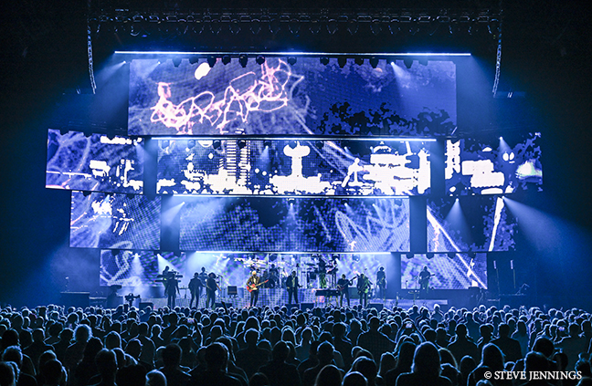
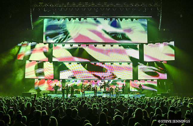
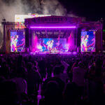
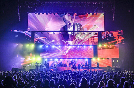
The initial concept was sparked when Bryan pointed at a picture of The Guggenheim Museum on the wall of his studio office, saying, “I’d like it to be something like this,” with curves and layers. “This tied in perfectly with my desire to avoid having a large flat screen at the back, because one, it’s been done before, and two, you’re really stuck for lighting angles. The first round of design drawings I produced had all curved screens rigged over the stage and wrapping around the sides, which we all loved… but unfortunately, the budget didn’t! So where we ended up was with four large-format, mostly straight screens over the stage and three wing screens per side, extending into the wings and angled inwards to allow anyone sitting around the sides to capture both cameras and content sent to the screens. The main header screen was a chevron shape and 17 meters wide (about 56’) by four meters high (about 13’), hung approximately five meters (about 16’) upstage and trimmed quite high. Bringing it downstage and having the chevron shape was key in allowing us to feed the images to the people on the sides and, again, compensate for not using I-Mag.”
The other three screens ended up being straight and slimming in size and trim height as they moved upstage. In between each screen were lighting trusses that were hung just upstage of each screen and trimmed to appear as though they were hanging off the bottom of each screen.
“These were positioned to also create layers of back and front light for the large 13-piece band,” Arthur said. “Hanging the side screens at a 30-degree angle also allowed both lighting and video to fill the cross stage shots we got from the remote tracking camera, superbly operated by Patrick Hall, placed across the length of the downstage edge,” he added.
“With the addition of screens covering the side and front of the fairly traditional band riser setup, I used over 250 square meters of ROE Vanish V8T screen,” Arthur continued. “Lighting-wise, apart from the five fully loaded overhead pre-rig trusses, there was a simple floor package around the side and upstage edges. To utilize the transparency of the Vanish screens, I had 80’ of silver satin drape hung upstage of it, all of which worked very will in adding increased visual depth to the design when the screens turned off.”
Arthur noted that, “as far as pre-production goes, I did a number of revisions in Vectorworks before we signed off on the final working design. We were very fortunate to have two weeks of pre-programming time at Bryan’s Studio in London where myself, Neil Holloway, Daniel Richardson, Steve Price and Matisse Desmedt pretty much co-designed the final product together. The advantages of this was that it was a great cost saver—we could come and go as we pleased over that time—and it was convenient for Bryan to pop in and take a look over our progress, exchange notes and ideas with everyone so he knew what to expect before we got to our seven days of real production rehearsals in Toronto.”
Arthur added that “tilizing Depence2 via an MVR export from Vectorworks and linking in with the disguise D3 servers really helped us all to get a feel for what the end results could be. On the second week, Kyle Reseigh joined us in the studio to continue creating the Notch FX. It was invaluable to have him on site with us, as we could chat about ideas and edits to get the right feel for the unique Roxy aesthetic. Once on tour, Matisse took care of the Notch side of things, as well as managing content changes. When I approached the creative team, I always opened up the conversation with saying that I wanted it to be a collaborative effort so having us all in the same room, with the artist, solving problems and throwing ideas around the room was a huge part of how we ended up with the successful end product.”
Arthur has a long history with rep Ian Gordon and Christie Lites, and since the large portion of the shows on this run were in the U.S., it made perfect sense to team up with them again. “He put together a great crew and offered massive support all the way through. He was totally invested in helping Adam King, our Production Manager, and I fulfill the design idea. He introduced us to some great people who were also highly invested in the project, so all round it was always positive. Namely Terry Higgs and Jeremy Hoff from THiNC Worldwide, who were all over the rigging portion of it, which ended up taking a huge amount of head-scratching to make it all work together. It turned out that Christie also supplied rigging for Video and Audio as well as the mother grid we employed for rigging consistency. So there was a huge amount of kit to manage, but Ian was at the first production load-in and subsequent production days, making sure there were no issues. I cannot thank him enough.”
Fixture-wise, Arthur initially wanted to use all Martin MAC Ultras, but, to stay within budget, opted to go back to workhorses from previous Bryan Ferry designs instead, relying on Martin Viper Profiles, MAC Viper Performances and MAC Viper DX washes instead. He also added in 94 GLP impression X4 Bar 20 to create lines between each of the breaks in the screens, light the drape and create a solid wash from the floor upstage of the band. “I like the Vipers— I know what I can get out of them, and I really wanted to have multiples of the same fixtures, both from a programming point of view, but also from a visual point of view. They also provided us with the previz gear in London and the Depence machine for daily programming touch ups whilst on the road. It was a fantastic tool to have to knock out the previous nights notes whilst waiting for the rig to be built.”
The only timecode used was in previz where they could program the songs and sit back and watch the cues roll over exactly the same each time. “This really helped us hone in on specifics. I really like this method. I was confident in knowing the songs well enough to learn the cueing once we were happy with the way each song looked. Come the tour itself, there was no timecode involved in triggering video or any lighting cues. I run it all manually. It did mean, in pre-production, that there was a lot of conversation with the content creators to split certain sections up so I could sync it all with my button presses for verse/chorus, etc., but overall, it worked well. I did take a click track feed to ensure I was starting the songs at the right spot though.”
Summing up, Arthur gave kudos to the production team. “I’ve said it before, and will say it again—I want to thank all of the amazing touring crew, vendors and local crew for being a huge part of bringing this large, ambitious design alive on a daily basis. There was a lot of gear and there were some long days and nights pulling it all together. For me, there were some nervous days leading up to it, but this is a design and show that I am immensely proud of.”
More photos by Steve Jennings:
