For Def Leppard’s 2011-2012 Mirrorball tour, show designer and video director Jonathan Beswick, who has been providing the band with distinctive video looks since 2006, worked with LD Kenji Ohashi to go beyond mere I-Mag to fuse lighting and video into rock ‘n’ roll looks that are even bigger than those achieved on previous tours. Higher-resolution video panels — and more of them — made that goal possible, and lighter-weight gear helped keep the production’s rigging, setup and tear down challenges in check.
Beswick began his career in Hollywood as a director of photography for commercials. Then, in 1984, he went out on the road with Tina Turner. Projection was becoming a bigger feature in concert design, and Beswick found himself as a video engineer with Nocturne Productions. There, he was involved in the creation of the first flight pack video systems.
His video directing credits include live rock concerts with a veritable Who’s Who of musical acts: Neil Diamond, The Police, Def Leppard, Journey, Elton John, Billy Joel, Celine Dion, KISS, Aerosmith, John Mellencamp, The Who, Robert Plant, Cream, Ted Nugent, Sarah McLachlan, Guns N’ Roses, James Taylor, Fall Out Boy, Joan Jett, Whitesnake, Billy Idol, Gloria Estefan and Michael Jackson.
Lately, Beswick has also been working with more country music acts, directing the CMT series Invitation Only with Brooks & Dunn, Kenny Chesney, and Rascal Flatts as well as CMT’s Crossroads series with John Mayer and Keith Urban. Beswick has also been creating content for shows for more than 10 years.
For the Mirrorball tour, which runs through December, takes a winter break and hits the road again in spring of 2012, Beswick and Ohashi are working with video and lighting gear provided by PRG/Nocturne and Upstaging, Inc.
PLSN: Tell me about your concept and approach to your video design for the Mirrorball tour.
Jonathan Beswick: I started with the fact that the band had a current set and they wanted to re-use it. I did change out the LED video panels to newer technology. It was a matter of keeping the same concept as a starting point but putting through a revamp to give it a bigger look. They also wanted to retain some of the original content that I had produced for the 2009 tour; the band liked it and the ‘09 tour was very short, so the content really only had a few usages. Ultimately, we ended up only using three pieces of content from 2009, and those were re-worked. The rest of the show was newly-created content.
PLSN: You mentioned wanting a bigger look, how did you achieve that?
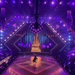
Yes. Last time around, I used a 53-by-13.5-foot LED wall upstage, and then LED fascias on the set carts. In the air, I had previously used the Nocturne V-Lite with its 28mm resolution. This time I wanted to go with a higher-res product, and I wanted to go bigger. The problem we had to overcome was, how do we go bigger within the same core design and make it look fresh? After considering it, I redesigned the large upstage screen area. It is now 63 by 17.9 feet, and I broke it up into seven separate panels. To up the resolution, I went with an 18mm product; the new PRG Nocturne Productions V-18. It is a module product, and I made each of the seven screen panels six modules wide by 12 modules high. I staggered the panels on the stage depth-wise to achieve a three-dimensional look to the wall, but kept the same aspect ratio that we had produced for the 2009 show, albeit a bigger version of it. The set carts behind the band are covered with PRG Nocturne V-Lite, their 28mm product.
PLSN: Tell me about your choice of the V-18 product and how it worked for your design.
We were the first tour to take that product out. I knew I wanted to use PRG Nocturne products, and when I saw the V-18, I knew I wanted it; I wanted to go with the better image quality it offered me. For this tour, it was more about creating content that would support the lighting and not simply having people watching the band on the screens. I wanted to make it more of a visual backdrop integrated into the show. With that in mind, all of the content that we produced was created in HD; so we wanted the content to really, really pop and the images do just that on the V-18 screens; it looks beautiful. The V-18 product falls right there in the middle between something that’s not low res and it’s not HD, but it really gives off that HD look. The combination of the superior imaging and key features of the V-18 product made it a good choice to support the Mirrorball shows.
I also wanted the video screens to work well with the lighting and the V-18 has a 13 percent transparency for integrating with lighting effects i.e.: lighting blow through! The thing that I really like about the V-18 is that it does give that HD look and yet it still allows for the lighting designer to do his thing. Our LD Kenji Ohashi has some great effects during the show with light blowing through the LED screens; it gives a real huge look to the show.
When you are using other higher-res products, when the LEDs are turned off and there isn’t much going on, it’s a giant black monolith hanging back there. The V-18, however, has just enough transparency that it can be used to create some scenic lighting effects.
PLSN: Tell me about working with Mark Devlin [of Mark Devlin Visual Designs] on creating the content for the Mirrorball tour.
Mark and I have worked together since 2002. I came to him for some content for KISS, and we’ve been working together ever since. We have a great working relationship. I think he is an amazing artist; a great talent and a visionary when it comes to putting things together. I can bring him a head-full of ideas for any number of things and he comes back quickly with solutions that are usually really spot on with what my original vision was, and I just let him run with it, and he runs a long way. Just a superlative graphic designer.
The design this year was more about making the stage show a real stage show and not putting the band up behind themselves. It was more about creating content that would support the lighting and not have people watching the band on the screens; make it more of a visual backdrop.
For the content on the set carts to bleed together seamlessly with the content on the upper screens, we chose to stay with the 28mm on the set carts for a number of reasons. One, we wanted to give it a slightly different texture than what was hanging in the air, which it does very effectively. We don’t lose a lot of resolution, so the pieces still blend together really, really well. From certain parts of the arena, it’s hard to tell the difference. The V-Lite 28mm is still a great product.
Another interesting consideration was that the LEDs on the set carts were in front of amplifiers, speakers for the band, and their monitors. So we had to look at sound getting through. The gap between the LED on the 28mm is just ever so slightly larger than on the 18mm, and we did some work with the backline guys to see how much of the audio came through the gaps in the LED. We decided that we would stay with the lower res products because of that larger gap.
PLSN: Talk about some of the challenges that you had to deal with in your design while on the road.
I would like to say that this was a super-complicated design, but when I sat down and designed the show it came together really quickly. A couple of things that made it particularly easy was that the V-18 is very light; very fast to go up. I mean our LED goes up in 45 minutes every day. If we didn’t have to wait for the lighting rig; its huge! The LED could go up even faster than that. Each of the large panel sections weighs a little over 1,000 lbs; in the past LED panels of the same size would easily be twice that weight. It allows us to put the LED into just about every venue that we go to.
There have only been a couple of exceptions of places where we haven’t been able to put all seven panels up, and that’s only because of the stage width, not weight. We drop panel number one and number seven in venues that aren’t wide enough. I designed the content so that the main content is going on the five central panels and there is stuff that bleeds off panels one and seven, but most of the activity is always happening in the center parts. I knew there would be times that we might have to lose those two end panels or scale down the LED.
PLSN: How do you deal with the content playback for this tour?
The content for the LED screens is driven by a [Green Hippo] Hippotizer media server, which the lighting director runs. This is the first show that I have designed specifically for the LD to run. Most of the time, we’ve done content that we run from back in our video production area where I direct the show. I think I am going to continue to do more of this current setup. I think that it’s much better for the LD to control the content; they’re out in the front of house and they can time it better. They can decide when things should come and go a little bit better. I think that integrating the video content control in with the lighting is really important.
More and more lighting directors are getting into content production. It’s fairly important to try and keep on pace with what the LDs are doing. I believe that as a director that you really need to let people do what they are best at, especially the camera crew. For our show, 85 percent of it is the camera crew. If you have good camera guys, you are going to have a great show. It’s about putting a good crew together.
PLSN: How was working with PRG Nocturne in support of this tour?
I’ve worked with Nocturne for years and was really pleased with the support that I got from Bob Brigham and PRG Nocturne. I think that going forward with PRG will be good for Nocturne as well as for tours and designers. They offer what production managers want; that the people they hire are going to come out and take care of things and not be a problem. I think as PRG Nocturne they are going to be even more successful, and more people will be able to experience what Nocturne can offer. It’s just a simple philosophy that they have. Bringing a great product with great service and making sure that every single show happens on time and without a hitch.
PLSN: Any other thoughts about the design for the Def Leppard Mirrorball tour?
As far as the show design, Kenji is an amazing talent as well. He is a brilliant lighting designer/director, and we are very lucky to have him. His lighting design is clearly the very core of the show, of course, besides the band. We provide a big-looking presentation for Def Leppard; a great backdrop for a really great band. We’ve been told that it’s one of the best looking shows that are out on tour right now. I will take that compliment any day.


