Two Projects are Inspired by the 1984 Talking Heads Concert Film’s Looks
In 1984, The Talking Heads released a concert movie like no other, Stop Making Sense. The film, directed by Jonathan Demme in close collaboration with David Byrne, captured the band toward the end of their tour over three nights at the Pantages Theatre in Hollywood, CA. Widely considered one of the best concert films ever made, Demme used the live performances to really showcase the band’s music and their highly theatrical style.

The Original, and Two Updates
The lighting design for the original film was co-designed by Byrne, who conceived and fully storyboarded the film, and theatrical LD Beverly Emmons. Also working on the 1984 film’s concert lighting was the Talking Heads touring lighting director Abbey Rosen and, working as a lighting technician, PLSN’s own Richard “Nook” Schoenfeld.
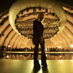
Recently, Stop Making Sense’s design got not one but two homage re-creations. The first was by the team behind the Fred Armisen, Bill Hader, and Seth Meyers-led original series Documentary Now! on the IFC channel and the second was by the Talking Heads tribute band, Start Making Sense. Both creative teams looked at the lighting designs and style choices of the film with an eye to evoking them with modern equipment, yet maintaining the original intent and style of the Emmons/Byrne design. Documentary Now! filmed their take at The San Gabriel Playhouse in Los Angeles for the satirical series episode titled “Final Transmission,” the last concert of the band Test Pattern. The band Start Making Sense staged their one-night-only recreation during their Zoellner Arts Center concert at Baker Hall located on the campus of Lehigh University in Bethlehem, PA. PLSN thought that it would be illuminating to take a look at the two different takes on this classic concert film’s lighting.

The Documentary Now! Project
Mike Baldassari of Mike-O-Matic Industries was the theatrical lighting designer brought into the Documentary Now! production. Having worked with Baldassari for years, co-directors Rhys Thomas and Alex Buono, who also serves as director of photography for the series, knew that he was the LD they needed with limited time and great ambitions. “Rhys and I know that he really shares our kind of obsessive goal of getting it right,” comments Buono. “We appreciate that. Our style and budgets mean you have to fly by the seat of your pants. When there is no time and you just got to shoot, he’s certainly the right guy to have in your corner. There’s no question that Mike’s instinct on how to approach something is going to end up being the right answer. We just have a tremendous amount of trust in Mike, and he never lets us down. Plus, he has a great sense of humor.”

Buono notes that they started with dissecting the original film and then could truly understand what they needed in “Final Transmission.” “What we loved about Stop Making Sense was the way that the stage design built up. We really wanted to capture that sense of it starting with a bare stage, and then platforms roll in and the band builds up. It looks simple, but actually it is really carefully layered. The same with the lighting. At first glance, there’s something about it that feels really raw but they are all nuanced lighting cues. If you’re not familiar with how theatrical lighting design works, it seems very simple. Then you start getting into it, and there are actually all these different parts to the cues and different lights being used to get all those actually not so simple iconic looks. We wanted all of those setups — the handheld light casting the long shadows, the really cool fluorescent tubes. All of those things. So we showed Mike the scenes from Stop Making Sense that we really wanted to emulate the lighting of for the ‘Final Transmission’ episode, and he just took it from there.”

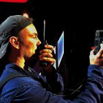
Already quite familiar with the film and a fan since it came out, Baldassari was keen to try his hand at the daunting task of recapturing the well-known lighting design. “I grew up with this film and was thrilled to now get the chance to do some lighting forensics on it. I spoke with Beverly, since I am fortunate to count her as a friend today, about the original design, and she really gave us some invaluable input. We knew we weren’t going to meticulously redo the design, but we definitely wanted to keep one big bold idea from each song. First, we created a grid of the songs, the important element about each of those songs, and we sort of reverse engineered David Byrne’s storyboards. If it was a strong enough element from the movie, we made sure we put it into our design. The perfect example is, in the movie, during the song is ‘Girlfriend is Better,’ a stagehand comes out with a handheld light and makes shadows on the background. That was one of the more iconic moments, and we knew we had do it. We sent Brandon [Baker], my associate and our sort of rock ‘n’ roll stage manager on this, out there with a Mole Richardson Tweenie Fresnel with a battery pack. It was pretty funny; I have to say. Actually it was all funny. I love working with these guys, Rhys and Alex and everyone. It’s literally like working at a laugh factory. You have all these great comedians around you, you can’t help but love your job.”

As to Baldassari’s own design, he explains, “I did it mostly with moving lights because I just had to have the ability to make changes on the fly, and also needed to save time by hanging less equipment. When they did Stop Making Sense, it was at the end of a tour, and they really had everything dialed in. Whereas we had a day at the San Gabriel Mission Playhouse where they had a very large dance lighting plot in place that included ETC Color Source LED PARs, so I used those. I essentially then laid another rig right on top of it that was mostly [Martin] MAC Auras. Onstage and at front of house, I had some PRG Best Boys to be able to have shutters. Watching the original film, I kept looking at it and thinking ‘how can I recreate what they had done, simply and with a lot of flexibility?’ Things like backlight that might’ve been a Leko before were a moving light with shutters this time. However, stuff that was essential and going to be on camera, for example in the original when they do ‘Take Me To The River,’ there are six 8-foot fluorescent tubes, that’s how that song is primarily lit. We absolutely reproduced that. Also, things like on each of the rolling platforms it looked to me that in the film they used Lowel Omni-lights, so I went ahead and re-created that. You know, one of the best parts of this project was falling in love with the movie all over again.”

The Tribute Band’s Design
Lighting designer Jason Liggett of Liggy Lighting Design, like Baldassari, is a fan of the film and the Talking Heads. He got the chance to recreate Stop Making Sense’s design for a one-night-only concert performance for the tribute band, Start Making Sense. Having worked for a number of years with the tribute band, he wanted to nail the design as closely as possible on the limited budget available.
Liggett first did a lot of research watching the original concert film a number of times as well as watching outtakes. He also picked Nook Schoenfeld’s brain for thoughts on the original lighting package and intent of the design. “You want the looks,” notes Liggett. “I know what they did from closely studying the film. If you watch the film from a lighting standpoint, it’s genius; the evolution of the looks. The way the film builds and the way the lighting builds with the energy of that show. Watching it, you learn that it’s not as simple as just, ‘Hey, if we get these lights, we can do this cue.’ Watching the film; watching how David Byrne worked within the lights — and how he works with the lights — you can see his vision. That is the genius of the film.”
Liggett used his research to translate the design intent into his lighting plot. “I had my notes; I went through look by look as we programmed and got as close as we could to the film. For what we were trying to do, it wasn’t as much about how we got there but that we got there. Working within a budget, I tried to stay as close as I could with all of the looks, if not the gear itself. In the original film, one of the main songs that stood out was ‘Take Me to the River.’ They had, on each side, 8-foot fluorescent fixtures. I went with 8-foot Kino Flo singles. Another example, in the original film they used 9-cell Molefays. Due to power issues and budget, we couldn’t use those, so I used 1kW PARs. Those were two big substitutions. The strobe effect remains the same. Also, they used Lowel Omni-lights; in our case, we had 200-Watt Sun Guns. For mid-stage, when the band is on the risers, I had a key light for each of the locations, but swapped in 100-Watt LTM Peppers for the original designs’ Omni-lights.”

One of the key challenges for Liggett to address was how to recreate the backstage look at the beginning of the movie’s concert scene. “In the film, they started off with an empty stage with no set,” says Liggett. “You just see the guts of the theatre; there are some ladders and some backstage equipment there. With this theatre, there is no upstage behind the set, so we weren’t able to create it just like the film, but we came close to the same vibe using ladders and gear. Also, with no backstage, we had to go with front projection on the cyc rather than the rear projection that the film used.”
The backstage limitations also impinged on Liggett’s ability to backlight in a similar manner to the film. “In the film they used a 1.2kW HMI on a stand bouncing off a 4×4,” explains Liggett. “My backlight had to come from the electrics above. I did use similar types of fixtures for the lights in the wings as well as for sidelight and areas downstage. I just went with smaller lights because we were on a smaller stage. In the film, they use a 1.2kW Joker Fresnel for the downstage light in ‘Take Me to the River;’ I’m using a 400-watt Joker.”
The End Results
Liggett was happy with the results. “I think we delivered and that our audience really enjoyed it,” Liggett says. “This was something that the band have really been wanting to do for a long time. When I get to work with these guys, it’s great and this was a really cool thing to get the chance to do together.”
Buono was also very happy with the results of their efforts on the “Final Transmission” episode, and Baldassari’s attention to detail in his design. “One of the great things about this series is the fun of it, the fun of ‘let’s see how close we can get to this.’ Mike has the same kind of sense, always saying ‘No, I think we can do better.’ There was a moment when Mike said, ‘There’s something wrong here. There’s something wrong with the back wall. There’s something bland about it.’ Next thing you know, he says, ‘We should stencil up No Smoking signs.’ We looked back at the film, and we’re like, ‘Holy sh*t, there they were.’ I didn’t remember them, but he was like, ‘Yeah, that’s what it’s missing.’”
In the end neither Baldassari nor Liggett missed a beat — or a shadow.


