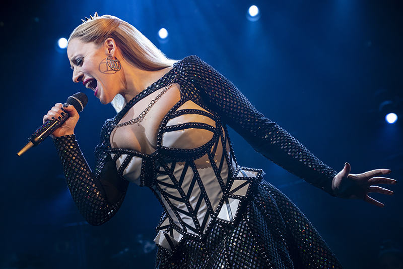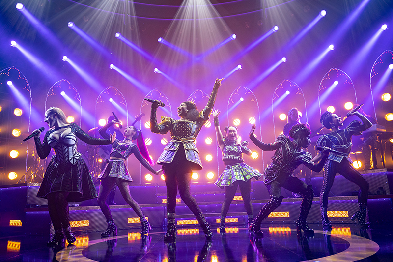
One of the first shows to re-open on Broadway this fall, the peppy pop musical SIX unites the six wives of Henry VIII in one place and time as a sassy girl group. Backed by the four-piece Ladies in Waiting band, the wives share woeful stories of their royal (and mostly fatal) betrothals in song, hoping to gain favor with the audience and be crowned the lead singer of the group. Along the way, the competitive queens start bonding in spite of their rivalry.
The briskly paced, 80-minute musical began life as a student production at the 2017 Fringe Festival in Edinburgh, Scotland. Scenic designer Emma Bailey and costume designer Gabriella Slade joined the creative team at the start of its 2018 UK tour and have been with it ever since, helping to launch it in the West End, for an Australian tour, and now on Broadway. The goal has been to deliver a very similar experience for each new audience, although venue sizes and touring considerations have necessitated some set tweaks, and the costumes have evolved slightly each time.
Layering A Cohesive Visual
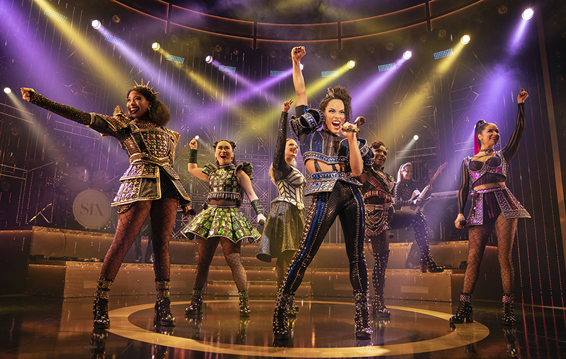
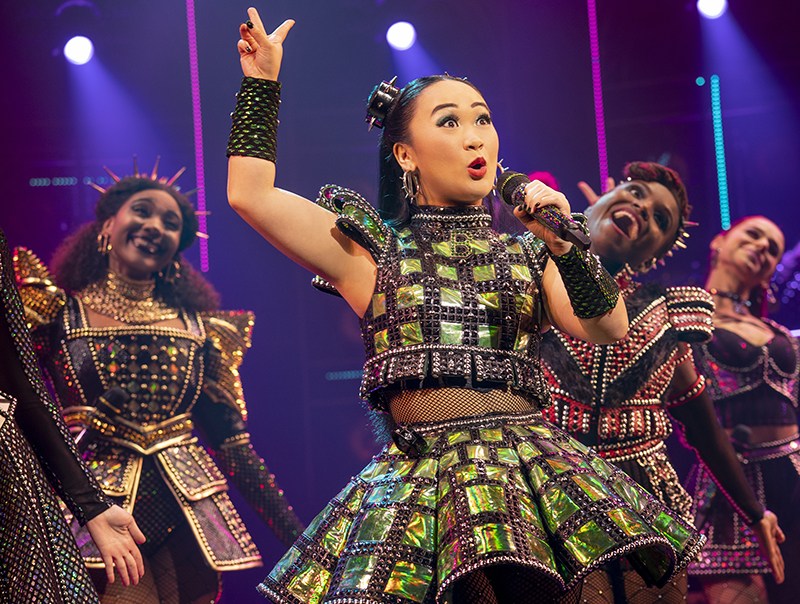
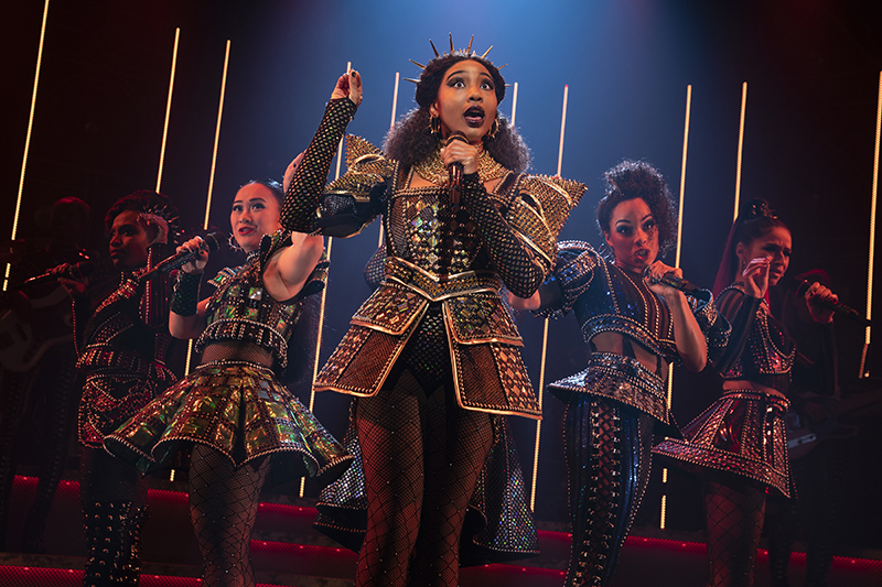
“I’ve always maintained that the most important aspect of the costume design is that they have this really powerful silhouette,” remarks Slade. “The Queens have this very different and defined silhouette, so you can identify each Queen for who they are. But as a unit the costumes all work together, so we use similar fabrics and trims across the board. Because of the sing-off element, the costume design really helps make sure that there is this sense of individuality, but this sense of unionship as well, especially towards the end of the show.”
Slade loved researching the “brilliantly rich period for fashion” that was the Tudor era with “the insane amount of detail that there was.” Naturally, the long and flowy dresses of that era are subverted by the shorter, sexier fashions that are de rigueur for modern pop divas. Each Queen has their own color to distinguish themselves and play into the pageantry of a pop concert.
Each of the Queen’s costumes has a piece of vacuform PVC, “a slightly textured black, very high shine PVC,” she explains. Also in each outfit, “you’ve got holographic foil, sequins, and the black lattice mesh that sits on top of the sequins that creates that crisscross aesthetic. Then the studded trim basically defines all the panels, costumes, and sleeves. What’s really nice is that the LED lighting, especially with the more iridescent kind of holographic fabrics, has a really fabulous kind of relationship with the costumes. They both feed off each other, and it creates a really amazing presence.”
Slade has layered color underneath the black mesh fabric in the Queens’ costumes, “so it puts a slight filter on it as more of a diffused sense and pattern of color within those forms,” she explains. “Then metallic details when you break up the large areas of very punchy color. There’s a lot of color teamed with black. There’s a nice link with Emma’s set frames as well, and it adds a nice depth to it. It’s not all yellow and pink. There’s a lovely quality there with those metallic and black divisions.”
Slade explains that there was a lot of R&D and workshopping to make sure that the Queens’ costumes allowed as much movement as possible without significantly disrupting either the aesthetic or the choreography. The Broadway producers were eager to add extra levels of detail to the costumes, so she added to the footwear and made the crowns a bit more intricate. She enjoyed working with the John Kristiansen New York, Inc. costume shop and notes she was “pleased that everything was beautifully created under one roof, whereas work in the U.K. tends to be a more freelance-based costume construct situation.”
Given that both designers have worked in each other’s disciplines before, the two women occasionally riffed off of each other’s ideas. Slade recalls that they were looking at the cross cutouts in the set, then “when we had the opportunity to develop one of the fabrics in the show, we managed to get that cross-cutout design printed onto some of the leggings,” she says. “It was so exciting that we were able to have that real fusion. Initially, the fabric was plain. I really wanted to make it shinier, and a way of doing that was to print foil onto it. I wanted it to be a Tudor pattern, so there was the link with the set cutouts. It’s really nice.”
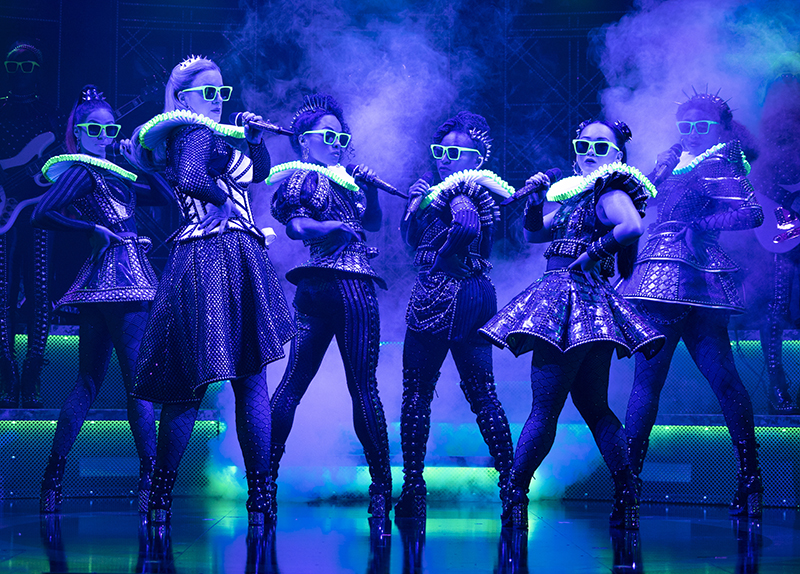
For the “Ladies in Waiting,” Slade chose a monochromatic concept — high shine, black PVC leggings with lattice detail down the center front. “Then the tops are chevron burnout style fabric with the stud work which creates the Tudor detail,” she elaborates. “They’ve got the small ruffs and the headbands which we call the hoods, and it feels like a really nice band aesthetic. But it gives them that heightened feel. We see them but we see the Queens as well, so they all feel unified as a design.”
All Together
That sense of unification, while also keeping the Queens as the focus, extended to Bailey’s more monochromatic and sturdy steel set, which already presented its share of other challenges. “I’ve had to learn so much about lighting and sound than I’ve ever known before because I have to integrate all of the sound and lighting equipment [into my design],” says Bailey. “It all has to sit together. There are so many DMX drivers and speakers, and if we build something slightly wrong, then there’s a steel beam in front of somebody’s strobe, or you can’t actually read the LED pixels properly because there isn’t the right angle on the framework of the steel. It’s very challenging making sure that all of that is integrated effectively, especially when you get on tour, because these things are going in and out in a day, and it has to stand the test of time. That level of collaboration is very intense.”
Co-writers/composers Toby Marlow and Lucy Moss, and co-director Jamie Armitage, “wanted to convey this feeling of a democratic, inclusive space,” states Bailey. “The shape of the set design is very rounded, quite tight, and includes the band and the Queens. There isn’t hierarchy to any of it. Even though we’re talking about competition, you don’t ever really elevate any of them as a single person. You’re always including them as a group. There are moments when each one of them takes us to the crowning slot [atop the central steps], but it allows everyone to move around and feel very much part of that.”
Bailey pulled a bit of inspiration from the rood screens of Tudor architecture for the scenic elements referred to by the Six team as pixel frames, but she moved away from religious references of the time, as they do not factor into the Six show. “It’s just taking elements of that and finding something that’s quite strong and powerful, but also very elemental,” she says. “That’s what the steel does.”
Steel and Mesh
While she notes that the set is stripped back, Bailey feels that “it allows those feelings of euphoria that you get when you’re at a gig or a rock concert. It’s quite powerful, but also you can move back and pull back when you need a bit more emotion or a bit more stillness. That’s how we hope that we move the story through its pop concert premise.”
The dimensions of the main set piece, including nine scenic pixel frames with lights, rear mesh wall, and the rostra [bandstand] in front are 11.795m (38.7’) wide by 8.05m (26.4’) deep. The rostra itself is 8.415m [27.6’] wide by 3.561m [11.68’] deep, and the downstage edge sits back 2.8m (9.2’) from the downstage apron line. The archway that holds the Six portal in place around the proscenium is a steel truss arranged in a goalpost design. “It’s comprised of 12” truss legs at 20’ on each side holding a 20.5” truss at 36’ long,” says Bailey. “These are bolted into the venue architecture. The rest of the set is made out of steel channel and sheet metal. The floor is black Valchromat, a colored MDF [medium density fiberboard].”
The new scenic element that Bailey added in for Broadway is a 20-foot curved mesh wall due to a new key layer reveal later in the show. “We embraced that through the mesh wall adding these transparencies which feed into the costumes as well,” she explains. “We’re constantly looking for those new levels of detail, and after doing London, we wanted that little extra finesse to the end of the show. The wall lights up, it’s curved, and it has a bespoke Tudor design like a laser-cut into sheet metal.”
The mesh wall curves right around the steel frames. Bailey notes that it has floor-mounted lights to illuminate it from below and ones behind it to light it up like a silhouette, which happens two-thirds of the way through the show just before Catherine Parr’s number. During that moment, “we try to reveal the theater space, the actual theater that we’re in, just to give a bit of honesty to the show at that point in the narrative,” says Bailey. “I think it’s great because we’re not trying to be theatrical in the sense of Hamlet, or we’re not trying to say that this isn’t a real environment. I think revealing it adds that extra detail to the story, but it’s not currently in every version of the show. The wall also lights up itself using embedded LEDs to provide that extra wow towards the end and reveal the girl group as you’ve never seen them before. Our own take on a stained-glass window.”
Lighting as Scenic
The main light sources are LEDs and ETC Source Four PARs (8 per scenic pixel frame), and there are also three Ayrton MagicDot-R lights per scenic pixel frame “which give shape, reach, and movement to the beams originating from the set,” says Bailey. “[Vari-Lite] SL Nitro 510C strobes are embedded in the rostra, crown, and portal scenic elements, giving us strong angular outlines for musical ‘bams and beats.’”
The Six scenic designer was impressed with she states, “the amazing work of Hudson Scenic”, who turned everything around in about a month-and-a-half and who she says “were innovative in their work with the LED frames behind the performers.”
“The LED frames are quite complicated, because they house a lot of wiring,” explains Bailey. “Hudson Scenic managed to make the wall so beautiful—not just on the front, but on the rear—so that when anything goes wrong, you’re still able to access it. You’re not seeing 1,000 different wires and DMX drivers. It’s a different level of cable tidying, and they were really good at making that framework so you could embed it all. They’re making our touring set for the U.S. That’s going to be a challenge having the tech all come apart because Broadway is obviously a sit-down. The next phase will also be a place to innovate, and we’ll see what we will come up with.”
Both Bailey and Slade praise the friendly and symbiotic Six creative team, which included lighting designer Tim Deiling and sound designer Paul Gatehouse for working collaboratively with the aim of making the best show possible. They added that they have associate designers under them now, which is helpful given that the show is playing on three continents. The associates and assistants include associate scenic designer Yu-Hsuan Chen; associate costume designer Lisa Zinni; and assistant costume designer Amanda Jenks. A U.S. tour is planned for Spring 2022.
“There’s always been this aim that the show is almost bigger than the venue that it’s in,” remarks Slade. “We’re keeping the show small, and it still always brings the house down. I think that’s always been the intention with Six versus making it this massively wide space. I think the intimacy and the powerfulness of it is actually what is key to the show.”
