Witnessing a three-hour dramatic spectacle on Broadway can be a dicey proposition. A play has to be damn good to keep your butt parked in a seat that long. The Ferryman, written by Jez Butterworth (Jerusalem, The River) and directed by Sam Mendes, is an epic, well-acted, and brilliantly executed show worth diving into. Set in 1981, it’s the intense tale of a large Irish family haunted by their tragic past. Its patriarch (an IRA member) went missing a decade earlier; his wife and son have been told by IRA associates that he left them and has been spotted randomly in other towns.
But when his remains are found by police and his murder is an obvious fact, the IRA shows up to the family home to insist that the wife and his brother, now head of the clan, not implicate their organization in his murder. This sets off an intense course of events that pits family member against family member over questions of familial loyalty as well as loyalty to Ireland itself, and what the price of freedom is worth. The show provides no easy answers and features an incredible denouement.

U.K. to Broadway
Scenic and costume designer Rob Howell, who won a Tony Award for his equally bold scenic design on Matilda, has worked on the show since it began life in the U.K. two years ago, first emerging as a regional production at the Royal Court Theatre in Spring 2017, then an Olivier Award-winning West End run for nearly a year before arriving on the Great White Way in October. The night that PLSN checked out the show, the cast of two dozen players received a massive standing ovation.
“It was a pleasure for all of us to work on,” Howell tells me. “Do you know the story wasn’t finished when we all said ‘Yes?’ He’d written enough of it for us all to know that it was great and was going to be fabulous, but actually, the last moments of the play weren’t down on the page. That’s very unusual.” They had faith that the finale would be fantastic.
Soon after, Howell jumped on board with Butterworth and Mendes. As the designer explains, Butterworth was always making changes to his text, Mendes had his own notes, and Howell and the producers had their own thoughts as well. Butterworth filtered in what he needed, and the resulting play provides both a gripping narrative pulse and passionate portrayals of well-drawn characters that rile up emotions while inspiring deeper thought about the issues at hand. The multi-layered material proved inspirational and integral for Howell’s contributions.
“I get sent quite a few plays nowadays,” he says. “But there aren’t many new plays that show the writer being completely calm about saying everything they want to say about love, sex, death, fairies, heat, passion, colors, textures, everything that he wants to say in one room. And that is a remarkable thing nowadays. Jez can write about everything he wants to say in one room. On the page, it’s a fairly mundane room, it’s a kitchen. But it becomes a landscape in Jez’s hands, and whilst all of the stuff of the kitchen is there — tables and chairs and sink and stove and stairs — it actually becomes a much broader landscape in his hands than what I put there.”

Slightly Askew
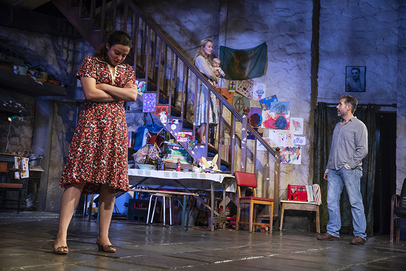
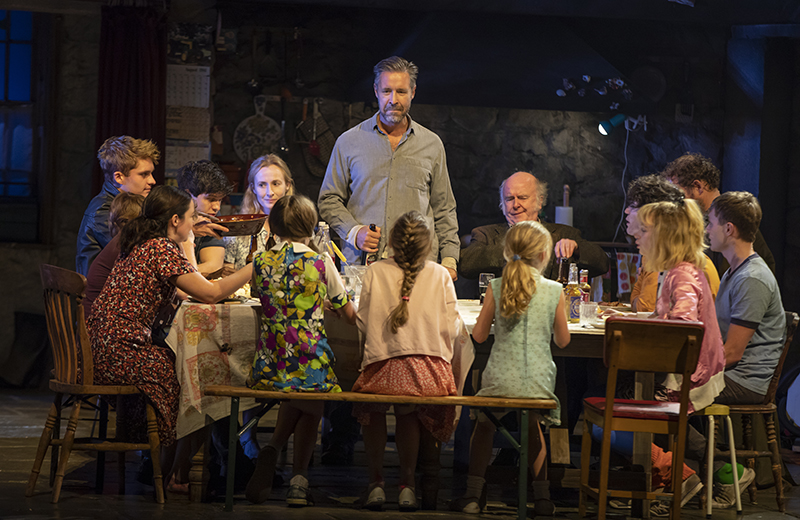
What Howell has done is create a set piece that feels real in terms of portraying a stone structure with a kitchen hearth, stairs, windows, kitchen entrance, and all the trappings of a family home, like posters, children’s art, and a photo of the deceased husband hanging over a doorway. But the sense of perspective has been rendered slightly askew. The ceiling slants upwards as it stretches downstage and tilted upwards toward stage left, dissecting the stage right wall and the stage left staircase at different angles. The sturdy wood staircase itself is larger, wider, and higher than one might expect.
Howell admits that when he read the original stage directions (which he indicates may have been altered since), the house described in great detail on the page presented a conundrum. “It made sense for the play and the dynamics of the play, but it didn’t make architectural sense,” says Howell. “There would be a window in the same wall as the door or something. On the one hand, you could just say it doesn’t make sense. On the other hand, what he’s doing is bringing to the group fragments of a room that he remembers, that he needs. If you embrace that as a designer, you can run towards a design which on the one hand does make architectural sense, but it’s unnervingly strange in a little way. It’s got something that’s not right about it — and that, for us, is the staircase which goes up into nowhere. We deliberately don’t create a room [upstairs] and a landing and a world up there. It’s a staircase that generations of this family travel down, and we don’t know where that is, where that’s going to. You do in a plain sense, but it’s deliberately incomplete.”

Adapting to the Venues
One challenge for The Ferryman was making the adjustment from the West End to Broadway. Whereas off-Broadway and out-of-town venues are usually wider than Broadway stages, the opposite is true of West End theatres. According to Howell, they are actually much narrower than Broadway houses. “In London, the ceiling was steeper and higher, but the measurement between the two walls was narrower,” he recalls. “What we discovered in London is the volume of air in that room worked for the play. So when we chose the Broadway theater for this show, I tried to manage the volume of air in the room to still be the same even though the walls are wider. The ceiling has come down and that’s to do with a sense of pressure in the room. Although the composition of it is different, the volume of air in that space is pretty well the same.”
While most of the props from the London show were delivered across the pond for the New York production, some were sourced here. Led by Simon Kenny, Souvenir Scenic Studios built the set in London. Later it went through Bill Mensching and ShowMotion in New York, who “did all the automation and the fine tuning to make sure it fitted because we pushed right through the proscenium into the house, which is an unusual thing to do,” says Howell. “I needed their help to help me make sure that what had been built in London would fit with the Broadway house.” Howell praises the “brilliant craftsmanship” of the scenic houses who worked with him to create a stone-looking structure from other materials.
Howell also proclaims his adoration for “Peter Mumford’s amazing lighting design. I mean, can we just stop on that for a minute? I’ve got a ceiling over the top of the set. I’ve got walls boxing him out. The only way you can get in is through the window, really, unless you just flood it from the front, which he doesn’t do.” Howell also marveled at Mumford’s ability to create “any number of atmospheric moods and unsettling lighting states — unsettling in terms of the story, by the way — where his only real way into the room is through the window. And sometimes I’ve got shutters in front of the window, so he can’t even get in that way. I’ve known Peter for a long time. We’ve done a lot of shows and operas, and he’s not at all squeamish about creating all the richness of atmosphere that he wants to do in a space that is basically a box with one wall missing. It’s a remarkable lighting design. It’s incredible.”
Layers of History
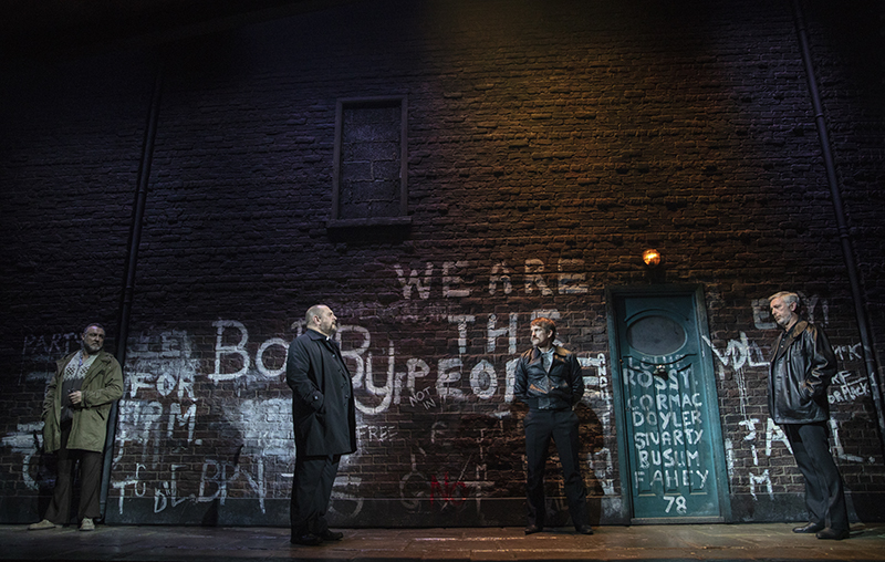
An important aspect of the show for Howell is the “layers and layers and layers of history” represented on stage — the different art and images on the walls, the different clothes everyone wears, the stories they tell, and the multiple generations of family members spanning 80 years. Even the opening scene, played out against an alley wall that soon raises to show the main set, features layers of graffiti on it. “What I’m trying to do maybe in a subliminal way is run alongside Jez’s layers in his writing, but giving them physical space,” remarks Howell. “Everything’s layered, and you feel like there’s stuff beneath everything.”
As both scenic and costume designer, Howell integrated his two disciplines seamlessly. “Once I knew what the room was going to be, or heading towards, and how much detail there was going to be, then that informed choices of colors and textures,” he explains. “When is something potent as a color and a texture? There are times when I’m using color to create a potent force in the room. And there are times when I’m draining the color out of somebody so they aren’t so obviously potent, then they turn out to be potent. Every single thing on the stage — every button, every shoelace, every pair of spectacles — is a decision.”
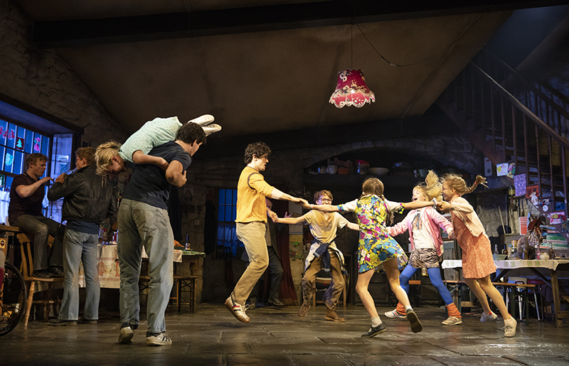
In terms of color, the overall set feels purposely muted and drab. Yet splashes of bright color perforate the color scheme, including the youthful ‘80s clothing of the children, a red lamp hanging above the dining table, and rock posters and the artwork of the younger children taped onto the walls. Interestingly enough, most of the kids’ art was created by young cast members who have been in the show and their siblings. They help lend an air of realism to the set, and that is an important aspect to heed here. Moments waver between intimate, somber storytelling and the clan dancing lively to radio songs, between anxiety and passion, between hopefulness and despondency. At different moments on stage, we see an actual baby, a real rabbit, and a live goose. In a show that deals with life and death, having actual life portrayed onstage was imperative for the playwright. And it does not feel like a gimmick.
“It’s all in the writing,” stresses Howell. “All you got to do is go back to the writing. As I said, life, death, sex, blood, all these things. When Jez brings life on stage, it’s not a doll being a baby. It’s a real baby, because that’s life. And when he brings life and death on stage, he brings a live goose on, and then 10 minutes later you’ve got a dead goose [brought on]. It wouldn’t be the same event. It wouldn’t have the same effect on an audience if you hadn’t have sensed the real life on stage. It’s there in the writing. If anybody’s got any queries about this production or play, just go back to the writing, because it’s all there.”


