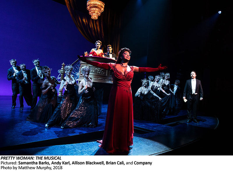
Broadway’s latest box office beast took many people by surprise when it immediately began amassing more than $1 million per week in ticket sales. Pretty Woman, the faithful adaptation of the hit 1990 movie starring Julia Roberts and Richard Gere, quickly became a hit during its month of previews. Directed by Jerry Mitchell, with a book by Garry Marshall and songs by Bryan Adams and Jim Vallance, the unabashed tourist musical has enchanted audiences as it retells the story of a Hollywood prostitute named Vivian (Samantha Barks) who is hired by a single businessman named Edward (Andy Karl) to be his companion during a week of meetings and parties in Los Angeles. But what starts off as a paid arrangement sparked by initial flirtations on the streets of Hollywood soon blossoms into something more, and it also threatens to fall apart when they each question what they are each in it for.
Scenic designer David Rockwell, who tackled this flashy production, is also an architect and founder and president of the Rockwell Group. He is certainly no stranger to splashy, vibrant-looking musicals with grand set pieces. He brought a train car onstage for On The Twentieth Century, created a large factory set for Kinky Boots and designed a beautifully sculpted department store interior for She Loves Me. That latter production finally allowed the multiple Tony Award nominee to win the coveted prize for his efforts. His work is known for being bold, but there are also times where knows when to pull back from such set pieces to imply some of what is there. That was the case here.
A Breezy, Late-1980s Vibe
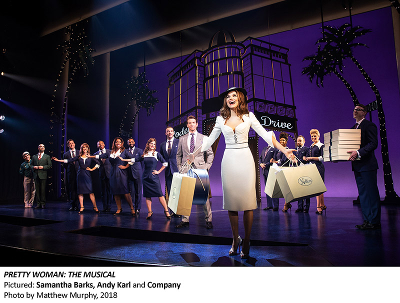
“Pretty Woman is one of the most beloved romantic comedy movies of all time,” says Rockwell. “We’re not only capturing an iconic movie, but we wanted to capture the amazing quality of Los Angeles. So much of the musical takes place in twilight and the evening, and we wanted that incredible atmosphere. Our goal was to create a fresh, new visual vocabulary that referenced the film, but was not a literal interpretation. Locations such as the Hollywood Hills, the Beverly Wilshire Hotel archway and Rodeo Drive have been distilled into airy, abstracted and fragmented scenery that suggest the variety of place locations required by the story.”
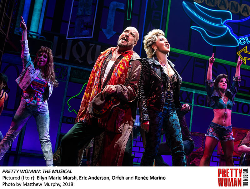
There are many backdrops that are painted and lit with highly saturated colors, such as the ones Rockwell just referenced. The first thought that screams out when one witnesses the opening sequence, which features Vivian and a large cast of characters singing and dancing along Hollywood Boulevard, is that this is a major flashback to the Decade of Decadence.
“Yes, our set evokes a late-1980s Los Angeles with simple, stark silhouettes, perspective and surprising lighting and color effects,” adds Rockwell. “We looked at key icons of the city, from the Hollywood sign to Rodeo Drive, to portray two vastly different worlds — the gritty blocks of Hollywood Boulevard and the refined elegance of Beverly Hills. We were also inspired by Southern California’s coastal climate. There is a steady presence of palm trees, and a tangerine-toned backdrop evokes a West Coast sunset.”
Two other key players in this show were lighting designers Kenneth Posner and Philip S. Rosenberg, who worked together to help create the often-breezy vibe of the show. The trio integrated their disciplines to make sure Pretty Woman got the right look, which often use rich colors in the background rather than cluttering the stage with set pieces or a video backdrop. “My love of theater is much about the collaborative creative process as it is about the final performance,” says Rockwell. “We worked very closely with Ken and Philip to create the show’s atmosphere and coloring, addressing the show’s lighting needs before we designed and built the scenery. Ken, Philip, and I first worked together on Hairspray in 2002. It’s been an amazing collaboration ever since. We finish each other’s sentences!”
Lighting and Set Elements
In a joint statement to PLSN, Posner and Rosenberg stated: “The lighting design for Pretty Woman has to be versatile enough to radically change each location the audience travels to. David Rockwell provided the perfect canvas in his scenic design to easily change from naturalism to abstraction and from reality to fantasy.”
The three-story building front with the balcony for the Hollywood Boulevard scenes required a certain balance, pun intended, in its assembly. Rockwell needed to make sure it had sturdiness for the actors — Vivian climbs up and down it during the show and also moves through the bedroom window to the balcony in the beginning — and movability for the crew.
“The balcony needed to be light and transparent,” says Rockwell. “We played with the heights of the first and upper landings. We also explored how the actors would climb and descend the unit. The depth of the wagon needed to be sturdy enough for the actors, yet nimble enough to fit through the wings and light enough for the stagehands. In the end, we designed two separate pieces — an escape stair and landing unit attaches to a main apartment unit in various ways.”
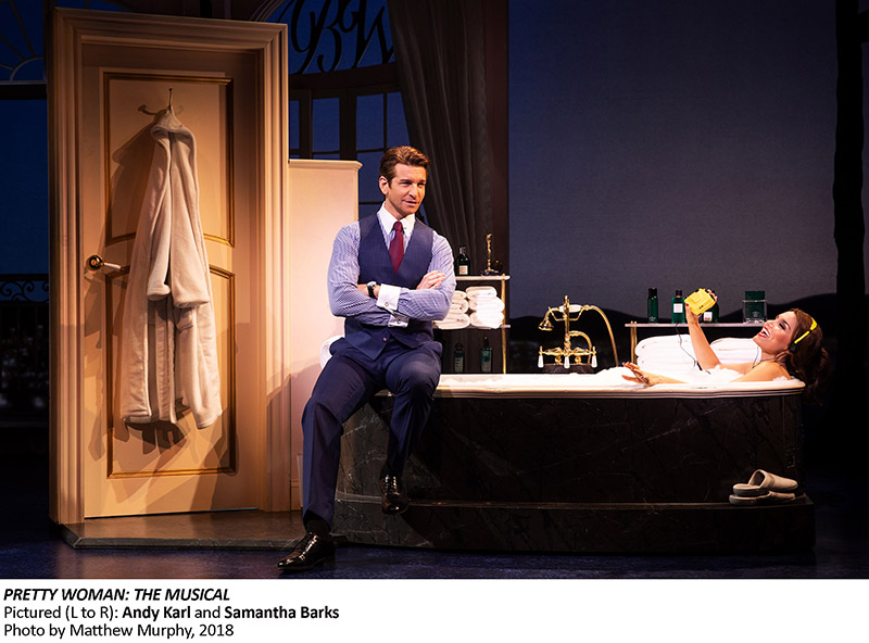
The Hollywood street scene features a lot of scenery — the three-story building at stage right, other building fronts and neon signage upstage center and left and a bus stop bench downstage center where the two leads first meet. The hotel penthouse suite includes, among other things, the bed, sofa, a baby grand piano and a balcony setting with windows and curtains. In one scene, a bathtub and bathroom door also slide on for the moment when Vivian is bathing and listening to her Walkman. By contrast, the opera date and country club party sequences are much more sparse in their decorations, and the shopping scenes in Beverly Hills are limited to the space of one store interior (essentially showcasing one main display) or an exterior Rodeo Drive archway through which Vivian parades during her Edward-financed shopping spree, flanked by various cast members and backlit palm trees adorned with LEDs to distinctly outline their shape.
“Our scenery moves along with the pacing of the show,” explains Rockwell. “The opera scene is about the pivotal moment when Vivian and Edward are falling in love, so we created two very lush elements — the curtain and the box. The fragments become more detailed, with the opulent opera box suggesting the grand house and the translucent gold curtain highlighting Vivian’s iconic red dress.”
On the flip side, the hotel suite had more moving parts to integrate onstage. “Edward’s penthouse required fast transitions and suggestive scenery,” says Rockwell. “Units come from stage left and right to create an elegant interior with a wrought iron balcony, piano, mini bar, bed, sofa and end table. We had to capture the right tone and sophistication through a multitude of moving, fragmented pieces.” This coordination of moving parts was made trickier by another factor. “The script returns there many times throughout the show, but always from a varying location. Each transition required a different type of movement.”
Airy Feel in a Tight Space
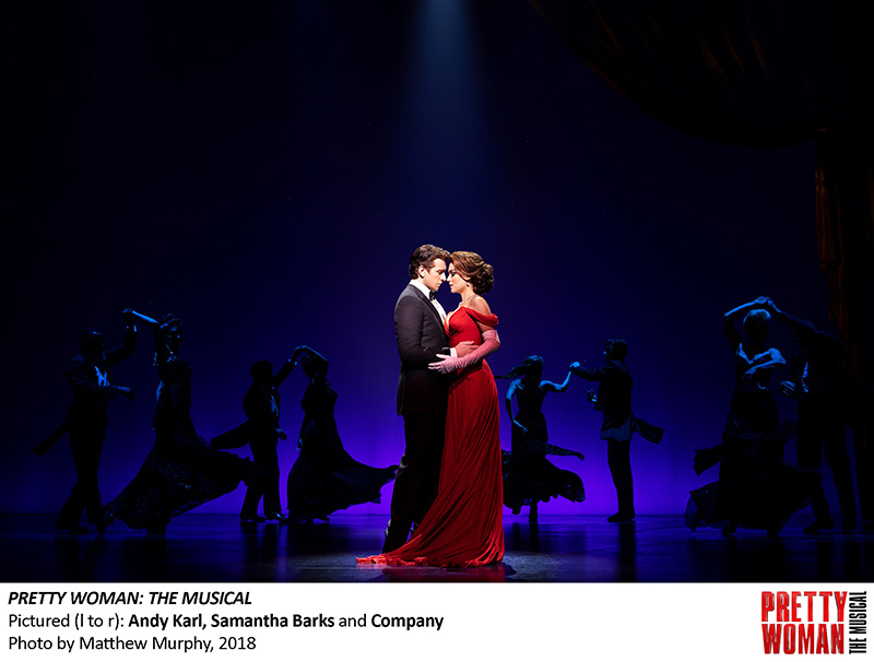
Pretty Woman originally played at the Oriental Theatre in Chicago in March and April. Productions that transfer face changes on the Great White Way, and Rockwell notes that overall they focused on tightening transitions in the show. On his end, they also recolored a few of the set pieces. “For example, we added a green ombré to the palm tree silhouettes,” he says.
As illustrated in last month’s column wing space in Broadway theatres is not easy to work with, as Rockwell notes working on Pretty Woman at the Nederlander Theatre in Manhattan. “Many New York theaters were built in the early 1900s when scenery was less three-dimensional, so wing space storage often presents a challenge,” he remarks. “In Pretty Woman, housing the apartment wagon was the main challenge. The 27-foot tall piece appears in both acts. In the end, it was flown to stage as soon as it came offstage and flown down when needed in the second act on overhead tracks.”
Each new show usually affords designers a chance to learn something new, and this show was no exception for Rockwell. “Every theatrical production is a challenging and thrilling experience,” he says. “As an architect, working on Pretty Woman gave me an amazing opportunity to dream up a visual language that evokes the film’s Hollywood surroundings. Working with Ken Posner, we learned how to create a set that feels like an endless sky. Light box portals surround the stage with color-changing LEDs to create the varying shades.”
Quick Transitions
Another recent show that Rockwell worked on that opened about a month after Pretty Woman (and just closed after an intended limited run) was the black comedy The Nap, and we would be remiss if we did not mention it because it features more of his superlative scenic design. It is a darkly humorous play about a straight and narrow snooker player caught between corrupt family members and ethics investigators. The Samuel J. Friedman Theatre in NYC is known for its limited space and Rockwell managed to squeeze in four major set pieces — the snooker hall, a hotel room, a country living room and a championship snooker hall complete with live video monitor — and he did so by hanging a majority of the set pieces and props above the stage. The smooth transitions were impressive to watch.
“Our work on Pretty Woman preceded The Nap,” says Rockwell. “They were totally different adventures, but each was completely rewarding and challenging. In both shows we had the amazing opportunity to work with two really great directors — Jerry Mitchell in Pretty Woman and Daniel Sullivan in The Nap. One key similarity is that both sets required quick, fluid transitions. In the transitions of The Nap, we built in practical lights to immerse the audience into the environment. So much of The Nap is like a number of Easter eggs — we wanted to create surprises the audience wouldn’t expect.”
There are two things we know for sure about David Rockwell’s design work — you do not usually know what to expect, and he keeps you bedazzled.


