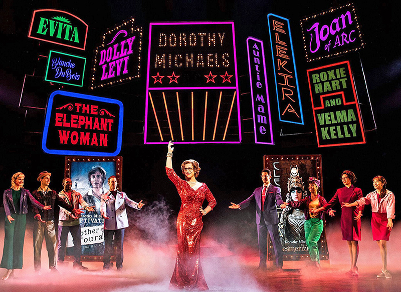
Propelled by Robert Horn’s witty writing and Santino Fontana’s superlative lead performance (both of which were honored with Tony Awards last month), the revamped musical version of the beloved ‘80s comedy film Tootsie has become a bona fide hit.
Ever-Shifting Scenery
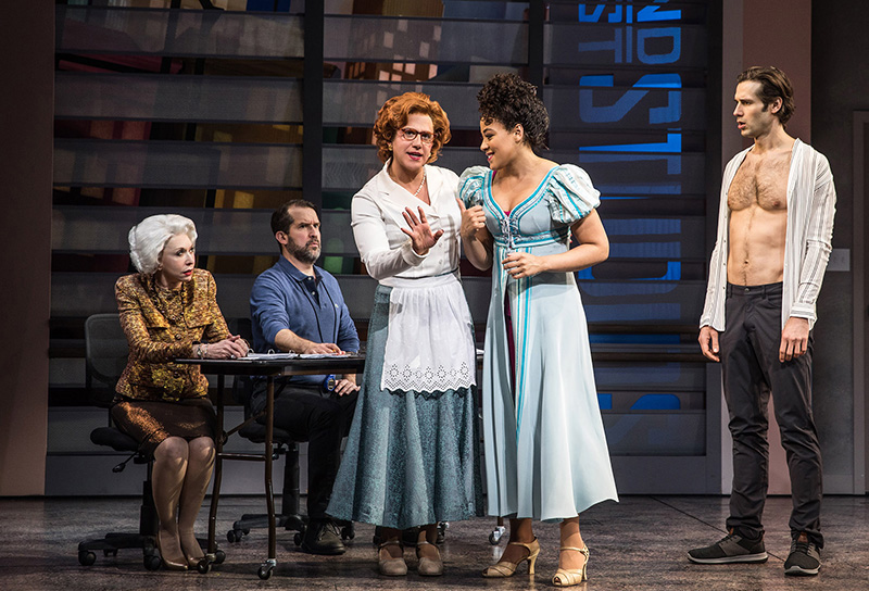
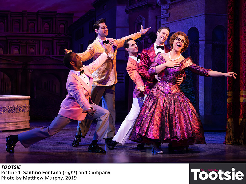
Actor Michael Dorsey’s Broadway career is dead in the water until he shows up to an audition disguised as a woman named Dorothy for the musical Juliet’s Curse, a sub-par sequel to Romeo and Juliet. After winning people over with “her” talent and charisma, Dorsey as Dorothy tangles with narcissistic, sexist director Ron Carlisle (Reg Rogers) to give the show a more feminist slant. It is then reborn as Juliet’s Nurse and generates a massive media buzz along with awkward romantic entanglements as both a male (John Behlmann) and female (Tony nominee Lilli Cooper) co-star vie for Dorothy’s affections.
The man tasked with lighting the ever-shifting scenery was veteran LD Don Holder, who also recently collaborated with scenic designer David Rockwell on Kiss Me, Kate. Holder spent a year and a half working on Tootsie before it went into production in New York. He attended workshops before the company’s out-of-town production started in the well-received Chicago version at the Cadillac Palace Theatre last summer. The show was about 20 minutes longer there, so the creators streamlined each scene to bring it down to the essentials and worked on greater character development and depth. They also wanted to keep the momentum going. “I think [director] Scott Ellis is great at that,” says Holder. He also praises the “amazing” lead performance of Fontana.
Given that the Cadillac Palace holds approximately 2,300 people and the Marquis around 1,600, the Tootsie team restricted their onstage footprint in Chicago to what they would be using in New York. “All the lighting positions were really, really far away,” says Holder, of the former theater. “Everything we hung downstage at the proscenium were the same basic ideas between Chicago and New York, but the equipment had to change. We factored that into our planning. The shop [PRG] was pretty accommodating about changing lenses and minor things like that.”
There were many more lighting positions available in Chicago, which allowed for a whole array of different lighting ideas, but in the Marquis, they had to create positions within the restrictions of that theater to reproduce what they had before. The Marquis has very limited positions on the sides of the theater, so “we had to build and expand and make new ones that had a very elaborate height construction,” says Holder.
Tootsie is structured much like a classic musical comedy, “with extended book scenes staged in realistic and naturally-lit interiors, to production numbers from three ‘musicals within a musical’, to a vast watercolor vision of the New York skyline, to many spectacular and complex fantasy sequences,” says Holder. He says that all of those elements, along with the opportunity to respond, lighting-wise, “to an incredibly dynamic score by David Yazbek made designing Tootsie a real treat, but also a challenge when it came to considering a lighting rig that could accommodate such an ambitious scope and diversity of styles.”
The veteran LD states that many of the interiors required a naturalistic approach using tungsten sources, “where the light felt truthful, invisible, and unforced,” which he says was crucial to landing the comedy. He also felt that the Juliet’s Nurse musical, a “whimsical version of Shakespeare’s Verona” revisited throughout the show, could benefit from a similar approach. “The musical commentary and inner monologue component of the story is revealed in spectacular style and required a highly dynamic approach, along with a very different lighting vocabulary — lots of movement, rapid color-changes, quick transitions, precise visual composition.”
A Mixed Rig
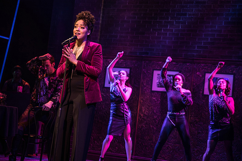
To achieve those objectives, his rig offers a mix of older and newer lights. “There’s a backbone of tungsten-halogen ETC profiles, some fitted with color scrollers, that provide the light that envelops the actors, carves out the interiors,” explains Holder. “The remainder of the rig is used to tone and accent the scenery, provide embellishment and compositional detail for each scene, deliver rapid and global color shifts and add a kinetic component to the light.”
A variety of fixtures provide a blend of LED and non-LED lumens. They include LED wash lights (GLP impression X4 XL’s, Martin MAC Quantums and MAC Aura XB’s), hard edge profiles (MAC Viper Performances and Vari-Lite VL3500Q’s), plus VL2500 Washes, GLP Impression X4 Bar 20’s, ETC Lustr2 profiles and Source Four Pars to meet the show’s lighting needs.
The settings in the show range from Dorsey’s apartment to backstage and onstage spaces, from a nightclub to a park. Holder gave each of the “musicals within the musical” its own look to reflect each production, from the purposely bad setup of the poor opening show that Dorsey flops while auditioning for to the directorial self-indulgence of Juliet’s Curse and the more cohesive and polished vision of Juliet’s Nurse.
It’s Complicated…
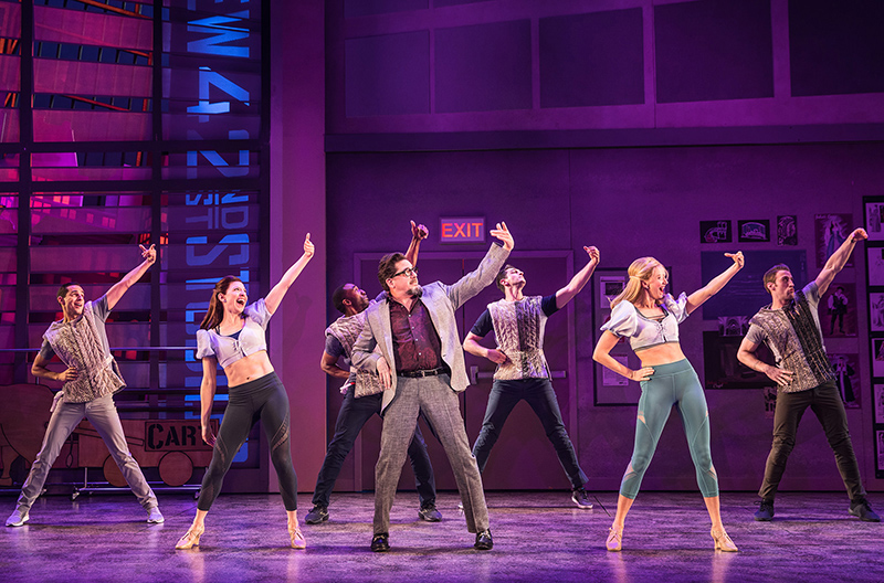
Holder says that there were two sequences that were particularly challenging. The first was the Act One closer, “Unstoppable,” where Dorsey declares how he will tackle all his Broadway roles and finally live his artistic dreams while assuming the guise of a woman.
“The storytelling is quite complex,” says Holder. “It’s a swirl of images in his head, like a massive thought bubble that comes to life onstage. It’s very sophisticated, musically, and staged quite cinematically, and the storytelling beats keep coming at you like a runaway train. It just required a lot of detail and musical gestures, and the music itself was so dynamic and reminiscent of a classic Broadway score that it required the lighting to feature a lot of musical accents, musical hits, and stings that were woven into the score. Even the smallest musical event was acknowledged with a lighting cue. Many of these accents were requested by the director. I certainly followed my impulses about that stuff, but the end result was nowhere near the number that I expected it to be.”
He adds that “Unstoppable” is “one long, slow boil” that continually builds thematically and musically, and that, design-wise, it swells from something small to huge and intense by the end. During that grand number, a group of Broadway marquee signs appear on stage. Says Holder: “Those were a combination of thin light boxes lined with color-changing LED tape and outlined with either an LED ‘like neon’ product or old fashioned incandescent 10W G12 lamps, wired for a three-circuit ‘marquee’ chase.”
The other challenging number was “The Most Important Night of My Life,” which features a series of inner monologues from the principal characters “all colliding together into one number,” Holder says. “It reveals everyone’s deepest thoughts about what this particular opening night means to them. We go inside the head of pretty much everybody we’ve encountered onstage to that point. We’re transported to multiple locations around the city, then to backstage pre-performance, and finally to the opening night show, all in the course of one number. Again, my objective was to craft the light to make the storytelling clear [and] the transitions fluid, using a constantly shifting clean vocabulary that also acknowledged the musical dynamics. The show generally required a lot of detail, a lot of precision, maybe much more so than many other projects I’ve been involved with. I think there were over 900 cues. For a musical, it’s usually in the 600 range.”
While he noted that there were ample places to hang lights at the Marquis, “it’s always a negotiation for real estate,” notes Holder. “There are a lot of flying pieces and a lot of set elements that were overhead that we had to share lighting positions with. It wasn’t like a show like Kiss Me, Kate where literally every inch was a long conversation, because there were just so many sets and so many drops in that teeny Studio 54 space. The Marquis is a bit more expansive and has a lot more depth, so it gives you the opportunity to spread things out a bit and do more.”
Another aspect of Tootsie that Holder found really challenging was all of the set electrics. He is noticing a growing trend where almost every scenic element has a lot of internal illumination — either set installed or set integrated lighting.
“Our early design process now has gone beyond what it used to be, which was conceptualization, a deep collaboration about the piece and point-of-view, and maybe talking to the set designer about how the light and the scenery could interact,” explains Holder. “But now on top of that is basically a lighting design up front to accommodate all the ideas of scenery. It’s even more imperative now to get lighting people involved in the design process earlier. It’s not just providing input, it’s organizing mockups and really doing demos of ideas and making sure they’re going to work on a larger scale.”
Synched Cues
On Tootsie, Holder had the opportunity to work with a production program called Stamp. As a show is being recorded, Stamp imprints cue placement and location onto video playback. If you want to review a beat in the show, all you need to do is “fast forward or move the video to the point that you want to look at, and the lighting will automatically go to that cue place,” says Holder. “It allows you to do real time editing outside of a rehearsal process and to actually access stage pictures very accurately, moment by moment.” Holder credits his moving light programmer Colin Scott for bringing Stamp into Tootsie.
Automated lighting technology constantly changes, so Holder always seeks the next good thing. He remarks that every automated light has its advantages and disadvantages, and no one light can do everything. “You really have to pick the right tool for the right application,” he says.
A new light for him on Tootsie was the GLP X4 XL LED wash, which he says is very bright, has a very large beam, and offers good color mixing. “During the ‘play within the play,’ there is an exposed electric with large diameter wash lights that were refocusing, moving, and changing as the staging developed,” Holder says, of the GLP X4 XLs. “I felt like they would have a big presence in the stage picture when exposed.”
He states that it is always a struggle to balance using new technology and the associated costs with making the best usage of older lights available at a rental shop. “In the case of Tootsie, there’s a lot of technology that’s been around for a long time, like the VL3500 Profiles,” says Holder. “I know they work, I know exactly what they do, and I know that they’re going to be relatively inexpensive. So, I used them.”
Holder points out that many current Broadway shows shirk the conventional lighting of single-purpose fixtures. He still holds onto at least a small component of that in his work.
“I think there’s a real elegance and beauty about being able to just call up a channel, and the light is right there in the color that you’ve already predetermined and the focus that you like,” explains Holder. “[With] everything else that we do now, you choose a fixture and then have to select many, many attributes — the color, the size, the focus, the texture. For every cue, it’s an ongoing series of many, many choices. And there’s something really great about turning on a light and having it be there where you want it. I know it sounds very old school, but there’s a certain elegance to it. There’s something nice about simplicity. Less is more. I still feel like that’s a catch phrase worth remembering and thinking about. I’m not a minimalist, but I do believe it.”


