The new musical, First Date, offers a peppy pop spin on the awkward blind date that many of us have endured. Aaron (Zachary Levi) is a finance man with foot-in-mouth tendencies, and Casey (Krysta Rodriguez) is an artsy, edgy girl with a toxic sense of humor. As they trade quips, barbs and awkward pauses, they learn to understand each other and open up about their mixed pasts. Mirroring the show’s approach, media/scenic designer David Gallo sought to subvert traditional Broadway notions while working around them.
 Edgy and Hip
“Basically what I wanted to do was design a musical inside out, so it doesn’t really have any masking or any of the natural stuff that you would have,” Gallo reports to PLSN. “When I first got the script, it seems that we were going for a more contemporary audience, kind of a hip audience, so what I was interested in creating was something that had a lot of the feelings of the old-fashioned-ness of Broadway. You came in and saw this empty theater that felt old fashioned, but the show itself popped out of that in a really fun way.”
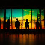
The bar onstage at the Longacre Theatre does not fully occupy the stage — its three open metal walls encompass a space 25 feet wide by 14 feet, 4 inches deep. Gallo worked within the contained unit onstage, positioning 11 video monitors placed high on the walls — four Sharp 60-inch LCD televisions in landscape orientation and seven Samsung 37-inch LCD televisions in portrait orientation. Three are on the left wall, four on the center and three on the right, with four Valence lightboxes (measuring about 6 feet wide and 3.5 feet high) positioned above and in front of the set, that provide imagery that augments but does not overwhelm the modest production. Together they exhibit separate paintings that form a unified view of Manhattan.
“This is a Broadway musical design on a very small footprint, which is another reason why I didn’t want to fill it up with masking or anything around,” explains Gallo. “The show itself is in the smallest space that we could conceive of doing, and then we let it emanate out from there with funky New York emptiness. We definitely wanted to limit the action because we had a small cast number, and we didn’t want people to look too lost up there. It only got a little bit bigger than in rehearsal because we found we didn’t have quite the room that we wanted. It was only meant to be a little musical. I wanted the media to be a part of the room and not added to the room. There are very elaborate, cool looking frames that are around the video monitors. The idea is that the video monitors look like these lightboxes that come alive and do all sorts of fun, different stuff.”
 Manhattan Motif
Creating more from less is a theme of Gallo’s design approach. The split-level bar features a lower level where a chair and table hug stage right, and sofas nest behind a chair and table where the couple eat dinner at stage left. The locations on each side feature actors who appear to be surreptitious bar patrons, but they metamorphose into lively characters residing in the heads of Aaron and Casey, including his best friend and her sister.
“The little sofas do a whole bunch of things you’re not aware of,” reveals Gallo. “There is stuff hidden all over that stage. There are props and costumes hidden everywhere. But those sofas created a sort of neutral area that the other cast can hang out until they needed to become characters. I try to keep everything on stage as open as possible, and obviously it’s reminiscent of New York City.”
The design of the bar mirrors a Manhattan suspension bridge. “The railing for the doorway [at stage left] is an actual piece that fell off the goddamn Williamsburg Bridge. It’s the real thing. So the ideas is that is an homage to all things New York, which gave me the excuse of using the I-beam as a motif. The room was built out of I-beams and the furniture is built out of I-beams. It allowed me to take that idea further and further.”
When he did research into Manhattan bars, Gallo discovered that many of them have photo/art galleries on the walls. When he decided to design the bar in a New York City motif, he made the choice to have each painting be a painting of Manhattan as done by a different artist. “Each painting stylistically is quite different but they all compositionally work together. There is the Manhattan skyline with the George Washington Bridge all the way at stage left and the Statue of Liberty all the way at stage right. We didn’t change it at all. That is the actual, unaltered Manhattan skyline. Every building is represented by the lightboxes.”
 Video Elements
Gallo’s use of video monitors was there to flesh out the onstage actions and emotions at key moments. The bar monitors with New York skyline paintings change when certain scenes require them to. During the number “The Girl For You,” Jewish and Christian iconography dances on the video screens, and more rock oriented images surface during “That’s Why You Love Me” as the bad boys of Casey’s past crudely “serenade” her. At another moment, the Google logo personified with eyes has a brief dialogue with Aaron after he admits to Casey that he Googled her prior to their date.
“As a scenic designer, what was interesting about designing the media is that people forget that you can turn that stuff off,” observes Gallo. “Because I was designing the whole thing, I resisted the temptation to put video in every moment of the show, and the editing process is not always appreciated. It’s not as much what you create as much as what you take away. I think the challenge was the amount that we used in tempering the whole thing so that it was not an overwhelming element. The other was finding whatever the language was going to be for those screens and incorporate them into the act. It was fun.”
Gallo says that the different sizes of the monitors make it so that when both sets are in their “show-correct orientation” — the back being horizontal and the sides being vertical — the height is almost identical between the two sets. Four of the 37-inch TVs are mounted portrait (stage right), three are mounted stage left and the 60-inch TVs are mounted landscape (upstage). There is a gap where the door is stage left.
 Projection and Control
In terms of FOH projection, Gallo used two Christie HD14K-M Series projectors with two fixed 0.8 lenses mounted splitting center on the mezzanine rail. First Date was programmed and run on a Dataton Watchout 5.5 with four outputs feeding the monitors and outputs.
“Each bank of bar TVs [three total] used a single output and was split into quadrants, with each quadrant going to a different monitor,” explains Gallo. “This allowed us to have individual control of each monitor without having to have 11 outputs.” Each TV displays a 960-by-540-resolution image. The FOH projectors are fed with a single 1920-by-1080 output, “and the convergence and slight keystoning happened at the projectors. The TV signals are split into quadrants by a product by the company Datapath. I believe we used the Datapath x4.
“The system lives on the grid at the theater,” he continues, “and we a KVM remote system that allows us to have the monitors for the programmer computer as well as the keyboard and mouse control at the tech table. There is also a KVM station at the light booth so that the head electrician can have Watchout control as well.”
With no video operator on the show, Watchout is triggered by lighting over MIDI using MSC (MIDI Show Control) from their ETC Eos lighting console. “I had a monitor with lighting’s cue list on it at the tech table so that we could always be in sync as our cue numbers had to match theirs. Worldstage engineered the system and was the vendor.”
 City Silhouettes
The start of the show features a projected 3-D model of New York City that covers the entire proscenium opening. “The projectors are converged to a single image at the projectors, instead of doing it in our control software, Watchout,” explains Gallo. “That convergence plane is the city drop with the building silhouettes cut out.”
The actors move in and out of this backdrop through the skyscraper cutouts as they sing the first song, “The One.” “What was fun about that is it’s basically an old-fashioned, two-dimensional cut backdrop that pulled up from the floor and we project on it,” he says. “It’s a low-tech idea and a high-tech idea working simultaneously, which is what I thought was fun about it.”
By comparison, the bar set and the overhead lightboxes fly away at the end of the show so that we get a wider view of a New York city street as Aaron and Casey speak outside of a subway station. “We did some cute stuff,” says Gallo. “Like when the video monitors in the bar fly out at the end, the video is programmed to replicate the stage behind them, giving the illusion the monitor disappears, leaving only the empty frames. I tried to treat the video screens as a totally different dimension a lot of times. But in the end what was really fun about it is that the screens were physically part of our environment, and it was cool to see them sit there then transform.”
Video Evolution
Gallo says that the crew began using video monitors late in the process, “which is shocking when you look at it now. They were going to be blank screens with video projecting from visible sources built into the room as part of the restaurant’s décor. We had the paintings in a very horizontal composition and video monitors did not come in those shapes, and it wasn’t until the painting technique that we’re projecting onto them didn’t work that we ended up going with video monitors. We did make some changes, so I think it’s very obvious why we put the frames around the outside of the video monitors.”
The final design works efficiently and vibrantly when utilized throughout the musical, which moves between both joke-laden and introspective book scenes that often lead into dynamic musical numbers.
“It was definitely a really interesting project,” Gallos says of First Date. “Working with the director [Bill Berry] was an amazing experience. He’s such an extraordinarily unique individual in many ways when it comes to directing on Broadway — very organized, very direct and very driven. It was all good.”


