Scenic Designs Extend into the Audience
Broadway and off-Broadway productions are continually trying to find bigger, bolder concepts to tantalize audiences. Whether it is extensive scenery, dazzling lighting, intensive video, or showers of confetti blasted out via cannons for a big finish, producers seek new ways to make shows more of a sensory experience. Sometimes it can be overkill, but other times it can produce some beguiling results, especially when it comes to extending scenery into the audience.
For the recent production of Tennessee Williams’ The Rose Tattoo starring Marisa Tomei, a walkway extended from stage right to an audience entryway a few rows out, requiring numerous seats to be removed. It also expanded the scope of the stage and represented a gateway to the world outside of the central home. During A Christmas Carol this past December, besides using the gimmick of having star Campbell Scott go out into the audience, large curtains served as chutes for actual fruit to be rolled from the second balcony down to crates on the stage. This carefully choreographed moment occurred during the transformation sequence where Scrooge decides to share his wealth on Christmas.
Immersing the Audience
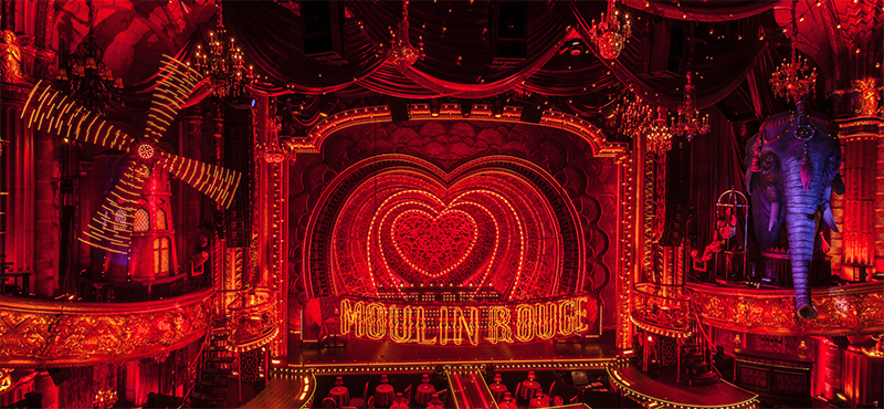
The biggest recent example of scenery expansion is Moulin Rouge, where scenic designer Derek McLane transformed the Hirschfeld Theatre into the famed Parisienne cabaret. As PLSN reported last summer, they covered all the walls with nine different types of mostly red velvet fabric on the walls. They painted the ceiling under the mezzanine red, and “we hung big swags of velvet and satin overhead,” says McLane. “We put a ridiculous number of light bulbs out in the auditorium.” He offers further information about what was done for the show.
“The original architecture of the Hirschfeld is very lovely, but it’s very plain and was basically a sandstone color, a beige color,” says McLane. “It just didn’t feel ornate or European enough, so we covered those railings with cherubs and windmills. There were sconces in the theater that had brass eagles on them, which also felt very American and didn’t feel particularly European. We made brass windmills to cover the brass eagles. They’re actually made out of cardboard. We also added 12 different chandeliers. There weren’t all that many wall sconces in the mezzanine, so we added a bunch of crystal wall sconces.”
Jordan Roth and Jujamcyn Theaters were reportedly very supportive of these artistic choices. “We weren’t permanently changing anything anyway,” notes McLane. “There were a few things that we wanted to repaint on the inside of the theater, so we had to get permission [from the New York City Landmarks Preservation Commission] so that when Moulin Rouge is finished it will get repainted to what it was.”
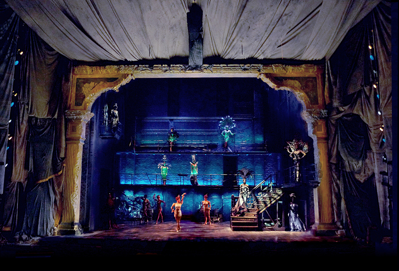
Moulin Rouge was not the first show for which McLane had extended the scenery into the audience. He designed the 2011 revival of Stephen Sondheim’s Follies at the Marquis Theatre, which is usually the home of tourist shows like Tootsie and Escape To Margaritaville. This was something different. He covered the Marquis Theatre with gray fabric because the characters onstage are united by the impending destruction of a Broadway theater and go there on its final night to reminisce and reconnect.
“It felt like it had some history to it,” McLane explains, of that set. “When we first did it at the Kennedy Center, that was a very modern theater, so I covered the inside of some of it because I wanted to try to make it a little less modern. The Marquis [Theatre] was in some ways the most wrong theater that we could’ve gone to with Follies in terms of what it feels like. What I had done at the Kennedy Center was a good start.”
When the show transitioned to the Marquis, McLane pushed to cover everything to really place audiences in the same space as the actors, and the producers concurred.
“We covered every bit of wall and every column,” he says. “We even covered a lot of the ceiling as much of the ceiling as we could, which was most of it. I couldn’t actually put all that ornament up in the Marquis. First of all, the Marquis is so modern there wouldn’t really have been a place to start, but also it would have been prohibitively expensive for that show. Instead, what I tried to do is make it feel like it was under construction, so I used to use a lot of old gray drop clothes.”
McLane says that the gray fabric was not that expensive. The greater cost came from hiring the labor to put it up. “We spent a lot of time planning, and then it went relatively quickly,” he says. “Also, by having that gray fabric there, it was meant to imply that there was something else underneath that that you couldn’t see.”
Orchestra and Mezzanine Decor
Two other stirring examples of Broadway scenery being placed all around the audience in the orchestra and mezzanine sections are Bloody Bloody Andrew Jackson, which was staged in 2010 and designed by Donyale Werle, and Natasha, Pierre and the Great Comet of 1812, which opened on Broadway in late 2016 and was designed by Mimi Lien. Both of those shows included paintings from their time — coincidentally, the early to mid-1800s — hung all around their respective venues. Jackson took it further with Christmas lights hung above and around the audience, light beams stretching from the stage to the back of the theater, and a faux taxidermy horse hung upside down over the orchestra section.
Scenic and lighting designer David Goldstein’s latest off-Broadway musical in NYC, Emojiland, seeks to bring the audience into its digital world. “Extending scenery into the audience is one of my favorite elements of design,” declares Goldstein. “With most plays, I want the audience to feel like they are experiencing the story for the first time with the characters. Extending the scenery into the audience allows the audience to feel immersed in the world of the show. Scenery can help transport the audience to a time and place of our choosing and wrapping the scenery around the audience only helps to fully flush out the visual world of the storytelling.”
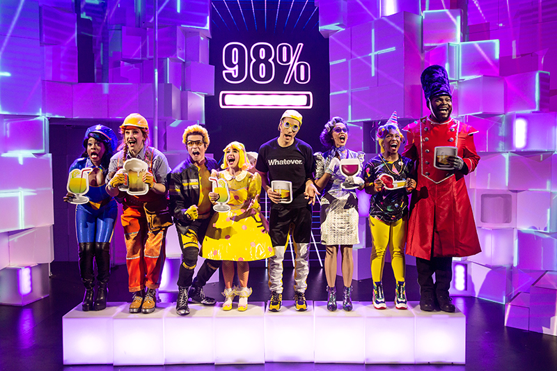
For Emojiland, Goldstein and director Thomas Caruso wanted to “create a pixelated playground to transport the audience inside a smart phone,” he says. “We didn’t want the scenery to end at the proscenium line, so we continued to break off pixels into the audience on house left and right as well as hanging pixels over the audiences’ head.”
The pixels onstage are 18-by-18-inch cubes. According to Goldstein, some are high gloss treated wood, some are Plexi, and some are manipulated by actors and are formed plastic.
“We talked about using video panels covering the entire stage at first,” he says. “The entire thing is designed based on the standard size of a video panel, 500mm x 500mm. Of course, it was too cost prohibitive to have 638 panels of video screen, so it turned into the upstage video wall, which is six feet wide by 18 feet tall, and the rest projected. Audience and reviewers alike are loving the pixilated playground we’ve created.”
Topping it Off
Sometimes a show does not simply extend into an audience but above it.
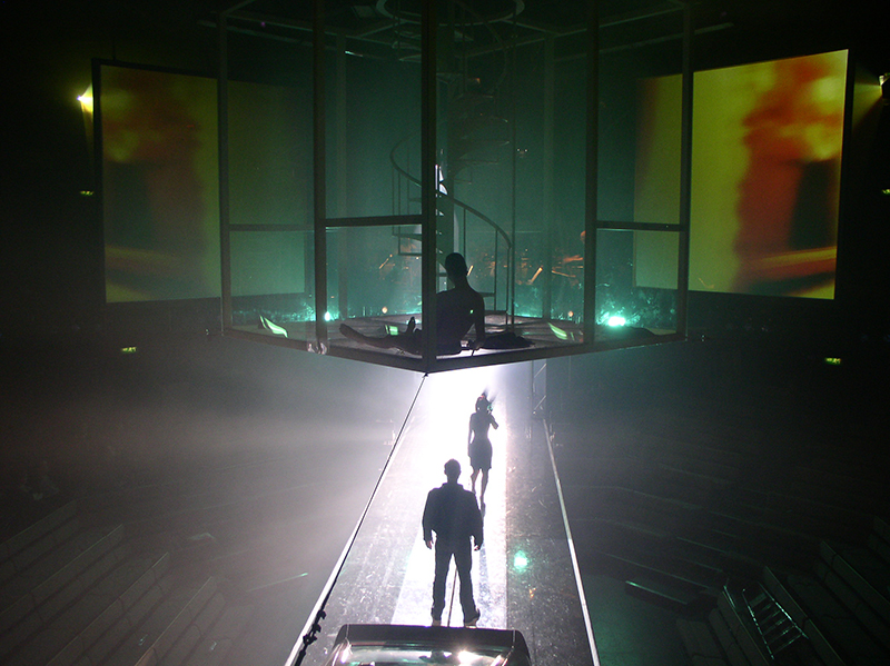
“I did this extremely strange opera version of David Lynch’s Lost Highway that was fantastic,” scenic designer Riccardo Hernández recalls of a 2008 production he did with director Diane Paulus at the Young Vic Theatre in London. Austrian composer Olga Neuwirth wrote the score and Novel Prize winner Elfriede Jelinek wrote the libretto. “The Young Vic is a space that’s like a huge octagon that you can manipulate to create different configurations. For this piece specifically, I had a floating glass box above the center of the stage in which actors could go up and down.” There was a spiral staircase inside that could be lowered onto the “highway,” a ramp that cuts across the auditorium.
In collaboration with projection designer Philip Bussmann, Hernández positioned four videos screens outside of the box and above the crowd, “as if this box had exploded in mid-air,” says the scenic designer. “It was really cool. Imagine a huge black box in which actors are floating in space in the air. It was a big square.” The four translucent projection screens, with images visible on either side, had the same dimensions as each side of the box, but were a few feet away and mounted above the audience as well. “Because the box was black, when Philip projected on those screens it would reflect also on the box. It was like [having] multiple layers which is a lot with what David Lynch does in his films, especially with this one which is all about self and identity.”
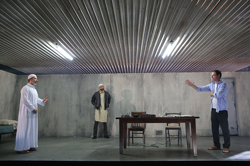
For The Invisible Hand at New York Theater Workshop in 2014, Hernández created a huge ceiling made out of corrugated metal that literally went to the back of the audience and blocked all the lighting positions, necessitating the use of fluorescent lights.
“In square footage, it was half of the theater, if not more,” elaborates Hernández. “It was just hovering on top of the audience and the action. It was very uncomfortable because if you sat in the last rows, if you were six-foot-six, your head could almost literally touch the ceiling. The whole point was to create a really perverse sense of claustrophobia. It’s an amazing play about ISIS and that environment in the Middle East. They have this American hostage like Daniel Pearl, but he doesn’t die.”
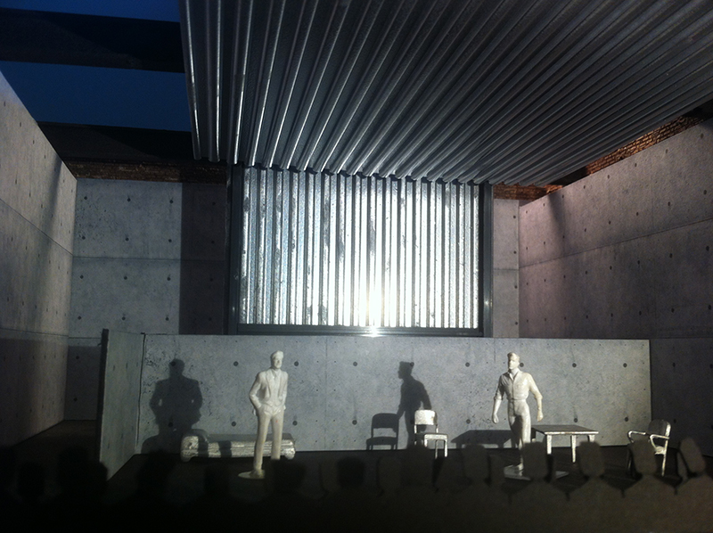
There was a big transition at the end of act one when the prisoner was moved to another prison, and the ceiling was lifted as far as it could go, creating a new, higher ceiling for another locale. “It was very loud, which we wanted,” says Hernández. “At the same time, you heard this Muslim prayer because the whole thing took place in the Middle East. It was pretty effective. I really wanted to get that sense of this uncomfortable, claustrophobic feeling that the audience has to feel, so by the time he’s moved to another prison and that thing’s lifted and you’ve heard the prayer in the background, you’ve got a little bit of a sense of relief. But at the same time, we’re still stuck in this environment which is unsettling, because you don’t know if you’re going to live or die.”
Hernández did a similar thing with Uncle Vanya, directed by Hungarian film director János Szász at the ART in Boston. The theater set was a tunnel that extended from the back of the audience to the stage, and it naturally got narrower as it reached the stage. The tunnel was inspired by scenes from Andre Tarkovsky’s surreal sci-fi film Stalker.
“The audience was sitting in the same space, under the same ceiling that the actors had,” says Hernández. “The audience also sat on the side. It was both thrust and proscenium, but the ceiling came way out hovering above the audience.”
While such ambitious set design can be impressive and lure theatergoers deeper into the world of the show, there are many practical considerations to work out beforehand.
“Every time you put in a ceiling, it’s very complicated because now you have some perforated areas of the ceiling where, if there’s a fire, you can have water coming down,” says Hernández. “It’s very complex. So in that sense, when you do these things it’s more expensive, especially when you have students. Especially in places like Boston and Connecticut. The rules have changed immensely. It’s become very expensive and very hard to do these things. But it’s always exciting when you pull it off. You’re inside of it.”
McLane feels that we are likely to see more shows of this nature of in the future, but it will depend upon what a production needs. As he remarks, “It’s exciting when people think boldly about the environment that the show is in.”


