In the run up to Super Bowl LVIII, the 13th annual NFL Honors ceremony took place on Thursday February 8 at the Resorts World Theatre. Broadcast and streamed live, the awards show featured a Las Vegas-centric scenic design by Production Designer Tamlyn Wright, Principal at Silent House, a lighting design by Jon Kusner of 22 Degrees, Inc. and scenic content design created by Tom Colbourne and his team from Blink. PLSN took a look inside the design for the show speaking with Wright and Colbourne.
Embracing Vegas
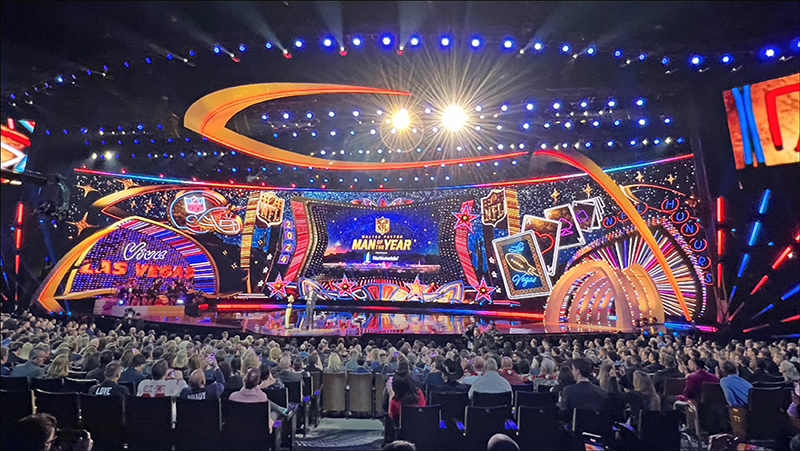
Designing the NFL Honors since 2022, Wright has taken each year’s production as an opportunity to give a nod to that year’s location, and they certainly delivered this year with a design that Wright notes, “oozed Las Vegas.” She explains, “With the NFL and the Super Bowl being in Vegas, which has become a big sports town, there was so much excitement. In the recent years, we have been really leaning into the personality of the cities that we’re going into so my initial designs were all gaming, luck, cards, dice, and neon. Using architecture of famous icons in Vegas. In a fun coincidence, Resorts World is on the site of the old Stardust, so I took the Stardust symbol and made that a little twinkle for the eyes, a bit of a wink to old Las Vegas. I needed a starscape for the background, so they’re my ‘Las Vegas’ stars.”
Wright also looked at Googie architecture since Las Vegas has a lot of Googie influence in its buildings and signage. A type of futurist architecture in the 1950s that was influenced by car culture, jets, the Atomic Age, and the Space Age, it evokes that iconic Vegas feel. “I really incorporated into the design neon and Vegas nostalgia for Googie architecture,” says Wright, “and all the things that sizzle about Vegas. We also have signature pieces from previous NFL Honors—the tunnel entrance; the halo header that’s vaulting over the screen, which looks like the football is being thrown from stage left to stage right. Those ‘NFL’ elements are paired with digital scenic elements in the content. It was fun to incorporate 3D elements in a digital way that lent itself to this space. We made it about the architecture in a way that’s really celebrating the NFL being in Las Vegas.” For the color palettes, Wright once again worked closely with longtime collaborator, Art Director Anthony Bishop. Though they looked at some different color palettes, red, white, and blue, and gold were this year’s go-to colors for the design; staying in the world of Americana and Vegas.
A Vegas-Sized Stage
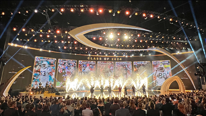
This year’s show took place in the 5,000-seat Resorts World Theatre; home to Las Vegas’ largest and tallest performance stage. This year’s set needed to be expanded to fill the massive proscenium. While some of the set pieces were built, a large portion of the production design consisted of created content on the massive, curved LED screen provided by Fuse Technical Group. “We knew that we wanted to go bigger, adding more screen surface to deal with the larger set,” Wright explains. “We made a large screen into a curved shape; to wrap the room and then created digital scenic elements in the screen content to expand the set without actually building more scenery.”
The massive LED screen then had to be divided up with mortises to designate different areas of the screen and the purposes they served for the show. “With the LED wall, we knew we needed to have a center 16:9 screen that displays the main graphics, packages, etc., then around that main 16:9 mortise at center, we could have some fun and clever things,” Wright describes. The center screen is flanked by trophies; the show name and the year; we had the NFL shield logos; we had a large digital helmet with the NFL logo, but when a winner walked onstage, their team logo appeared in that helmet. The winners were also featured in the 5×10 Las Vegas playing card mortise on the screen where we could also have their I-Mag shots, or the cards could highlight sponsors. Then we had the Las Vegas skyline in the background, which included the Las Vegas skyscape—with The Sphere that had the NFL logo; with the desert and Mount Charleston; cactus and our tiny Stardust-inspired stars; gold trim, and a lot of digital neon; a lot of wonderful details that we were able to throw into the mix. There’s a lot of tasks we had to deal with on our screen. The center, the lower six or so feet of the screen, we had to protect for our close-ups background shots, so that’s solid content.”
Wright worked on the scenic screens content with Blink and was very happy with the ideas that the Blink team brought to the design table. “Fresh perspectives were something that Tom [Colbourne of Blink] and that team really offered up in the collaboration here,” comments Wright. “It hadn’t occurred to me to have this center landscape that we need for the show; to have a spill outside of the center that we had. When they did that, initially I was like, ‘Wow, that’s killer,’ it offered up the the stardust stars in the sky and it gave these flying footballs a reason to be in the air. It gave it such depth, which is why screens are magical; the depth that they can offer.”
Flexibility is also a selling point for using digital scenery and lighting, points out Wright. “You want the show to look great, for the set to serve the show, so you have to be able to have subtle moments. When they are showing video packages, we want to bring the lights down. Or during the In Memoriam segment, we have to really be thoughtful about how to compose that, so bringing all of our work into a silhouette and then still having a starry sky just seemed like a lovely way to play that role and then take the mood down with lighting. Giving it a really simple look.” Another different look the team created was when the Pro Football Hall of Fame Class of 2024 was introduced. “We replicated a little of the aesthetic of the NFL Hall of Fame,” comments Wright. “We had the players come up on lifts, which is already part of the architecture of the building. As each one was named, we had a ‘card’ for each player on the screen. Each of those rotated to reveal the players and then the pyro went off by Pyrotek. That was a big, dazzling, emotional hero moment for everyone.”
Happy with the results, Wright feels that both the television audience at home, as well as the audience at the Resorts World Theatre got a good show. “It was great to see that the audiences could sit there and soak in the details. I think it really came together beautifully. It was wonderful that the NFL was able to take a fun ‘gamble,’ with the Vegas-theme. That mid-century modern Vegas-flair really came through. Going through the process of creating the Vegas Googie architecture with Blink on this was very rewarding. Giving ourselves the flexibility to have it play on screen, working as well as it did in the house and for the TV audience. That was why bringing Tom and the Blink team into this mix was important; it was a great collaboration. The NFL Honors is such a fun project to come back to year after year.”

Scenery on Screen
Tom Colbourne, Owner and CEO of Blink, also felt the collaboration was successful and enjoyed the blending of the content into, and with, the scenic production design. “For many award shows, we, or whoever’s making graphics for the show, will make some very nice, soft, subtle moving graphics that look great on camera, but they don’t typically live as one with the scenic and the set design,” notes Colbourne. “They’re typically the set looks like a set and the screens look like screens in the set that display graphics. Tamlyn’s concept, which really excited us, was to blur the line between the physical set and what’s on the screen much more; to treat this super-wide screen as this amazing, almost infinite canvas on camera, because it fills so much of the frame. To create this illusion that we’ve actually got this abstract environment up there on the screen, which feels like architecture, props, and lights rather than conventional graphics.”
Together, Wright’s team and Blink have created a kind of fantastical landscape. There were animations when presenters would come through the physically built entry tunnel as well as bespoke animations for different areas of the set. “I think it’s meant to be unclear to the viewer which elements of it are a set piece,” explains Colbourne. “In a different world with unlimited time and money, some of these things could have been built on the stage. Like the frame around the main, center screen, that could have been a physical set piece that Tamlyn had designed, but it’s not it’s virtual. The screen on the left behind the band, on camera, looked like a structure that had been built. The audience couldn’t really tell. It was so hyper photoreal; that was the kind of finish we were trying to do. That was a constraint we set ourselves. Let’s pretend this is something that we really built, because that will help reinforce the illusion.”
Normally, with most shows, the screens are constantly animating on and off, whizzing in and out. “We resisted the temptation to do that because as soon as you do that, the audience sees that it’s a screen,” continues Colbourne. “We thought though how it looked from different angles. Every element you see was designed around the way was going to be shot and staged. You’ve got the central 16:9 screen, which was behind the main presenter podium. We knew there’d be a closeup camera when there’s someone’s at the podium, so we made sure there were lots of nice rich details behind that closeup shot. That looks like it could be a set piece, and that was very deliberate. Then on the left, we had the band screen for when they performed and had closeups of the band. We made sure that all those ‘lights’ behind them would animate and twinkle as if they were moving to the music.”
A Video View
Fuse Technical Group provided the LED screens, which for the main screen was ROE Visual’s CB3, which was 77 tiles wide by 7 tiles high—about 150’ x 28’ and curved. Kish Rigging provided the curved pipe for the screen. Gary Madura, Account Executive and Project Manager with Fuse Technical Group explains some of what else the Fuse team handled. “We had a cutout of six tiles wide by two and a half tiles high for the tunnel entrance for the players and presenters’ entrances onto the stage. The inside of the five tunnel arches were covered with 276 Amflex 3mm flexible LED tiles. At the rear of the tunnel is another ROE CB3 backing wall that’s 7 tiles wide by 2.5 tiles high.” Lux Machina provided the media servers.
When you have a 150’ wide x 28’ high curved screen, there are a few challenges, holding to the curve being one of them. “The curve of the screen was an interesting challenge for our team to solve as the radius of the curve wasn’t one of the standard curve angles of the LED panels,” says Madura. “I was a little concerned about having a curved screen that big, because the adjustable locks on the CB product lock into certain angles; this was not one of the angles. We didn’t want it getting a little off the curve, but because we had gravity on our side, and we were able to tighten down the adjustable blocks enough, it kept the curve. I thought it was going to be a bit more of a challenge but fortunately it worked just fine. Kish was really diligent in making sure things were level. Because of that, it went together quickly for such a large screen, and we troubleshot as we went up. Once the screen was up and in place, there was minimal troubleshooting needed. That was great because with the large tech area behind the screen, there wasn’t room to get a lift in, even if we wanted to. The biggest challenge was cable management, frankly. You don’t want to be mixed up trying to find a specific cable, let alone troubleshoot. It’s something we work hard to avoid. At Fuse we try to plan for all the details. This project had a lot to consider and we are really pleased with how it all went.”
A Team Win
“It’s always very collaborative with us when we work with Tamlyn and Silent House, which is how at Blink we love to work.” Colbourne says. “The process with Tamlyn on this, was that she did this sketch straight off the bat, which showed her initial thoughts. The brief Tamlyn got from NFL was ‘something that oozed Vegas.’ This was a production design-led screens concept. Tamlyn did this amazing sketch, and we went away and brought it to life. It was already so well-considered in terms of how it would work with the set and how it would work on camera. Tamlyn’s done this in the physical world so much, she’s built actual sets like this. In this case, our job was to work out how we could bring that design to life in the content and how we could use it really cleverly in terms of how it could animate, how it could be lit, how it could transition and transform. We created a 3D render to present to Tamlyn and then, very collaboratively with Tamlyn, it evolved into a finished product.” And what a touchdown that finished product was. The NFL Honors were a fun event and certainly a design win.
