 Pop quiz: What are the two most important tools of a lighting designer?
If you said Starbucks or the Internet, maybe you should consider a career in audio. If you said light and dark—congratulations, you just might have a future in this business. As the saying goes, if the only tool you have is a hammer, then everything starts looking like a nail. Some lighting designers use light as a hammer, forcefully applying it to every “nail” they see. What we often neglect to recognize is that we have a lot of tools at our disposal, including the dark. And nothing can better emphasize the light better than the dark.
As the editor of the most widely circulated lighting magazine in North America (according to BPS audits) I get lots of lighting pictures e-mailed to me and I’ve been keeping an archive for the past three or four years. Lately I’ve been searching through them looking for examples of chiaroscuro in lighting. They are difficult to come by. What is chiaroscuro? Glad you asked.
Chiaroscuro is Italian for light/dark. It’s a word that artists use to describe the bold use of light and dark for dramatic emphasis. Leonardo da Vinci was one of the early pioneers of chiaroscuro in painting and it was later more fully developed by Giovanni Baglione, Michelangelo Merisi de Caravaggio and Rembrandt.
Notice the two words, light and dark. Many of us use light to the exclusion of dark. We are, after all, lighting designers and not shadow designers. But da Vinci, arguably one of the greatest artists of all time, placed special emphasis on shadows to breathe life into his work. “Shadows,” he said, “have their boundaries at certain determinable points. He who is ignorant of these will produce work without relief; and the relief is the summit and the soul of painting.”
Relief is the yin and the yang, the shadow and light, in a composition. Relief is to visuals what silence is to music. As Michael J. Gelb said in How to Think Like Leonardo da Vinci, “Great musicians claim that their art comes to life in the spaces between the notes.” By the same token, great lighting comes to life in the dark spaces between the light.
So I’ve been searching through hundreds and hundreds of pictures, looking for examples in light that will hold up to some of the strongest examples of chiaroscuro in painting, such as Baglione’s Sacred Love Versus Profane Love. They’re hard to come by.
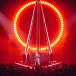
I have, however, seen great examples in real life. The one that sticks out in my mind I was not allowed to photograph. It was a Prince show, two years ago, that was lit by Peter Morse. Morse clearly gets it. His use of light and dark is phenomenal, and given the chance, he will use it to great advantage. In this case he was given the chance because “his purple badness” kept the video crew in check and asked Morse to use as much dark as he used light. And Morse pulled it off like a modern-day Rembrandt.
My own attempts at using chiaroscuro in lighting have met with limited success. My favorite is from a show with Rocketown Records recording artists Watermark, Shaun Groves, Michael Olsen, Ginny Owens and Taylor Sorensen. I set up two 250-watt automated fixtures on the floor off stage right and left and I had two other fixtures back lighting from the floor. When I only used these lights, giant shadows were projected on the wings of the stage.
But it’s not always easy to work in an environment with deep darkness. A number of issues conspire against the adventurous lighting designer looking for chiaroscuro, not the least of which is the proliferation of video. Videots—and I mean that in the best of ways—are trained to work in light, not light and dark conditions. I have yet to work with a video director who asked for less light or more shadows. No, videots like lots of soft light and they abhor shadows, the very antithesis to chiaroscuro.
Then there’s the ubiquitous LED video backdrop, most of which have to be turned down to two percent to keep from completely washing out the lighting. And if the video displays don’t completely kill the chiaroscuro vibe, then the profusion of LED menu displays on the automated lights will. Or the scads of “exit” signs, aisle lights, light leaks or other stray photons. That’s the dark side of chiaroscuro.
For these reasons I believe in a singular approach to production design, where one person is in charge of lighting design, set design and, yes, the integration of video into the design, particularly the video displays and the content. A holistic approach to lighting and video forces the designer to balance every element of the design. It forces us to lose our tunnel vision and focus on the big picture. It makes possible the creation of lighting looks with soul.
Don’t leave the author in the dark. Send your e-mail to rcadena@plsn.com.


