Scenic Designer Jason Sherwood on the Sam Smith Thrill of It All Tour
Sam Smith is currently on the road in support of his second album, The Thrill of it All. The trek marked the concert touring debut of set designer Jason Sherwood. An in-demand theater designer, the NYC-based Sherwood connected quickly with both Smith and creative director Lee Lodge, though he has no music touring background. That lack of credits in music, but extensive credentials in theater, was exactly what they wanted for the very theatrical feel of the tour.
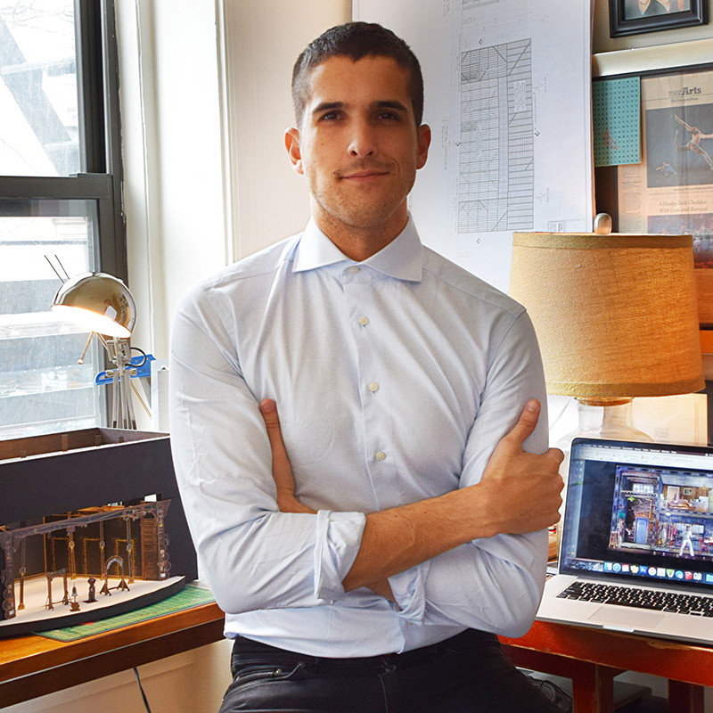
“Sam knew he wanted to work with someone who had a theatrical background,” explains Sherwood. “So Lee Lodge set up some meetings with theatrical designers in New York City, and I was on that list — I think as a bit of a wild card. Sam and I sat down in the spring of 2017 and at that time I brought some pictures. I said, ‘I don’t know what your new album sounds like, but if I were to design something based on your previous music, here are some pictures I respond to;’ and we just bonded. We had a similar sensibility, and we both have a handful of similar interests; it was a nice, easy connection. He is very clear on what he likes and is easy to work with, open to ideas.”
Sherwood was then invited to be on the design team and to meet with Smith again in London. The collaboration would not only encompass the tour, but also a handful of television appearances that led up to the tour. “There were a number of TV appearances beginning in the fall of 2017,” recalls Sherwood. “We did SNL, Ellen, The Late, Late Show, Graham Norton, as well as the Grammy and BRIT Awards. The designs for the TV appearances were allusions to the tour design, but there was nothing literally taken from the tour design. It was a great opportunity build a vocabulary and develop the campaign.”
For the tour’s set design, Sherwood worked closely with Smith and Lodge. “There was a pretty tight look book of what the show, the journey of what the show was going to be before we really involved anyone else. It was Lee, Sam, and I figuring that out. Lee is just a brilliant collaborator and the tight collaboration between all of us on the design team was wonderful. That included Tim Routledge, the lighting designer, and Kate Moross, of Studio Moross, who came in to do the projection design. I had a storyboard for every song with the different elements and how they were going to meld. What I imagined that to be, the textures, everything. Then everyone really came in and brought the design to the next level.”
The Shard and the Circle
“Tim gave some wonderful suggestions, like there’s a moment in the show for a few songs where we lower the lighting rig; we lose the shard and circle completely,” Sherwood says. “We had a bad version of that idea, but then Tim came in and really made it his own, which was amazing. And Kate really honored a lot of the original projection ideas, but then developed them so much further. She developed an idea about handwriting being projected on the shard that became very important and is the walk-in look. What was lovely about it is that I felt like we had a tight directive on what we wanted the lights and the projections to do within the overall look and then as collaborators, Tim and Kate came in and just took it to a whole new space that we hadn’t imagined, a space that was so much more beautiful and so enhanced by their imagination.”
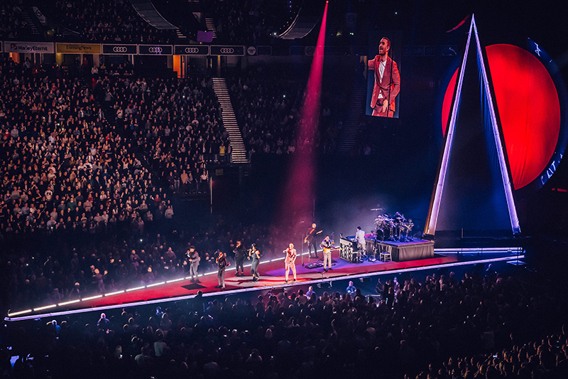
For the set design itself Lodge, Smith, and Sherwood wanted to create something very intimate, something deceptively simple. Smith is known for his soulful sound and Sherwood wanted to capture his connection to the music. “I wanted something that would really bring the focus to Sam at all times and really focus on the music; holding it in a sculptural or abstract way,” states Sherwood. “The word we always used was intimacy. Right off the bat, we knew we didn’t want to do an end-stage tour where you have a 40-foot by 60-foot stage at one end of the arena. We were dealing with a unique seating plan on the floor. The stage is shaped like a very thin triangle; it juts about 100 feet out into the middle of the arena. Sam is on, essentially, a very thin thrust. It’s almost like a runway that he can go up both sides. What became exciting was that we created an opportunity for something like 300 additional front row seats than you would normally have.”
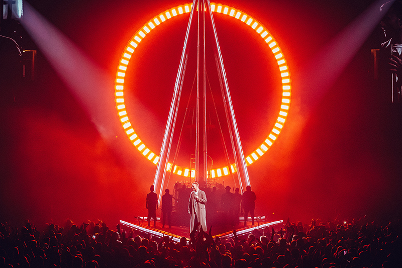
The striking visual elements of the scenic design — which include a 50-foot-tall shard shape that opens up into pointed wings and a large circular disc upstage measuring 39-feet in diameter — support and reflect Smith’s audience-connecting performance. “The first thing I said to Sam at our lunch was that his music often feels like a person standing alone singing out into a void; waiting to see if he’ll get a response back,” says Sherwood. “There’s this loneliness; this isolation to the songs. We started talking about lighthouse imagery. We started exploring the idea that you would see Sam at first in silhouette only with a single point of light, like a lighthouse. Throughout the evening, we wanted Sam and his music to reveal itself to the audience; to invite people to be a part of it. So, the structure itself peels away and opens, in a literal way; reveals itself, until at the very end it’s this gold tower. Sam ascends the staircase for one last moment of intimacy. He gets closer to the stalls’ audience than he normally would. And so, it’s about that peeling away those layers and the revealing of a precious thing.”
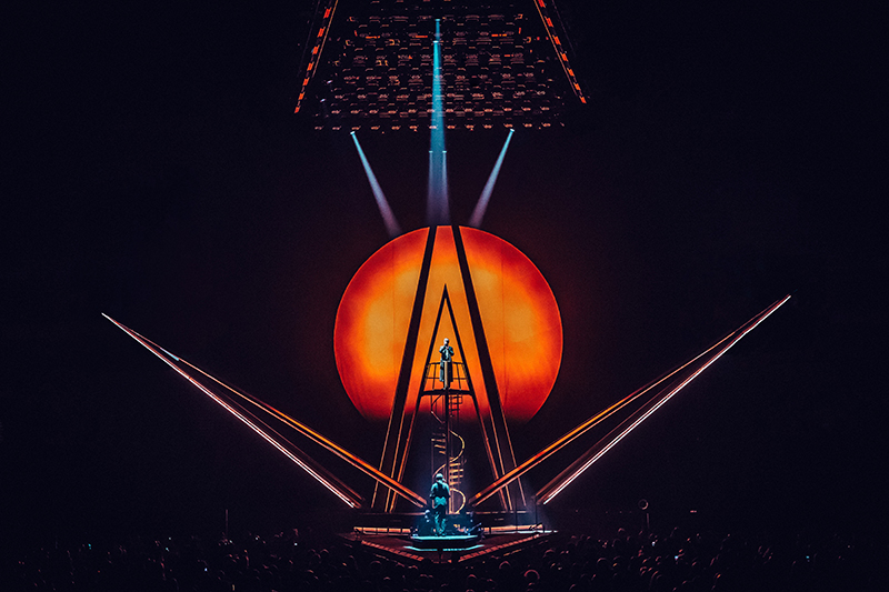
Seamless Design and Execution
Sherwood continues, “On top of the idea of the design of the shard was the question of how to create something that would feel very elegant and slick; not too utilitarian, but that would break apart and be tour-able. Brilliant Stages, in the U.K., built the tour, and everyone was very, very aligned on the objective that the finishes and seams had to be perfect. The fabrics that we used were replaced throughout the tour so that they always felt fresh. There are six kabuki elements in the show; fabric panels that are inset in that shard structure that rip away. So, it was really all about how the elegance and the simplicity; the control of the design that would tour and maintain itself so that it wasn’t like, ‘Oh, we had a beautiful idea, but in order to stand it up it needed all this ugly infrastructure.’”
Working along with the production manager for the tour, Wob Roberts and the team at Brilliant Stages, Sherwood’s idea is anything but ugly. The shard structure — in the middle of the show — elegantly opens up and cantilevers out over the floor audience. “Those triangular sail pieces are 50 feet tall,” Sherwood comments. “We wanted them to suspend out, over the audience without a visible cable pick point. There’s actually no pick point at all, not even an invisible one. Brilliant Stages engineered these incredible geared mechanisms in the bottom of each of those sails. It creates an arm that extends out over the audience that holds all the weight at the base. They move perfectly and smoothly every single time. It’s just a magnificent piece of engineering because it’s a basically a big sail that’s got a whole ladder rig and then it moves forward with the whole thing’s weight redistributing as it goes. The arm has to be controlling a new factor of weight all the time. It opens beautifully, like a flower blooming. And then it closes back up, and then it opens again, and then it closes yet again. It really is a fantastic feat.”
Sherwood credits Brilliant Stages with helping him through the fabrication and build process for this, his first concert tour. “The support of Brilliant Stages was incredible. I was nervous about the project but everyone was so willing to accept that I was going to approach it differently. They were very, very collaborative in that way, and really did an incredible job pulling the set off. I mean it’s consistent, it’s beautiful, and it’s exactly what I wanted.”
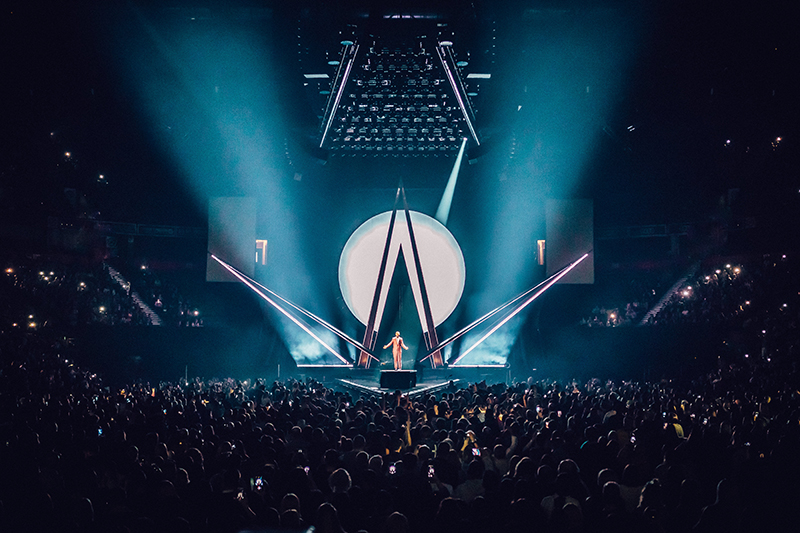
The other major scenic element is the large circular disc upstage, which had been in the design since Sherwood’s first storyboards. “That element was doing three major things,” explains the designer, “it was a large disc like a light box, then it had a ring around it that is an individually — and separately — controllable light box, and then a blast of light from behind that we called the ‘eclipse’. Tim and I worked very, very closely on the design of the ring and the disc. I didn’t know how we were going to make all these elements work, but Tim came in with so many wonderful suggestions and then as a team we set about figuring it out. And then there is Kate’s projection work. A lot of people come to the show and don’t even realize that projections are being used, which is to her credit in a wonderful way. Basically, there are textures and images on the shard, and it’s affected by the disc piece. The shard begins in an icy, very cool state, and then as the disc grows behind it, it morphs. The disc’s effects shine onto the shard; so, there are these subtle moments of relationship between the two. I really like the interplay between those two major elements.”
Sherwood is excited to do more in the world of music, but it must be the right fit. “I’m just not going to be the designer who does a giant screen and fabulous screen content,” he says. “What I loved about Sam’s music, was that I loved it before I even met him, and it felt emotional to me, and I had a connection to it. It’s the same with a play or anything that I do, I want to be able to connect to it, and I want there to be a theatricality and a live-ness to it. I want there to be a tactile element to it. I will say that this was a really lovely process all around. I’ve been told, having been my first time, that I’ve been spoiled. I certainly feel that way because it truly was a dream project and collaboration with the whole team.”
Sam Smith’s The Thrill of It All tour is set to wrap up at the end of November in Australia.
