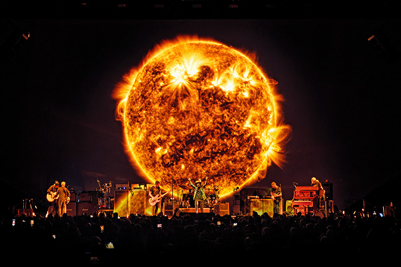
Pearl Jam is back on the road with its Dark Matter World Tour 2024 with a production design by Spike Brant of Nimblist, lighting design by Kille Knobel, and video/screens production by Rob Sheridan. The three creatives shared their thoughts with PLSN on this engaging production which brings more video to the band’s performance while still remaining true to Pearl Jam concert. Each of them speaking about working on this very organic production to take us behind the design, sharing their insights in their own words.
SPIKE BRANT
Production Designer/Technical Producer, Nimblist
Kille and I have worked together on Pearl Jam’s design for over ten years. Eddie [Vedder] made a connection with Rob Sheridan, so they they developed the high-level creative direction focused on the look and feel of the projected video content. It was important to the band for the existing team to work in collaboration with Rob, which has been key to the success of the design. The band desired a minimalist, stripped down approach, bringing video to the forefront..They focused on having a clean stage — something they’ve been working toward over the last few years. As a result, we have our very first custom TAIT stage, allowing us to hide the monitors underneath the stage.
Video-centric
There is a strong visual design element associated with the new record, Dark Matter, which is a big change. The band released a visualizer as part of the album to go along with the music. For many years, Pearl Jam has played 360° shows, but with this video-forward design, the onsale was adjusted to go 180° straight across the upstage edge. Ed wanted the audience to have a clear view of the screens; he didn’t want to compromise this experience for the sake of selling more tickets.
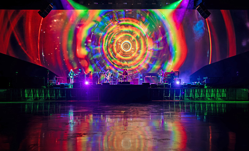
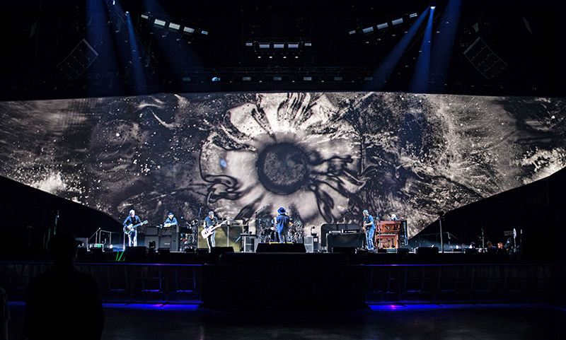
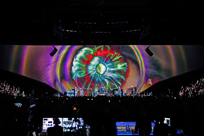
The band wanted a large, immersive canvas, and so we had conversations about the pros and cons of LED vs projection. Since the band is very organic, a big LED wall just didn’t make sense, so that pushed us towards using projection on a giant canvas. A lot of really practical elements drove the shape of the screen based on a study of multiple venues. We came up with a fixed shape for the backdrop that would work in almost all the arenas. Even with our goal of minimalism for the show, we still ended up with 140 points of rigging, including hanging a massive projection surface extending over the seats. Initially, we were leaning towards a leno-filled scrim, but it wasn’t an option for the massive size we needed. In the end, we ended up with a 150’ wide seamless gray muslin plus legs. It’s 35’ high in the center and tapers down to 20’ high at the edges. The drop was built by Sew What? Inc.
The trick is to fly it as one piece, so SGPS took their triangle track truss and made a custom hinge that folds upwards like an F-14 plane on an aircraft carrier. You build the three pieces, put the drop on the carriers just on the center section. When you take it up to trim, it’s flat, so that you can pull it straight, stretch it from the top, and then put pipes in the bottom and tag it off. Once it’s up, it stretches out quickly, never having to drag the drops over the seats. It gets loaded and struck from the center. For projection, we went with three sets of triple-stacked 40K projectors. We do all the convergence inside the projectors and the blending is in the Disguise media servers. With the gray fabric, the black levels were on point and the images look great.
Blending Lighting and Video
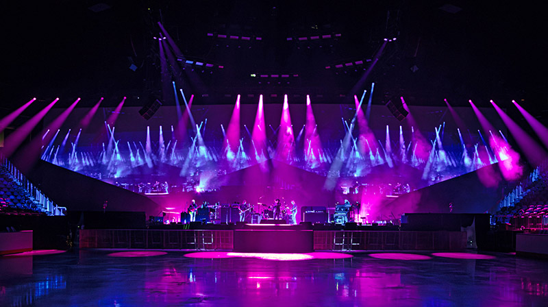
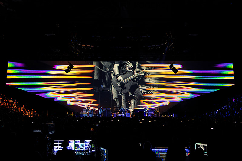
The lighting is super-efficient, minimal, and utilitarian. We wanted to be able to control the audience lighting because of the projection. From the moment the doors open, the venue house lights are off. We’re carrying over 250 ft of 12 inch truss with ACME Thunderbolts in the front of house, that we’re using as house lights giving us complete control. All these ingredients play nicely together and make for beautiful images. The projection has a very soft organic feel, which is exactly what the band was looking for. The projection is very easy on the eyes and the lighting doesn’t blow it out as much as one might have thought it would. The content appears soft and gives you the opposite effect of LED where everything is sharp. It’s very forgiving from a content perspective. The Dark Matter album was foundational to Rob Sheridan’s content. He created pieces as fully composed videos with minimal support lighting. The projectors act as a key light with everything blending together.
A Show in Five Chapters
The band wanted to tell a story in five chapters, beginning with a faded red velvet curtain projected on the screen when doors open. The curtain stays for the opening act, where their logos are projected onto the curtain. When Pearl Jam is ready to go on, the ‘house lights’ go out and the curtain ‘opens’, as the band walks onstage. The first chapter is super minimal and restrained: no video, just a simple hemisphere of light across the back, classic Pearl Jam. They start low key and play in silhouette. Transitioning to the next chapter, five old-school Mole Richardson 2kW Nook lights cast shadows of the band on the backdrop.
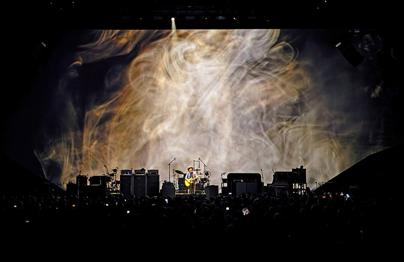
The second chapter is a section of Dark Matter songs. The lights are barely on, just supporting key light, little accents letting the content drive the visual story. Very minimal I-Mag as well. For the third chapter, we’re into old-school Pearl Jam, which is very lighting-forward. Blue Leach’s cameras come in strong, and we’re using the backdrop like an old school cyc with solid colors, gradients and even some gobos. Here, the lighting takes lead along with Blue’s cameras. Chapter 4 dives back into Dark Matter songs and now cameras are integrated with the content and the lighting is a little stronger. The last chapter before the encore is bigger and less constrained. Who knows what they’re going to throw into the set list at this point. They come back for the encore and the actual venue house lights come on and everything is stripped away with the large camera feed on the upstage screen. The whole show is a journey, and it’s constantly evolving and changing.
Vendor Support
Upstaging was a great partner as always. Dan Curley [Senior Project Manager] and the Upstaging team understand how to package a show for touring. Our Lighting Crew Chief was Mike Green, one of my all-time favorite crew chiefs.
Ben Johnson at Fuse let us test our proof of concept at their shop in Vegas. Sew What?Inc had the resources to get us exactly what we wanted, and Andrea Fraser was a patient shepherd during the design process.
From the Nimblist team, our Technical Designer Jonathan Hollinger coordinated with every department to make sure each had their needs addressed with solutions incorporated into the drawing to make it as accurate as possible. He produced a drawing set for almost every single venue. There’s a lot of work involved figuring out how to fit everything with all the audience rigging. Nimblist’s Andy Philpo created all the detailed visualizations and renderings. To get all the programming done, we had three great programmers—Eric Marchwinski set it up, with Will Flavin taking over, and then Mark Humphrey joining for a week at the end to get it all finished up. It is a fantastic show, collaborative and one that keeps evolving; in other words, very Pearl Jam.
KILLE KNOBEL
Lighting Designer/Director
In terms of the design aesthetic I was going for, I would say—simplicity. Obviously, because of the projection screen I had to design a rig that was all in one plane except for some floor lights. That was challenging but an exciting thing to be faced with as well. In the past, Pearl Jam played a different set list every night, and they also changed things on the fly and cycled a lot of different songs through. Most of the show is different night to night, even though going into this, they really wanted to emphasize the new album. So, I knew they were going to play the new album consistently. Also, they’ve never been a band that’s visually aggressive; never a super flashy show with a lot of visual noise. They’ve always liked an inherent simplicity. Their whole philosophy is music first, let the music stand on its own. When all’s said and done, I’ll have anywhere from 60 to 80 songs in the desk, to navigate the scope of what they play.
I take a little bit of a different approach to busking, I prefer to use songs that I’ve programmed to busk with because they’re more visually composed. In the past, there was a lot of visual diversity in the shows by just relying on simple things like moving trusses. I could do simple moves with the truss and create a totally different environment. Going into this show, I couldn’t depend on any of those old sorts of tricks, now there’s this whole new element in the show. I knew the show was going to be predominantly projection forward and we wanted to make it very cohesive and integrated. It was a relief in some ways—projection in some songs is going to take the lead, and lighting in some songs is going to take the lead. I did have to think, ‘How am I going to design a show that feels different when everything’s just all at one trim level essentially?’ So, I have a lot of different paintbrushes in terms of fixture choices.
Key Gear Choices
A lot of it I knew would come from just how I choose to use the rig. When I thought about the fixture choices I wanted for the show, I chose lights that either could do a lot of things or were powerful non-sourcey wash lights. The band wanted washes, just nice color washes. I didn’t want to do traditional wash light, which is why I used ACME Thunderbolts in the rig, both for all the audience lighting, as well as stage lighting. Spec’ing the [Elation] KL Panels worked out great. I wanted a light box effect from them, similar to something you would do on a film set to create very dispersed light. They are a gorgeous source with some of the best mixed color I have come across. Those KL Panels really ended up being a great tool to give the band what they wanted in terms of washes. There’s no song where all the fixture types are on at once. When it’s a very projection-forward song, the lighting’s incredibly minimal, like for most of the new material. I don’t turn the rig on at all except for key light and I light everything from the floor. I’m using Follow-Me for the remote followspots, which I’m a big fan of. Upstaging has been behind Follow-Me for years. Upstaging, I think, is second to none in terms of supporting that product and the level of expertise they have in-house. Because of them I was an early adopter of Follow-Me and we’ve done some complicated things with it in the past. Upstaging’s ability to support that product has been excellent over all the years.
Vendor Support
Upstaging has been our vendor for years, and they’ve always been outstanding. The gear is always pristine and well cared for; Upstaging does not cut corners on the details. If we try to MacGyver some solution with Gaff tape, pipe, and a Cheeseborough, they’ll say ‘no, we can build something for that.’ They don’t want to have any janky solutions out on tour. I’ve had a long relationship with John Huddleston, and now Dan Curley as our Project Manager; nothing is ever an issue. We couldn’t be happier with the support we get from them.
And I have to say, Upstaging always sends out a top-notch crew. And what an incredible crew we had this time. It’s always hard between runs, because we don’t go out for very long, so it’s hard to pull crews together for four or six weeks. So, to Upstaging’s credit, they still managed to pull these A-teams together when we have these unconventionally scheduled tours. The crew for this last leg was just outstanding; every one of them got along personally and professionally, and they worked tirelessly. I cannot take credit for the success of this tour without acknowledging I’m only as good as the sum total of the crew that Upstaging sent out. My Front of House Tech, Dallas Sisson has just been a gamechanger for me in terms of managing the complexity of this show and keeping everything organized. Plus, we had three all star programmers for this one—Eric Marchwinski, Will Flavin, and Mark Humphreys. Eric has programmed Pearl Jam with me for 13 years, on and off. It’s a very unique show file in terms of how I punt, so building the architecture for that is complex; it’s a real throwback to how I used to punt on the Icon console. Just a big shout out to the crew.
Cohesive Collaboration
Spike and I have been working and collaborating together for years, we’re pals but as well as colleagues. We are always pushing each other to be better designers. While we respect each other’s autonomy in our respective areas of expertise, we both have our hands in all aspects of the design growing it from a cohesive place. The internal vetting process we put our decisions through can be exhaustive and at times comical to witness I am told because we both have the “sweat every detail” kind of personalities. Having Rob Sheridan involved as a new collaborator on this tour has been so invigorating and exciting to our process. Stepping into a long-established camp has to be so daunting, but Rob should teach a master class on it. The band was heavily involved in the planning of the design and Rob’s ability as a total newcomer to interpret their input and vision was uncanny. He’s a wildly talented artist with a delicate touch. The band could not have found someone more perfect to lead us down the path of integrating content for the first time into a Pearl Jam tour.
ROB SHERIDAN
Creative Director, Rob Sheridan Productions
Pearl Jam had never had video content before, so when I joined this team that had been defining the lighting look of Pearl Jam’s shows for years, the most important question for me was, “How do we bring video art into a Pearl Jam show tastefully, without taking anything away from what a Pearl Jam show is?” This is one of the best live rock bands of our generation, and the experience of seeing them play is a very strong human connection. I didn’t want video to overtake the band or become the central focus of the show; it had to strike a balance.
When I first started talking with the band, they had this new album, Dark Matter, which had a lot of cosmic themes accented by some beautiful album art created with long-exposure light painting. You could really feel the energy of how enthusiastic they were about this album, and they wanted to present it live in a different way that framed it as something special. So after spending some time with the band and the music, I proposed a vision of conceptual, organic visuals jumping off from the album’s cosmic undercurrents into an abstract world of elemental light. Pearl Jam really embraced my avant-garde approach of non-literal imagery and non-linear storytelling that would bring another layer to the new album and allow the band to play sections of it together, as a presentation. I began creating video art pieces that formed the core of the “Dark Matter” presentation, and peripheral content bleeding off of it that could become textures for other parts of the show with live cameras blended in.
Adding in the Video Content
On top of the conceptual challenges of bringing video into Pearl Jam’s show, there was the very practical production challenge of transforming a long-running 360° stage format into a more traditional 180° setup. Kille and Spike had to go back to the drawing board, everything had to start from scratch. Kille had to rebuild all her cues and she and Spike had to look very differently at how to light the band and present them. But having to wipe the slate clean in that way really helped make it easier for us to integrate this new video element holistically, as a team. Spike and Kille have been fantastic to work with. They really understood the unusual vision of video being a very organic presence in the room that sets the stage for the band. It’s not a big spectacle to surround them and overtake them, it’s more about creating a beautiful set for them to perform in. A big part of that was using projection to bring analog softness and a real tactile feeling to the backdrops. When I think of Pearl Jam, I don’t think of big, bright, cold LED screens; I think of warm incandescent light. It’s not super common to have a big front projection screen at an arena rock show these days, but it felt very Pearl Jam to me. Spike was up for that challenge, and it was cool to have so much enthusiasm from the whole creative team. On lighting, you simply don’t want anybody other than Kille for Pearl Jam; she’s the heart of the show and knows all their songs intimately. Plus, you have [Video Director] Blue Leach who’s been doing Pearl Jam’s live cameras for years. On previous tours, Blue’s footage was displayed on traditional dual I-Mag screens that were disparate elements from the stage. For the Dark Matter tour, we centered the production by disposing of I-Mag screens and incorporating live footage directly into the imagery on our backdrop screen.
Bringing the live feeds into our main canvas gave us the freedom to design where live cameras appear on the screen, when they come in and out, how they’re stylized, and how clearly the band is featured versus when the band becomes more a part of the background texture. We put together an extensive toolkit of masks, blend modes, and real-time video effects to make the cameras a dynamic part of the creative vision that make every set piece completely unique every night. And crucially, the live cameras help us strike that balance we were all seeking between a conceptual visual presentation and a show that is first and foremost about an incredible live band connecting with their audience. For certain songs, we have carefully designed video art pieces that are more immersive for the audience to get lost in a conceptual experience; then other times we just have a gradient of light as a backdrop and big live camera feeds where the audience can really see and feel the band’s performance, and also often see themselves – to heighten the live human experience. Blue’s directing is key to how the cameras form that connective tissue, he’s been extremely involved in that integration. The whole production has been a unique collision of creative elements from several different directions, which has made for a visual canvas as diverse as Pearl Jam’s set lists.
Experimental Filmmaking
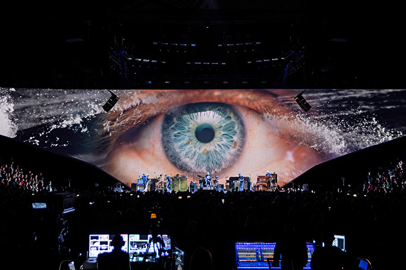
For the creation of the original video art pieces, I proposed an unusual approach that the band was very supportive of. Rather than rigidly define a set number of precise “content pieces,” I wanted to be able to spend time following inspiration and amassing a large library of textural elements that the video pieces could emerge from. We set up a laboratory of experimental filmmaking with a very lean crew for a few months here in Tacoma. We used a cutting-edge 1000 frames per second (developed by local company Freefly Systems) and macro lenses to capture organic interactions of liquids, chemical reactions, light refractions, and other elemental worlds invisible to the naked eye. We then brought those real filmed elements together to create unique abstract art pieces for each song, with very minimal use of CG, that felt right for Pearl Jam; very analog, tactile, oldschool. The slow-motion camera allowed us to sit in these spaces of light or water or fire and just gradually discover all these slow, elegant moments unfolding within them.
After we finished principal photography, I spent two full days sitting with Ed [Vedder] and Jeff [Ament] looking through the video pieces, seeing what directions inspired them, talking about which visuals might go with which songs. They were thrilled and inspired and phenomenal to collaborate with. There was one piece I showed them, of a very slowly moving ocean wave, which I’d turned upside down so the wave warped the surface of the water in such a surreal way that you don’t even really understand you’re looking at an ocean until this huge wave crashes across the screen. Ed saw that clip and said “play ‘Wreckage’ over that.” We hit play on the song as the video clip played, it wasn’t aligned at all but it just happened that the big crashing wave landed perfectly with the music. The timing was so perfect, Ed and Jeff said “that’s it, that’s ‘Wreckage.’” So that became one of my favorite parts of the show, this one long still clip that plays without any cuts. It’s a real slow-burn tension and release kind of thing, a very avant-garde way to present a new rock single at an arena concert, but it works so well, and it came out of a true spark of inspiration with the band.
Teamwork
I made all the video content with a very lean team and thankfully my producer Stephanie Sheridan, who is also my wife, did an incredible job putting all the filming, materials and crew together locally at our studio. It’s been fantastic working on this tour; it’s an incredible team, the band, Spike, Kille, Blue; everyone involved is just really passionate. Everything was very holistic, hand-crafted, and organic in the way it was approached. You couldn’t ask for a better situation to go into, with people who are devoted to their craft, to the art that we’re all producing musically and visually, just top tier on every level.
VENDOR VIEW
Upstaging
Dan Curley, Project Manager
On the challenges/solutions for this production and how Upstaging addressed them
One solution we were tasked with was how to cram a lot of lights into five clusters. Luckily, we have a lot of pods at Upstaging, and we were able to utilize some 4’x10’ pods for this purpose. Designers Spike Brant and Kille Knobel came back to us with lights jammed in them, sticking out the sides of them and even poking up out the top. Another challenge, but something that we are used to, was that since there was going to be a large rear projection surface running from the 200 level balcony across to the other balcony side, every cable in the air had to go up and over the screen to backstage. This required a lot of choreography and coordination, especially since we were providing rigging for all departments as well.
Also, Kille and Spike requested the ability to get a little more spread out of the ACME Thunderbolt LED strobe/wash lights. They were going to use them to light the entire arena, from walk-in to walk-out (no house lights on this one), and all the audience looks in between. Trying to frost an LED wash is a challenge, but we settled on a film made by Rosco to get the spread to 60°. The arena ends up being evenly and well-lit with not as many fixtures as one would think it would take to achieve that.
On supporting the creative team for this tour
This is a great camp to work with and we are proud to be partners with them over the years. Kille is the momma bear of the lighting team, and we love her for being just that. We started this process off by hosting a fixture shootout in Los Angeles for Kille to see a range of fixtures. Elation’s Proteus Maximus, KL Panel XL, and ACME Sunrise Beam Wash for the stage, and the ACME Thunderbolt to light the audience were the winners from it. Truck space was also a major driving factor in how big the system could be. We were able to use our proprietary truck pack program to show Spike that we could fit all that they had drawn into the allotted trucks for lighting and rigging.
On why Upstaging was the right vendor for this production
This Pearl Jam tour is a great example of how knowing your clients is the key to success, for both them and for us. Knowing the designer’s quirks, what they like and don’t like to see, we are then able to correct things in the shop before it can even get to a punch list of fixes at rehearsals. At Upstaging we listen to our clients to understand what they want and we pay attention to the smallest details so there are no surprises when it leaves the shop.
PRODUCTION TEAM
- Production Manager: John Lafferty
- Production Designer/Technical Producer: Spike Brant, Nimblist
- Lighting Designer/Director: Kille Knobel
- Lighting Programmers: Will Flavin, Mark Humphrey, Eric Marchwinski
- Creative Director: Rob Sheridan, Rob Sheridan Productions
- Video Director: Blue Leach
- Screens Director/Programmer: Grant McDonald
- Notch Programming: Andy Babin, Hayden Katz
- Video Engineer: Jack Hunter
- Projectionist: Ed Moore
- Video Crew Chief: Robert Behounek
- Server Tech/Op: Brittany Mena
- FOH Lighting Tech: Dallas Sisson
- Lighting Crew Chief: Mike Green
- Lighting Crew: Brendan Langord, Adam Morrison, Zachary Boebel, Luke Dobson, Emilio Aguilar, Maya Hughes
- Head Carpenter: Michael Gomez
- Head Rigger: Davy McCready
VENDORS
- Lighting: Upstaging
- Video: Fuse Technical Group
- Content: Rob Sheridan Productions, Joy Bird Studios, Warm & Fuzzy Studios
- Soft Goods: Sew What?
- Staging/Set: TAIT
GEAR
Lighting
- 68 ACME Thunderbolt
- 38 ACME Thunderbolt Barndoor
- 28 ACME XA-1200 BW Sunrise
- 1 ACME XP-550 Scorpius
- 14 Ayrton Domino-S
- 5 Ayrton Domino-LT
- 18 CHAUVET Color STRIKE M
- 38 Elation Proteus Maximus 2.0
- 15 Elation KL Panel XL
- 6 Martin MAC Aura XIP
- 10 Martin MAC One
- 8 Mole Richardson 2kW Nook Light
- 1 Follow-Me System Remote Followspot System
- 2 MA Lighting grandMA3 full-size
- 2 MA Lighting grandMA3 Extension Wing
Video
- 9 Panasonic 40K Laser Projector
- Disguise Media Server
- Sony FS7 Camera
Atmospherics
- 2 Master FX Mystic 2 Hazer
- 2 MDG Atmosphere HO Hazer
- 4 Elation Magma Fan 1
- 6 Reel FX RE Fan 2
- 4 22” Half Mirror Balls


