Step inside the Gritty World
Immersive Everywhere, the UK company known for successful immersive theatrical experiences including Doctor Who: Time Fracture are back with Peaky Blinders: The Rise. Much of the creative team from the Doctor Who experience also return including Creative Director Tom Maller, Production Designer Rebecca Brower, and Lighting Designer Terry Cook. For those not familiar with Peaky Blinders, it’s a TV drama based in 1920’s Birmingham, England that chronicles the gangster family, the Shelbys. Audiences for this immersive production follow the gang’s boss, Tommy Shelby on his rise in taking over London. The production takes audiences to numerous iconic locations from the first two seasons of the show. The worlds of the show are created by Lighting Designer Cook, partner/principal designer at Woodroffe Bassett Design, and Production Designer Brower, principal of Rebecca Brower Production & Stage Design. With the recent opening of Peaky Blinders: The Rise PLSN spoke with the designers about the creative solutions of doing immersive theater.
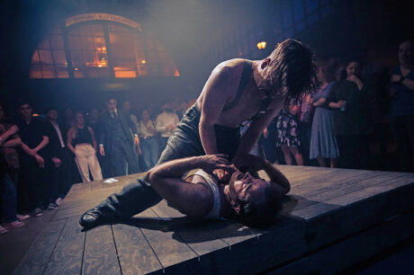
Cook On the Lighting
Tell us a bit about the importance of lighting in an immersive environment and specifically about your approach for Peaky Blinders: The Rise.
I’ve been doing immersive theater lighting since 2014. When I first came into it, I really thought the 60W light bulb in the corner of a dark room was the way to approach immersive lighting. I very quickly learned that wasn’t the way to work. You really have to push yourself and you have to think across multiple genres, more theatrical style lighting, television and film lighting, as well as live music. Also, architectural lighting in many ways, because as an immersive lighting designer, you’re often in an abandoned warehouse or a derelict building. You have to light the prettiness, or the ugliness of the building, as well as the actions that happen within it. I have now done a number of immersive shows with Director Tom Maller, including Peaky Blinders: The Rise.
Tom and I sat and started by discussing color. I explained that in the TV show a lot of it really sat in daytime when you’re indoors and then nighttime when you’re outdoors. There was a lot of reflective light through windows, and a lot of naturalistic lighting coming through windows that seemed overly bright. So, that was the forefront of what we took into the design. Then we had a really good meeting with Rebecca Brower. This is our second show together, the first was Doctor Who: Time Fracture. During that process of designing Doctor Who, Becca and I realized that actually lighting and scenic often are not treated as one and it was really important to us that we did treat them as one. One really helps the other. We established a working relationship on Doctor Who that made Peaky so much easier because we trusted each other. We trust that both of us remember the importance of the whole design from floor to ceiling; we are together trying to create these complete worlds.
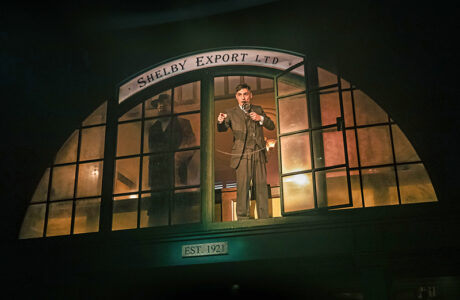
With Peaky she had a very clear idea of what scenic we were going to get from the TV show itself, and what we were able to do within our Grade II listed building, which meant nothing can be permanently fixed to the building itself. All of our lighting installation; the power installation; the sound; the scenic, is all temporarily fixed within the building so we can remove it and the building can return back to its original use, which was an old horse hospital. Becca and I went space by space, and one of the first things that we talked about was the window lighting. We realized that in our venue, we didn’t have a huge amount of windows. So, we’ve created them with a number of light boxes around the space. Actually, the biggest compliment is that people think when they arrive, they’re looking out of a natural window. That is because we’ve color matched to rough time of day of arrivals and that sort of fools the audience into thinking that it’s real. Then as we get into the show, with the arrival of Tommy, that’s the first time that we really take our world from the naturalistic world into a much more saturated color.
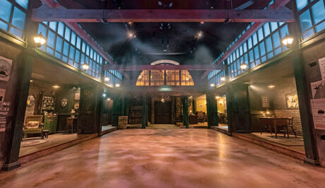
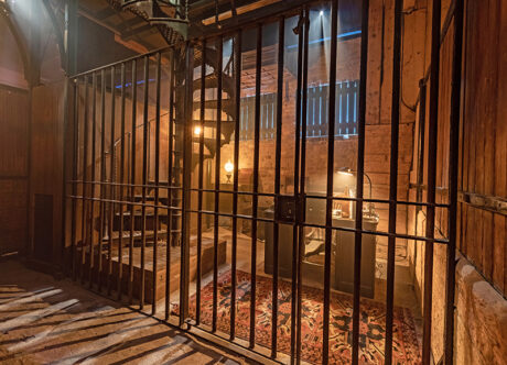
The other big important lighting decision in Peaky Blinders was the practical lighting. It’s the first time on any immersive show where I’ve designed the show around the practicals and then gone back and filled it in with the theatrical lighting. I might put a special in a doorway, or in a box here or there, but actually what’s really important to me, was that in every room there was something true and real to the TV show. Like, in Tommy’s office we managed to get all the practical lights from the TV show. Unbeknownst to us that in the TV show, they never actually lit up. They fired lights off camera into them to be able to balance them. So, of course, we then had to make them electrically safe because I wanted them to light up. That was a bit of a challenge. The lit practicals end result means that you walk into a room, and you are utterly convinced that the light pouring through the window is real and the chandelier above the desk is what’s illuminating the room. In the corners of the room, the theatrical lights are hidden behind books tucked up out of the way. We found some exhibition LED fixtures that are the size of your thumb, that we could hide behind things so that an actor can just walk into a position and their faces are illuminated but we’re not blowing the overall look out. When the audience looks up, or looks around, their minds need to be completely transported. The use of the practical light source is doing a lot of that work and you hope that no one notices the lighting rig out of the way. I work really hard on creating that with these immersive shows.
Of course, when you are within an immersive environment, where the audience is literally standing on the stage within feet of the actors, you have to approach it very, very differently from a stage lighting show. If I want to create a dark scene, I actually need three times the amount of light that I would in a theatrical show, because it has to be safe. The audience still has to be able to travel from A to B completely safely and actually see where they’re going. So, if you want it incredibly dark, what you end up doing is using more fixtures, zooming them right in, and then running them at a lesser level, meaning that there’s less bounce, less bleed onto other things, which is really important in the immersive world.
Is lighting used to actually move the audience through the narrative at times?
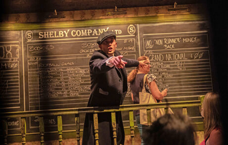
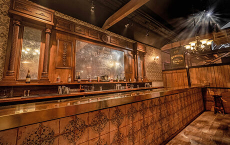
Yes, but not in the way that you would think. Of course, there’s moments where we might illuminate a particular area as action might happen over there and an audience will drift there, but actually we use lighting almost as cue lights. The show caller is able to trigger some lighting cues that give the cast information, a window might change green to say hurry up, or the next moment’s ready. The cast will see that, and they will then respond accordingly. There’re no traditional cue lights, in theatrical terms, that the cast can see so the lighting cues are a subtle way to adapt and tell the cast what to do. A really good example of this in Peaky is that we actually have three endings of the show, and the audience chooses which ending. It’s about the amount of money stolen during the show. The show caller triggers a cue list and, in the bars, some of the bar lights go red, or they go green, or they go yellow, depending on the ending option chosen. The windows do the same in one area where there’s actually a boxing match happening at that point. This lets all the cast know the choice without being told, and the audience have no idea because it is a small light change in the corner of your eye. You just don’t pick up on it in an immersive world the way you might in a theater show.
What’s one thing you would share with other designers who might be tasked with working on an immersive production?
Research, research, research. Peaky, I knew inside out because I was a fan of the show, which made it so much easier creatively to get behind. Of course, as a theatrical lighting designer, the first thing you do is pick up the script and read it, or if you are doing an immersive show, you watch the TV show or the film. If it’s a concert, you listen to the music. We all know; we all do those things, but if you really do the research and know the world of the story inside out, it just makes all the decisions so much easier. Also, I would say storyboarding. That is something that I do in immersive entertainment. It really gives you a framework to work with and it helps you decide the direction that you’re going in before you even put pen to paper for a kit [gear] list and then a drawing.
What I have learned since all the way back from my very first immersive show, The Grand Budapest Hotel for Secret Cinema, is that where you earn your money as an immersive lighting designer is making people believe that it’s utterly real and that they are in an actual world, and you work really hard to never break that world.
Brower On the Production Design
Talk about your approach to the production design for Peaky Blinders: The Rise and the unique considerations of scenery for an immersive environment.
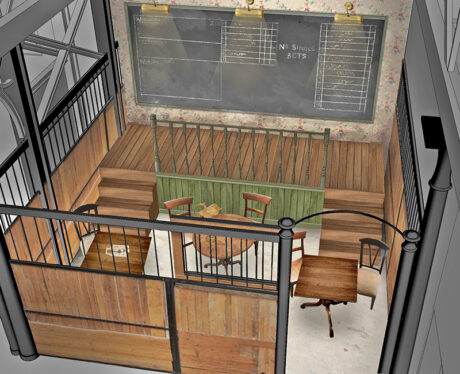
Something that is unique to immersive theater is certainly the audience being right on the set. Normally, when I’m doing a theater set, the audience are not touching the set; they’re a good 20 meters away. I can be clever with the materials I pick and the choices I make. With this, I can’t do that because the audience is right there, they can touch it, they’re standing on it, and they’re feeling it. I try and make different material choice decisions, making sure for example, brick work is a solid form of brick work instead of something that I would use in a theater such as a vacuform. I try to make sure all of the doors and hinges, all those tiny details that you take for granted when you’re designing a theatrical show, that here they are all real. They’re everywhere you look those details. Also, I have to be careful, because every door can be opened, so I need to be mindful of what’s behind all the doors. If I don’t want an audience member to go there, it’s got to be a properly locked door. Every surface becomes important down to the surface that you are walking on under your feet; to the chair that you are sitting on; to the giant safe that you are opening; and to the wall that you are touching next to that safe. Also, I have to say the art direction and props teams were really who brought those empty shelves that I created to life. I put together references of what we wanted the inner workings of these rooms to look like and then they would find those elements. The whole team were just fantastic in getting into this one, along with our scenic artist teams, and our carpentry teams.
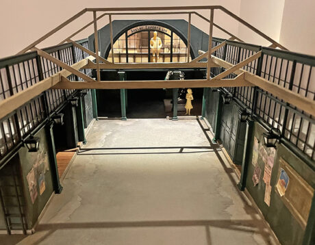
For the overall production design for Peaky Blinders, for me, this was much more site specific than a lot of my other work. It’s quite a rare thing to be given a venue that’s so incredibly period-accurate and has the look and feel of the actual show that you’re portraying. Normally, I’m given an empty building that I have to literally put floors, walls, and ceilings into to hide every inch of the building to make it match the IP. This space was amazing—a Victorian era building in Camden Market. Half of my work had already been done. There are loads of amazing hefty wooden beams, big steel reinforced girders, and all brick walls and cobbled floors, which I knew I wanted to highlight. I wanted to make sure that I used the architecture of the building instead of completely covering it up.
One thing that I do, whenever I’m designing a show like this, is try to really make sure that all of the technical elements are integrated as best as possible. I worked with Terry much earlier on in the design process for an immersive experience because we want the audience to feel as immersed as possible, so integrating the lighting is integral. Terry and I worked closely to make sure every single one of the rooms just felt and looked really realistic. Peaky Blinders, being such a dark take on post first World War, meant that we could keep all of the light levels really low; light the majority of the spaces with practicals. My art director [Ryan O’Conner] and I scoured the UK looking for the needed practicals; then we would go back to Terry and his team and say, ‘How do you like this pendant? Do you think this glass top will work?’ and so on. We’ve got some really amazing giant chandeliers. Getting to choose those and understanding what they would do to the space, both visually and from a lighting perspective, was really interesting and exciting.

What are some of the accommodations you made in your design to help move the audience through the narrative?
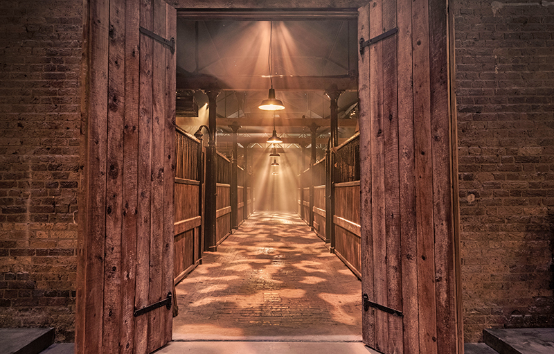
That’s very much a collaboration between myself, the Creative Director Tom Maller, and the rest of the production team. We have an amazing beginning to the show where we knew we were limited for space in this venue. It wasn’t as big as some of the other venues we worked in as a team before, but we wanted to make sure our audience felt like it was big. So, we hide the central room, which is Shelby Export Ltd. We turn it into a nod to Watery Lane, from the first episode. We pull across timber bi-folding doors and close everything up; the lighting is kept as low as possible. We have fake gas lamps all the way down to draw our audience into the area we want them to be. We take everybody into the furthest room, the stables, and stage management then pulls back all of the doors. The lighting in Tommy’s office turns on, and we also do a real theatrical reveal by opening two giant stable doors, and then taking the audience back into a space that they have already been in but it is now completely unrecognizable. It was nice to get to do a bit of that theatricality instead of all the realism.
What was one of the biggest challenges?
I think the biggest challenge, for which I was really proud of the solution and feel the team really overcame well, is that our building is Grade II listed. In the UK, you are absolutely not allowed to touch the interior or exterior of a Grade ll building in any way. So, we had to create set and design solutions that to the audience’s eye look like they’re part of the building but do not actually touch any of the building whatsoever. Terry came up with an amazing idea of a suspended rig above the set and this I absolutely loved. We painted the ceilings black and the rig then was supported off the beams of the set and sits really high up into the apex of the roof. It completely disappears. That was the element, at the very beginning of this project we were very worried about but now looking back, I feel the decisions that we all made, collectively and individually within our departments, really worked; so, I’m proud of that.
What’s one thing you would share with another designer who is working on an immersive project?
Challenge yourself with the type of materials you discuss with the construction company. Think a bit further than just the design itself. Ask yourself, ‘What does it feel like to walk on or to touch?’ Instead of just the visual aspect, it’s immersive theater, you want to try to make sure that you feel like you’re in the world when standing in the center of it. It’s not just about the look, it’s about everything that’s around you. I worked with Illusion Design & Construct on this show, the same company that built Doctor Who: Time Fracture, during which we had built a good relationship and understanding of each other’s work. You do need a carpentry workshop that understands immersive theater. They need to understand, like I mentioned, that these doors and walls are going to be opened and touched on a regular basis. Obviously for normal theater, you don’t have to consider the longevity of those set elements because it’s only the actors ever going to be touching the items but that isn’t the case with immersive set elements. They had a really, really good understanding of what that meant and how we had to up the quality of the materials and the details for this production. And don’t be scared as a designer to challenge the design team and ask, ‘can we integrate this specific piece in a better way?’ We had many conversations like that. ‘Does that have to sit there? Why don’t I create something that it can go within?’ It’s much more collaborative with the other departments, which I think it is really exciting as a designer.
Where do you see immersive entertainment going?
People’s expectations of an experience, quite rightly, have really risen in the last couple of years. As we’ve been forced to stay inside and we have all been watching brilliant Netflix and Amazon series and everything, which has been fantastic, but now you can really feel in society that there’s an urge to get out and experience everything yourself. I feel that these large-scale immersive productions are taking the production values of these fantastic series and films, and putting you as an audience member, right bang in the center of them; really bringing that experience people want. The clever thing about our show is that it’s set in a very specific point within the timeline of Peaky Blinders. It takes place at the end of series two into series three. Who’s to say in years to come, we couldn’t suddenly pick up in series four or in series six, or when we hear a bit more about what the film’s going to be? That’s the great thing with these big IPs that concentrate on a series because there’s so much material that we can take out and change it for the fans. The experience can change each time.
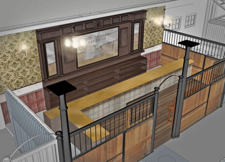
Peaky Blinders: The Rise is running at The Camden Garrison in London’s Camden Market currently booking through mid-February 2023.
Production Team for Peaky Blinders: The Rise
Creative Director: Tom Maller
Production Design: Rebecca Brower
Lighting Design: Terry Cook
Sound Design: Luke Swaffield
Associate Lighting Designer: Matt Ladkin
Art Director: Ryan O’Conner
Associate Designer: Hannah Postlethwaite
Costume Supervisor: Michelle Bristow
Wigs Supervisor: Abbie Leigh Willets
Production Manager: Erin Witton GBA
Producer: Peter Huntley
Associate Director: Elena Voce
Script Writer: Katie Lyons
Composer: Barnaby Race
Fight Director: Stuart Boother
Movement Director: Charlie Burt
Intimacy Director: Raniah Al-sayed
Vendors
Lighting Rental: White Light Ltd
Lighting Practicals: Electric Foundry Ltd
Scenic Construction: Illusion Design & Construct
Environmental Scent: EcoSent
Production shots from the immersive production, Peaky Blinders: The Rise. Photos by Mark Senior
