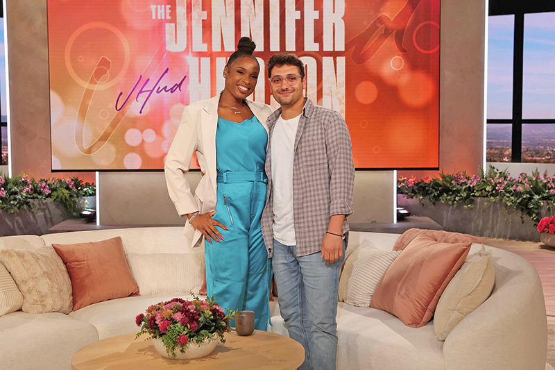
On Sept. 12, 2022, The Jennifer Hudson Show debuted in syndication in more than 95% of the U.S. television markets. The hour-long, five-days-a-week, talk/variety show, helmed by EGOT (EMMY, Grammy, OSCAR and Tony) winner Hudson, is being produced by Warner Bros. Entertainment and is shot in the same Warner Bros.’ lot studio previously home to The Ellen DeGeneres Show. Chicago-based Production Designer Michael Apostolos, who has worked with Hudson on numerous music projects including her tribute to Aretha Franklin—Jennifer Hudson Live at the Apollo back in August of 2021—again joined forces with her to design the new set. This is the first television talk show that Apostolos, Principal of Fourline Creative, has designed and he was pleased to have this opportunity with Hudson.
Apostolos started by meeting virtually with Hudson and her producing team to understand exactly what they wanted to do with her show. “Jennifer’s big thing with the show was creating an inviting, warm, and cozy, yet open space,” he explains, “a space that doesn’t drive any specific narrative. We didn’t want to put a roof on the show’s limits. It was more about just creating this space where she can be herself and that her guests feel at home and welcome; to just spark natural conversations. A place for everyone.”
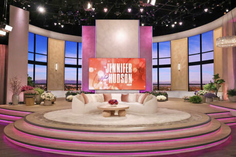
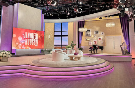
Creating a relaxed and welcoming environment, Apostolos’ set has the overall feel of a well-designed home with curves and subtle colors—sand, taupe, and cream. He also has included tastefully discreet LED tape accents of purple, which is Hudson’s favorite color, on the steps up to the stage platform and along the walls, as well as around the LED screen behind the curved couch used by Hudson and her guests. Establishing a sense of locale there is also a large, curved back wall of windows that look out towards the mountains surrounding Los Angeles, with some of the city in view to place the show. A variety of plants line the area under the rear window wall. There is also a feature area camera-right with a baby grand piano and musical instruments which includes photos of Hudson on the wall. Upstage camera-left are large video screen walls that open and close for the host’s main entrance and serve as an area for musical performances, games, and demonstrations.
Out of the Norm
Since this was his first time designing a talk show, Apostolos dove into research mode. “The first thing I did was a deep dive into other daytime shows, both past and present. I wanted to find the common theme and break it. I wanted to give Jennifer a space that was as unique and as warm and inviting as she is. The common thread that I found was two chairs for the host and guest. It’s very formal—‘let me interview you, you plug your show or book, etc.,’ but Jennifer is one to have real conversations—I’m not saying other shows don’t—but for Jen, I know that it’s all about having a real conversation and diving deep. I wanted a space that allowed the guest and Jennifer to feel comfortable talking that way, so I approached it with a couch, which is something you don’t often see on daytime television. Typically, we have one or two people at most sitting with Jennifer. I went with a curved couch to create this central area for ‘home base.’ Something that accents the curves in the rest of the set and with really clean lines. My big goal was to break sharp lines and have curves that open to the camera; to feel very large but also very inviting.”
Making the set feel light and airy was another key element that Apostolos wanted to bring to the production design for Hudson’s eponymous talk show. “I wanted to set the tone that the show was in daytime and since these shows are often shot in studios that have no windows, you get no sense of where or when you are,” the designer comments. “One of the things that I did right off the bat was create these larger-than-life upstage windows where you can see the Los Angeles mountains in the background with some of the city in the foreground. This reminds you of where we are, and it brings in the feeling of natural light. I thought that was a really important thing that I tried to incorporate right away and designed from there. I used a similar curvature of the upstage windows and upstage header that mirrored the curved-shaped home base’s center platform to draw focus to the center.” The raised, circular platform has steps that wrap around the entire set piece. “We wanted to really make it feel accessible to everyone—not only figuratively—but also literally when audience members are invited up on stage for a moment with Jennifer. The entire set design allows us a lot of space to do different things.”
There is a more personal area to the set that Apostolos designed, “Another really key thing that I wanted to bring into this was what we call the ‘feature section,’” explains Apostolos. “It’s a section that is an extension of the curved header that actually wraps around to marry this featured area to the main set. This area is a nod towards Jen’s personal life and just brings a real, unique, and personal sense of who she is. This is also referred to as the ‘music section’ and has a baby grand piano, a harp, and some musical instruments as a reference to Jennifer’s wonderful musicianship. We then have this wall full of pictures that are hand chosen by Jennifer—her family, friends, career moments, and show moments. The goal for that wall is to be ever-changing. So, when Jennifer has a special moment that she really wants to hold onto, we can frame that and add it to the wall. It’ll be this continually growing wall of memories and moments.”
In fact, Apostolos and his team have filled the set with a lot of touches and items that are meaningful to Hudson and are nice little Easter eggs for fans to try to spot. “Something special to Jennifer, that I included, are different floral arrangements, because she loves flowers,” comments Apostolos. “And she loves purple. There are colorful moments sprinkled throughout the set. We also included a few picture frames on the various tables on the set, with pictures of her cats and dogs that are hidden there. I know that’s very special to Jen, and while they might not always be visible to the viewer, she can always see them when she’s walking out on the stage.”
Change of Scenery
While the view outside the rear windows may look like a drop, it’s actually a large LED wall so the ‘scenery’ can change as needed. “We wanted to make sure that the creative team on the show had the ability to change the scenery as the show progresses and grows, and the seasons change. To be able to keep it fresh,” says Apostolos. “We also have a large wall with a video screen behind the home base couch area that features our main graphics. That’s front and center and serves as a backdrop for Jen. It is in front of the rear window wall, so it creates a large open area in the set.” Guests can enter from behind this central wall and make their way to the couch.
The LED screens were provided by NEP Sweetwater and the scenery was built by Goodnight and Co., with the project led by Beth Goodnight. “Beth was incredible and her whole team was amazing,” states Apostolos. “They went above and beyond to make it happen since we were on a tight schedule. I truthfully couldn’t have picked better collaborators than them. They came in and executed the vision beyond what I could have expected.” Margaux Lapresle was Apostolos’ art director and Martin Vallejo is the art director on the show. He’s there every day, keeping the set intact and tackling the creative moments that need some art touches. The assistant art director is Alexi Gomez, and Elliot Little was Apostolos’ draftsman and associate designer. “Elliot helped in getting everything drawn out and was a great person to have collaborated with throughout the process.”
Shine a Light
The Lighting Designer for The Jennifer Hudson Show is Tom Beck, who previously lit The Ellen DeGeneres Show, so he was familiar with the studio. “I had worked with Tom on various occasions, especially when I came in with musical performances on Ellen over the years,” notes Apostolos. “It was very nice to work with Tom and his lighting team again and in a different capacity. I also want to thank the amazing team that I got to work with on this project and for this opportunity. The great EPs—Corey, Andy, Graehme, Lisa, Walter, and Mary. The wonderful execs—David McGuire, Lauren Blincoe, Meredith Fox, and everyone at Warner Bros. And certainly Jennifer, for her continued support and trust, and for allowing me to be a part of her debut national talk show. Creating with her, and this whole team, has been an honor and joy.”
Apostolos, having obviously enjoyed designing The Jennifer Hudson Show, contrasts the differences between designing for a musical performance and a TV talk show. “Designing for music is all about accenting the artist’s vision and the music’s tempo and feel. Finding the rhythm and capturing their latest body of work that they’ve put out to present it live. People come and see a live performance and there are moments that remain forever in their memory. I often go for an impact with powerful moments. With designing for television, this was more about painting a very beautiful, yet subtle picture, that isn’t overwhelming, because you’re going to be watching it every single day. That was a big difference, just diving into this new world and putting myself in the viewer’s perspective of a fan who’s watching every day at home. Something that makes you feel welcome, that makes you feel joy, that makes you feel connected to Jennifer, but also doesn’t get repetitive seeing it every day on TV. I wanted the set to always feel fresh in some way.” Apostolos has succeeded in creating a set that does feel like a lovely open living space with a gorgeous view of Los Angeles; one that viewers are sure to want to return to, day after day.

