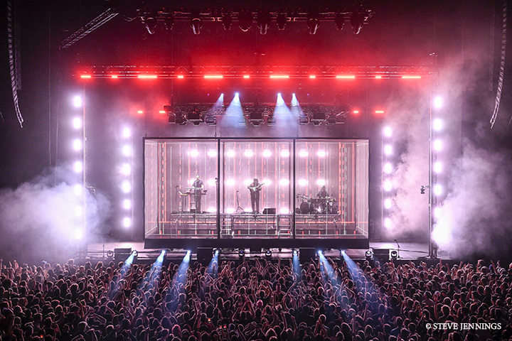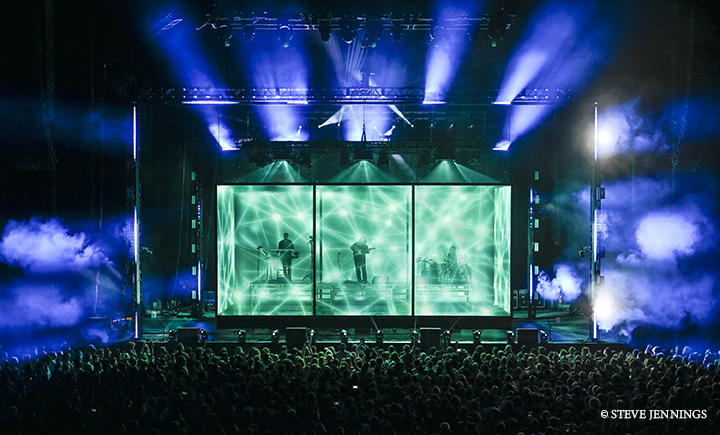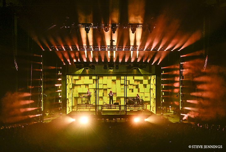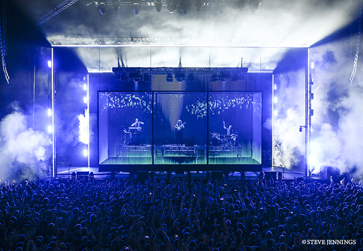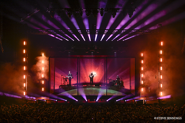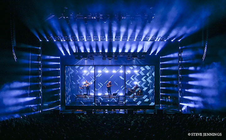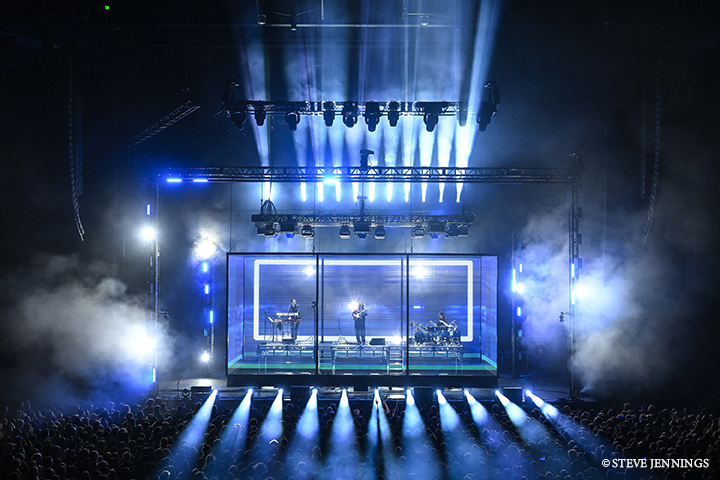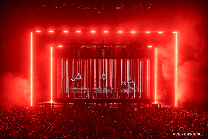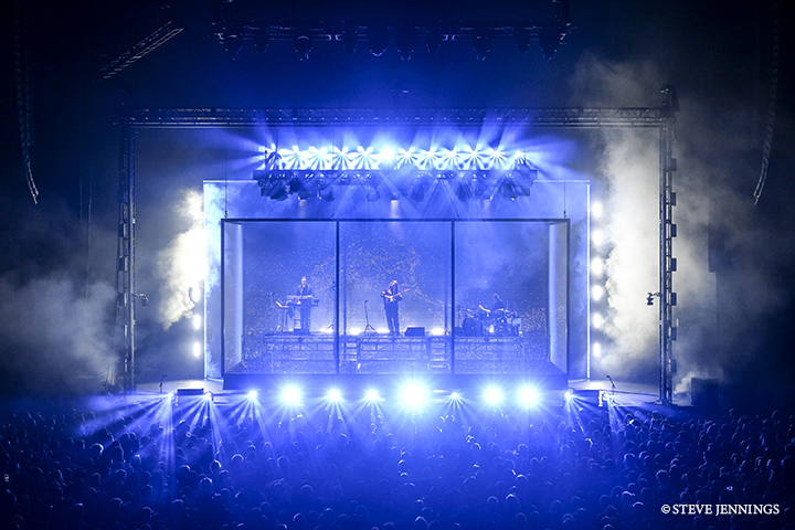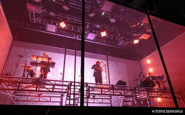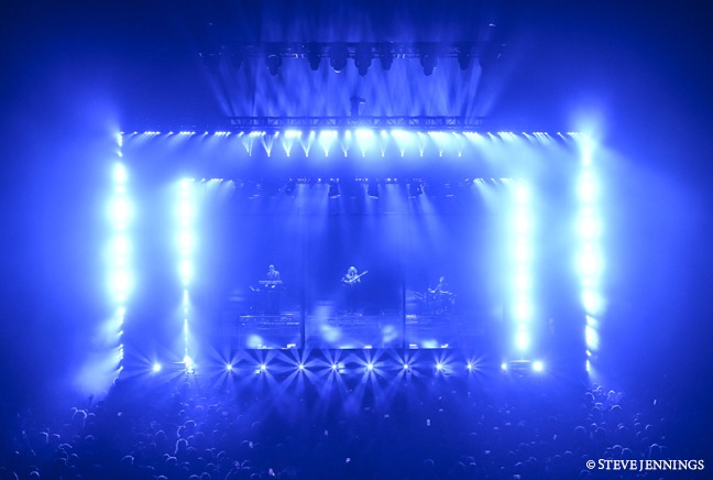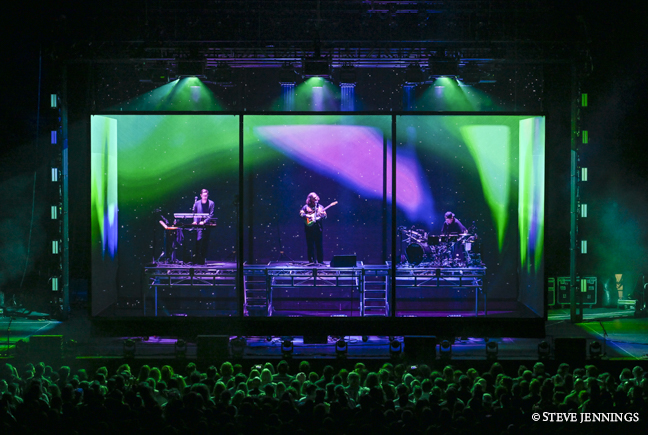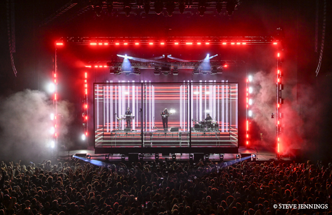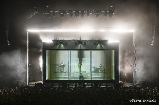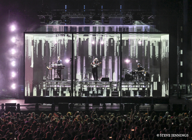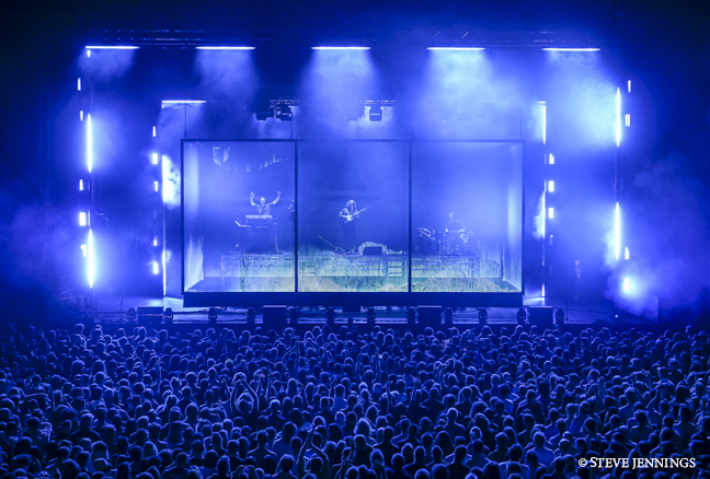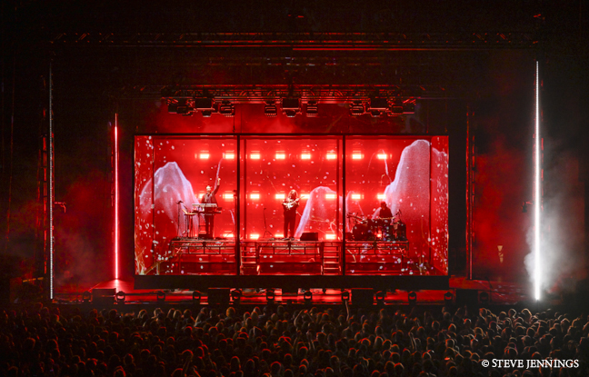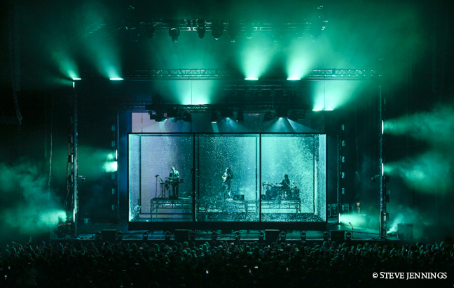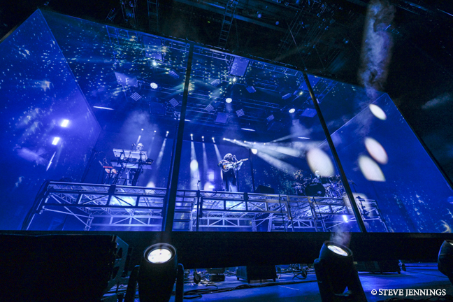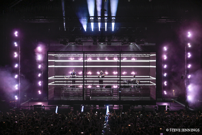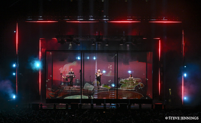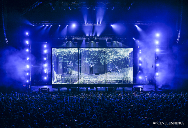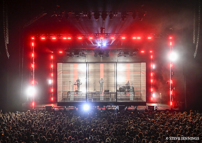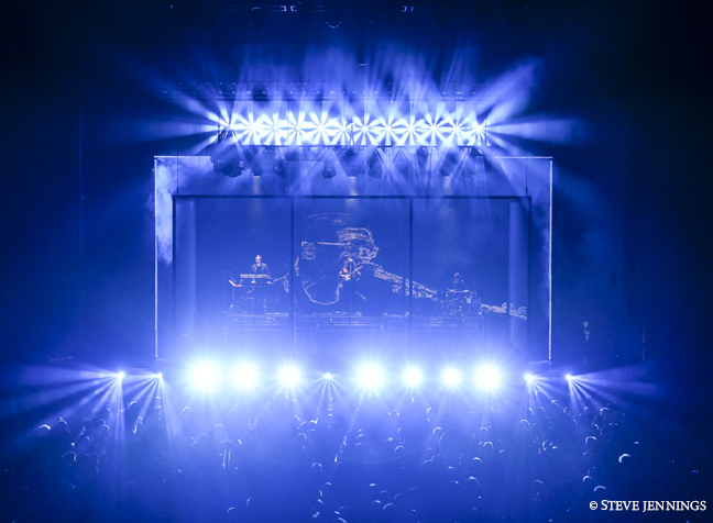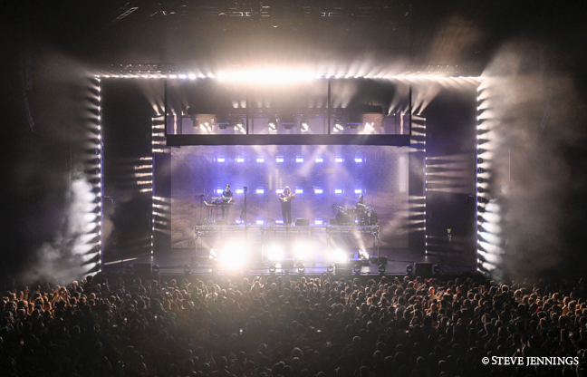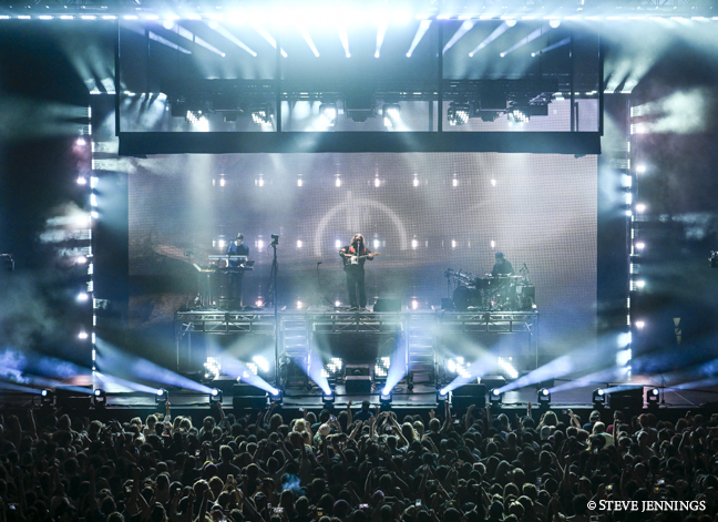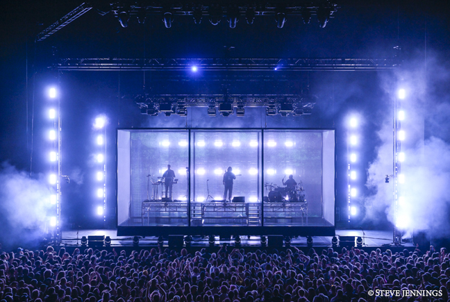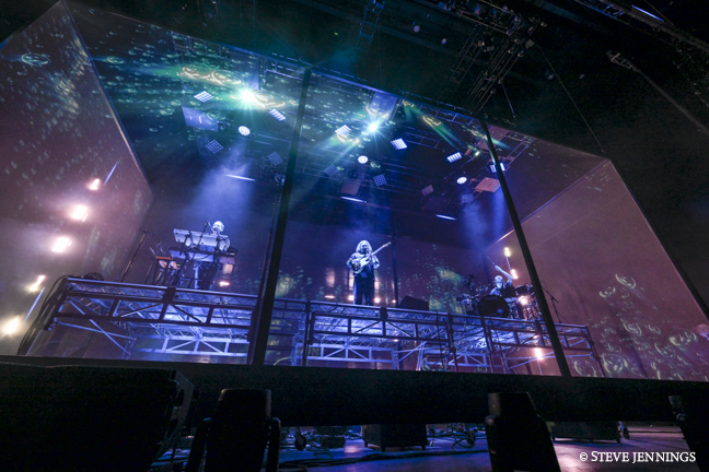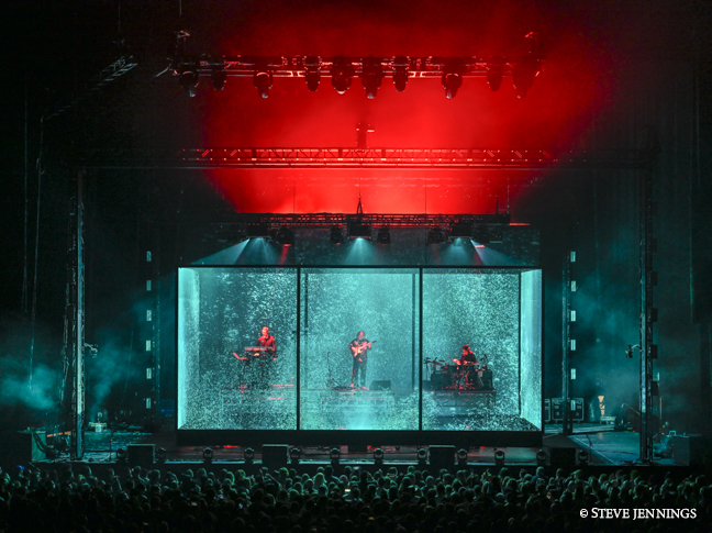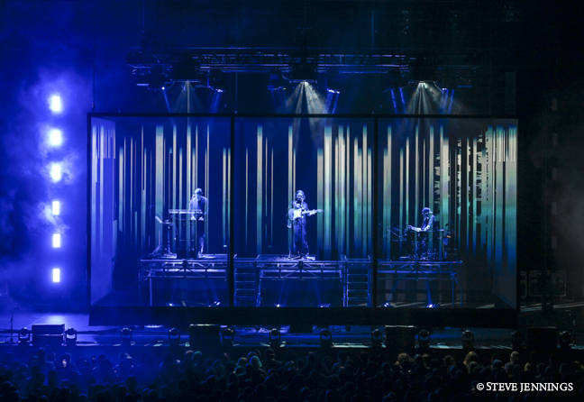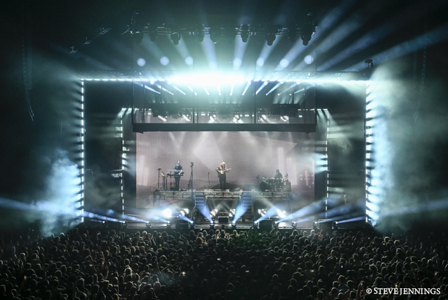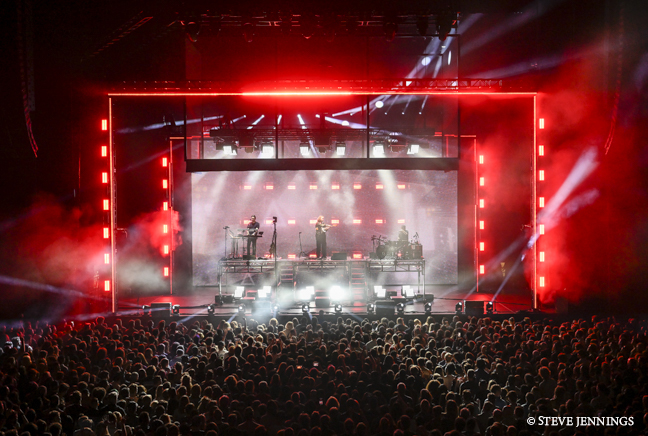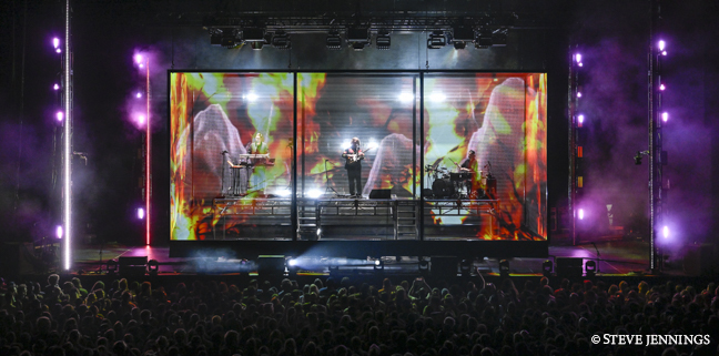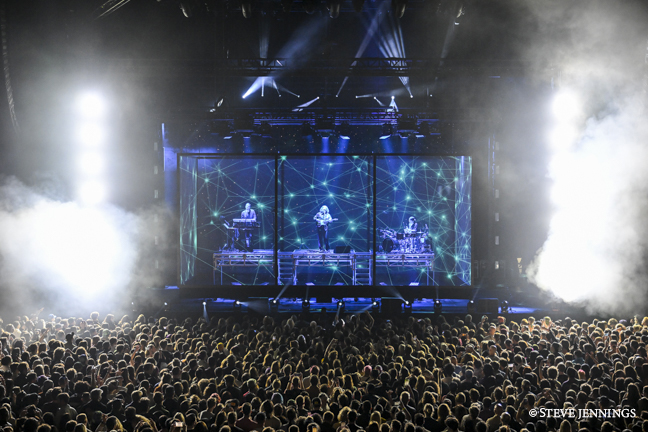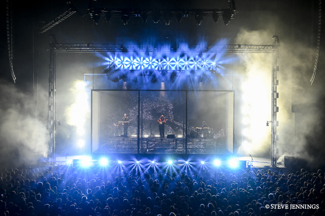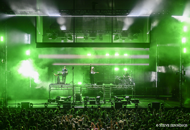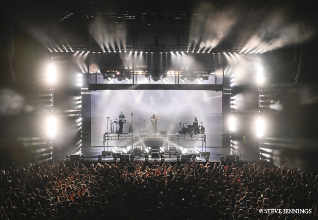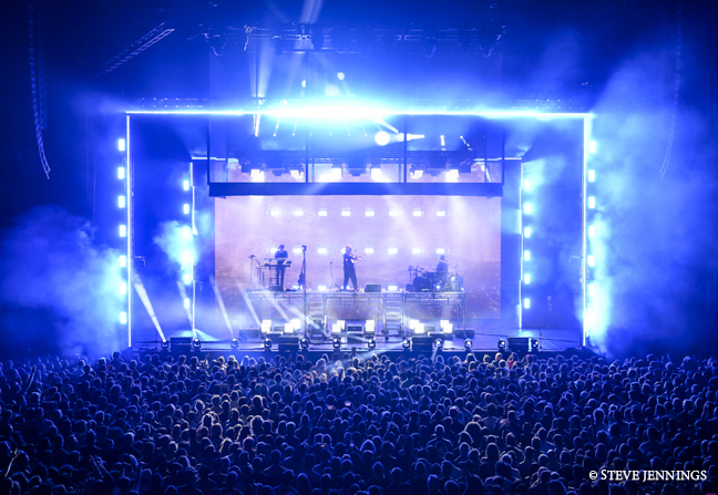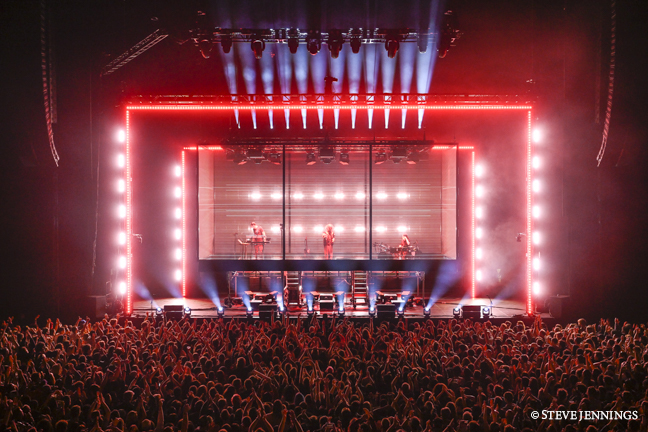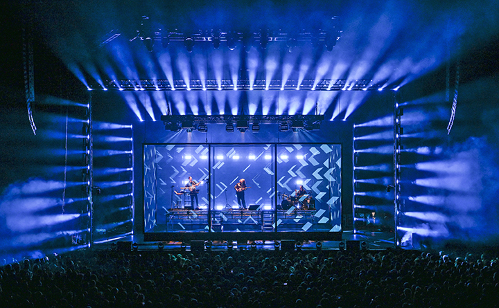
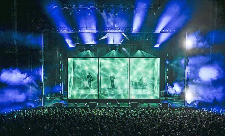
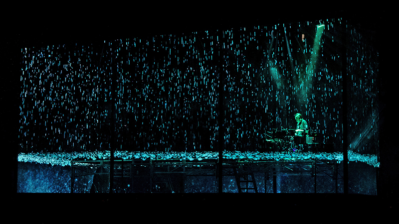
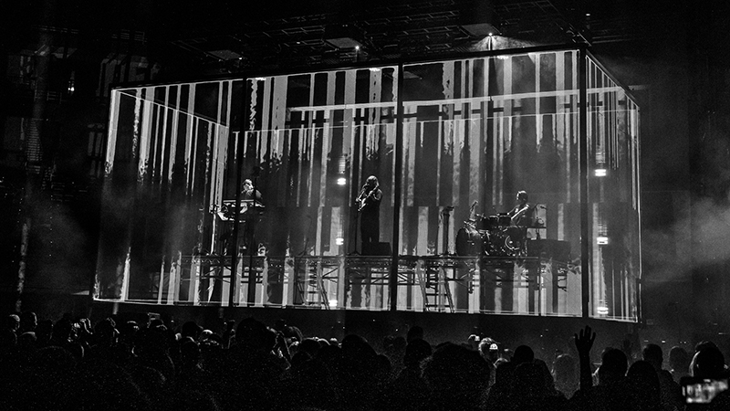
It looks like a box. Onstage is a rectangular shape constructed of frames and wrapped in 1,500 square feet of transparent material. The audience can see the three band members performing inside. Video images, projected from its interior, are displayed all over the box. An LED wall behind the box projects even more content.
British indie rock band alt-J is offering fans on The Dream tour a show unlike any other. The production, supporting the new release of their album of the same name, is another collaborative creation from alt-J’s longtime manager Stephen “Tav” Taverner and the design team of FragmentNine (F9). PLSN spoke with F9’s Jackson Gallagher about how the team designed outside—and inside—the box.
Upstaging is supporting the tour as the lighting and video vendor. All Access Staging & Production fabricated the box, Holotronica provided the Hologauze 50 projection material, and Liteup supplied the media servers and control package.
Designing The Dream
PLSN: What is FragmentNine’s history with alt-J as the creative direction and production design team?
Jackson Gallagher: F9 has been designing the band’s shows since 2012—each production known for its creativity and ingenuity. Their design for alt-J’s Relaxer world tour in 2017 gave us the Knight of Illumination award for arena design. This time around, we imagined a more delicate and airy performance, echoing the uplifting and hopeful elements of the new album. On the design team with me are Jeremy Lechterman (also serving as lighting programmer) and Mike Hankowsky (also serving as video programmer).
What was this tour design’s starting point?
The brief was to elevate the performance to something akin to an art installation while still retaining power and energy. The result is a four sided “fish tank” of projection in which the band performs. It’s a dream show for lighting/video designers because alt-J just stands there; their show is very much about their music. They are not the kind to run around onstage and have the audience sing along in your traditional rock show, so it becomes an open sandbox that we would be limited by with some other artists.
This version of the show seems like the utmost expression of that confinement. On the other hand, it is also the most elevated and exposed the band has ever been. It’s a slightly “uncomfortable” visual, which we like. Musically, alt-J is quite narrative. While the albums overall don’t have a specific thru line, each song is like a soundtrack to a short film. Joe [Newman], the lead singer, is a movie nut. His lyrics echo that of a screenplay, and he makes constant references to films and historical events throughout alt-J’s lexicon. Echoing that, we endeavored to create little vignettes through light and video to support the subject matter without being too “on the nose.”
Were there worries that the design might distance the band from the fans?
The band was a little worried about being disconnected from the audience. When you’re up there and there’s video content six feet away from you between you and the audience, it can feel a little isolating, however, when the video is off, you barely notice the fabric. We also put the box on Kinesys automation, and we lifted it out for a couple of songs to remove it and let the band connect with the audience. There’s a certain coziness when we lift it up and let people connect a little bit more. I don’t think it is as much of a reconnection when you take away the box because when you have that negative space you forget that you have this architecture around the band. You can still see them and connect with them. You lose the sense that the fabric is there when there’s video content on it. But even losing the architecture for a song or two is a nice change.
Ultimately, they weren’t nearly as worried about it when they were there in person as they were in the design process when we told them there would be a fabric between them and the audience in every direction. We weren’t too concerned about that. What we worried about was: is the really narrow projector path going to work? Can we carry the whole show with video content without a ton of lighting? I think we did successfully by the end of it, but that’s where our anxiety was while we were in the design phase in previz before we saw it in person.
How much did the design change throughout the process?
Quite a lot. We explored a plethora of different structures at the beginning of the process. Something was appealing about the simplicity of a box and leaning into video more than we have in the past. Tav came to us initially about using holograms, and this thought sent us down some interesting rabbit holes, but what you see is the end result.
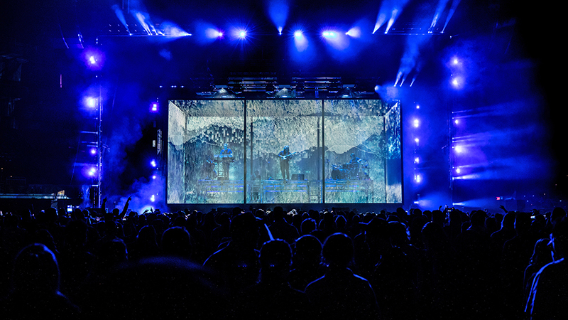
Describe the box.
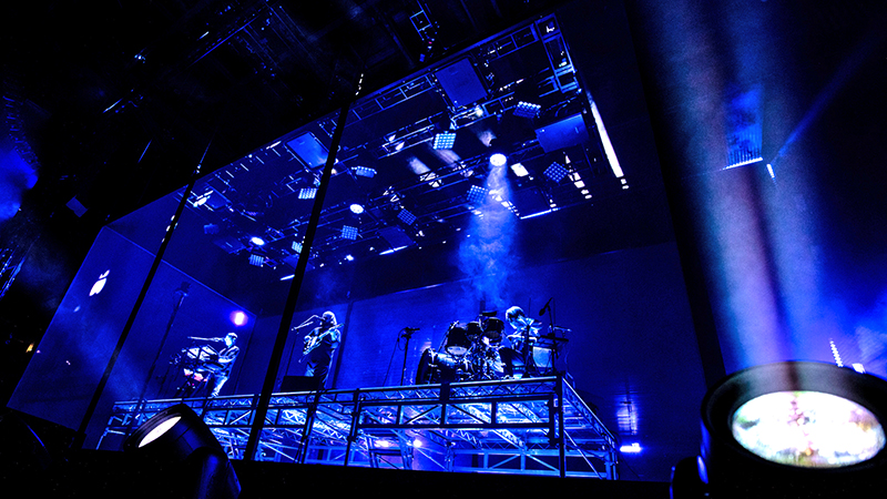
Its dimensions are 36’ W x 16’ H x 16’ D. The band is inside the box, sitting atop a platform that is standard metal decking with a transparent Plexi surface, so we can light them from below. There are several Ayrton MagicPanels underneath the platform, but nothing attached.
All the projectors are inside the box, about 5’ from the walls. So, we removed some support legs from the platform and left others there, and when the projectors come in, we were clearing the platforms by an inch or two in some cases. Everything was meticulously calculated. We were hoping the math worked. And it did. But the first day of putting it all together was a little nerve-wracking. So, we have the box around the band and an upstage LED wall behind them using ROE Vanish 25 LED panels with touring frames.
It was such a video-forward show. When you shoot lights through the Hologauze, it looks pretty terrible, so we have a fairly scaled back lighting package and we really rested on the video. But we had what we call two goalposts, or horseshoe-shaped things. One was downstage and one was upstage, around the box that was lined with [GLP] X4 Bar 20s and some GLP JDC1 strobes on there as well to frame out the picture with lighting. But it was kind of a dead zone because we couldn’t shoot anything through the box. We had some Elation Dartz 360s up top and some [Ayrton] MagicPanels and some [Robe] Spiiders inside the box for keylight, but it was really just this world of demarcation: we did some stuff inside the box and some stuff outside the box, but it was pretty limiting in what we could do. That made the ultimate design more compelling because it forced us to do things a little differently and make something that’s not our standard show.
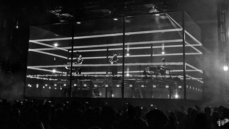
It sounds like the video element was the most important design consideration.
Jeremy [Lechterman] and I, who started the company together, have always been a tag team with lighting and video. One of our strengths has been integrating lighting and video together and blurring the lines of where lighting stops and video begins. It’s an amalgamation of the two worlds together. This show was 100 percent video-forward, and every other decision was impacted by the video. Every fixture, every lighting position, everything to do with lighting was a byproduct in one way or another of the video decision. We were all attracted to this projection idea very early on and we knew that was going to be the central core of the show because the band’s manager wanted to get away from traditional LED and go with a softer, fully projection look. Some of our initial ideas were LED-based, but he wasn’t seeing a lot of shows out there that were fully projection-based, so we went for it.
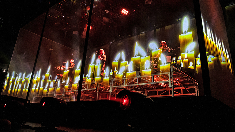
What were the challenges of projecting content on the box?
Finding the suitable fabric for the content and the proper projector placement was the most challenging part of the design process. There seems to be a never-ending rabbit hole of holographic materials out there that are great for front projection. However, very few worked well for rear projection. With how we wanted the box to function, rear-projection was a must. [Holotronica’s] Hologauze 50 ended up being the winner for us, as it was specifically designed for rear projection. The Hologauze material (a silvered gauze) is fantastic. We fell in love with its transparency. You lose the sense that it’s there when there’s video content on it. [The Hologauze material is mounted with Velcro to the All Access metal frames of the box. This allows easier install/de-rig times, as well as flexibility around the rigging points.] The other MVP in this were some incredible short-throw lenses on Panasonic 20K laser projectors.
For content, we had an incredible team of animators, all of which we’ve worked with for a long time. It was such an interesting medium. We play a lot with negative space in the content because negative space becomes transparency where we’re normally dealing with a background. So, there are many times when there is content on the upper third or lower third, still letting you see the band. But doing foreground content in front of an artist is a new challenge. Even some simple textures looked incredible up on the box. Liteup provides the four disguise d3 gx 2 media servers and the control package.
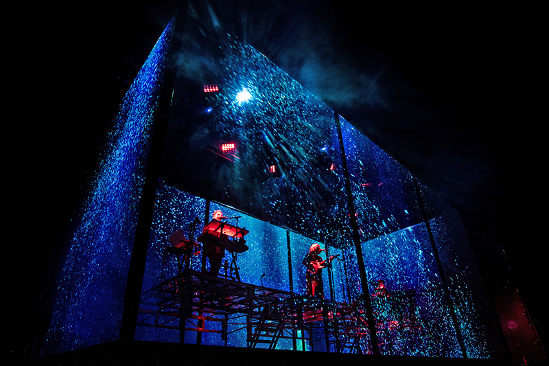
What are the differences in creating holographic-style content versus traditional video content?
The main difference for creating “holographic” content is that black is now transparent rather than a void. The more positive the content is, the less we see the band, and vice versa. At a minimum, we had to be conscious of what parts of the content were bright or dark as that played into visibility. It also gave us some fun tools to greater strobing or static looks that momentarily revealed the band. When the content doesn’t fill up the full projection surface, it really looks like something is floating in midair, because you can’t really see the fabric when there isn’t any light on it. We had sharks, jellyfish, candles, wheat crops, and a whole host of 2D shapes and compositions.
The tour played a few small venues that couldn’t accommodate the box. What changes were made to those performances?
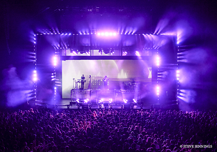
Milwaukee got rescheduled into a smaller, 1,000-person capacity venue. Last time I spoke with Tour Manager Maarten Cobbaut, there were two or three shows where we couldn’t fit the box in at all, and maybe one where we couldn’t fly it out all the way. I think they were able to get the upstage LED wall in. We made a couple small revisions. Normally we have three layers of video and sometimes we took the video off the box and put it on the LED wall. It’s still a pretty good show even if you can only get the LED wall in. The show still has a sizable lighting package capable of quite a lot of cowbell, but far from the amount of previous shows.
We’ve been working with this band since their beginnings, and their routing is always a combination of giant venues and tiny venues. Needing to be flexible is the ground floor with their routing. There is no production manager—those duties are shared by the tour manager, lighting crew chief, and stage manager. Our Crew Chief Marc Callaghan and Stage Manager Jason Fearnley do a really good job understanding what’s important in the design and how it can be adjusted. It’s not just like, “aw, cut it, we don’t need it.” They are all very invested in the show looking good and it would be much more difficult, if not impossible, without them.
Do you have any comments about Upstaging’s crew and service?
We loved working with Upstaging again. They’ve been our U.S. vendor on the show for several years now. They work tirelessly to make sure the production is as good as it possibly can be.
alt-J The Dream Tour
- Production Team
- Creative Direction & Production Design: FragmentNine (Jeremy Lechterman, Jackson Gallagher, Mike “Hank” Hankowsky)
- Associate Designer: Sydney Asselin
- Lighting Programming: Jeremy Lechterman
- Video Programming: Mike “Hank” Hankowsky
- Design Project Manager: Rob Kuhn
- Content Animation: Pablo Beckett, Ally Munro, Cody Samson, Arty Bondarciukas, Andy Reuter
- Manager: Stephen “Tav” Taverner
- Tour Manager: Maarten Cobbaut
- Lighting Director: Dave Singleton
- Video Engineer: Dan Bond
- Crew Chief: Marc Callaghan
- Touring Lighting Crew: Luke Hornbuckle, Adam La Femina
- Upstaging Crew: Nick Strand, Nick Schloosser, Mike Ponsiglione, Rob McLaughlin
- Stage Manager: Jason Fearnley
- Production Assistant: Lien De Lentdecker
Vendors
- Lighting & Video: Upstaging
- Control: Liteup (UK)
- Scenic Fabrication: All Access Staging & Production
- Hologauze 50: Holotronica
Gear
Lighting
- 2 MA Lighting grandMA3 light Console
- 4 MA Lighting grandMA3 NPU Processor
- 1 Brainstorm SR-112 Distripalyzer Timecode Reader
- 1 Chauvet Four Channel Dimmer Pack
- 62 GLP impression X4 Bar 20
- 50 GLP JDC1 Hybrid Strobe
- 26 Ayrton MagicPanel-R
- 24 Elation Dartz 360
- 3 Robe Spiider
Hologauze Box and Video
- 1 Projection Gauze Cube w/1,500 sq. ft. Hologauze 50 Material
- 66 ROE Vanish 25mm LED Panel w/Touring Frames
- 1 Brompton Technology LED Processor
- 18 Panasonic PT-RZ21KU Laser Projector
- 18 Panasonic ET-D75LE95 Ultra Short Throw Lens
- 1 Folsom ImagePRO-4K Image Processor
Automation & Truss
- 1 Kinesys Vector Motion Control System
- 6 Kinesys Elevation1+ Module
- 6 Liftket Kinesys Motor
- 23 1-Ton Motor with Rigging
- 4 ½-Ton Motor with Rigging
- 6 10’ Hud Truss, Black
- 22 8’ Hud Truss, Black
- 9 10’x20.5”x20.5” Truss, Black
- 6 8’x20.5”x20.5” Truss, Black
- 10 10’x12’ Truss, Black
More alt-J The Dream 2022 tour photos by Steve Jennings:
