Designing the Las Vegas Residency
In March of 2023, Adele wrapped up the first five months of her Las Vegas concert residency, Weekends with Adele, at The Colosseum at Caesar’s Palace. The residency, with performances on Friday and Saturday nights, sold out quickly and received praise from critics as well as her many fans. The stunning show returned to the stage in June, offering audiences another opportunity to experience Adele’s wonderful performance as well the beautiful design work of Lighting Designer Cory FitzGerald, Senior Partner at Silent House Studios, and the Production Design by STUFISH Entertainment Architects. PLSN spoke with both FitzGerald and Ric Lipson, a Partner at STUFISH on their Las Vegas worthy spectacular designs for the residency.
STAGE ARCHITECTURE:
Ric Lipson, Stufish
We first asked Lipson to discuss the overall design and the aesthetic that the team felt was right for the Weekends with Adele residency. “Adele had some very specific concepts that she wanted to achieve,” he says. “The venue is large, and she wanted a way of making it feel intimate in parts of the show and grand in other parts. She was very keen on the idea that the show would start small and simple with just her and a piano and slowly, it would grow into this taller and wider space. She wanted her band to be a big part of the show. She wanted them to be close to her at times for interaction and in the background at other times. She also knew she wanted a large orchestra of strings. For the band we created a series of kinetic band platforms that were able to move up and downstage as one or in individual sections to compliment the different scenes.”
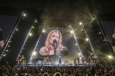
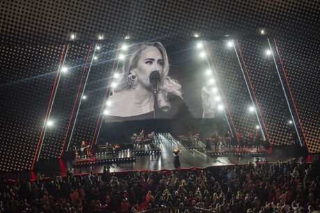
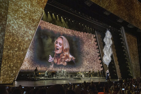
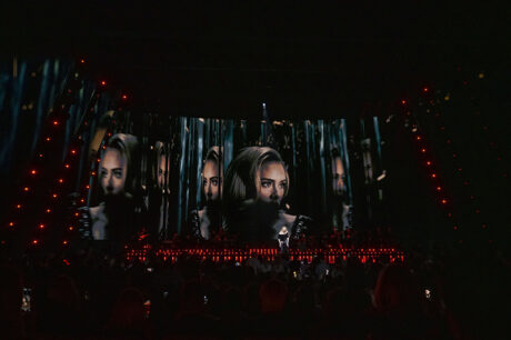
Lipson states that it was important that the production design support and frame Adele rather than being in competition or distracting from her. “I think, and it sounds cliché to say it, but she is an amazing performer. You could do her show without anything onstage. She could come out, with just the piano, the band, a microphone and do a whole show. I think part of what made this show work was that we had to find the right language when we started the creative process.” Knowing that intimacy was really what she was striving for, Adele wanted the design to explore how to break that wall between her and the audience. “That led us into thinking about a show that could grow and shrink around her; about having these scenic panels that would slide across the stage to create openings that would be projected,” continues Lipson. “Projection was a softer approach. The thing to explain when you go and see a show in those Las Vegas theaters, is that they are really wide, tall, vast spaces. The last thing you want to do is make it feel bigger. But at the same time, we realized that actually, if you own the whole visual space from wall to wall, if you complement the life sized artist with a massive I-Mag image of her, it is not a distraction but, it actually frames and focuses the 4,100 person audiences’ attention in a different way. It works really well,” says Lipson, adding, “We built over the full house proscenium with a large custom frame system from TAIT and wrapped it with acoustically transparent, projection fabric. This helped to hide the multiple hangs of L-Acoustic’s L-ISA speaker system while allowing panoramic projections to happen. The sonic element is obviously very important in an Adele show, so we worked hard with Adele’s sound team to find a fabric that met all the criteria.”
Projecting Content on the Walls
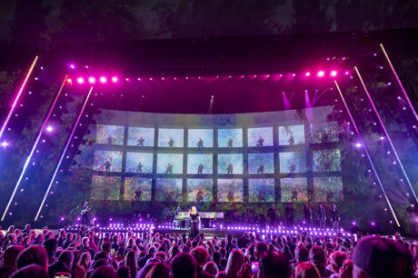
The projected world extends from the false proscenium, back into the main stage, Lipson says. “The main scenic statement takes the form of three portals that frame the inside of the stage. The portals are made from the sliding panels. The edges of the portal panels are sloped to create a more dynamic classic Deco shape. Working with Cory, we knew there could be layers of lights that could come and go as well between the layers.”
Finding the right material to project onto was a key consideration, explains Lipson. “One of the big challenges was finding a fabric that we could project onto that would be bright and clear but that would also be dark enough when you didn’t want it to be lit with projectors. We worked with a company called Carbon Black, who I was introduced to a few years ago. They have a fabric that is a very dark gray. It’s essentially covered in a coating that reflects the laser projection in a much brighter way than a traditional projection surface. That became the silver bullet for making the projection look great on the sliding panels. We also had a number of brand new 50K Panasonic laser projectors, which are super bright and crisp with 4K resolution.”
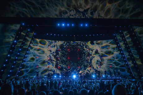
With projection and video playing a large role in this production, it took team work to ensure the content and the design supported the music. The content was created by London-based Treatment Studio and headed up by Video Creative Producers Sam Pattinson, Lizzie Pocock and Creative Director Noah Campeau. The disguise media servers were programmed and operated by Richard Turner. The video system—LED wall, projectors, media servers, and control network were all provided by Solotech, led by Video Project Lead, Ian “Woody” Woodall and Project Manager, Eamonn McCullagh. Lipson describes how they all worked together to address the challenges of so many projectors and focal points. “Richard Turner, who is head of production projection, worked very closely with Treatment Studios, to figure out which scene would be on which slider and then with Solotech’s team to make sure it all worked holistically together. We did a lot of the work with the Creative and Show directors figuring out the tableaus of where the sliders would be in each song to make sure that the focus and shadows were optimized per look. All the movement was all digitally tracked with the TAIT Navigator system linked with disguise, so that the pixel masks would all track perfectly with the sliding panels. Solotech also supplied us with a full stage width, curved LED screen of ROE LED panels that hung upstage forming the backdrop for most of the show and concealing a Vertical Orchestra. That screen can lift up revealing the wall of performers which consists of 24 string musicians stacked 3 layers high and 8 performers wide. There are 20 massive TAIT automated motors to fly the LED wall up and down.”
Layered FX
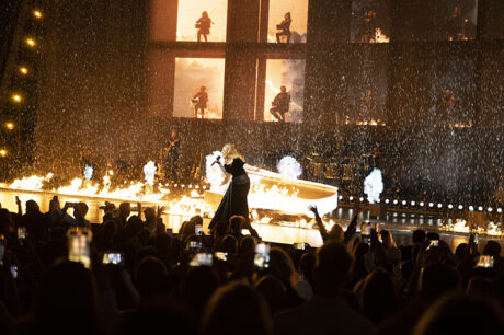
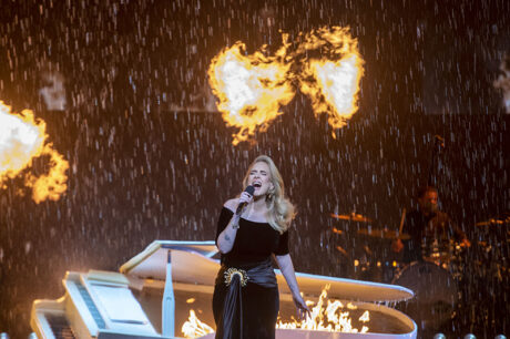
The special effects are among the solutions that Lipson is particularly pleased with in the show. California-based Jem FX handled a number of the effects needed for the show. “I think that one of the standout moments in the show is ‘Set Fire to the Rain,’ not only because you’re seeing 120’-wide custom rain curtain and fire coming out of the stage. The gas for the fire effect was all pumped in through fire grates built into the TAIT stage deck that we built up together with a water catchment and drainage trough into the filtration system,” Lipson says.
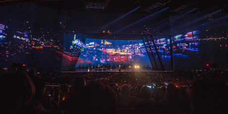
“One of my favorite moments is where she sings and there’s a time-lapse overlay with pictures of London streets and buses going by. When the video screen has lifted up, there is a gauze over the fronts of the boxes that’s projected onto, with the orchestra seen through it.” The full reveal of the layers of projection that blends with the orchestra with the house LED screen in the rear makes another beautiful statement. While there are many standout technical moments, “equally, some of the simpler moments in the show are just so beautiful,” comments Lipson. “There are some really emotional moments in the show that are actually quite simple.”
Scale and Support
When asked what another designer, one who really understands what goes into a production of this scope, would find interesting, Lipson answers simply, “The scale of it. I think, if you don’t know what you’re looking at, I think it’s impressive. If you do know what you’re looking at, I think it’s more impressive, because you’d go, ‘Oh, my God, there’s a lot of stuff in there!’ These massive panels look small, but they’re 40’-high by 40’-wide moving at two foot a second across the stage with really accurate positioning data. They move and track the video image at the same time. When you look at the panels, there are only three inches between each panel. When the sliders come off stage, they have to park in the wings, which they fill up. There are the massive tracks that the sliders live on, which are 160’-long custom-built track trusses. In between those tracks, there are angled lighting tracking truss frames that follow the scenic panels. In between these layers are water curtains, confetti drops, props, TAIT nano winches. All these different elements have to fit and play together so TAIT had to build completely custom tracks that can track closer together to maximize the space. The accuracy of the panels, the speed that they move at, the sound of them on the tracks, the integration of pixel mapped LED along the edges together with the lighting truss frames, all work together.”
All of the staging and automation systems were supplied by TAIT, who Lipson gives a lot of credit for the support they provided the production. “TAIT’s support was impeccable, one of the best experiences I’ve had with them, everything was built to go in quickly in the way that TAIT does so beautifully.” Some other props were built by Artem in the UK and Jem FX in the U.S.
Lipson notes that everybody—from all departments and disciplines—came together really well to produce a show that truly supports Adele and her music. “The technical elements all came together on the installation really well. Paul English, the Production Manager, was just amazing. Matt Askem and Kim Gavin and their teams, Adele and her management were all really wonderful. Cory and his team were very collaborative in the integration between lighting and scenery, and Treatment were quick to adapt as the show evolved with creative solutions. The STUFISH team also worked on all the large and small details of the show to make sure everything worked well in the room and as captured by the cameras under the supervision of Director Matt. Everybody really contributed to this being a great collaboration. Adele was the lead, she was committed to making sure the show was what she wanted it to be. We did our technical build at Rock Lititz studios and rehearsed in the Colosseum. The show turned into this beautiful piece of theater and concert. Everybody involved is proud of it, and feels like we created something very special. This show was really a true collaboration.”

LIGHTING:
Cory FitzGerald, Lighting Designer
The concept of the show was to grow from an intimate experience, to a full stage spectacle,” explains FitzGerald. “When I was brought into the design phase, there was already the concept of sliding, diagonally edged panels to create various ‘A’ shaped apertures. We coordinated with automated lighting trusses that would follow that same shape and create different opportunities for scaling the space throughout the show. It’s a very dramatic progression, literally expanding over the course of the show.”
From the beginning, the creative team worked to give every audience member a great show and have an intimate experience. “We had the normal limitations one finds in any room,” says FitzGerald, “you always have to find ways to make sure things fit in the room you’re in and not compromise sight lines. She was very specific about every seat in the room having a good view, so we wouldn’t want to do something that would limit the balconies. She also wanted I-Mag to be available on the sides of the proscenium so everyone could see what she was doing closeup. It was important to Adele to that she really connected with each fan in the audience.”
In addition to the automation that moves the three layers of angled panels, there are the automated lighting trusses that FitzGerald used to make his lighting positions track with the scenic panels. “We have angled automated truss with lighting, including Ayrton Khamsins and GLP FR-10 Bars, that maintain that angle ‘A’ shape. The intent was to allow for stronger exposed lighting looks, and then more subtle or even hidden lighting moments where the trusses were completely behind the projection panels. We could close-down to the smallest A shape or expand to the full 120’ open stage and keep our side positions in play.”
Balancing Lighting and Projection
“This show is unique because the entire set is designed to be a projection surface,” says FitzGerald. “We worked for weeks testing the Carbon Black with various projectors and lighting solutions to see what would be the best marriage of the two. We knew we needed to avoid spill and bounce and be able to keep the negative space in the content as visually dark as possible. Learning the do’s and don’ts allowed us to craft theatrical looks on stage, projected scenery and graphics as well as balanced Imag all on various surfaces throughout the show.”
FitzGerald contines, “Every light in the rig has shutters because we wanted to be very specific about what we lit. We used the Ayrton fixtures in almost every location to be nimble, so if we wanted to do a song in one location and have a really intimate moment, then decide creatively to move it all to a different area of the stage, we would be able to create the same looks.”
By incorporating that versatility into his design, FitzGerald was prepared for creative changes. “There was a lot of subtlety that went through everything, which we were thankfully prepared for. We had a strong creative design, and we prepared for ideation during rehearsals. We ended up using nearly every feature of every fixture.”
Key Equipment Choices
The LD chose to go with 192 Ayrton LED Khamsin Profiles and 25 LED Diablo Profiles for their shuttering capabilities. “The Ayrton Khamsins were our workhorse light. They were everywhere so that we could be flexible. I’ve used them before, so I knew that they were versatile and bright. We chose to have shutters everywhere so that we could cut off projection portals and scenery as needed from any angle. They have great textures, brightness, and fast, vivid color. We also wanted uniformity visually throughout the rig which is very important to me, creating aesthetically pleasing arrays of lights that can handle all the requirements of the show. Instead of having your ‘wash system’ and your ‘spot system’, you just have ‘Lights’, and the lights do what you need the lights to do. I personally don’t really like the idea of seeing a lot of different sources or lens shapes in the rig. It’s all very specific and helps define the space to be more intentional and geometric.”
For a big back light from the floor, he went with 25 Ayrton Domino Profiles, again with an LED light engine and shutters when needed to shape his lights. “Those gave us a strong and versatile backlight,” he says. “We used the GLP FR-10 Bars along the edges of the sliding portals as well as the GLP FR-1s along the edge of the band risers to keep those sources consistent as well. Keeping the size and shape of the source uniform was important. Because our band risers weren’t uniform in size, we couldn’t use the FR-10 Bars as we had along the trusses, and the FR-1s actually were a much better choice in that location with pan as well as tilt. We used a combination of the Robe BMFL FollowSpot LT and Forte for the front and rear followspots.”
The lighting equipment was supplied by UK-based Neg Earth Lights, “It’s always great getting to work with them,” states FitzGerald. “Sam Ridgeway came to oversee a lot of it. Callum Humphreys was Front of House Tech and Jonathan Sellers was Lighting Crew Chief for rehearsals then left the show in the capable hands of Andy Bellar for the run. The show was expertly programmed by Associate LD Sam Paine, Mark Humphrey and Davey Martinez. The previz file was created by Earlybird Visual and included all the automation which was a huge help to visualize the stage during the build.”
For FitzGerald, part of the enjoyment of doing this show was that it got him back to his theatrical roots. “It is a very theatrical show,” he explains. “Through the colors, textures, the angles—it felt much more theater, or operatic, than a typical concert performance. Not only because of her music and her style, but also the nature of the venue itself. From a theater textbook perspective, it has a proscenium, portals with wing entrances as well as a lot of traditional dance side lighting and box booms. It became much more about using those techniques to craft a music performance within a theater show, which is something I haven’t gotten to do for a long time. I loved getting to use those skills again.”
FitzGerald thoroughly enjoyed collaborating with the Stufish team on the Weekends with Adele residency. “It’s always a pleasure to work with Stufish,” he says. “Stufish are always pushing the edge of what can be done and thinking of things in a very theatrical and thorough way. They’re such a unique team of theatrical set design / architectural engineers who create with the entire performance in mind, not just the object. They’re constantly thinking about the details from the concept to the execution and every step in between.”
FitzGerald is rightfully satisfied with the looks he created and happy with the small gestures that he and the creative team were able to come up with for Adele and for her many fans. “Of all the shows I have gotten to do, this one is a really beautiful blend of theater and concert,” he says. “Seeing the subtlety that we got to do with her type of music at a scale of this size; it allows it to feel intimate. Finding a understated rhythm to highlight, or creating a small color shift that has a huge impact; something that you don’t necessarily see in an arena or a stadium. This show allowed us to be much more focused and intentional. With the scale of the I-Mag surfaces, we could shift the entire feeling in the room by simply changing the way she was lit on screen. To me that level of control on the image people see on screen is an incredibly powerful way to tell a story. “


