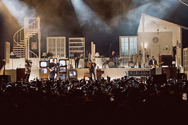
For over a decade, Production and Lighting Designer, Tobias Rylander has been designing for the Manchester UK-based art rock band, The 1975. This past year saw him back with the group in support of their At Their Very Best and Still… At Their Very Best tours, an ambitious show that combined the band’s imaginative storytelling, wrapped within a set design of a two-story house. Rylander spoke with PLSN about his very theatrical design and his longtime collaboration with the band.
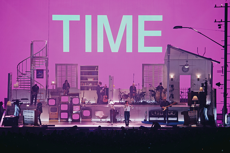
Working closely with lead singer Matthew Healy on the overall creative designs, Rylander and Healy went through a lot of different concepts. “It all started with Matthew knowing and feeling that he wanted it to be more of an analog show; real was the word that we used a lot,” explains Rylander. “This time, Matthew wanted it to be more real, and focused on the fact that they are a band—and a really good band. I spent time with them in the studio while they were recording, drawing up sketches of ideas. The more we sketched, Matthew realized that he wanted it to be a house in some form. So, we went through a lot of different aesthetics, but ended up with this almost Broadway set. One of his criteria to focus on was the I-Mag and camera work. He wanted it to be very cinematic in approach. So, I knew while designing the house that I needed a set background for the scenes to take place in. I looked at it from a lot of different camera angles and we played the scenarios.”
Consistency in the Design
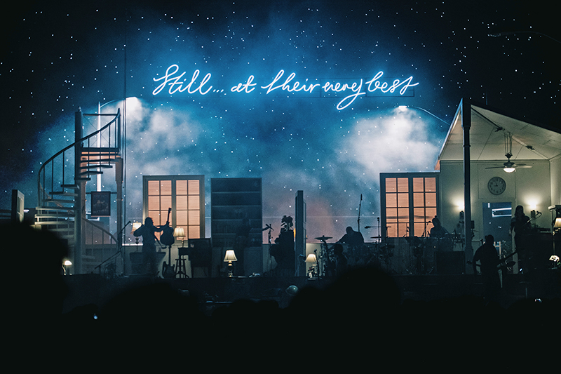
For the next leg of the tour—the Still… At Their Very Best portion—Rylander added an upstage screen that’s mostly used as a set extension. “We’re using lots of horizon landscapes, clouds, sky, and content like that,” says Rylander. “For the second part of the tour, we went into the era of Still… At Their Very Best, so the screen is used to communicate a lot of the different eras of their shows. We’re bringing back looks and content from earlier tours for some songs—even from the first and second albums. Since it’s been me doing the shows, it’s always been the same look in one way or another, which the audience and fans really appreciate. They love that they can see a thumbnail photo and know what song it is.”
The design of The 1975’s shows has been an evolution over the 10 years that Rylander has been working with the band on the look and feel of their shows. The designer continues, “Songs have had the same themes, the same color schemes, the same textures, and looks to them. They have just developed or been turned upside down, or inside out. The fans definitely recognize the different looks within a show.”
Content Creation
Rylander has had a long relationship working with Stockholm, Sweden-based Green Wall Designs, who created the content for this tour. “I’ve been working with Viktor Rundlöf [Creative Director & Producer] from Green Wall Designs for a long time. He’s my guy, basically,” says Rylander, “so I always reach out to him. He did parts of the last tour, and for this tour, he’s done all the content. Since I moved back home to Sweden during the pandemic from Los Angeles, I needed a partner in terms of content and for help with renderings and drafting. Green Wall has been my new home when it comes to that in Sweden.”
For his video design, Rylander has an LED screen that consists of ROE Visual’s CB5 LED video panels along with some ROE Black Onyx BO3 panels, all paired with Brompton Technology’s Tessera SX40 and M2 processing. For the I-Mag, they’re deploying Panasonic 30K projectors rear projecting onto AV Stumpfl’s VarioLock projection screens. Rylander relies on a Green Hippo media server to feed the video content to the screens. “I’m a Hippo guy. Since my first tours, I learned how to program it, so I know it by heart. I also love to use video, whether it’s projectors or LED screen. I used it as lights a lot of the time. So, we program it from the lighting console and use it as a big old wash light with very expensive gobos, basically. For I-Mag, we tinted a little bit, and sometimes we make it have a little bit more film quality, but it’s raw footage. The intent is that it’s a movie, or play, that plays out.” Video gear was provided by PRG.
Supporting Imagery
The show has two acts, one of which supports the latest record—Being Funny in a Foreign Language—the band’s fifth studio album, which is very cinematic in nature. Rylander brought these filmic qualities to his design. “It is a challenge to create so many looks,” he says. “I referred to the campaign assets and artwork around the album release, of which I’ve based a lot of the world that we ended up with on stage. This is something I always do; look to the artwork, photos, and videos of the album release.”
“For the first act, it’s more based on Being Funny in a Foreign Language, an era that we’re living in right now, which is Still… At Their Very Best. That first part is very much scenic, a theatrical play, almost. It’s much less lighting programming, not so many colors, and it’s really a theatrical set. So, in the first half of the show, we’re basically going through scenes and stages throughout the day, just like you would as an act in play.”
For this tour, Rylander added a B-stage at the front of house. Lead singer Healy acts out bits between the two acts out on the B-stage. “Then the second act is older songs from earlier eras, and that’s where we go more rock showy with colors and have more graphic content on the upstage wall,” explains Rylander. “The stage becomes more of an art piece than a theater stage. During the break between acts, the whole stage crew—in lab coats—come on and strip the house of all the props and turns it into a clean, white monochromatic palette for us to perform all the historical songs and content onto, which is also why the house, the set, and everything is white, to be a blank canvas; anyone’s home; anyone’s stage to perform on.”
Building the Set
Rylander worked closely with PRG’s Frederic Opsomer and PRG Scenic to create the house set for the tour. The walls consist of lightweight honeycombed aluminum panels. The framing of the house is PRG’s new Infiniform structure. It’s like a very flexible—and very supportive—framing system. The idea is that there’s no waste with Infiniform, it can easily build—and unbuild—any kind of structure and then go back into rental inventory not the dumpster after the tour. “It’s like an Erector set; it comes in bits and pieces,” comments Rylander. “It needs to be built every day, so we worked for a long time with Frederic and the PRG team to make it happen. Our most important approach to the set was to have minimal landfill. Basically, the CO2 footprint is something that is very important, both to me and the band, so we wanted to work with reusable materials and assets that could basically go back on the shelf when done.”
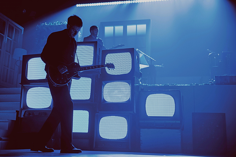
The touring team and PRG created a paneled touring system that can quickly be loaded-in and out. “It’s now paneled and comes as elements, but it still needs to come together every day,” says the designer. “We’re touring with a TAIT rolling stage that’s quick to set up and then we build the house. It’s been holding up well and is still beautiful. We did give it a coat of paint between legs of the tours.” The house set in the first act is filled with furniture and props, which were sourced in an interesting manner while rehearsing at Rock Lititz. “They’re all real objects,” says Rylander. “Basically, it started with me and the Lighting Director/Programmer Darren Purves on bicycles going around shopping at Lititz flea markets and Amish run shops. Later, we brought on a set person, who is also the band’s creative director and stylist for all the videos. She helped us find some of the furniture. For this set, everything is thought through and most of it has got a deeper meaning or touchstones from the band’s history or personal life. It’s always evolving and changing.”
Choice of Color
Like the two very different acts of the show, Rylander’s color choices are very different between the two portions of the show. The first half is more theatrical and monochromatic, whereas the second half uses more colors—many of which refer to the previous eras for the band. “For my color choices, since the first act has more of a theatrical or cinematic vibe, we do more or less photography lighting just to get nice skin tones. It’s playing more with a daylight to tungsten color scheme, where we just make it look cozy. Nice and inviting, rather than colorful.”
“Then in the second act, we used the color palettes and choices that we did in 2014, which is an interesting story,” continues Rylander. “The band started out monochromatic—black and white. All the artwork, photography, everything was black and white. The first tour was black and white as well. No colored lighting. All the backlight and all the lighting on stage was projections just doing volumetric aerial projections. But during that period, which was also when Instagram started to play a big role in social media, we noticed that the fans started to colorize the photos that they took of the tour because they got bored of black and white lighting. So, we started to color the show the way they colored their photos. So, in a way, the fans informed us on color schemes with their own artwork. That became the color scheme for the new record’s artwork. So, a lot of the color schemes come from either artwork or ongoing campaigns for a certain era, music, or video connected to a specific song.”
Key Gear Choices
Since they were introduced, Rylander has been “a sucker for the GLP impression X4 Bars.” This time around, he had the opportunity to use the brighter GLP FR10s, where he could creatively use the individual pixel zoom of the luminaire. “The GLP FR10s frame the whole stage set,” he explains. “I always love to have light curtains as both a great silhouette, but also as a big color wash over the whole stage. I always tend to have a couple of those lined up on the horizon of a show.” The FR10s have been deployed judiciously. With limited truck space, his choice of fixture also needed to reflect sufficient versatility to fulfill a number of functions. “I also wanted a fixture that would work as an effect light, and give us movement and beat when needed,” he explains, “so we are using the FR10 Bar in all ways possible.”
A row of the FR10s upstage covers the full width of the stage, both at floor level and in the flown truss above it. Rylander explains, “This is replicated on both sides so that the set is completely ‘boxed in’ with light, especially when we tilt out the upstage truss line to become a kind of ‘ceiling’ where we are able to produce sky and cloud effects in a theatrical way.” The interplay of these linear light curtains expertly articulate the roof and walls of the set.
Also, knowing they wanted to have a cinematic and retro feel to the show, “a lot of the side lighting is done with Strand Castor 2kW Fresnels, just to get that analog feel and texture. I’ve always been a big fan of a big old Fresnel lens in a theatrical setting with a tungsten warmth.”
When they started the At Their Very Best tour last year, he had Martin MAC Vipers as the spot “since I needed a framing shutter fixture,” says Rylander. “This time around with Still… At Their Very Best, we were playing bigger venues, so we upgraded to the [Martin] ERA 800s. Having added the upstage video screen, we also needed to up our lighting in terms of intensity and punch to compete with the LED video. I went with SGM Q-10s for both wash and strobes, as well as some eye candy, pixelly effects. We’ve been using those same fixtures when they were new in 2015. Apart from the SGMs, there were no wash lights.” Lighting was supplied by Christie Lights, which has supported Rylander and the band over many tours.
Design Solutions
There are many songs and design solutions that Rylander is pleased with for this tour. “It’s such a fun show and so diverse,” he says. “I was really pleased with both how the set looks to the eye and on camera. It’s always fun to work with the camera and video director to capture the moment, but I was very pleased this time when we added to upstage video screen, where it acts as a set extension and how we could really extend this world. These Steven Spielberg-ish scenes that we had dreamt about.”
The set still pleases Rylander every time he walks into an arena and sees it. “It’s not huge, but it’s physical and it’s nice to look at. I am also very pleased with how I designed it to always have backgrounds to the camera shots. In all the angles the show is shot at, there’s always either a wall, ceiling, staircase, or window with blinds. It takes lighting well since it’s white, so it’s easy to transform it into different moods, settings, and scenes. That’s what’s really unique with the set and show, and what I’m most proud of, basically. I’m happy to continue working with The 1975, and very proud that we’ve been together for 10 years already. They’ve become family.”
WORKING WITH GREEN WALL DESIGNS
Stockholm, Sweden-based Green Wall Designs created all the video content for The 1975’s Still… At Their Very Best Tour. Green Wall Design’s Creative Director & Producer, Viktor Rundlöf has worked with Tobias Rylander on numerous projects including Abba Voyage and Beyonce’s recent The Renaissance World Tour. Rundlöf shared some information about working on The 1975’s tour design.
What was the aesthetic of the content that The 1975 wanted to support their performance narrative on the tour?
Most of the content we created for the show was to support an abstract narrative, leaving a lot of space for the interpretations and emotions of the audience. One core concept was to give the physical set an environment, a place to exist in, reflecting the mood of the song and enhancing the visual experience.
Tell us a little about your relationship and collaboration with The 1975 and Tobias Rylander.
Our relationship with The 1975 is through Tobias Rylander, their long time Set and Lighting Designer. He first asked if we could supply content for the 2019 tour, and since then we have worked with the band whenever we have had the chance. We have also been joining them onsite during pre-production to aid the creation process.
We have had the pleasure of working together with Tobias on numerous projects over the last several years. We always like taking on Tobias’ projects. They always have an interesting angle to them, and there are always beautiful concepts and ideas that spark creativity and joy to work with.
What’s an example of the content that you think really captures the essence of Green Wall’s work on The 1975 tour?
We did a piece where we took a 3D model of the set and lit it in different ways in software. Then we captured the shadow from that lighting on a virtual screen and rendered that to the real screen. I think it’s a good example because it captures the essence of many different disciplines like set, lighting, and video, and merges them together. That is something we always like doing.
Why do you think that Green Wall Designs was a good match for The 1975?
The 1975 are always pushing forward, unafraid to try new things, bold and clever, acting, but also reacting to an ever-changing environment. Evolving out of curiosity rather than necessity, and that is kind of how we would like to think of ourselves as well.
PRODUCTION TEAM
- Tour Manager: Maarten Cobbaut
- Production Manager: Josh Barnes
- Show & Set Design: Tobias Rylander & Matthew Healy
- Lighting Design: Tobias Rylander
- Creative Direction: Patricia Villirillo & Matthew Healy
- Lighting Directors & Programmers: Darren Purves, Michael Straun
- Touring Lighting Director & Programmer: Tyler Santangelo
- Video Screen Content: Green Wall Designs / Viktor Rundölf
- Stage Manager: Jason Fearnley
- Production Coordinator: Alice Fraser
- Production Assistant: Nicole Rosiak
- Lighting Crew Chief: Craig Hancock
- Lighting Technicians: Liam Begley, Tom Forward, Craig JR-Saunders, Sudip Shrestha, Jo Sparham Ferrier, Phil Taylor
- Head of Video: Ed Lawlor
- Video Crew Chief: Stu Heaney
- Video Director: Dylan Etherington
- Cameras: Chip Wood, Sam Osborne
- Video Technicians: Cesar Escandon, Will Hardman, Sam Quick, Evan Ceisel
- Projectionist: Paul Borthwick
- Head Set Carpenter: Jem Nicholson
- Set Carpenters: Ray Bogle, Connor Catterall, James English, Stu Farnell, Mag Harding, Steve Joy
- Props Styling: Staci Lee, Rusty Snyder
- Props Master: Phoebe Millard
- Props Assistant: Rosie Lines
- Styling Assistant: Nelima Obhiambo
- Head Rigger: Simon Lawrence
- Riggers: Katie Flanders, Hilary Taylor Kench
Vendors
- Lighting, Rigging: Christie Lites
- Video, Scenic: PRG
- B-Stage and Lifts: All Access
- Staging: TAIT
- Content: Green Wall Designs
- Trucking: On Tour Logistics
- Bussing: Star Coaches
GEAR
Lighting
- 60 Martin ERA 800 Performance Profile
- 72 GLP impression FR10 Bar
- 18 SGM Q10 Strobe/Flood
- 18 Strand 400F TV LED Fresnel
- 44 Astera Titan Tube
- 14 Astera Helios Tube
- 16 Astera NYX Lamp
- 1 Chroma-Q Color Force II 12
- 1 Ayrton Zonda FX
- 4 Robe BMFL RoboSpot
- 1 grandMA3 Full Size
- 1 LumenRadio Stardust Transmitter
- 3 Robe RoboSpot Controllers
Atmospheric
- 2 MDG ATMe Haze Generator
- 4 hazebase Base Touring Plus Hazer
- 2 Martin JEM AF1 Fan
Staging/Rigging
- 1 Lot PRG Infiniform Scenic Structure
- 28 Broadweigh Bluetooth Load Shackles
- 125 Motors
Video
- 292 ROE Visual Carbon CB5 LED Video Panel
- 9 ROE Visual Black Onyx BO3 LED Video Panel
- 1 Brompton Technology Tessera SX40 LED Processor
- 1 Brompton Technology Tessera M2 LED Processor
- 6 Panasonic PT-RZ31K 30K Projector
- 2 AV Stumpfl VarioLock Projection Screen
- 4 Sony HDC-2500 Camera
- 4 Panasonic AW-UE160 Camera
- 1 Panasonic AW-RP150 Camera
- 6 Marshall CV-503WP Camera
- 1 Ross Carbonite Black+ 2 M/E Switcher
- 1 Ross Ultrix 64×64 12G Router
