Wynn Las Vegas premiered Awakening in November 2022, a spectacular production that immerses audiences in a custom-designed 360˚ theater at the resort. The show is conceived and created by Bernie Yuman, Baz Halpin, and Michael Curry, and narrated by two-time Academy Award®-winner Anthony Hopkins. When announced, Craig Billings, CEO of Wynn Resorts said, “Every so often, the bar for spectacle in Las Vegas is raised. State of the art lighting, sound, and stage technology, coupled with intricate storytelling, glamorous costumes, and large-scale puppetry will make Awakening and the Awakening Theater stand out as true innovation in theatrical entertainment and raise that bar for Las Vegas, once again. I am deeply proud of the team that has so carefully crafted this one-of-a-kind experience.”
No stranger to designing spectacular experiences, Baz Halpin is the Producer and Director of Awakening. He noted, “I’ve been fortunate to work with many of the greatest artists in the live entertainment space, but with Awakening I had the opportunity to explore completely new territory. I’ve always been fascinated with the 360˚-experience and the intimacy that it creates between the audience and performers. It allows for a level of immersivity that brings the theatrical experience to life.”
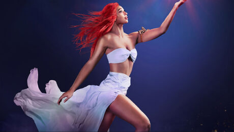
Inviting audiences to join the quest of a heroine and her two fellow travelers as they seek to reunite two lost lovers, Awakening, is infused with modern day myth and magic, as the show comes to life through a combination of dramatic choreography, technology, and fantastic creatures. Helping to bring that story to life is the lighting designed by Jules Fisher + Peggy Eisenhauer. They recently told PLSN a bit about how they approached this unique project.
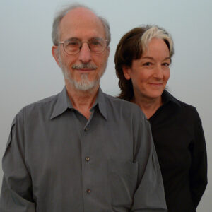
Please discuss the approach to your lighting design for Awakening, and also the challenge of the ‘glass’ floor.
Our central approach to Awakening in the Wynn Theater begins and ends with the fact that we are lighting a script-driven spectacle in the round. The most fundamental aspect of the lighting design to be solved in the round is how to create composition that is simultaneously dynamic from every angle, every seat in 360˚. Working in “true” round is its own kind of geometry, and everyone who has come upon it in lighting design has been faced with its uniqueness, differing significantly from three-quarter, or long thrust, where there is still maintained an “upstage” or “back-of-stage” that is agreed to be a disadvantaged or obstructed viewing angle.
We worked in the Wynn Theater over 15-years prior on the previous production there, the aqua theater spectacle called Le Rêve. At the time we were introduced to that project, there were some isolated problems needing to be solved. How to completely separate the lighting of the performance from lighting the audience, which doesn’t mean we don’t integrate audience lighting, only that we have control of the separation. For example, back lighting from the center to the outer edge of the stage should not also accidentally light the first three rows. A beautiful low front angle for costumes should not bounce harshly into the opposite seating section. All of this seems unglamorous and technical, but these choices give a nice quality of architecture to controlling light in the space. An open round space quickly turns muddy, spilly, and unfocused without precise control of every angle, where it terminates, how it blends, and how it separates from others. One light introduced at a glaring angle affects hundreds of audience seats. Add to this requirement the value and limitation of physical real estate above the stage for the placement of fixtures and preference of angle. For a show with this many contiguous rigging points, this many moving scenic elements, gaining spatial continuity and nice symmetry overhead was a drawn-out collaborative effort. Another charge from our Technical Supervision: Don’t design things in too tightly. Sometimes we broke the rules, but six-inch clearances were to be the standard intent.
As for the glass deck, we did not know we were going ahead with that layering of product until very late in prep. It was confirmed long after the lighting positions had been laid out, but as it became a reality, we made sure that there were no reflections directly into the audience from any of the primary lighting positions. Only one position, depending on tilt, would reflect directly in the audience, so we felt secure with that knowledge.
Tell us about how some choices of lighting elements (sources; beam angles; and color selections) in your design support the narrative and merge with the larger production design.
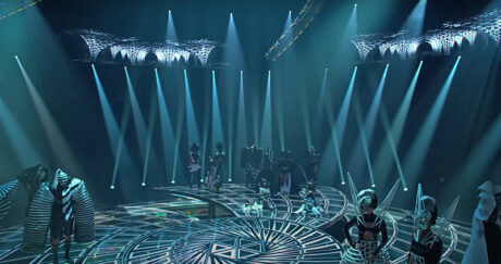
Color choices had been discussed and put into visuals very early in the process. Our story takes place in the four realms of water, earth, air, and fire, as well as the celebration of magic becoming whole. Each realm was described as strongly monochromatic while touching the edges of chroma in either direction from monochrome—for example water taking a monochrome look in blue—all kinds of blue could touch into teal or into warm blue bordering on violet, but no farther in either direction. Then once costumes were introduced, they would be treated with touches of highlights of complementary color that popped each individual costume palette.
Tell us about how the cueing has been used to move the moments and the scenes, as well as audience focus, to support the overall creative design.
It was always discussed that the audience would exist in an immersive environment—that light would incorporate audience seating as an extension of the storytelling environment. We would describe the actual cueing moment to moment as highly energetic, highly rhythmic, and worked in tandem and counterpoint to the energy and rhythm of the video design. Often the video design created the largest of gestures with whirling and twirling and strong directionality of the space, allowing the lighting to become a reflection of that element. Other times the movement in light articulated the dynamic array of sound effects to give the audience a visceral vibrational experience with sound and light. Many times, we cool the motion to settle the audience’s gaze, such as during an optical illusion that requires the intense focus of visual perception, or the key plot moments where highlighting the actors was our focus.
What were some of your key equipment choices and what features did you use to achieve your design?
All of the equipment in Awakening was purchased and installed by the amazing team at Wynn. During our workshop testing and through a long period of research, we brought together the various types of lighting fixtures that we thought had the ingredients we were seeking. Certain things we knew from having worked in the space previously were the requirements of the long throws, the amount of glare any single fixture produced while lighting an isolated scene, and of course the real estate available overhead. In early dialogue with the Director, he expressed that building an image with a smaller number of fixtures had a desirable appearance, so we chose fixtures that could deliver enough brightness with a modest number of beams. We also knew this would aid in lighting the illusions. Pouring 70 or 100 lights at a scene to create brightness can destroy composition and create too many shadows and too much spill. We wanted to craft a more cinematic feel to the dramatic moments so that a single spotlight would hold its own with a principal character. That led us to the kind of fixture types that would be appropriate.
We found historically that minimizing the numbers of equipment types gave us the most robust inventory and the most coherent maintenance process, so we tried to find fixtures that would give us the “do it all really well attributes” instead of the “does one or two specialty things well” types of fixtures. That led us to choose the fixture of largest quantity to be the Ayrton Huracán LT (for long throw). The LT had just come out after we had decided on the Huracán as the workhorse. The LT has lensing that allows for a 4° collimated beam at an incredible brightness, as well as dozens of other attributes that you would find in an arena AND theater. To be honest there were several fixtures very close in brightness and features. We could name the Martin Ultra, the Robe Esprite as also being highly considered. For the floor we chose the Ayrton Eurus, which is an astonishing light, with full features, small and powerful. There is a large lighting plot underneath the deck that uplights the glass stage/structure/lifts, which also lights atmosphere emerging under the deck. Those fixtures were considered to be much shorter throws with a different variety of attributes, particularly the TMB Flare, TMB Mozart, Mac Aura XP, and Claypaky Sharpy+.
For followspot and tracking we chose to place three manned lights in the air and employ the Zactrack automated tracking system. We tested the most current systems of tracking, and because of our initial sense of the action of the show, we went with Zactrack.
Who was your shop for the lighting and how was their support for you on this project?
The lighting vendor for Awakening was PRG Las Vegas. The traditional shop responsibilities were shared between PRG and the Wynn lighting team. So much of the prep was done on site once the equipment acceptance testing had been completed at PRG. The immaculate network was built by Jim Holiday and Ian Billings, both through PRG, guided in early stage by Advance Project Manager Jeanette Farmer. We could not have asked for a more talented and dedicated support team. There is amazing longevity at Wynn, and we have many of the same talented crew as we had throughout the years working on Le Rêve.
If you were speaking with peers, what would be the thing that you would tell them about from your work on Awakening?
Awakening, as in any narrative-driven theatrical production, puts the Director in the role of Auteur in the best sense. Baz Halpin influenced every aspect of design throughout all disciplines (being a dazzling visual designer himself) to sculpt kinetic musicality, choreography, and illusion into his dynamic signature style of dramatic storytelling. One way we would characterize our work on Awakening is that it does not look like any other show we have ever designed. It is always our goal that our work reflects the vision of the director and the other creative voices. We strive to never have a recognizable style and Awakening is an example of that. It was always intended to combine Las Vegas spectacle (a variety of attributes), concert event energy, and theatrical/cinematic narrative storytelling. Doses of all of those entertainment characteristics are evident in Awakening.
One of the biggest shifts in our approach to this project was in the early decision to work with a Programmer we did not know, on a desk still in development (the lineage of which we do not typically use for a narrative-theatrical-style production). The Programmer was Eric Marchwinski, recommended to us by the Director, and we learned upon meeting him that the MA Lighting grandMA3 would be his console of choice. To be honest, lots of folks thought this combination was a crazy choice—industry friends and colleagues, our loyal group of programmers, and many folks at Wynn. In aspirational parlance it is called ‘jumping off a cliff.’ “I worked to explain this choice to everyone,” says Peggy. “I could not exactly describe how I sensed that it was the right decision. But everything I knew about Eric, from watching his work with Baz on other shows and from reading his articulate discussion of process fascinated me and I wanted to leap.” What Eric has brought to the show is full creative collaboration—the kind of contribution that is made among partners who have strong foundational history. Eric’s understanding and shorthand with Halpin, having worked with him over so many shows, allowed us to arrive at Halpin’s style of energetic rhythmic cueing and visceral audience interaction of light and video seamlessly, efficiently and with great taste and flair. Zach Peletz, the Show Video Programmer, is also a regular production colleague of Marchwinksi and Halpin, and he provided seamless and intuitively fluid video cueing integration with lighting.
Talk about the experience of being part of the show’s creative team and how the collaboration on this production worked, especially as so much of the creative/development process happened during Covid.
Of course, due to timing much of our creative dialogue occurred over Zoom. We had regular creative meetings and sometimes online drafting sessions. We referenced visual materials coming through Scenic Designers George Tsypin, Vincent Richards, and the Silent House team. This was probably a bit like other shows being developed during that time. The biggest challenge was staying on schedule as all the testing processes and prototypes were subject to supply chain issues, just like all other businesses.
Talk a bit about returning again to Wynn but in a relatively new space since so much reworking of the theater was done.
Returning to Wynn, with the newly configured theater/staging mostly impacted our design because of the opening of the overhead space by the removal of the architectural dome that was in place for Le Rêve and the way the airspace was replaced with six articulated bridges. The seating and general sightlines stayed the same for us. Additional differences were relative to the specular surface of the deck, the reflectivity of many other scenic elements, and the requirement to control light for illusions—a completely new responsibility in that theater.
Are there any Associates, Assistants, Crew, or Programmer/Console Operators that you would like to credit?
The Wynn lighting team was stellar: Production Electrician Ben Clark, Head of Lighting William Harlow, House Programmer Andy Balmert, and an amazing lighting crew that was just terrific, all supervised by the brilliant expertise of Executive Director of Technical Operations, Dale Hurt. We worked closely with a talented group of lighting design professionals at Earlybird Visual led by Kirk J. Miller, Josh Levin, Alex Fasciolo, Grayson Breen, and Nick Coauette, who managed the massive amount of lighting-control-side data, headed by Marchwinski, and added lighting programming coverage by Mark Humphrey. We integrated with the astonishing talent of Kevin Ramser and Tom Colbourne at Blink who provided content for video, and the true laser artistry of Lawrence Wright of ER Laser Productions. Intrepid design team leadership was headed by Associate LD Mitchell Fenton. LD through prep was Jonathan Spencer, with Assistants Nick Pollock and Chris Childs during production. We also had the immense support of the Stage Management team headed by Phyllis Schray, Jennifer Cook and their handpicked group of hands-on SMs.
Above all, our Producer/General Manager Rick Gray, with his vast experience in spectacle in Las Vegas and theatrical roots, supported and guided all of us, making it possible for us to thrive creatively at the highest level we could imagine.
The Creative Team
- Executive Producer/Producer: Bernie Yuman
- Producer and Director: Baz Halpin
- Producer and Character Designer: Michael Curry
- Producer and GM Entertainment: Rick Gray
- Writer: Kelly Sue DeConnick
- Composer: Brian Tyler
- Set Designer: George Tsypin
- Costume Designer: Soyon An
- Lighting Designers: Jules Fisher + Peggy Eisenhauer
- Sound Designer: Peter Hylenski
- Illusion Designer: Paul Kieve
- Screen Graphics Director: Tom Colbourne
- Supervising Choreographer: Nolan Padilla
- Narrated by: Anthony Hopkins
