For David Goldstein, designing sets and lighting isn’t just a vocation. It’s a creative compulsion. Ever since his childhood, he has been lured to the world on and behind the stage, and his openness to new experiences has led him on theatrical adventures across the country.
The 32-year-old designer has been involved in theater since he was eight years old and performed in Joseph and the Technicolor Dreamcoat and The Wizard Of Oz at the Jewish Community Center in his hometown. “I was hooked,” recalls Goldstein. “I found what I wanted to do with the rest of my life.” He grew up with a children’s theater company called the Golden Performing Arts Center in the San Fernando Valley of California, which remains active over 30 years later. His first show there was Grease in 1996, and he would up performing in over 15 musicals in the next 10 years.
By the time he began high school in Calabasas, CA, working with theater teacher Bill Garrett, Goldstein switched from being onstage to behind the scenes. The spring musical during his freshman year was How To Succeed In Business Without Really Trying.
“I remember building little set models with graph paper and masking tape, and being taught how to work in scale for the first time in ninth grade,” recollects Goldstein. “I learned the set shifts and designing and painting in high school, and I was still involved with my extracurricular theater program at Golden Performing Arts Center. They started letting me run the set shift crew. They allowed me to explore more than just being on stage. I was really, really blessed as a high school kid to find multiple outlets for my creativity that allowed me to do more than what the expectations were.”
While studying for his BFA in Theatre Design and Production at York University in Toronto, Goldstein returned every summer to L.A. work on children’s theater and designs for summer camps. After graduating college, he worked on various productions before moving to New York, where he has designed for many off-Broadway shows plus regional theater around the country. PLSN first profiled him for the gothic production, Deep Love, at the New York Musical Festival (NYMF) in 2015, which was around the time he was also working on Stalking the Bogeyman. Goldstein formed a bond with Bogeyman director Marcus Potter, and they have since collaborated with on many shows.
Exploring the Looks
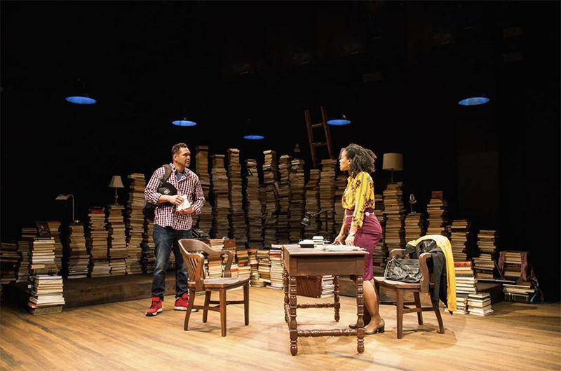
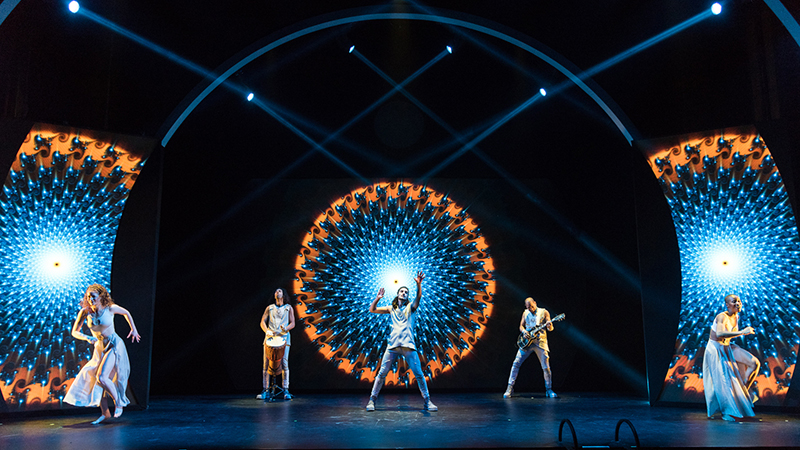
Goldstein has certainly explored a variety of looks in his shows, from the piles of books forming the backdrop to The Assignment to the arches and portals adorned with LED tape on The Portal: A Rock Odyssey, for which he served as a scenic design consultant. The director of that latter show, Luke Comer, is a Colorado-based artist who founded the Arise music festival and whose work crosses various media. Comer and his team knew how they wanted The Portal to feel and what content the video screens would provide.
“I was just consulting on how to tie it together in the best way,” says Goldstein. “Since the show was called The Portal, we created this circular portal through which we see this entire show, like looking down the rabbit hole. We created these arches and portals and used LED tape and some reflective scenic material, but it was very, very simple. It was just to allow the lighting and the video to shine and draw attention and focus to this video in the back. It was an interesting project.”
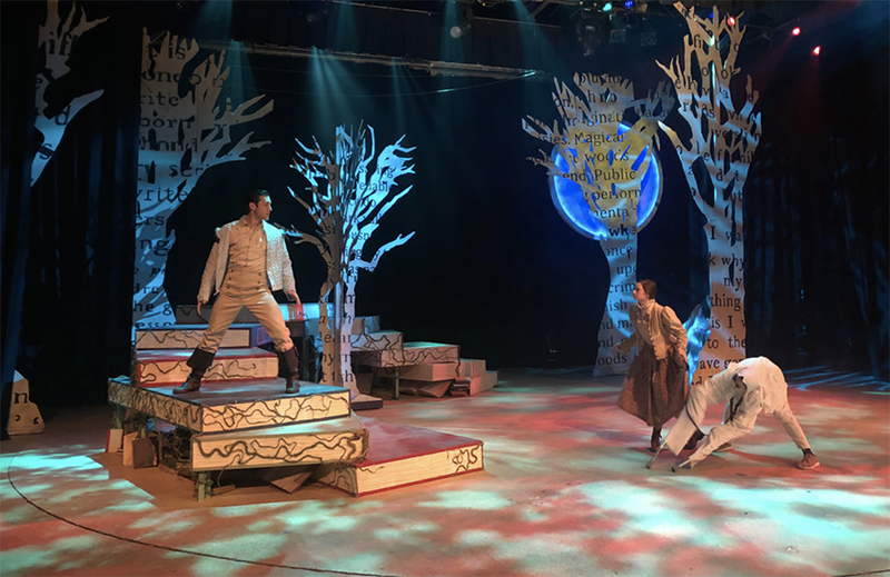
His approach to Into the Woods last summer at the Timber Lake Playhouse in Mt. Carroll, IL was inspired by the work of U.K.-based artist Sue Blackwell. “She does these art maquettes that she cuts out of books,” explains Goldstein. “I thought the look was gorgeous and an Into the Woods design waiting to happen. She has a fairy tale book that she did the illustrations for.” When director Paul Stancato brought him onboard for the production, Goldstein pitched him on the concept and quickly got the green light. The text-imprinted trees onstage looked like they were cut out of giant books. In fact, giant books comprised an arched stairway in the show.
Lighting and Show Movement
For the play Elevator, “the lighting defined the language of how the show moved,” says Goldstein. With the choice to not have the seven person cast leave the space within the titular space onstage, the creative team needed to find a way to transform the space with lighting and movements, “and with a differentiation between the fantasy and the reality. Lighting helped define that language.”
Lighting puppets for the current touring production of That Golden Girls Show! took him into a different area. “Lighting puppets is always a challenge,” he declares. “With That Golden Girls Show!, we wanted to make sure the puppets popped off the stage. It has to be bright enough that you can see the full range of movement the puppets can do, but not too bright that it blows out the visuals of the set, or the color or tone of the moment. I found myself doing a lot of high side light to carve the puppets away from the background, and minor front light to fill in shadows. The focus has to be the puppet, and not the puppeteer manipulating them.”

Keeping the Energy Positive
When Goldstein admits that he goes where the money takes him, it is out of necessity and not vapidity. “I really will take whatever I can, assuming the people that I’m going to be working with are coming from a place of love,” he clarifies. “I don’t fight with collaborators. I don’t argue. There’s no point in that. I argue because I believe in the piece, and we can have differing opinions and conversations about art, but at the end of the day, we’re not curing cancer, we’re making theater. I love this, and I’m not going to allow myself to get too deep in a negative way. I’ll take whatever work I can and be grateful for it. Some people look down on the dinner theaters in the middle of nowhere Illinois, but I’m going to have a great time creating art for this audience. We’re going to be moved by seeing Beauty and the Beast, so why not?”
Goldstein tends to only light shows that he designs the set for. He designs sets for a dozen shows a year, while serving both roles on one or two more. His goal with lighting is to support the story, move it forward, and ensure that the audience experiences the emotions that are intended. As far as lighting gear, he does not favor one brand or model over another. “That’s not what it is for me,” he says. “It’s about how you use the same equipment that all the designers are using across the country.”
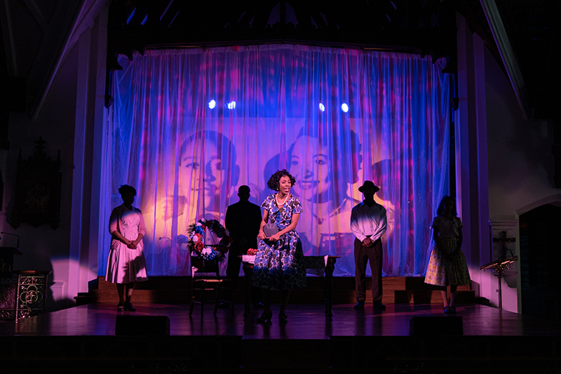
He recently worked on a show called Till that he designed sets for at last year’s New York Musical Festival (NYMF). For the subsequent production at the American Theatre Group in New Jersey, they brought him back to do sets and lights. The civil rights themed show was staged at the Church of St. Andrew in South Orange, but Goldstein still wanted a set, lighting, and to enhance it like a full production.
There were electrical challenges at the church, which has seating for at least 300 people. They could not bring extra power into the building, which had about 60 amps of power overall. His equipment choices were all based on how much power they drew in independently, the location of the circuits in the room, and how much power he could pull per position.
“I decided that most of the circuits were 15 amps in the room,” explains Goldstein. “I decided that any specific lighting position could not pull more than 15 amps in that position because I didn’t want to have to run multiple cables to multiple positions.” Originally, he planned to rent small dimmer packs, Source Fours, and various gear, but cost and time restrictions led to them going entirely LED. With a minimal budget, he spec’ed 50 LED Source Four Lustrs, but only 30 were available to use in terms of rental.
“I started looking at Color Source PARs and some wash units that I wanted,” recalls Goldstein. “Of course, they didn’t have the wash units, but they had plenty of Auras. So I said, ‘All right, let’s do it.’ I wound up with something like 30 Lustrs, 10 Auras, 10 Color Source PARs, and only about six or seven positions around the room. I came up with a plot that I was really satisfied with. When it came time to light the show, I really had way more than the director ever expected me to be able to pull off in a church with 60 amps of power. We pulled off a beautiful, full show, and the audience loved it.”
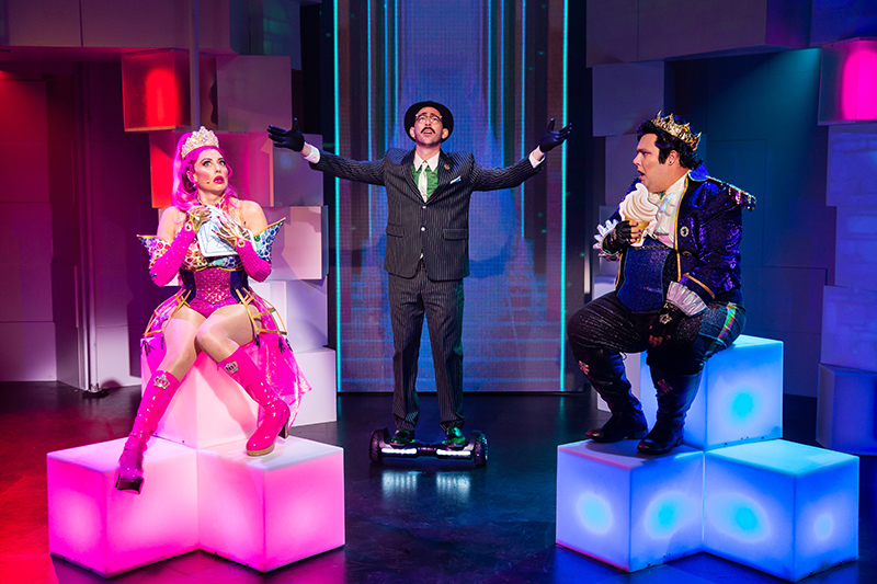
The $1 million combined budget for Emojiland certainly was much larger than that for Till, but Goldstein points out that challenges exist at different levels of budgets. “I’ve learned on at any level of the spectrum money will always be in the way, whether you have $5,000 for a set or $50,000 for a set,” he elaborates. “With Emojiland, money was absolutely a challenge, knowing we wanted to create a set for a digital world to live.”
They originally designed “this entire gorgeous world that had 638 squares of video tile” from the floor to the walls. But, as Goldstein admitted, they could not even afford a percentage of that. Thus some of the video tiles were taken over by scenery, others by lighting. “But in the end, the shape of the world stayed the same from the beginning,” he says. “Once we developed the language and we decided how people are going to move through this and what the shape was going to be, that stayed as all the other elements fell into place. We wound up maybe 40 [18” x 18”] tiles of video panel on an upstage wall that was about six feet wide by 18 feet tall. That was the upstage video wall, and the rest was projection mapping.”
Another interesting aspect to Emojiland was the edict from Tom Caruso, who advised Goldstein to create a set that, if the technology doesn’t work, if the video and lighting broke down before a performance, that it would still have a beautiful set. “Because the show itself, while being centered around technology, is about love and acceptance and heart and not judging a book by its cover,” says Goldstein. “It’s all these real emotions. We’re just using emojis and electronic worlds and a digital world to tell the story. It’s real. So we have to make sure we have a set that was beautiful in its own right.”
When contemplating the overarching philosophy and aesthetic vision that have guided him throughout his career, Goldstein remarks, “First of all, ‘no’ is never the right answer. I don’t ever say ‘no’ to anything. Even when directors bring me awful ideas, I won’t say ‘no’ to that. I’ll just bring them a better idea that they like more. If I have to distill it down, my philosophy is, ‘Be a good person.’ Be someone that people want to work with, that want you in the room, like your creativity, like your attitude, and they like how you deal with stress and drama and anger and frustration. Be a good person, and people will want to work with you. Be open to changing from anyone. I call myself a collaborative dramaturgical set designer because I will take ideas from anyone and bring them into the set, assuming they support the dramaturgical arc of the storytelling. I will ask directors questions that they never even thought about because I’m asking about what that character would do in their room that would imply what’s on the wall. There’s more than just what is in the script — what’s in that character’s heart? Be open to ideas from anywhere.”
