American singer/songwriter Mitski wrapped up her spring tour in April in support of her album The Land Is Inhospitable and So Are We. Renowned Show Designer Andi Watson collaborated with Mitski and her team to provide them with a scenic and lighting design that fully supported Mitski and the narrative of her music. Watson spoke with PLSN about his creative work on this tour.
Andi, tell us about your design aesthetic and collaborating with Mitski
Mitski was incredibly open to concepts as to an aesthetic direction whilst at the same time having really thought out opinions and ideas of her own. I always start with a completely blank sketchbook before talking to an artist so that what I create is bespoke and is informed by their thoughts and personality. Going through this process with Mitski was an absolute delight.
I created a physical design I was happy with and felt represented the essence of our conversations, and which would work well for the venues we would be playing. One key aspect of the design is that all hard colors on the set are a variation on a specific orange that Mitski uses on the album artwork. ‘Mitski Orange’ was used with black to create gradients used in custom artwork for the various riser tops, skirts, and borders. This created a very holistic visual feel.
Talk about the use of color and creating the visual environment to support the narrative
I create individual worlds, or visual environments, for each of a performance’s songs to exist within. Working with Mitski, and her fantastic Choreographer Monica Mirabile, made the process of conjuring these environments incredibly interesting and fun. Mitski uses choreographed movement almost continuously during her performance, along with physical props, which helped inform the resulting color and physicality of the lighting and how the set itself is used. Additionally, Mitski’s music and lyrics are so beautifully evocative. Creating each song environment was sometimes very complicated and intricate, but working together with Mitski and Monica, the color choices and the color progression throughout the show made perfect sense.
Talk about the scenic/prop elements and interplay with lighting
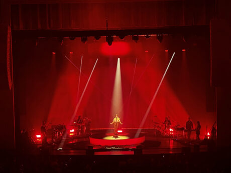
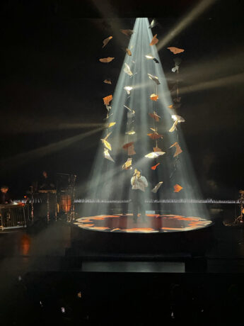
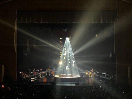
There are two main physical set elements, First, a circular platform—14’ in diameter, 2’high—that Mitski almost exclusively performs on. The top of the riser is covered with printed Harlequin Clarity vinyl flooring, and the riser has a custom-printed skirt, both with the Mitski Orange to black gradient. The platform also has 12 circular cutouts to allow for 12 ACME Pulsar S2 fixtures to fire up through the Harlequin Clarity.
Geometrically above Mitski’s platform, and crucially mirroring it, the second main elements is an approximately 14’ diameter circular truss which contains lighting and scenic elements. Twelve 12 ACME Super Dotline linear fixtures are hung from the outside cord of the truss whilst eight GLP X5 washes, two Ayrton Huracán profiles, and two GLP JDC1s are also positioned inside this assembly. The Dotlines were chosen for their very narrow beams to encircle Mitski and allow for beautiful modulations of light. The LED washes are used as powerful beams from above, while the Huracáns are used as top key lights, along with one on the floor, with a Follow-Me system.
The circular truss is skirted with a 4’ Mitski Orange to black gradient truss border. Hung from the top of the truss on outriggers are solenoids for the circular Kabuki used in the first song. The last, and most unique, component are eight Wahlberg DMX winches used to lower and raise a cloud of copper pieces that match elements of the album artwork. When deployed, this creates a mesmerizingly beautiful mobile of slowly rotating copper shards which reflect the light from the X5 washes above and the ACME Pulsar S2s below. The mobile is slowly deployed in a song near the middle of the set, and in the subsequent song Mitski interacts with the shards and they are raised, one-by-one, back to their home position.
Throughout the performance, the lights pointing up from the platform and the lights pointing down interact with one another forming barriers, cages, and create pathways for Mitski to interact with. The backdrop and truss borders are also a very important part of making sure all the physical elements on stage feel like one entity. These are made from a black/orange shot velvet fabric which takes light incredibly. Travis Shaffer and Nicholas Schwartz at Upstaging fabrication did an absolutely incredible, beautiful, job of transforming my ideas into real physical creations on the stage.
What were some of your other gear choices, and anyone you’d like to highlight?
All the equipment choices were informed by the physical stage set design and the lighting that needed to enable the performance. The front and back truss ACME Lyras, GLP JDC1s and X5 washes are the workhorses of the lighting system, being used in a more conventional way. The CHAUVET COLORado PXL Bar 16s were chosen to uplight the backdrop and create incredibly punchy, bright, beams when focused forward above Mitski.
The placement and abilities of the various fixtures gave us huge scope for creating individual worlds. Saul Valiunas, Programmer/Lighting Director, spent a huge amount of time creating beautiful individual modulations for all the cells of the various fixtures. It was a lot of work, but the result was that we could light each song to perfectly represent the music and Mitski’s performance. I would like to thank Saul for his patience during our nights programming, our lighting team on the tour of Myranda Risley and Myles Wong, Production Manager Nick Hardy, Stage Manager Nic Close, and John Bahnick at Upstaging for looking after the tour.
VENDOR VIEW
Josh Wagner,
Project Manager, Upstaging, Inc.
On solutions Upstaging provided
Some of the solutions were fun projects, such as how to hang the lights in the middle of the circle truss without interfering with the copper scenic pieces on the winches, and placing the Pulsars under the custom riser so they could light through it. We also built a custom Kabuki system for the circle truss. We worked with Travis Shaffer and Nick Schwartz from our fab department to incorporate all the solutions during their scenic build.
On supporting Show Designer Andi Watson
Andi is a visionary, and an extremely intelligent person. Working with him always leads to interesting ideas and a bit of an education. He comes up with extremely original concepts most haven’t seen before. Coming up with the plan to make his ideas a reality is always a challenge that’s well worth it in the end. Andi’s always ready to help formulate a plan, and equally willing to help work out the solutions to any problems.
On why Upstaging was the right vendor for this tour
Upstaging was the right vendor for this tour for a few reasons. We work with Andi on a lot of projects, so we know what to expect from him and equally we have the experience to give him what he wants. We were also able to offer a one stop shop for this tour—lighting, scenic, and trucking. Additionally, we were able to give them a space to program and rehearse. That allowed them to get a lot of work done before the wheels hit the road. Also, this was our first time working with most of the people on the Mitski production team. They’ve been great on all fronts; one of the most upbeat groups around.
