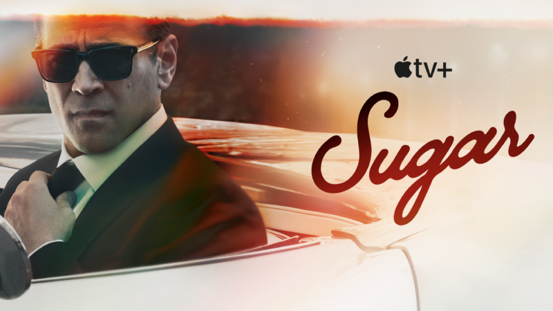
 The AppleTV+ production of the Neo-noir Sugar follows private investigator John Sugar [played by Colin Farrell], who examines the mysterious disappearance of Olivia Siegel, the granddaughter of a legendary Hollywood producer. PI Sugar, with a passion for classic cinema, is enigmatic and struggles with personal demons as he tries to track her down. As he digs into what happened to Olivia, he unearths Siegel family secrets, old and new. Set in contemporary Los Angeles, Sugar is a modern spin on the hardboiled detective story that feels like a throwback to film noir classics ranging from Raymond Chandler’s The Big Sleep to James Ellroy’s LA Confidential. And while modern, Sugar, cinematographically still evokes the noir look beautifully.
Cinematographers César Charlone and Richard Rutkowski split duties on the film supporting Directors Fernando Meirelles and Adam Arkin respectively on this half-hour drama series. PLSN spoke with Rutkowski about shooting the fast-paced storylines of his episodes all over—warm studio interiors to bright exteriors—Hollywood and Los Angeles. In addition to exploring practical effects, placing clues in Polaroids, cellphone and laptop screens, as well as shooting an anamorphic 1950s-style film segment that’s shown at a glamorous Hollywood retrospective.
Talk about the collaboration between you and Charlone, as well as about shooting in the noir style, but with a modern approach.
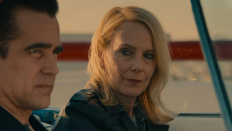
Well, César is like a hero to me. I mean, City of God and The Constant Gardener are two movies that I bring up a lot when I try to talk to a new director about visual style. I was so happy to meet him; he has such a long track record of doing great work. He was a complete collaborator on this show. It just was the friendliest, nicest collaboration, and I really think his work is outstanding. He helped me see some of the patterns that they were using to get the effects they were getting. I feel like I helped him in some ways with the lighting situations on stage because he wasn’t used to lighting big stages. So, it was just a really great collaboration; he’s a gentleman and also a real talent.
So, yes, this was a very collaborative show because the first block was directed by Fernando Meirelles and shot by César Charlone. Adam Arkin, my director, and I were working in alternating blocks with Fernando and César—we shot episodes 3, 4, and 7. The theory of the show was that it’s a modern noir, it’s very meta, very self-referential, and historically referential. We wound up with literal references on screen to some of the classic noir—Double Indemnity, the Mike Hammer films, things that truly have a root that we wanted to unearth the possibilities from. Being in modern day Los Angeles, there were so many opportunities to expand this vocabulary while at the same time acknowledging that others had done it.
LA Confidential comes to mind; in fact, we had their villain, the marvelous James Cromwell. So does The Long Goodbye, The Grifters; I was particularly taken with To Live and Die in LA, which was marvelously photographed by Robbie Müller. César and Fernando have quite a shorthand from their almost three decades of working together. It was marvelous to watch them piece together how they would shoot things, the volume of shots they would create, the dynamic-ness of these shots. They never wanted a traditional setup like a master and coverage. It was always more pastiche and collage. So, we fell into that slip stream and then moved it in the direction of our work. We wanted contrast. We wanted a different color palette, and we wanted the light, the intense light of Los Angeles to feel present in the photography, and for Los Angeles itself to be a character.
There appears to be a large amount of natural light in the show. Talk about the use of natural light and creating the balance with light and shadow.
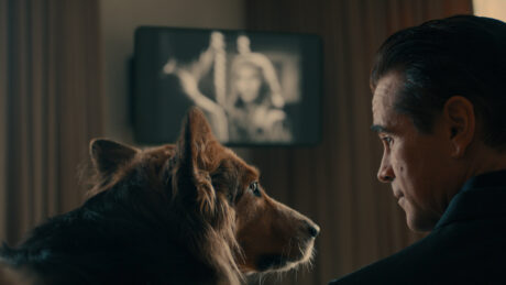
I’m glad you say that because while there is a large amount of natural light, there’s also a lot of work spilling the natural light on stage interiors. And we knew that the LA-ness of it all had to be a very important storytelling point and it had to also be a foundation under which the audience believed, oh, modern day noir, modern day gumshoe, but of some elevated level. They don’t know how elevated until they get to the end of things, but the importance of light was obviously something that had to be referenced in the photography. So, we let overexposure happen, and for a lot of the day exteriors, we embraced big, long vistas, be they city vistas or in the countryside, rural vistas, like when they go to Arizona.
We also were aware that we were going to have some issues with an open convertible car driving around Los Angeles, not being able to control the lighting at all times. We embraced that not only in day, but also at night. I think some of the night photography in that open car is absolutely gorgeous; it came out really well. It’s a boldness on the part of the filmmakers to embrace that because many people would say, ‘well, why don’t you do an LED wall or do something more controlled?’ No, we wanted to see Los Angeles and make it part of the shots. Then on some of the interiors, you will, I hope, think that they are totally naturally lit by bright sunlit windows. They’re in fact stage interiors. So, Ruby’s house, all the interiors are staged both day and night, and Sugar’s suite at the hotel were beautifully built by Production Designer Tom Foden. He did a great job.
We sold, I think, a very convincing natural light aesthetic in Sugar’s bedroom at the beginning of episode three. We played the reflection of light, from outside a window, on the ceiling. We played the daylight in the background on a seamless drop, and I felt very, very satisfied with all that. With Ruby’s house, once over the threshold of Tom’s interior set, you’re in a real location. So, we did shots that completely went one to the other and I thought they were very successful. On a technical level that can be a challenge, but I had a very good Gaffer in Tracy Estes, who was equally ambitious to the idea that this can be a lit show, a show that uses lighting as part of storytelling, as part of an overall aesthetic. That’s something I think you get when you have a self-reflexive color noir show set in LA. There’s an embodiment of the old studio system and yes, people used to light in certain ways. Now we’re more modern, we have different instruments, but we’re still lighting scenes and we’re using that to create mood and context.
Talk about your use of both old and newer lighting instruments.
I think that Tracy and his team did well in merging older types of lighting units with newer ones. We’d have the newest LED versions, like the Astera Helios, but sometimes we’d use a Lowell Rifa light, which are great to shape a face, or a 650W Chimera Chinese Lantern that can provide that classic overhead tungsten set up. I liked that we looked backwards to look forwards in some ways. We looked back at older types of Hollywood lighting knowing that was part of the meta-ness of the show, but we also embraced modern tools as needed. There are some amazing lights these days.
Tell us about the film within the show that you shot for the ‘retrospective’ scene in episode 4.
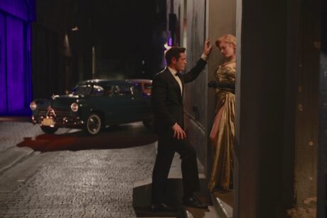
Well, that was a lot of fun. The whole idea of showing a film on screen at the Warner Theater, which was actually in Long Beach, came about because as soon as we scouted the Warner Theater, which is in beautiful shape and beautifully maintained. And like our show, a throwback to the sort of glamor and the dream factory of Hollywood. I saw that they had the right, beautifully maintained projectors in place. I said, ‘let’s just make the film; a short reel, three to four minutes. Let’s show the film on the screen so we can incorporate the image and the actor in the same shot or reflect the image back onto the actor’s face.’ We repeated it several times on a single strand of film so we didn’t have to rewind it for each take. We reflected the film image onto the actor’s face using a soft, silver shiny board or a white cloth.
Then we got to do fun things like see the film actually going through the projector. It solved several problems and saved a bit of money. But what it also created, and this was a nice point of camaraderie and teamwork among all of us, it created the opportunity to look backwards, to look forwards. We knew we needed something that looked like an old Douglas Sirk film with a deeply Hollywood vibe of strong color and very precise lighting and all the things we used to do several decades ago. It also needed to stand out texturally from the current photography. There had to be a texture and a sort of architecture of the image that was very different from what you see in the current day.
Then the film had to tell an important clue, which was about the young woman’s dress on screen. That clue had a resonance going forward in episodes, and within that episode. I convinced Adam, who was for it, and then talked to the producers that this is the easiest way. It gave us the opportunity to bring back anamorphic lenses and a film camera. We had maybe three mags of film, that was our allotment. We had only a few hours to do it, and it was literally the back door to our production offices; a back alley on the east side of the Paramount lot. An alley that has been filmed multiple times, so like our story, it has a self-referential reality to it. We got out the clothing, the cars, the rain effects, and the neon light and we just went for it.
I’m very happy with the result because I think it speaks to what the show is about, which is a mystery tied inside of a legacy, tied inside of a unique place, which is the dream factory of Hollywood. It enabled us to do things that camera persons and lighting persons hadn’t done in years, which is to get out the meter, determine a key side, determine ratios, try to match ratios on both directions, try and control the color palette across a film versus across a video. What I also like is that we never had to involve video cameras in the creation of that segment. The video cameras came later when we saw that film on a screen finished. I’d like to do it again. I’d like to use that sort of opportunity again sometime because it was really a lot of fun.
You also needed to capture quite a bit of the social media feeds, laptops, and computer screens for the show.
We were very aware that it’s the modern day, and the mystery of the missing girl, Olivia, is going to be part of a social media feed. There were clues from social media; that’s just part of the world we live in. Instead of writing letters or deciphering from telegrams, or a locket left behind in a box, although there is some of that, we used social media as a storytelling prompt and as a clue, so it made sense to us. Then we went for it, and I liked the way it interacted with us generally.
We had a very good on set video department that could mostly put on screen the images we needed. Sometimes it had to be a gray screen because material hadn’t been shot yet, but mostly we were able to see it and of course brighten or darken the screen to match what our lighting was on camera. When it came to filming [the social content itself], there was a lot of iPhone usage. The iPhone has matured, and you can get lenses on it. I also used the ultra-compact Sony RXO, which is a tiny little box of a camera; it works very well. We used the Sony RXOs all around that theater when Sugar was seeing the interrelations of the characters across a wall of video surveillance images. He’s looking at RXO feeds that we had brought in during the photography of other scenes. They were all over the place—but you just never saw them—they captured those images for us.
What were one or two of the more challenging scenes to capture?
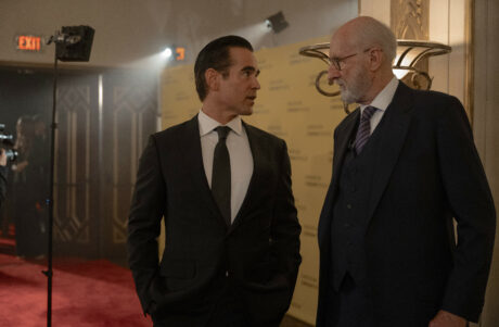
Well, the two days that we spent at the Warner Theater in Long Beach were challenging days because of the amount of material that needed to be seen. We needed to see the arrival, which is a big crane shot, walking Sugar in amidst extras and vehicles, flash photography going on. We walked him all the way in and continued the shot on Steadicam. It was pretty cool. What we did was place Kenny [Niernberg], our Steadicam operator on a lift arm, it came down, then he stepped off and followed Sugar inside. Kudos to Colin for helping with that choreography. If you don’t have an actor who knows where the lens is and how to work with it, those shots can be hard to do.
We had to then go through all the scenes that takes place outside the doors of the theater, then the scene inside the projection room, then the scene inside the screening room, then the scene of the Q&A with Ben Mankiewicz. Then bad news arrives, and the heart attack backstage scenes. So, that was all done in two days, which was a big lift, but we had prepared for it. Adam’s a very prepared director and I like to have all my ducks in a row and be on it with the technical crew. Thanks to both Tracy, and David Donoho, our Key Grip, the camera operators and assistants, and everyone, we had the ability to sort of be ahead of things, one after the other. We got that work done, I thought, in a very good amount of time. And it was good work as well, which is the most important part. I think another challenge was being in the open cars driving around LA. We had two cameras and would try to, of course, change up shots during a run. We wanted to get several different angles and have it all be able to be edited as part of a phone call he’s making, or a conversation he’s having, all while he’s driving. That had its own challenges because you have to be safe, so you’re led or followed by police. The main thing was to just keep the cameras active, stay in communication with the operators, and know what the shots were that we needed to tell the story.
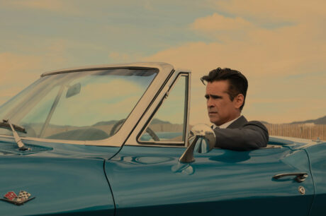
Another thing that comes to mind, is the car. That car was a revelation because it’s an older car, but it’s made of plastic. So, the normal magnetic mounts were not going to work. We couldn’t do a good mount. Also, you really had to be very precious about the car. So, we were on low loaders with dollies or tripods, sometimes a [camera] slider, trying to not touch the car but get cool shots of it. It wasn’t always easy. Then you also have to plan your routes so that you’re exploiting the best daylight in daytime. We were also exploiting routes like Wilshire Boulevard at night. I’m just very, very grateful to Colin for being an actor who can work in that situation. Not every actor wants a camera right in the passenger seat next to them going between the rearview mirror and their face and their hand when they’re driving. He was not only game, but really capable and aware of the lens.
I also think of the scene where he comes to Melody’s rescue and we had several pieces to shoot for that sequence: him driving, him arriving, him figuring out which apartment to go to, running up the stairs, and then he has a bit of a spell just outside the door. And again, working with Colin and the camera, just inches apart, I was pulling the lens out of the mount to get this dramatic effect of going out focus and snapping back in. Colin was just so ready for that and ready to work with us on that. And the way it feels then when you move from, he’s this dynamic guy in a suit running upstairs and now he’s having this terrible moment and then he’s in the hallway charging, and busting in to the room and he sort of takes over the situation. I thought that was all really well achieved, and it was not easy when you look at it on the page, but the way that the crew worked together, and Adam and the actors, it just became, ‘yeah, this is it.’ I was really pleased with that sequence.
Talk about your collaboration with Production Designer Tom Foden.
Tom is a very gifted, very diligent, and very hardworking production designer. I really admire his resume. I admired his eye, and he had a great team—set dressers, lead men, and everything. His ears are open and he’s smart; he comes up with solutions that are capable of being done in time for the production. You have to balance that we went to some very high-end locations, like the Siegel mansion, but we also went to some lower end locations—nasty motel rooms or back alleys of the oil fields in Culver City. Tom embraced them all and did great work in all of them. It’s actually a very handsome show, thanks to his work.
How would you sum up your experience working on Sugar?
Well, I think it’s important to recognize that this is not middle of the road, or predictable content, and I just want to applaud Apple for getting involved in this. Of course, they have a wonderful star and producers, so it seemed like it was going to be a great project. But it would be forgivable to be in a position to greenlight a show and look at this content and say, ‘wait a minute, what are you talking about? How many times are we going to cut back to black and white movies from the 1940s?’ But they did it, and I think it’s receiving a lot of interest from other filmmakers because it’s bolder and outside the norm. I hadn’t worked with Adam [Arkin], our director, since I did the first season of The Americans with him. After eight or nine years, we finally found a project to reteam on, and I couldn’t be happier with that communication. He’s got great ideas, but he never makes himself completely the general, and you the lieutenant. He really wants to work together with people, and I find that to be a situation where I do my best work. So, I felt like this was a great opportunity thanks to him and his way of working. I am very pleased with the show, very proud of what we all did.
