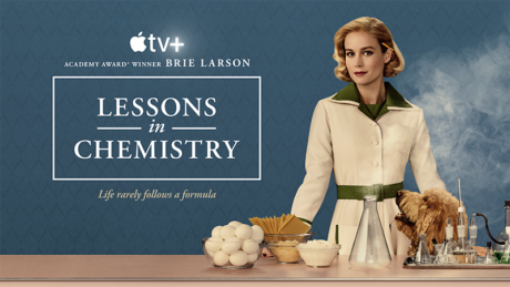
Set in the 1950s, the critically acclaimed Apple TV+ series Lessons in Chemistry, follows Elizabeth Zott (played by Brie Larson), whose dream of being a scientist is put on hold in a patriarchal society. When Elizabeth finds herself fired from her lab, she accepts a job as a host on a TV cooking show and sets out to teach a nation of overlooked housewives—and the men who are suddenly listening—a lot more than recipes. For Cinematographers Jason Oldak and Zack Galler, the visually stylized period piece offered both creative opportunities as well as challenges. One such challenge for Oldak as DP was creating distinctive looks for both the 50s setting and the 1930s flashbacks in an episode. There were also shoots on lakes, numerous exteriors and various interiors to navigate, light and capture. It is of note that in today’s seemingly rapid march into virtual production that Lessons in Chemistry never entered a volume, shooting entirely on set and locations.
PLSN recently spoke with Jason Oldak, just prior to the ASC Awards, for which Oldak was nominated in the Limited Or Anthology Series Or Motion Picture Made For TV category for his evocative work on Lessons in Chemistry’s episode 107 “Book of Calvin.” This well-deserved recognition is of no surprise to fans of the show, which simply looks stunning, in scene after scene, where the lighting and the capture on camera fully supports the narrative; immersing viewers in the world of the story.
Tell us about the visual aesthetic, from a cinematography POV, that is the core of Lessons in Chemistry.
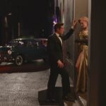
Really the idea is a ‘less is more’ kind of approach. When we started out to set a look, we knew we wanted to find, say the right vintage glass to tell the story; not over do our LUT [Lookup Table], we knew we didn’t want the look to overpower anything else. We had an amazing costume designer [Mirren Gordon-Crozier] and we had an amazing production designer, Cat [Catherine] Smith, who both brought a color palette that did worlds and wonders for us. I feel like with the mix of our LUT, which sort of embodied that 1950s Agfa color stock that we used to have, it had a sort of warmth to it. Some cools would pop through, but in general, I think let that be very subtle. Let the colors of the show play out. We used Canon K-35 lenses, so there was already some vintage glass happening there. The atmospheric smoke, sort of softens the light, let it carry the scene through the spaces, and really that was the look. In terms of where did we start for the visuals, I think Zack Galler and I, we both shared similar images in our respective interview look books, some period images and whatnot. But really, I think once we narrowed in on what we wanted to do with the show, ‘less is more’, the subtleness of it all, is the way we approached it.
You mentioned working closely with Catherine Smith, talk about that collaboration.
She started sharing images with us right from the beginning. She was a plethora of knowledge in terms of the period, and her team were just top notch. If we had any questions about certain shots we wanted to do, she was very much attentive on how she could solve that for us. We used this remote head, an Arri SRH, throughout most of the show; a stabilized remote head. We wanted to move with the actors a lot. Not in a West Wing way, but more if we’re moving from room to room, asking, ‘can we do it with the stabilized head, rolling all the way through without sort of a bump here or there?’ And Cat actually built sets in a way so that when we would move through the Hastings lab it was smooth. It was built thinking about the camera. Her whole mindset of building was also keeping us in mind, which was great in terms of lighting and camera movement.
When a show has multiple episodes with multiple cinematographers, how do you maintain that visual through line?
In general, especially with a television show, you have multiple people coming in and out. You have different directors, different DPs on different episode. So, I really do believe in establishing a through line. There has to be some sort of through line to a show that should really feel like a movie. I can’t speak for other shows, but I will say that Zack and I were on the same page from the beginning. Obviously, I mentioned a little earlier, we shared similar ideas in terms of the imagery that we presented to the producers in our interviews. But once we started, we were very communicative. Since he went first, I was watching a lot of what they were doing in the respect that, how he was moving the camera around, etc. But the interesting thing about this show is that it chronicles a woman’s life, right? And each episode are chapters that almost feel like stages of her life, different emotional arcs. So, there was a lot of room for each of us to give our own voice, but still keep that through line. In episode three, which I did, she loses somebody. We go to a very different tonality in terms of our lighting, but it wasn’t a departure from our overall look. It was just a different approach to how we did that same palette in terms of lighting. For Zack and I, throughout the show, I feel like it was very important, and I’m sure he would say the same, to keep this through “Lessons” feel.
Though the show is set in the 1950s, there were flashback sequences to the 1930s, how did you handle the lighting to differentiate those two time periods while maintaining a cohesive visual style?
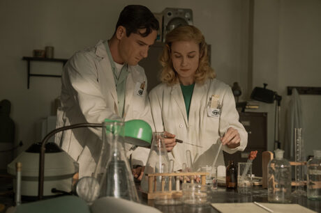
When we read episode seven and we were introduced with this 1930s aesthetic, the director, Tara Miele and I, we talked about if there was a place to sort of depart from the quote/unquote “Lessons” look, maybe this was it. This was a character, Calvin, where we’re going back in time with, we’re telling his story. His story was he was stripped of a home, he was stripped of a family, and yet had the perseverance to keep moving forward and upward with his scientific background, with his intelligence to then reach, where we know in the present of our story. It felt like if we’re starting in the 30s in this boy’s home, maybe we strip some of that color away as well. We cool off the palette, we bloom the highlights a little bit more. We also found imagery for that and shared it with our final colorist and with our DIT [Digital Imaging Technician] to kind of get us in the ballpark with that LUT. And again, costumes and set design worked with us in terms of limiting the color palette overall. Then when we transition to 1950, there’s a camera flash. We bring ourselves to 1950, and the perseverance of young Calvin is now shown with more color, with more warmth. So, I think it’s a nice way you see that differentiation between the two periods.
Can you tell me about one of the more challenging scenes to capture? I imagine shooting the rowing scene was particularly hard.
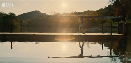
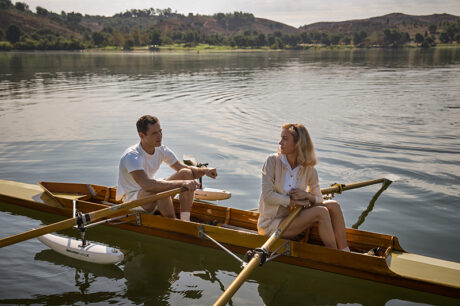
The rowing scene was one of the most gratifying, and one of the most challenging scenes of the most challenging days of the show. Because, when you put together a TV schedule or a movie shooting schedule, if you have a location specifically, like a lake, you want to not only shoot the lake scene from episode seven, but you also want to do the lake stuff from episode eight. And oh yeah, we had a little bit from episode five, since that is the same director and we’re all going on episode seven, so let’s do that also on that day. There is a lot to do in a day. Plus, it also happened we were shooting it in December when the light sets at 4:30. So it had to be very planned out. We worked very intensely with our AD, our director, about what we were really looking for within each shot. Now, a lot happens on the day when you’re on the water, but for me it was very important to be in the right place where the sun was, in terms of camera and sun.
And then also the imagery that we were shooting, at least for episode seven, dealt with it. It was being overlaid with this narration between two men that are writing letters to each other. The director and I wanted to tell a story of Calvin rowing that worked metaphorically with some of what they’re actually saying within their letters. There were intentional ways we moved the camera. It wasn’t just put ‘em in the water and shoot a bunch of stuff. There was structure to it, and we had to get it all done within maybe a 10 /11 hour day because of the sun situation. So, it was very challenging. But in reading the early scripts, there was a scene about Calvin in the open water in early morning. I remember reading it and thinking, oh my God, it was so visual in my mind, it was something I really wanted to do. And then once we got to episode seven and I was able to shoot that day, it was so satisfying to me, some of my favorite shots.
Is there a particular scene or scenes that really epitomizes what you were trying to do as a Cinematographer? [Answer has spoilers]
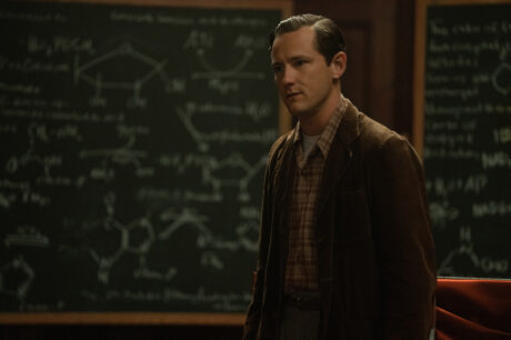
Episode seven, I have so much love for that episode, but I also equally love episode three. In episode one and two, you see this love start to form with these two characters, and the actors were so amazing, and they made you fall in love with them. And then as soon as episode two ends, everything is taken from you as an audience member. Episode three was a departure in many ways. I lost my father many years ago, in a very similar tragic accident, not exactly, but in a similar way. So, the way we photographed that episode was personal in many ways. Just that feeling of what somebody goes through when you find out that someone has been taken from you. It’s almost like everything around you kind of slows down, which is what [Directors] Bert&Bertie and I created at the very beginning of that episode.
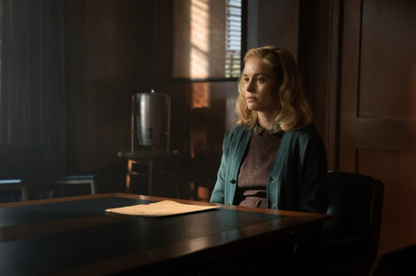
We had this montage where the character finds out the news and then she moves through. It’s all about moving through time. All of a sudden, she is in a funeral home and then she is here and she is there. And I think the episode was very satisfying in terms of where we went with the lighting, how sometimes it was all about just being still, there’s a lot of movement in our show, but in that episode in particular, Brie acted so much with just her face. There was not a lot of dialogue, so there were moments where it just felt right that the camera found the right composition and let her do her thing. I really love that episode, episode three… and episode seven.
Tell me about working with your Camera and Electric teams.
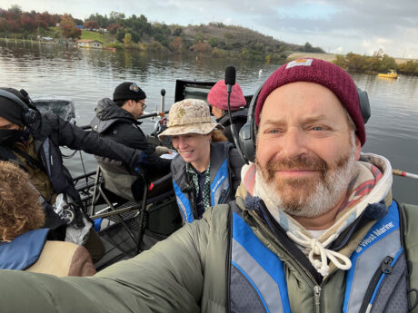
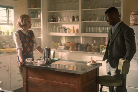
I would say at least half the people on my immediate crew I’d worked with before. Our Gaffer, Len Levine, was a new collaborator that I hope to do many more projects with. He is one of the most talented people I’ve ever worked with. He knows so much about lighting, both him and his team. I would not be where I am without them in regards to this show, equally that for the Grip team. And my ‘a’ Camera Operator, his name is Mikael Levin. He has done probably five or six shows with me. There’s so much beautiful movement of the camera in this show. We used a lot of crane work. All the open water stuff was a crane on a pontoon boat. We were all moving and telling Mikael what we were looking for, but his talents went above and beyond any of our visions. He truly is one of my closest collaborators, and you can actually see his work in how the camera moves and frames itself. So, yeah, this show really felt, to me, like a dream team in that everybody that was hired knew exactly what they were doing, and everyone wanted to be there. Everyone had a passion for this show. I know a lot of people say that, but I truly mean it. This really felt like such a great group of artists and technicians. I am so grateful to all of those people because a cinematographer can’t do this job without them.
