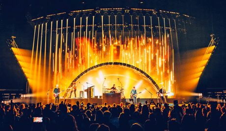
Matchbox Twenty is currently treating audiences to a unique emotional musical experience on their Slow Dream tour, the band’s first tour since 2017’s A Brief History of Everything. Produced by Live Nation, the show features a co-Production Design by Sooner Routhier and Curtis Adams, working closely with Matchbox Twenty’s Paul Doucette, who in addition to being the band’s guitar player, also serves as Creative Director. The show design reflects the journey that the band wants to take its fans on during the evening. The creative team also includes Associate Lighting Designer/Programmer, Nick van Nostrand; Lighting Director, Fraser MacKeen; Video Programmer, Joshua Stuart, and Content Creation by Raw Cereal (Anders Rahm, Grant Draper, and Cort Lawrence). Taking time to speak to PLSN, the team shared some insight into creating the right visual experience to support this tour.
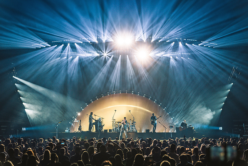
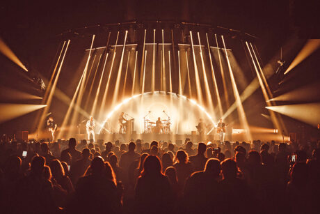
The creative direction for this tour came from Matchbox Twenty, explains Doucette, “Things that felt important to us were that the show felt minimalist and architectural. It had to exist as an environment in which the band lived in. The sphere gave us the environment and the trussing gave us the minimalism; and together was the architecture. But it was also important that it all could go away and become intimate. The ‘nucleus’ gave us the ability to leave the environment entirely for a moment and go into a new world. So, when we brought the sphere back it felt new again. And finally, the show had to grow and evolve as it moved on. Which is where the wall came in. We feel you have to save something for the middle and for the end that shows people something they haven’t seen yet. But more importantly, feel something they have not felt yet.”
Adams also notes the band wanted to “evoke fun and joy with the audience through emotions and art. From the first moment we spoke with the band, we knew this show would be special. The design was inspired by several pieces of key art provided by the band that offered strong style influences around minimalism, texture, and desaturated colors.” Routhier agrees, saying, “The band wanted to take the audience through a journey of emotions during the show. The main focus was ‘joy’; the feeling of being surrounded by thousands of people singing and dancing along to your favorite music.”
Creating the Mood
“Our view of a show,” Doucette describes, “is that, just like the structure of a song or a film, it is very much a story you are telling an audience. It’s a journey and our job is to be the guides. The moods gave us a structure to work within to do that. It starts with the set list obviously. How we want the flow to go. We knew we wanted to start with joy and celebration to invite the crowd in and end with nostalgia so that they left feeling the 27 years we’ve all spent together. The rest was figuring out the path to get them there. Once we got down to production rehearsals, sometimes we saw that in order to get us there, we had to break away from the mood structure slightly. But having them give us a box to work in and when we left it, it was by choice and not random. It felt intentional. And we think people feel that. Even when it’s not obvious.”
Routier recalls, “Curtis and I brainstormed emotions, moods, and color and kept coming back to circular shapes—spheres, colors, moods, nostalgia… The entire discussion began to feel centered around a mood ring. Mood rings by nature appear very hazy. You get the feeling that more will be revealed to you the longer you look at it.” This exploration of spheres and mood rings led the team to come up with the idea of an inflatable sphere that would be placed in front of the video screen to work with—and alter the video content.
To realize this sphere idea, they went to longtime vendor Matthew Whitehead and his Amsterdam-based Airworks team. “The Mood Sphere,” describes Adams, “was designed with an opaque to translucent gradient, which would soften and texturize light and color emanating from the sphere, giving content and light the appearance of being ‘dream-like.’ We knew that this project would not be an easy task, so we went to our partners at Airworks, who possessed the artistry needed to capture our vision and would also be able to navigate the Mood Sphere’s practical challenges and limitations. The Airworks delivered an incredible piece.” Routhier concurs wholeheartedly, “Airworks is always such a pleasure to work with; extremely professional and talented. They always provide the perfect solutions for our crazy ideas.”
Routhier particularly points to the halftone gradient that Airworks applied to the inflatable Mood Sphere for “creating the ‘other worldly’ effect that we were expecting, just not to the degree of sexiness it ended up adding to the show. When we first saw lighting and video affected by the gradient, we stood in awe, walking around the room and watching from different angles.” Much like the idea of the longer you look at a mood ring as mentioned by Routhier, Adams attributes the same concept to the sphere saying, “The objective of the inflatable sphere was to explore color and texture that continues to change the more you look at it.”
An Arc of Colors
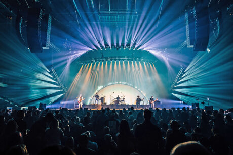
The team structured the show into four ‘moods’ through the arc of the show—three acts plus the encore. Creating different moods for each with color and video content to realize the emotions of the various acts of the performance. “Sooner and I discovered quickly in the design process that our through line was a color story, and unlike a traditional three-act show, we developed four primary moods that captured the essence and arc of the show,” says Adams. “We knew that we had to find the perfect combination of hues to achieve the show’s theme, and Sooner is truly a master of color. Together we were able to marry different emotions to colors and then build a unique color palette for each of the moods. Our four moods for the Slow Dreams tour were—Mood 1: Joy & Celebration composed of magenta, pinks, CTO, CTB, orange, muted yellow, yellow, and orange. Mood 2: Love & Connection comprising of royal blue, teal, light blue, purple, lavender, CTB, emerald, and forest green. Mood 3: Peace & Harmony comprising salmon, teal, lime green, mint, muted yellow, and daisy yellow. Mood 4: Nostalgia consisting of magenta, purple, salmon, peach, CTO, pale yellow, and yellow. A song would inspire a unique color combination based on the emotions it evoked within that mood’s color palette. Once we had these color themes decided on, the content and lighting teams were able to make the show come to life to enhance the experience beyond the Mood Sphere.”
The creative team drew upon various key influences in designing the individual looks. Adams continues, “Sometimes it was the song, sometimes a piece of art that the band had provided, and other times the performance revolved around a creative concept perfect for that number; however, the various ‘moods’ were the real driving force for the evolution of the show. From the beginning of the design, we knew we wanted the show to grow throughout the evening, so one of the key challenges was keeping the show smaller in the beginning and focusing on content within the sphere, without affecting the performance’s impact.”
Abstract Content
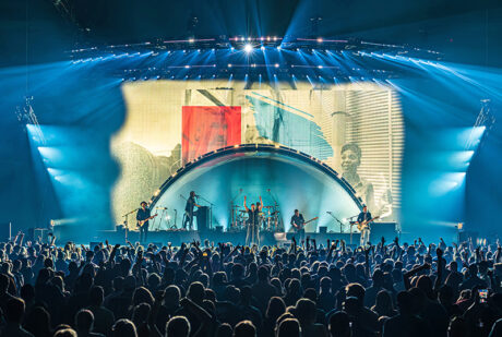
In terms of content, Routhier and Adams laid out a creative vision that included using content in various sections of the video screens throughout the show to build the scale of the show during the performance. Content creators Raw Cereal describes, “there was a heavy focus on building into the show, starting small and building into bigger moments multiple times throughout the night.” They continue noting the main goal “was to start within the sphere, and just a small amount within it. We then, song by song, built towards the inner edge, until we had a large reveal of the screen space outside of the sphere. From there, all bets were off, and we worked to develop moments of interaction. A big moment that comes to mind is in “Parade” where we saw an abstract ‘opening’ in the sphere open, colored spheres began to pour out and fill the sphere, and when the music grew to a large moment, the spheres were released, floating upwards into infinity. As the music continued, the spheres floated down, now bouncing on the outer edge of the sphere making it seem as though the video were physical and there with us in the room, playing with the stage design. A big advantage of the sphere material and screen placement was that the sphere would reflect the video, often making it look as though the video was physical and the imagery floating in space above the stage.”
Raw Cereal aimed to build imagery that was abstract while following the storyline of the collective mood ring. They explain, “That helped narrow down our focus to color and emotion, to finding the right shape and textures to match each emotion. And to running through the spectrum of colors that were put in place to define songs and acts in the show. The sphere allowed us to think outside of normal boundaries of screens and live within a fun new structure, overall building an art piece instead of boxes of video. We saw that this approach helped the lighting come to life in a big way; not being overpowered by video and allowing for lots of space.”
“The color story and ‘moods’ that were laid out by Sooner and Curtis helped lay out a platform in which to travel along with the music,” they say describing the content creation process. “Once the color direction was laid out, we had the exciting challenge of developing imagery with Sooner, Curtis, and the band. Each mood, and their supporting colors and emotions, called for their own imagery. A big part of the fun of visuals production for the show was spending time as a group developing shapes and motion to match each mood and moment individually. Often, we would find a good fit visually, take a step back, and realize we were missing a hue or not touching on an emotion enough. This allowed us to really hone in on the ethereal nature of the art and push for something greater.”
Choices and Tools
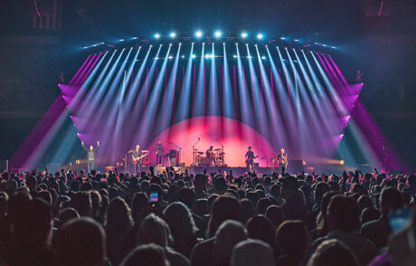
To support the moods, the show’s arc and the video content, the lighting team took their time in choosing colors—and color combinations—to add their visual layer to the creative narrative of the show. “We used color a lot in this show, and we worked really hard to choose colors and combinations that were a bit outside the normal spectrum of what you’d expect to see at a rock concert,” comments Associate Lighting Designer van Nostrand. “We also spent a lot of time subtracting things from the show once it was programmed. I always like to keep the initial programming busy, and then pull back in areas to create space. Forcing yourself to ‘over program’ the show initially, often leads to some great ideas as you’re forced to dig deep in order to avoid repetition. Then you select the best ideas to keep.”
Van Nostrand cites a key equipment choice that he feels works particularly well with the video. “Sooner had the rig designed when I came onboard, but my favorite bit of kit is the [GLP] X4 Bar 10s around the mood sphere. You can’t really go wrong with an X4 Bar, but in this instance, they worked especially well with the mood sphere. They acted as an extension of the video, almost finger-like in some moments.” The lighting package also included GLP X4 Bar 10s; Robe MegaPointes, iSpiiders, CHAUVET Maverick Storm 2s; along with Astera Titan and Helios Tubes. In terms of key equipment for Lighting Director MacKeen, it was the “MA3 lighting console in MA2 mode. On a manually operated show with a limited programming and rehearsal window, it was helpful to have a platform that I knew and could rely on.”
The lighting and video equipment, along with special effects and audio were provided by Solotech. Video Programmer, Joshua Stuart, commented on Solotech’s support, “The Solotech team were quite helpful from pre-viz through to the first show. We had a lot of last-minute details that led to a high intensity rush going into the first show and their team helped accommodate and deliver with aplomb.” LD MacKeen concurs, adding that “It is great to see so many new people who are learning and being taught our industry. Solotech has a great way of nurturing new talent coming into our business and giving them the support they need when starting out in their careers.”
The video product Solotech supplied for the screen was SACO S6 LED video panels with two disguise gx 2c media servers with Notch. The disguise servers were selected by the content and technical direction team members. Stuart, who worked alongside both the design team and the content creation teams implemented the server and screens control, comments, “As the show is not timecode reliant, we wanted a streamlined approach to allow stable playback and flexible, simple show control for [LD] Fraser over sACN/Art-Net.”
Raw Cereal in regard to the tools they used states, “The vision of this show is to be a living art piece. To accent such an artistic design, we had to focus on developing thoughtful moments of interplay and the visual compositions we landed on came out of a want to live within the sphere, outside the sphere, and find interactivity between those areas. We used a multitude of tools that allowed us to develop different animation styles to support the story. Along the way we used Unreal Engine 5, After Effects, Notch, TouchDesigner, and Cinema 4D, all of which allowed us to explore new visual arenas, landing on a final delivery that was dynamic and supportive of the initial show direction.”
Perspective and Point of View
When asked what might stand out about this tour and its design, many of the team had different perspectives—as well as similar takes. “For me, the inflatable mood sphere/bubble really created a unique design point for lighting and video to experiment and play,” says Stuart. “The textures and optical transformations resultant from back lighting with the LED wall and content and front lighting with different LX fixtures and gobos really allowed us to create striking and cool looks. It transmutes throughout the show, starting like a sunrise, becoming a gigantic eye, a Rorschach dreamscape, then a furious cloud over a cityscape, and so forth. It stands out as an interesting design concept by the sheer fact of its modularity of use during the course of the show.”
From a lighting perspective, both MacKeen and van Nostrand feel it’s all about how it looks from your point of view as an audience member. “The show is extremely social media friendly,” comments MacKeen. “It is almost a lost art form to build chases and effects in such a fashion that no matter where you are in the audience, your photographs will be able to capture the exquisite nature of the design perfectly and look elegant online.” Van Nostrand adds, “Fraser does bring up a good point. We did spend a lot of time trying to ensure that every look we built was designed to be viewed from multiple angles. You want things to look purposeful, even if viewed from the side. We also try to ensure that anything with motion looks good as a still frame.”
The team from Raw Cereal sum up, saying, “There’s something charming about the complex and deep back story that went into it creating such a visually exciting show. The design, the moods, the color, the focus on emotions… they all create an extra layer that’s impossible to recreate. The front end creative is what really drives a show like this, and we think others would agree.”
In conclusion, Doucette states, “Sooner, Curtis, the Playground team” and the Raw Cereal guys brought the design intention tenfold. Without a doubt, some of my favorite group of humans I have ever worked with on a show.”
Production Team
- Tour Director: Veikko Fuhrmann
- Tour Manager Assistant: Gerard Heintz
- Production Manager: Tony Moon
- Stage Manager: Colin West
- Tour Coordinator: Suzin Moon
- Production Design: Curtis Adams and Sooner Routhier
- Creative Producer: Allison Ciccarelli
- Technical Direction: Matt Geasey, Bryan Seigel
- Associate Lighting Designer/
Programmer: Nick van Nostrand - Lighting Director: Fraser MacKeen
- Video Programmer: Joshua Stuart
- Video Content: Anders Rahm, Cort Lawrence, Grant Draper
- Lighting Crew Chief: Sam Stuart
- LX Light Techs: Eric Cere, Helana Hardy, Michael McCullough, Maxime Gosselin
- Video Crew Chief: Kenny Ackerman
- Video Techs: Ian Bertrand, Clinton Darrah
- Head Rigger: Jennifer Dymond
- Carpenters: Kristopher Davis, John Herrin, Kaitlyn Rose Feltes
Vendors
- Video/Lighting/SFX/Audio: Solotech
- Video Content: Raw Cereal
- Inflatable Mood Sphere: Airworks
- Staging: Gallagher Staging & Productions
Equipment
Lighting
- 2 MA Lighting grandMA3
- 4 MA Lighting grandMA3 Processing Unit M
- 12 Astera Titan Tube
- 12 Astera Helios Tube
- 28 CHAUVET Maverick Storm 2
- 24 GLP Impression X4Bar 20
- 30 GLP Impression X4Bar 10
- 48 Robe MegaPointe
- 8 Robe iSpiider
- 2 MDG The One Touring
- 2 MDG Ice Fog Q
- 2 Martin Jem AF 1 Fan
Video
- 665 SACO S6 Video Tile
- 2 disguise gx2c Server with Notch
