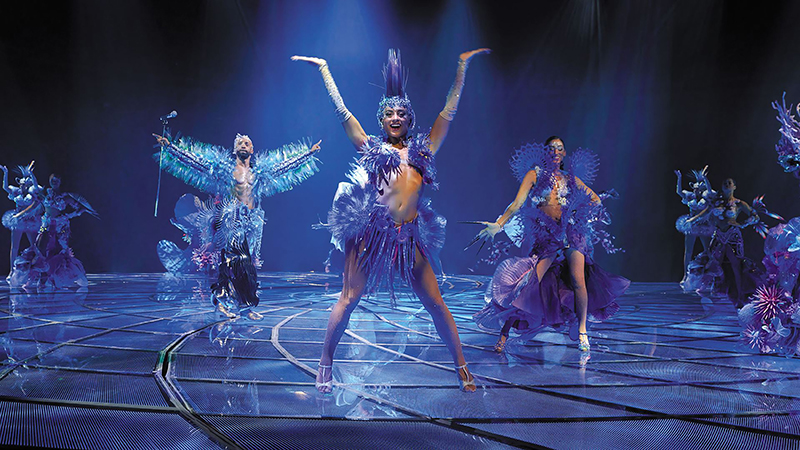
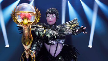
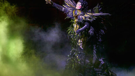
Awakening returned to Wynn Las Vegas at the beginning of this summer, restaged and reimagined. Located in one of the most technologically immersive theaters ever created, Awakening is directed by Baz Halpin of Silent House Productions. The 80-minute 360°-experience, conceived and created by Bernie Yuman, Baz Halpin, and Michael Curry, features a stunning scenic design by George Tsypin, a richly colored, evocative lighting design by Jules Fisher + Peggy Eisenhauer, an individually, fully immersive sound design by Peter Hylenski, and over 300 sumptuous costumes by designer Soyon An. PLSN spoke with Halpin on his experiences bringing the show to reality as a director with a designer’s expertise. We also spoke with Associate Scenic Designer, Vincent Richards who gives us some details of the scenic solutions for this impressive production.
Baz Halpin
Director
As a director, what can people expect seeing Awakening?
It is a Las Vegas spectacular, first and foremost. It’s everything that you would think—and hope to see—in a spectacular like that. The technology of the stage is unbelievable. It is jam-packed with wow moments, whether they’re illusions, human performance, or stage technology. It’s got all of that. The stage itself is pretty incredible; it was built by Show Canada, who also built a lot of the props. The stage itself is a 62’ diameter circle made of steel and is about 18’ tall with a range of motion. They built it all in Canada, then deconstructed it, put it on trucks and drove it to Vegas and rebuilt it in the space.
The video content and video in the show is another big deal. The video content was done by BLINK, Inc. That was a huge part of the illusions that were created by Paul Kieve, which are pretty spectacular as well. I mean, they produce a phoenix that’s 54’ wide and 30’ tall in the middle of a room in about eight seconds. So, it has everything that you’d expect of a spectacular, but what it also has, is it’s driven by the story, by a narrative that takes you along this journey. It’s not an acts-based show in the way that Cirque, or other types of Vegas shows are. It’s got a story that’s compelling and moving, and I think that that’s really what sets it apart from other Vegas shows. The show is certainly… technologically, it’s probably one of the most incredible shows I’ve ever seen. And it’s a show that people seem really seem to resonate with. I’m very proud of it.
You are a director with a designer’s eye. Are there elements you brought in because you understand the production possibilities?
I mean, obviously 25 years in live production, I’ve got a set of sensibilities and I’ve got a taste for what I like. But I also wanted to put a team of people together that would expand on what I could just do by myself. I wanted to bring in a set designer that I thought would do something completely different to what I would do. The fact that it was at the Wynn, and it was a production partnership with Wynn, I wanted to reflect the brand. It sounds somewhat corporate in that respect, but Wynn has such a strong place in the Las Vegas landscape, and the previous show Le Rêve was an amazing show and one of my favorites. It was important that it was reflective of that quality; of that place. I felt that everything needed to be very artful, very beautiful, and with regards to the set, I really thought the elements needed to be sculptural. I was looking at a lot of different designers, and George Tsypin was somebody whose work I always admired, and somebody who really, I thought, was an out of the box thinker that creates beautiful pieces of art.
And George did what I hoped he would do, which was to create something that was so adventurous—building a glass stage that would rotate, split into eight different sections, go up and down, be constructed of both dichroic glass and four-inch thick bulletproof glass, and then build a custom LED matrix from a clear copper mesh and slap that into the middle of it. To build that stage, one that I think is the most beautiful stage that’s ever been constructed and certainly the most technologically advanced, it’s truly amazing. He really understood how to unify the 360° space. I wanted the action and the visual to happen above, in front, behind, everywhere. George brought the room together with these six enormous dichroic glass bridges, which were built by PRG. George is really a genius, he’s an artist and he is singularly focused on the beauty of the object and making brave decisions. What I really enjoyed about George was he was constantly encouraging me to be brave in the decisions and make moves that were more difficult, but the payoff and the success was entirely worth it.
Tell me about how lighting is used from a directorial point of view.
I always admired Jules Fisher and Peggy Eisenhauer. They’re legends in our business. Jules + Peggy had lit the Le Rêve show, so they had a great understanding of the room, and that was critical because it’s not conventional. But what Jules + Peggy also really understood was how to direct attention. That’s the other biggest part of that show, how you direct attention to the action, to making sure the audience never feels lost because it’s a very high energy show.
Visually there’s a lot going on, so making sure that it was lit in a way that your eye was always being led naturally to where you’re supposed to look. That’s the biggest role that lighting needed to play, outside of then just having the dynamism, creating the beautiful looks. Again, there are no backdrops, nothing that’s filling up the space. The issue was then in filling that up, utilizing lighting to craft architectural looks that were more sculptural. I connected Jules and Peggy with Eric Marchwinski and the folks at Earlybird [Visual]. I really encouraged them to have a conversation and see if they’d be a good fit together, which of course they were, and Jules + Peggy ended up working with Eric on programming. Plus, I have to say, they’re incredibly charming people and very gracious, so it was great working with them.
How did you use the scenery and the automation to help move the story?
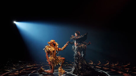
It is about seamless transitions. The show is just under 80 minutes long and there are no blackouts. The story has to push through, beat by beat, and we’re following a lead character on a journey. It was about being very clever in our transition. There are four different levels to the theater space. There’s a high grid and a low grid. The high grid has a carousel system with a dozen winches on it that rotates. Certain scenery and performers are delivered from the high grid. The lower grid has a giant gantry system—like a crane almost—which was built by PRG, that delivers some of the larger pieces of scenery. Then on the stage level, we’ve got three vomitories, which are all connected to the back of house by a big circular ring. Then in the basement, those vomitories are mimicked below in the same manner.
So, you have those four different locations where things and people can come on and off. Moving between them lets us really focus on the transitions between scenes. For example, let’s say, the water world is ending, and the stage goes down to the basement and the scenery is being moved off into the sub deck vomitory, your eyes are however, being drawn up as 1,500 Glow Motion acrylic rocks come down from the ceiling, and puppets are flying above your head. So, we’re constantly shifting where the audience is looking to maintain not only concealment of transitions, but also to keep moving that story along. We really put a lot of thought into the sequencing between elements, to ensure it all flows quickly, and there are never any breaks, never any holds, and it all keeps moving the scenes one after the other.
How did your work in the concert touring space inform your directing work?
Well, my background before I got into concert touring was in classical music and musical theater. It’s almost going back to my roots in a way. I think in concert touring, in pop shows that we create, it’s always looking for high energy, high impact, wow moments, and understanding how to take an audience on a journey; crafting something that has a flow. Certainly, working with music to build a journey that has a pace, that has energy, has the right peaks and valleys; ticking all the boxes of those fundamentals. The flow of Awakening musically has a structure, almost like a set list. Those fundamentals are similar, and I think a lot of that approach, understanding that, stems from what I do on big pop tours. I am taking the audience on a journey with the music.
Is there something you are particularly pleased with about Awakening?
I’m incredibly pleased overall that something so unbelievably technical, with so many axes of motion, with so many giant moving parts, lots of things that are incredibly difficult, we were able to accomplish. And the illusions, we make one of the lead characters, the character of Light, we make him appear in the center of the room. The room is lit, you’re looking at the stage and he appears. He materializes almost like a Star Trek transporter from the head down. It’s an incredible illusion, and one reporter called it, ‘The closest thing to a miracle you’ll ever witness on stage.’ To be able to go from there, the sequencing of everything that needs to happen to get the props to scenery, the illusions, everything to take place, it’s like that metaphor of the duck swimming on the river. It’s peaceful and placid on the top and it just looks graceful, but beneath the feet are spinning furiously. It’s kind of the same thing on Awakening.
I would say that in crafting the show, crafting the narrative, and I worked on how we get from A to B, to C, and my production experience always underpinned that. So, what I am proud of is that we always found solutions without losing energy of how to get from A to B, to C in a fulfilling way. We never thought, ‘Oh, well we can’t do that because that thing’s over there and that thing needs to come in there, or that thing is already on the winch.’ The foundation of the show was rooted in a production sensibility so that it served and supported everything we wanted to do with the narrative. I am quite proud of how it all came together.
Vincent Richards
Associate Scenic Designer
Talk about where the scenic design started and walk me through the primary scenic elements.
We started this process with an empty theater, which at its core is a sphere within a cube. One of our goals was to embrace this essential relationship and echo it throughout the design process and major design elements: the bridges and floor lifts.
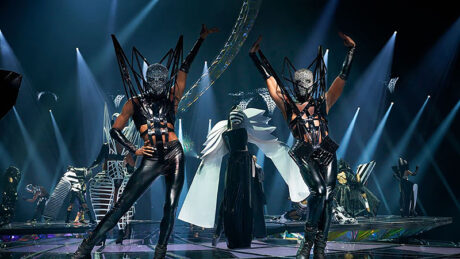
At the mezzanine level, we have six bridges penetrating a wrap around blow-through video wall. The spines of the bridges follow the curve of the original dome of the theater and spiral down clockwise. Each bridge is a triangulated space frame layered with transparent dichroic polycarbonate with embedded LED. The rear of the bridge is mounted on a tracking liftgate, while hoists suspend the other end. The bridges are beautiful, lightweight, but massive 65’ structures that float, uniting the large venue. By adjusting the vertical position of the bridge’s rear pivot, we can create a dynamic and unique flight patterns. The bridges come alive when the performers use them for entrances and exits over the audience. Seeing through the bridges to performers above you is unexpected and rewarding.
The circular floor comprises three elements: an outer ring that lifts up and down, six “petal” decks that move up and down and rotate, and a central circular lift on its own turntable. The shape of the floor follows the same spiral gesture of the bridge, which, from above, echoes the form of a nautilus. We had the privilege of working with the engineering firm McLaren in the early concept phases of the design before being awarded to Show Canada. This relationship proved rewarding because, typically, you design the concept. Then you bring it to an engineer who is usually under a time constraint to get the work into production. We understood that the determining factor would be the structure’s integrity, and ensuring our ability to achieve it took precedence. Collaboratively, we designed everything around triangular space frames. This framework allowed us to maintain an exceptionally lightweight and transparent configuration. Having the structure be a design in and of itself was critical because the LED glass floor needed that transparency so we could light through the diachronic triangulated panels below it.
What were some of the details that got built into scenic elements like the floor?
For the video elements on the floor, we worked with 5TEN, a New York-based company that invents—and helps its clients execute and install custom video solutions. We wanted a transparent/ translucent floor and came up with a transparent LED film embedded in the glass. This product was perfect for this show; we could shine lights through it while mixing transparent video and giving us a multidimensional surface. One of the first challenges was ensuring the glass was structural. Because of deflection, we used ballistic glass to support the show’s weight. The final floor tile is two layers of clear glass and one tinted glass, creating deep, beautiful reflections as if the performers were standing on water.. The diodes are mounted on a very open-weave copper mesh and individually placed to control the LEDs’ pixel pitch and color shift. Hence, the audience in the round sees a consistent color when the stage rotates. Under the glass top surface is another world of triangulated dichroic polycarbonate, each mounted at different angles, just like the bridges. Some of our inspiration came from Roman mosaic floors at The Getty Villa on triangulated layouts. .
Were there other video elements in the set?
A video wall comprising ROE Visual’s V8 system for a semi transparent video screen is on the mezzanine level. We looked at many screens, and the V8 had this outstanding quality. It outperformed some of the other screens we looked at, as it maintained a feeling of lightness and didn’t feel so oppressive when not on. Behind the video screen and all over the space are some Rose Brand LED Star drops and minimal masking that help direct your attention in a very open space.
Was there a challenge that you solved with the automation systems?
Specifically with the floor, we had a couple of challenges: continuous variable rotation, minimal supports, speed of the lifts, vertical travel while rotating, a compressed understage storage area, and constantly playing tracking video.
We had to quickly rule out hydraulic lifts and moved toward eclectic spiral lifts, commonly used in orchestra pits. Show Canada came up with a very clever solution to stabilize these lifts while moving, and now we have an outer ring and six petals that can rotate and move up and down independently. Below the main floor is an area we call the subdeck, with a lighting grid to uplight the floor.
The center disc stage is a column on a traditional hydraulic lift from Le Rêve with a slew ring-based turntable from the previous show.
Tell us about the aerial systems that move scenic pieces.
Above the stage are two grid systems that we called the “High Grid” and the “Low Grid”. The first grid is over 60’ in the air and has a circular hole in the center, with the gantry system made by PRG. The low grid Gantry can rotate 360°, lift 30,000 lbs., and traverse the entire grid length, about 90’. At the center of the gantry is an eight-foot hole, through which we can raise and lower scenery and performers while it is carrying set pieces. It’s fast, quiet, and moves about three feet per second. It’s a great system that Dale Hurt, the TD, designed with PRG.
Above that is a high grid. At the top of that space is a carousel with eight tracks. Each track has a winch that moves in and out while raising and lowering performers. This eight-arm system can also rotate at a very high speed, creating dynamic movements when all of it is in motion. Like the center column, this carousel system existed previously in the space and provided a fantastic tool for Baz and his team to make beautiful stage pictures.
Talk about some of the decorative elements in the show.
Above each of the three voms are kinetic sculptures that mimic the motif of a Phoenix. These were made in Taiwan by Cubicle Motivation Systems, a specialty group that collaborates regularly with George Tsypin. It’s a beautiful piece of machinery with layers of articulating wings and dichroic glass that brilliantly reflects light and dances at the show’s end. Even the hidden machinery responsible for this feels like a work of art, with the precision of a watch.
Hanging below the low grid are hundreds of small winches that display thousands of LEDs orbs encased in translucent sculptures designed as “rocks.” The rocks, winches, and LED were all produced and manufactured by Glow Motion out of Nashville, TN. Each winch held a strand of about 1-6 rocks, moved independently, and could address the LED orbs inside each stone. This element allowed for some magical transitions where what appeared to be static floating rocks in the “Earth” scene could come alive inside and move in patterns above people’s heads.
The automation control is the TAIT Navigator automation system, correct?
Yes, TAIT handled all the automation controls. They did a lot of great work ensuring all the different automation systems worked together in the TAIT Navigator automation control system, which was difficult given all the nodes and various mechanical systems.
How was PRG’s support for the show?
PRG was also excellent. They worked with us on the bridges and gantry. The gantry was right in their wheelhouse because they had built the gantry system for the previous show, but this time we could hang it off the ceiling, which gave us a lot of space to load in the new scenic elements. Working with them on the bridges was a lot of fun, mainly because we could do a large portion of the finishing work from the Las Vegas shop while working in the theater. This in-person collaboration was critical for the finished work on the bridges, where each contained hundreds of unique triangulated panels that had to be mounted individually and around masked LED strips. The Vegas shop had some great problem solvers and skilled artisans who helped me understand how to put this together cleanly and beautifully.
And you worked with Show Canada on the stage floor and some of the scenic elements.
Show Canada is an excellent vendor. As they say, lifts have been in their family for years. Working with a company that was excited to try to move into something new and take on such a risk was fantastic. I loved that about Show Canada; they are willing to try everything. I remember first coming to them to say, “The floor needs to automate, be made out of the glass, rotate, have dichroic and transparent LED video in it, and we don’t want a lot of framing.” They didn’t even bat an eyelash and said, “Okay, we’ll figure it out together.” And we did. They also made the “Fire Tree,” which had hundreds of branches measuring 24’ wide and over 30’ tall, all while being able to collapse into a 9’ storage space. They are talented scenic artists, great technical minds, and have a lot of bravery, which was inspiring.
For such an ambitious show, you couldn’t have better colleagues to work with than Rick Gray and his team at The Wynn.
Working with Rick Gray, Producer and GM for Entertainment at The Wynn, was enriching, and I learned a lot from him because of his history of doing large shows in Vegas. One of the things that stood out for me was when he told me, “Doing the impossible is just a battle of wills.” If you find people willing to do it, you can do it.’ That was a testament to everyone who worked on the show. Most of what we pulled off would have seemed impossible. I’m still impressed that we could complete the scenic elements as close to the original design as we did.
I’m fortunate and thankful for the opportunity to work with Rick and his team, including Dale Hurt, the head TD. Dale is a mechanical genius. When the vendors couldn’t figure something out, Dale was right there, working them through it. The entire Wynn team is fantastic. I don’t know any other group who could have pulled it off, really. They deserve a lot of credit, and I am forever grateful to all those great people who worked with us on Awakening at The Wynn and the vendors.
I don’t know if I’ll have this sort of opportunity again, but it was amazing to work on a process that wanted to capture something that is, in essence, hard to describe but is so different than other things out there and so risky. Having the team around you willing to take such a leap of faith was an experience I’m genuinely grateful for. Everyone wanted to push the boundaries of every department—sound, lighting, video, costumes—every design element. To have everybody firing on all cylinders and trying to drive so far ahead was a fantastic opportunity to be part of and one that I am very grateful for having experienced.
Watch an insightful Behind the Scenes video tour of the Awakening’s stage design and technology to see many of the elements discussed at https://plsn.me/AwakeningTechnology


