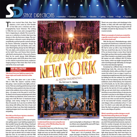
The new Broadway musical New York, New York features a score by John Kander & Fred Ebb and is directed and choreographed by Susan Stroman. The setting is 1946, the war is over, and a resurgent New York is beginning to emerge. The musical focuses on a collection of artists that have big dreams in the city that never sleeps. The lavish production features a dynamic scenic design by Beowulf Boritt; a period-specific costume design by Donna Zakowska; projection design by both Christopher Ash and Boritt; and a rich, color-filled lighting design by Ken Billington. The sets, lights, and costumes were all nominated for both Tony and Drama Desk Awards, with Boritt winning both awards for his scenic design. Billington and Boritt talked with PLSN editor, Michael S. Eddy, about their work on this vibrant musical that has audiences singing along to “New York, New York” each performance.
Ken Billington, Lighting Design
Talk about how your lighting supports the larger style and creative direction of the show.
The show takes place over a year in New York in 1946. The seasons—summer, winter, fall, spring—were crucial to sets, lights, and costumes. That was a starting point knowing we had to hit those various seasons to be clear and make sense to the audience, especially since we have so many locations—22 scenes in Act One and 21 in Act Two. So, there’s a lot of scenery and we’re trying to tell a fluid story without any blackouts. Some scenes only last a page and a half. We have 12 translucent drops upstage, some being onstage for no longer than 30 seconds. So, it was how to tell this fluid story along with telling what time of year and what time of day it was. Now that’s standard for a lighting designer, but it was particularly crucial in this storytelling.
How did you fit all your rig into a standard, too small Broadway house?
It always comes down to the issue of space. Just getting space to put lighting equipment in that wouldn’t bang into other things. Overhead where I had 19” or 20”, I used Ayrton Diablo S because they are 18”. Other places, I had six inches between a scrim and a drop, and I had to find how do I get an electric into six inches to front light the scrim. We ended up with the TMB Solaris Flare Q+Rayzr, which is an inch and a half wide. I‘d used them before; they give a lot of light. I had to put in five ground rows as well, which are [Chroma-Q] Color Force IIs. Overhead, I had ColorBlaze TRXs and Color Force IIs. It was what I could fit. I do feel, the show looks great; I didn’t suffer. It was the classic, ‘Oh, let’s do a big Broadway musical, and you have no room in the theater!’. It is always a fun design challenge, which I enjoy solving.
What were you using for backlight with such limited space?
I didn’t have room for PARs, so I used [GLP] FR 10 Bars for backlight. They’re compact. So, it was knowing what I needed to do, finding the space, and then finding equipment that would fit into the space I had. My soft specials overhead are [Claypaky A.Leda] B-Eye K20s, which is an older fixture, but it’s great and doesn’t have any halation.
I understand that you were using the new LED version of the PRG Best Boy. How did those work for you?
I think that I had some of the first ones. I have 50 of them in the show. They are great. They’re bright and once we took the rubber gasket off the front, they fit. On the electrics, if I have a half-inch on each side of the moving lights, that’s a lot! They’re robust and have a lot of gobos. Since the LED engine was a new element to the light, we had some issues which were fixed as we found the problem. A little software upgrade here and there. PRG solved it all. It never hurt us or shut us down. The Best Boys are my sidelight; I have three in each entrance. They’re great for sidelight and have great color mixing, so they worked well.
What were some of your other key equipment choices?
My front of house is mostly incandescent ETC Source Four 750s with [ETC] Lustr IIs where I needed color. I’m also using [Elation] Proteus Maximus, [GLP] X4 Bar 20s, [Martin] MAC Auras and MAC Encore WRMs. The Auras are on ladders to fill in corners. I was the guy who first ever used moving lights on Broadway in 1983 when six of them were a big deal! Now, the total number of moving lights we have on this is 155. We used an ETC Apex console to control the show.
Who built the practicals and neon signs?
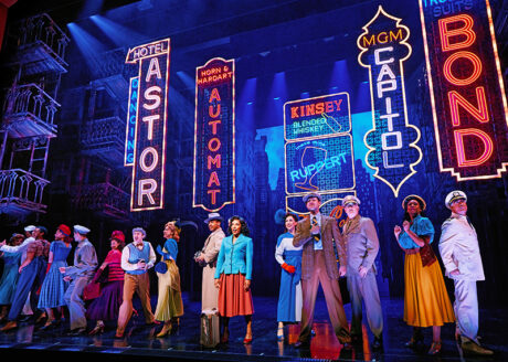
There were a lot of practicals. There were pages and pages of drawings of all those Times Square signs, the New York sign, 100 and some odd light boxes of windows. Then battery-powered streetlights and stoplights. I had an Assistant, Aaron Porter, who did pre-production on the show, spending eight weeks drawing up practicals. The fabrication was all done by Hudson Scenic. The neon was LED neon from Iluminii.
How did color play into your design?
It’s gritty New York, yet bright and sunny a lot of the time. We go all over; we go into nightclubs; we’re on the subway, we’re in dingy bar rooms, we are in Central Park. Color helped define the locations. So, the color needs to be totally appropriate for the time of day, the time of year, and the location. Color helped define the locations. Like the rundown bar is cold and uninteresting. But then when the bar gets fixed up, it gets colorful. I use a lot of saturated color too, or I go with white; it’s whatever the location required. There’s one scene where we’re backstage in the theater, so that’s cold with warm light coming from the wings. Then they go on stage and it’s all footlights and pink for days because it’s a 1940s musical comedy.
What’s an example of a look you created for a specific musical number or moment in the show that stands out?
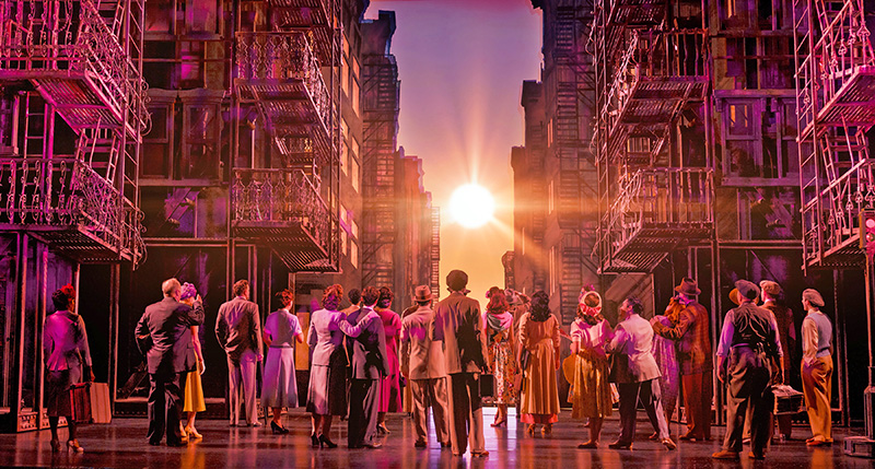
Well, the big one is Manhattanhenge, which for people who don’t know, is when, a couple of times a year, the sun lines up perfectly with the east-west oriented streets. We had to come up with a way of doing that. That was crucial from day one. So how do I do it? Our bounce drop is a Leno. Since I had all these lights up there, that wasn’t a problem lighting it. Then I needed a very bright source of light. We started out with a Wildsun [K25 TC] fixture from Ayrton, which was bright enough but the circle wasn’t big enough. Ultimately, we changed it to a three foot diameter light box.
Everybody has a different idea of what Manhattanhenge looks like, color-wise. Here it’s a combination of pink, yellow, and blue; it’s a great sunset. But when it was onstage, it wasn’t encompassing enough because they start the song by looking out into the audience. So, I put PAR heads on the two balcony rails, on the back of the auditorium, on back of the balcony, on the mezzanine, and out of the booth, etc. The entire audience is bathed from behind with this pink light. Then, the cast for the last bit of it turns upstage. The PARs go out and what’s been coming from behind them is now in front of them. It was nice, but I put pink in and due to color fatigue in the eyes, everyone said, ‘Oh, it’s not pink enough.’ Well, of course it was when we start, but the song goes on for two-and-a-half minutes; everyone gets color fatigue. I did a combination of Lee 111 and Lee 110, which is just really dark pink that you think, ‘No, that’s not going to work.’ But actually, due to color fatigue, it’s perfect.
What’s something another designer would find interesting about your design?
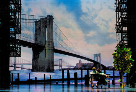
Most people have found it amazing how I did the drops, including lighting designers. Honestly, you don’t find painted translucencies anymore. I think the number of people who know how to paint them are becoming fewer. I’ve been using my method for years; I totally understand lighting them. I don’t know if many universities teach how to light drops because they don’t have them. So, people ask, ‘Oh, that isn’t a video screen?’ No, it’s painted drops. I’ve given tutorials of how to light drops. I don’t want to say it’s a dying art form. It’s easier now to get a drop printed or put a video screen up. And we could have easily done a video screen. I don’t know if it would’ve been any less expensive because the video screen’s an ongoing rental. To do one of that scale of a full back of a stage is expensive. You need the pixels to be so fine. I am glad we went with the drops. I love having the drops.
So, how do you light translucent drops?
It’s the bounce into the backdrop. I have front light, top and bottom. There’s a dark blue scrim in front of everything, because when we swap the drops, you don’t want to see the drops flying in and out. So, I front light the scrim and you don’t see the drops flying in or out. There’s lights top and bottom, front and back, basically. On the sides, I have torms of Elation FUZE PAR Z175s, which is a zoom PAR that hits into the bounce drop so I can highlight areas around where windows would be. So, I have those hitting the bounce drop behind the translucent drops. I zoom them down and I can light certain areas behind windows and other areas I want to stand out.
Who were your associate and assistant designers? Also, any crew that you’d like to highlight?
My Associate was Anthony Pearson, and my Assistant was Venus Gulbranson. The Programmer was David Arch, and because it’s so big, I had two Production Electricians—Jimmy Fedigan and Michael Brown. I had a really good team, they were great.
How was PRG’s support for your design?
It’s never been less than perfect. I go back to Four Star before it was PRG; they’ve done about 95% of my Broadway shows.
Any other thoughts on working on New York, New York?
The show, as a whole, looks terrific. It looks like everybody did their job. It delivers on being a big Broadway musical. When you finish a show with the song, “New York, New York”, the entire audience is just on their feet singing along. It’s a lot of what you want the theater to be.
Beowulf Boritt, Scenic Design & Co-Projection Design
Talk about how your design developed. What were some of your inspirations, research, or references?
It always starts with a script. I talked to [Director] Susan Stroman, and with a Stroman show, I’m starting in a different way than with some directors, because I know there’s going to be a lot of dance. Whatever the set was going to be would have to open to an open stage at times. We wanted to create both a love letter to New York and something that honestly showed New York—both the grittiness and the beauty of it. The very first ideas I had, very early on, were a couple of things that stuck with the show. The doorman with the snow shovels that turned into Bow Bridge, and the commuter’s briefcases that turn into the Whispering Arch. Those were the first two ideas of how to approach the show. We thought even more of the set would be created that way, but we ultimately didn’t keep going in that direction.
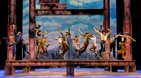
The “Wine and Peaches” number, where they dance on the I-beams, even in the script, I pinpointed that and said, ‘that is the most Susan Stroman idea I’ve ever read in my life.’ It wasn’t until we got to the workshop and the producers started seeing the choreography and imagining it that they understood where we were headed with it. I thought, ‘That’s a spectacular moment and a great challenge for a set designer.’ We went through a number of different versions of what the set might be, but something that allowed that I-beam structure to assemble in an exciting way was always part of the driver of what the set is. Even though it’s a unique look within the show, all the rest of it was created to allow that to be able to happen.
How do you get the metal sound of the tap dancing on the I-Beams in that number?
We always wanted them to be dancing on real steel. Even in the workshop, the platforms were covered in a quarter inch of plate steel, just like in the show, so that you get the sound of a steel tap on a steel beam. It makes a unique sound for the show; an industrial metal sound that isn’t normal for a tap show. The entire assembly for “Wine and Peaches” is massive and each of those beams are split in two halves that go off into the wings. Each half weighs 1,300 lbs. because of all the steel on them. The downstage ones have jackknife beams that come on stage and then pivot upstage to connect to the upstage beams. It’s quite a complicated assembly that comes together very quickly. On stage right, the beams don’t fit in the wings. The distance I needed them to be onstage was bigger than the wing space available off-stage, so they’re stored vertically hanging in the air. They get lowered down on a chain motor, Stagehands grab them and pivot them 90° as they’re flying in. After the number they then have to come off and do the reverse. Essentially, the scenery does its own dance in the wings.
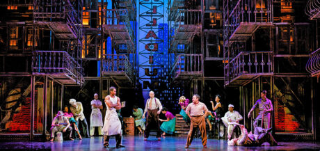
Speak about the practical fire escapes you incorporated in your design. Those had to be quite the technical build.
They were ultimately the envelope of the set. There was one thing that drove the design all along, and it comes from the snow shovels and the briefcases idea. We were looking at those ideas and David Thompson, the book writer, said, ‘That’s it. New York is people. It’s not about buildings, it’s not about architecture. It’s about people. That’s what makes the city so exciting. The sort of mass of people living on top of each other is what’s exciting.’ Frankly that’s exciting in a musical; you want to see people more than things. So, the fire escapees came about as a way to populate the city. The surround is fire escapes and windows. Windows imply people living beyond them, and the fire escapes create little platforms that people can act on.
Technically, there are six; two of them are fixed to the back of the proscenium, and four of them move. They’re real fire escapes, all made of iron and steel. They weigh 10,000 lbs. each. A lot of that weight is in the base, because they’re 25’ tall and there’s nothing holding them up at the top. They have to be counterweighted, so they won’t tip over even when there’s a bunch of actors on them. Also, they’re in forced perspective, which was its own challenge. Showman Fabricators built that part of the set, and it was like watching a bunch of sculptors at work; we had very intense technical drawings of what we wanted it to be. It’s a little scary for a designer, because all the perspective has to line up across the entire set. But it’s a bunch of pieces being built separately at different shops, at different times. I never even saw the fire escapes together until we were in the theater, so it was a little nerve-wracking. If something was off a little bit, you were going to see it. Luckily, they did a great job and most of it lines up perfectly. Hudson Scenic did the automation. Neil Mazzella was the Technical Supervisor on the whole show. So, Hudson built the deck and did all the automation; they jobbed out the fire escapes to Showman.
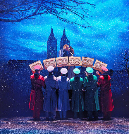
Talk about the translucent backdrops you had painted for this show.
The poetry of the set largely comes through in the backdrops, I think. They’re way upstage. Thanks to Disney, when they had Frozen in there, they bumped the back of the theater out 10’, so there’s this funny alcove center stage; it doesn’t go into the wings, it’s just the 40’ at center with more depth. I packed it full of backdrops; there’s 12 fully hand-painted drops. I’ve never done that many in a show before. There was some discussion of using LED, it would’ve taken less space and ultimately been cheaper. But because the show is set in the ‘40s and it’s such a golden age of Broadway story, I felt it was really important we’d be in that vocabulary. Even though we would use a little projection in the show, it is basically traditional techniques.
Who painted your drops?
There’s a painter that I’ve worked with for many years, Irina Portnyagina. She’s a Ukrainian woman who’s been in the U.S. for a long time, but just the most brilliant scenic painter in the world, in my opinion. She’d retired after the pandemic and moved back to Europe. I called her and asked if she’d consider coming back and painting for me. She moved back to New York for six months and Neil hired her up at Hudson. She painted eight of the 12 drops for me. People seemed to think it was a video wall because it is so luminous. It’s not truly dimensional, but she creates this incredible depth in her painting.
How did color play into your design?
Interestingly, I didn’t use a whole lot. I kept saying ‘There’s no color in there.’ There is some, but it’s a very black and white and gray design for the most part, with flashes of color. I feel like that’s the experience of New York. The city is very gray, and then you get these little flashes of life in it, and the skies tend to be very blue. I have one drop that’s a very intense purply sunset. Then I tend to do little flashes of red in moments that I want to highlight things. So, the bandstand is bright red, the awning of La Pavillon is bright red. There’re moments of red pops through the show, but in general, it’s a lot of muted colors. I let the costumes pop and be the bright colors.
How was the support of your shops and vendors for your design?
Hudson Scenic was fantastic. Neil, again, is an old friend. It’s a well-oiled machine. It’s Hudson and Showman Fabricators, as well as BB Props, Tom Carroll Scenery, and propNspoon, that all built pieces of it. There’s so many props and they’re so intricate and so involved with choreography that the prop build alone was a massive project. It was bigger than a lot of the sets that I do because everything had to be danced with or danced on. Chris Pantuso was my Prop Supervisor, who has also worked with Stroman and I for years. Chris is just fantastic and a great guy at understanding, ‘Okay, this suitcase has to look like a suitcase, but it’s got to be light enough that someone can hold it in the air for two minutes while they sing. This is the shop that can do that, and this is how we ought to make it.’ Great at taking the harebrained ideas and saying, ‘This is practically how we can make that happen.’
Any associates and assistants you’d like to credit?
Alexis Distler is my longtime Associate. She’s been with me for 15 years now and is a rock star. I always say I get to be the Tasmanian Devil, turning out creative ideas and having fun and throwing paint everywhere. She has to clean it all up and turn it into a set of drawings that a shop can actually build. I had a series of assistants. Romello Huins was my Second Assistant, a young designer who recently graduated from North Carolina School of the Arts. Jared Rutherford did a lot of the drafting for me, and Nate Bertone jumped in to help with the props with Chris Pantuso.
Anything else that you’d like to mention about working on New York, New York?
The crew at the St. James Theatre, particularly Timmy McDonough Jr, were just rock stars about making it all work. It took us about a week of tech to finally get it working so that we could do it all, because it is so precise. The timing is so tight. Again, the crew at the St. James is just extraordinary. I think our producers had almost given up on it being possible, and we just kept saying, ‘No, it’s possible. We just need time to keep rehearsing it and get everybody kind of working like a machine.’
