This past spring two iconic performers were honored in dedicated broadcast events, both of which Production Designer Tamlyn Wright, Partner of Silent House Productions designed. Each show reflected the celebrated woman’s career, talent and personal story. Joni Mitchell: The Library of Congress Gershwin Prize for Popular Song, presented the Gershwin prize and saw her feted by her musical peers, during the PBS broadcast. Carol Burnett: 90 Years of Laughter + Love was a retrospective special of her remarkable career with a host of performers wishing her Happy Birthday throughout the NBC broadcast. Wright worked closely with two lighting designers from the design firm 22 Degrees—Matt Firestone on the Joni Mitchell project and Jon Kusner for the Carol Burnett project. Wright, Firestone, and Kusner spoke with PLSN about working on these special projects for two icons and capturing the essence of each woman in the designs.
JONI MITCHELL: The Library of Congress Gershwin Prize for Popular Song
PLSN: What were you trying to evoke with your design to reflect Joni Mitchell?
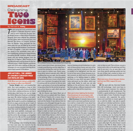
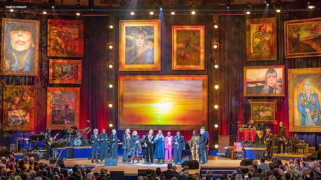
Tamlyn Wright: Joni is an amazing fine artist. She’s been painting as long as she’s been singing. It was such an interesting thing to find when creating architecture for her; a homey place that houses her soul on stage. Ken Ehrlich [Executive Producer] and Joni go way back. We started looking at her paintings and the narratives and the songs around them. We thought it would be amazing to use her art on stage and let her art be a part of that narrative. We were selective, along with her, about creating moments throughout the show that would be highlighted with lighting. Some were portraits, landscapes, pictures that, in a way, made sense. As Ken created the set list, the set design came together at the same time. We used the visuals she had created over the years to highlight and create a story of her.
All the paintings were lit during the show, but there were some nice moments for the camera that we were able to push and pull with some of the visuals. In addition to that, we had a stage center frame that was a projection screen so we could bring in some additional pictures that weren’t a part of the set. What was so fun about that was obviously taking a portrait or a landscape that’s typically three feet by four feet at most and making it large enough on stage; you want everyone to be able to see them. Having the center screen upstage was wonderful because we were able to not only have the branded titles of the show, but we were able to swap out some of those visuals and be more specific if we didn’t have them on stage. Allan Wells, from mDots, and his team created the screen content that would then play into some of the narratives for some of the songs as well.
Is there something you put in the show that you feel is quintessentially Joni Mitchell?
TW: Her artwork. Also, all the wood we used. It seems kind of basic, but we put down a simple wood flooring over the stage floor. It covered the existing floor and our set extensions to give it a holistic look. There’s something about natural materials with a little bit of gilding that was just right. And the palette of her paintings. What is so interesting about the paintings that were chosen is that her palette is very consistent throughout her work. In working with her archivist on this we were able to get pictures of not just the paintings to reproduce them for the set, but we got pictures of the frames as well, which were also part of telling the story.
My Art Director was Aaron Black out of New York, and we worked with Peter Marengo of Norton Projects, LLC, a newer shop. It turned out beautifully. We reproduced her work and the frames. It was obvious that she had given a lot of thought through the years as to how each painting would be presented so it was important that the frames were reproduced. We also had drapery from Drape Kings to create our back curved gallery wall with, which added a nice layer. We endeavor not to create things that are so flat for broadcast, being in this gallery space we wanted to create some variety within our looks. That was important to Ken, Matt, and myself, especially given that we’re looking at the same art for an hour and a half.
Talk about collaborating with Matt Firestone and how lighting enhanced the set.
TW: Matt is a longtime collaborator. We worked together to deal with the limited rigging points that we had available in the space at Constitution Hall. They were utilized in a way that was great for both scenic and lighting because we were able to double up on not only hanging the artwork, but the lights. We had the artwork hanging rigged out from the truss. Then we had his lights in the midst of that on a center pipe. Then we also took advantage of the upstage chord to hang off of as well.
We had the blue drape in the back, so Matt was able to really push and pull with the depth of that, and then also get other colors into the mix, which was nice for different moods within Joni’s music. He worked hard on framing out and shuttering in to give each of those picture frames and each of the pictures a way that he could punch them up as needed to be highlighted. And then also to sort of lose some of those, because at certain moments we didn’t want to see all of the paintings, so his lighting helped to obliterate them in a way, which was great. Shadow some and punch up the others, which was really lovely. Really, his work was not only lighting on the performers down on stage, but then giving a different treatment to this gallery wall to help tell the visual story.
Matt, you’ve been lighting the Gershwin Prize broadcasts for several years, talk about lighting this one for Joni Mitchell.
Matt Firestone: It’s fantastic that our honoree is such a vast music performer and writer, as well as a visual artist. It was about how best we could incorporate her visual artistry along with the music. I think that Tamlyn and the team, along with Ken Ehrlich, really were able to solidify that and make it a visual gallery of her work over the years. I augmented what they’d done just to try to give it a little bit of an amp up by lighting the art and the drapery. They made a great backdrop, so the paintings themselves were almost standing on their own. Through uplighting the drapes, I could add dimension at times, but at other times one painting would be highlighted for a specific performance and that rang true with quite a few production numbers that we did. One, notably, where we started on a painting of Graham Nash and did a really slow zoom out to reveal Graham playing; I thought that was a cool moment. It really worked. This show was special to work on, I always enjoy designing the Gershwin Prize broadcasts.
Talk about obscuring the other paintings so that you really made the one pop.
MF: By use of pattern and texture. Trying to make those closeups different at times was important to me. To try to not have every performance looking the same. Some songs were general, and some were very specific to the paintings we lit. So, the ones that really weren’t, we took an approach to give some texture, still knowing that the paintings are there, but adding a little bit of texture and color to them as well. Then at times, we put a texture and a color on the paintings and then high lit one over it. So, we were able to still have those specific paintings pulled out, but the rest of them had a texture to them, so it just didn’t fall off but the weren’t the focus.
What were some of your key gear choices and how was PRG’s support for your design?
MF: We went with the [Vari-Lite] VL2600. With LED technology, I don’t even have to think about power anymore. Our audience is predominantly lit with incandescent. The VL2600 is a great workhorse, it’s always been a favorite light of mine. Production brought in musicians who supported the performance and used them as visuals against the set, so with the 2600s I was able to specifically pull-out individual performers, besides the paintings. I had to be able to specifically bring out—in different scenarios—individual performers. Only having four followspots, I couldn’t spot everybody on stage, and I really didn’t want to put up a big front wash and blow everything out. So, having the 2600s gave me these pools of light that I could color-correct or work in a different color temperature against the performer. The 2600 is a great utility light. The other fixture I would mention is the PRG 5L Wash, which is the standard VL5 that we’ve loved for years. PRG has done a great job of putting new life into them by taking the incandescent bulb out, putting an LED RGB white engine into the fixture and allowing us to still use that fixture in ways that we would have traditionally. I was really happy with how PRG did it. There’s no heat coming out of the light and there’s no sound, so they’re great lights.
Tony Ward [PRG Account Manager] and Travis Snyder [PRG Project Manager] have been supporting 22 Degrees for the last seven years. This project had a modest budget, and they worked with me to get it to a workable number. Their crew are always top. They know the gear. There’s a level of prep that’s not just about a gear list, it’s a lot more than that with them. I turn in my light plot and my gear list and then they take it to the next level of what plugs into what and how does this work. It just takes a lot off the designer.
CAROL BURNETT: 90 Years of Laughter + Love
Talk about capturing the essence of Carol Burnett in your design.
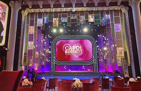
TW: I wanted to bring her heart and love onto stage as well as her humor and comedy. What brings Carol to life for me is a little bit of that nostalgia, which brought me back to the ‘70s and watching her show. What was interesting in the making of this set was I was thinking about some of the essential visuals of comedy in the ‘70s. The tricolor drape palette from The Tonight Show as well as the circular shapes and globes from The Sonny and Cher Show. Carol had her iconic variety show and her set was constantly changing. Taking those base humor colors—those palettes—and using them in a way that was maybe lifting them a little, making it a little bit more sophisticated for the time that she’s in now, obviously. I wasn’t trying to recreate her set per se, but there were these elements of important art direction and design we wanted to maybe echo.
We shot this show in the Avalon Theater in Hollywood. We found out it used to do live broadcasts every week and variety shows aired from there. It’s been a nightclub for the last 30 years. It was very important to all of us that the environment was intimate, that it would look great on camera, and give us a wonderful mood of friends getting together and having some laughs. The proscenium is portrait-oriented; it’s almost taller than it is wide. So, as we were looking at the design and working in that space, I had to bring in the height of it and then yet still give ourselves room to work and give ourselves a large screen. We needed that not only show all the clips but also give ourselves an entrance. Believe it or not, there was only one stage entrance.
The center screen reminded me of an old Zenith console TV.
TW: Exactly. I’m glad you noticed. It was fun. Even though it’s 16:9 proportions instead of 4:3 proportion, we knew we’d be showing both kinds of packages given the 4:3 ratio on so much of the broadcast clips from her TV work. It turned out to work quite lovely in that space; it totally brought back the feeling of the Zenith at home and watching The Carol Burnett Show.
My Art Director was Travis Deck and Global Entertainment Industries was our set shop, led by Jamieson Winans. He’s been a dear friend and collaborator through the decades. He does the Grammy’s, Emmy’s, Academy Awards, all these. He said to me when I came in with the Carol Burnett special, ‘I don’t care if I’m going to make a dollar on it. I need to do this show.’ He’s also such a fan as I am. She was a big part of his childhood too.
Talk about collaborating with Jon Kushner and his lighting work.
TW: Jon is another longtime collaborator; one of my 22 Degree friends. It was tight on budget, and he did a masterful job with the lighting, especially balancing the backlight on the panels and all with the clips. When it came down to our practicals, we had these globe lights that hearkening back to the Sonny and Cher era. Those were featured on everyone’s table and that same motif was then carried onto the set where we had various chandeliers that were made of orbs. It helped take the flatness out of the room. It helped push the 3D nature of the space, which was beautiful. It was a simple solution to staying in the design world of Carol’s space, but also then giving us a tool to play with.
Jon, talk about your lighting on this production.
Jon Kusner: It’s the style of show that doesn’t happen very often, it had some traditional scenery, which was refreshing, and it was kind of a simple, straightforward show. In this kooky old theater, which had a lot of its own limitations. This style of television they don’t do that much there, so they couldn’t handle a lot of the gear we needed. The whole project made me go back and revisit my early career when I worked for Ken Billington doing Broadway shows in old buildings that needed some minding. So, the puzzle from my side was how do I support the show and add what it needed with working around a venue that isn’t totally user-friendly, but needed an awful lot of light to make this old glorious theater come to life? We were shoving a lot of floor lights and random things into places to get lights on the walls and give the camera enough information to understand that it’s this old theater.
What were some of your gear solutions and choices?
JK: The SGM P-1, a battery-operated wireless DMX fixture, got an awful lot of usage. And Astera Tubes, again, battery-powered, and wireless DMX. That allowed us to quietly tuck them into places and didn’t have to worry about how to get a lot of cable into place. We had pictures and sparkle drops and what felt like old Broadway scenery, which I thought was an appropriate nod to the generation of Carol. The amount of television and movies that lady did, well it’s mind-blowing to think about the amount of work that she did over her lifetime.
For other gear choices, it was all about scale. We didn’t have a lot of weight capacity and/or room to put things. We had some GLP X4s and X4Ss because they’re smaller and easy to hang, and some Vari-Lite VL2600s, just again, a smaller footprint, but does a nice job of being an audience light. Then some traditional Source Four ellipsoidals, because we could hang them on the scenery where they were partially for scenery, and partially functional to get light into the audience. Because again, we didn’t have that many great locations to light or put gear. The ‘found’ location of being built into the scenery allowed us to get light in the right place and be a bit of a scenic element to the story.
Luckily, I convinced Tony Ward [PRG Account Executive] to be the Gaffer on the show. It became the perfect relationship because in these harder to load into venues, he is just so clever and been around so long that he knows what kind of wacky hardware to bring to make the install go well. It was a short load-in, but Tony and a team of [IATSE Local] 728 Electricians and Best Boys they put in place just knocked it out. It was great.
Tamlyn, any final thoughts on working with these two iconic women?
TW: It was amazing! Working for two women that I’m a massive fan of, and who both affected who I am today was quite an amazing coincidence. Also my collaborators were great and very supportive. It was quite special. They are both such talented, kind women and it was an honor, really it was.
