For the Nickelodeon Kids’ Choice Awards, which aired March 4, 2023, the show featured a digital performance segment with rapper/Nickelodeon star Young Dylan. The sequence was shot via virtual production at LA’s Lulu Studio 18 with a Production Design by Silent House Principal Tamlyn Wright, who was Creative Producer, Production Design for the segment. Lulu Studio 18’s owner Michael Zinman served as Virtual Production Producer. They shared how they created the otherworldly, kid-friendly virtual environment.
“The segment was a pre-taped digital performance—inserted into the live performance of the awards show—that was done with Young Dylan as the talent, a group of dancers, and a DJ,” explains Wright. “It’s also a branded, sponsored performance for the Oscar Mayer brand, Lunchables.” Matador Content was the producing entity, led by Producer Mark DiCristofaro. “Working with virtual production answered the production problems around wanting to create something that was ‘unbuildable,’” Wright continues, “as well as to do something highly creative in the Nickelodeon space with their heightened realities with cartoon and animation.”
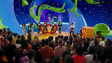
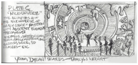
When the performance segment was introduced, the camera enters a mouth built into the awards show set, then the television audience enters a virtual ‘throat’ tunnel and opens up into the virtual world Wright and company created. “Tamlyn created all the storyboard sketches with assets we got from Nickelodeon,” says Zinman. “She worked together with them plus our Unreal technical artist for four days before the shoot at the studio, building and animating the world. Then we had one day to put the set deck and DJ booth in. The next day we taped with 115 kids in the audience.”
Creating the Unbuildable
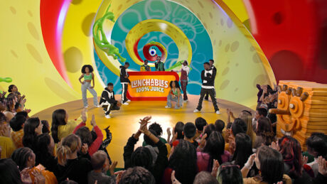
Wright had a fun time creating the virtual world for this performance. “By its nature, it’s a kids’ performance, and we were able to put it in this really fun space that we would never have been able to afford to build,” comments Wright, “but then, it really was unbuildable. It takes place in a strange, wild world. The idea was to go inside of an element that was on the stage and not give us any sense of reality. We didn’t want to be in a warehouse, we didn’t want to be on top of a building. We wanted to be still connected to the show that they’ve created visually. We ended up ‘going inside’ the Nickelodeon blimp. We made a blimp that looked like it was an orange-peeled balloon—spiral cut, that unraveled. It was very psychedelic in its nature, and we’re inside of that.”
Using a virtual production solution allowed the creative team to change perspectives and go through the psychedelic space of the performance with the different icons from Nickelodeon, all the way to the slime motif of the show, and beyond. Zinman says, “The only things that were actually built were the branded Lunchable’s DJ stand and the yellow circular stage.”
All Keyed Up
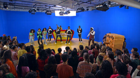
All the virtual assets were created in Cinema 4D, “which is great because that’s the native platform that we use for screen visuals,” continues Zinman. “Then we used Unreal Engine 5 to do the real time rendering on stage with stYpe RedSpys for camera tracking.” Instead of an LED screen, Zinman used a wraparound cyc painted with chromakey blue paint. “We do blue screen work using Blackmagic Design’s Ultimatte 4K paint,” explains Zinman. “My tagline is, ‘It’s unreal what you can do with blue paint.’ Sure, it’s sexy to have a giant LED screen, but it’s a lot of time and cost. I’ve done both, and I can certainly say the results are better with a blue screen. I’ve done XR with LED and I’ve done XR with green and blue screens; they both have their pros and cons. What I can tell you is that the keyers right now are so sensitive to the point where you cannot tell what’s real and what’s not anymore. The benefit is you’re getting the full 4K resolution of AR or XR set extensions that are not trying to blend in with an LED screen. I tell others all the time to look at blue chromakey. Don’t be afraid of blue paint—or green!” Zinman used a PRG Mbox media server for the project. “Every single thing—studio and virtual lighting, the entire XR model, all the props, cues, and media server were run from a single ETC Eos Ti console,” he explains. Zinman and Wright also worked closely with Lighting Designer Matt Firestone to merge the real and virtual environments.
Working in a New Flow
Wright, who still starts all her storyboards with pencil sketches, comments, “I know that part of the joy of this for me was that it was a really fun landscape to work in. It was obviously somewhat out of my comfort zone, coming from the world of scene painting and drawing with pencils. But at the same time, I had complete trust. After seeing some of the demos at Michael’s Lulu Studio 18, I had complete trust in the process. I knew that we were going to come up with something that was really special for the solution of the challenge of having an abstract, upside-down creative direction.”
She continues, “The timeline was a little different than a regular design and scenic build. You have to settle on things quite quickly; wrap up your design earlier on, as there are visual artists involved to create what you’ve designed. Lulu’s Unreal technical artist, and the art direction team at Nickelodeon, uploaded all the Cinema 4D asset files, which was fantastic to start as a base. But once those came into Unreal Engine, there were days of retexturing, rescaling, relighting all of these objects, which were assets from the Nickelodeon style guide.”
For Wright, she notes, “It was a wonderful answer to the creative challenge of a performance in a space that was unbuildable and supposed to be happening in this weightless atmosphere. It was a really fun place to explore as a designer and it all folded together brilliantly. The client was beyond pleased. I think it completely exceeded their expectations.”
