Ideally, change should put new ideas in motion. When it does, good results invariably happen. The production team that created dynamic looks for the Church of the Highland’s aptly named Motion Student Conference demonstrated this in convincing fashion recently.
For the first time in three years, the annual youth event returned to a familiar venue: Birmingham’s Legacy Arena. But the building they worked in this summer was changed from the one they knew in the pre-Covid period. The facility had undergone a renovation, making it necessary for the team to adjust their design concept.
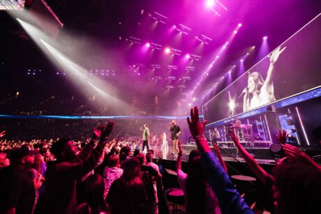 “This was an interesting year for us, being back in the local arena that we have used before,” said Lighting Designer Griffin McCravy. “However, because of the renovation we had to make some changes to our original plan, as new limitations made it necessary to shift the footprints of some of our video walls. The challenge was to do this while still having an impactful and visually interesting stage design. Our Experience Director, Brian Worster, did fantastic work leading the effort to create a concept that adapted to the new building while still being true to our vision.”
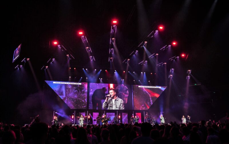
As part of the design adjustment the team went with a more solid, and larger LED surface than they’d previously envisioned. Although this suited the arena’s new dimensions, the team wanted to make sure that “the large LED surface did not become boring visually,” said McCravey. To address this concern, they arranged their video surfaces in different shapes, and used off-centered I-Mag, alpha overlays to ensure that their walls had the necessary variety.
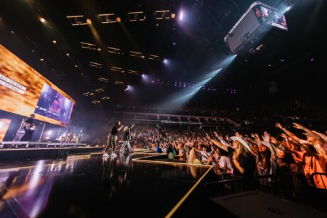 “We created some base looks for speaking moments, worship looks, and other situations,” said McCravey. “But at the same time, we wanted to have more vibrant looks during our music portions.”
To enhance the dynamic impact of their adjusted design, the team included 16 CHAUVET Color Strike M fixtures in the rig, positioning them between the truss towers on the deck, as well as on the tips of the prominent truss fingers that pointed out to the audience. Like the rest of the lighting rig, the powerful motorized wash/blinders were supplied by 4Wall Entertainment, while the video wall was from CTS AVL.
“We were excited by the idea of having a bright wash fixture with dual strobe elements in its center the first time we saw the Color STRIKE M,” said McCravey. “For this event, the fixtures gave us some very eye-catching effects with their two strobe elements. The Color STRIKES between truss towers blew light through the bands onstage, while the fixtures at the finger points allowed us to throw lots of light out into the room for audience interaction.”
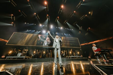 The conference rig also included 36 Maverick MK3 Wash fixtures, which were used to create aerial effects and base wash looks, as well as 28 Rogue R1 BeamWashes. “Our Rogues played a big role in creating the backbone of our look for live audience and video,” said McCravy “Though this was a live show, we tried to make it as great as we could for the camera. We used camera for I-Mag in the room, as well as ISO capturing all of our cameras to cut together video footage for things like promo pieces, recap videos, and even music videos.
“We often will take songs, moments, speaking segments, and things of that kind, then post them after the conference to online platforms such as YouTube for people to go back and re-watch,” he continued. “Each year before the conference, we spend time pre-programming and previzing much of the event, and then adjusting presets and such onsite. I have found I work best when I can choose, such as having a fade run of “0% to 100%” as I pre-program the event, then adjusting final intensities onsite.”
Whether seen live or via a video recording, the Students in Motion design is intended to engage on an emotional level while making worshippers comfortable. This is in keeping with the design philosophy followed at Church of the Highlands.
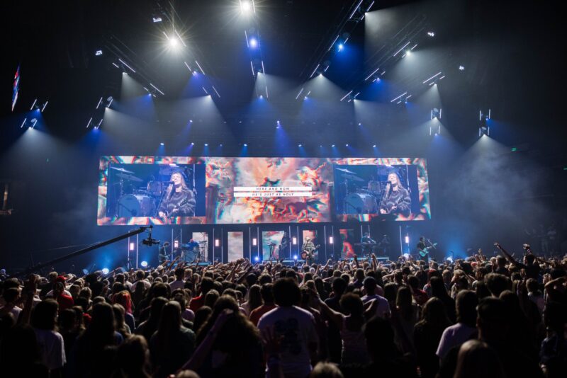
“From the beginning, intimacy in design is always at the forefront of what we do and how we program a service to help accomplish this,” said McCravy. “Practically, I try to pick moments for big, dynamic, ‘in your face’ looks, and then spend most of the rest of the lighting design making everyone onstage well-seen, while creating a comfortable worship environment. I love big, pretty wash looks, since this is often much less harsh on an audience, while also being a great base to build on for big dynamic looks when songs build in energy and intensity.”
Sometimes outside occurrences, like the renovation of a familiar venue, may create new challenges when working to achieve these looks, but in the end McCravy sticks to this design vision, following it as a constant beacon in a world of constant motion and change.
Further information from CHAUVET Professional: www.chauvetprofessional.com
