Designers Tamlyn Wright and Jon Kusner’s game plan
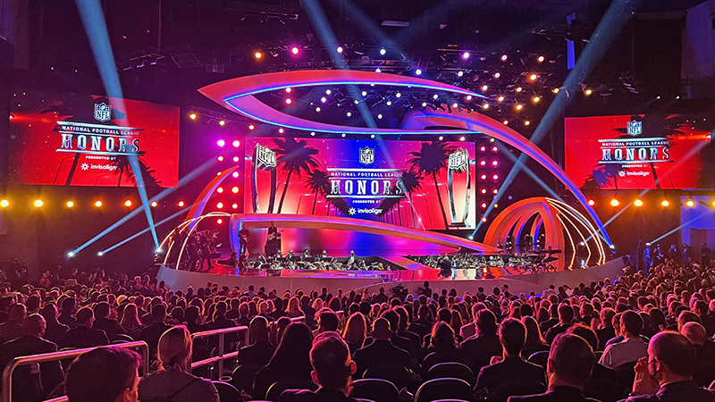
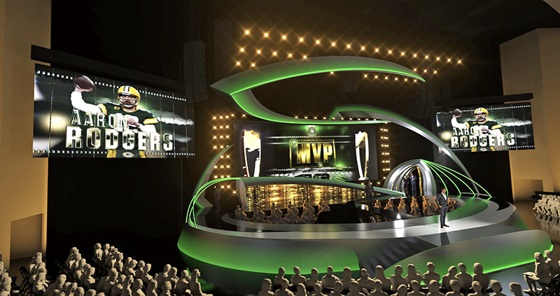
The annual NFL Honors returned on Thursday February 10th, live and in-person, during the run up to Super Bowl LVI. Broadcast on ESPN and ABC from the newly opened YouTube Theater on the campus of SoFi Stadium in Inglewood, CA, this year’s show featured a new scenic design by Production Designer Tamlyn Wright, Principal of Silent House Productions, and a lighting design by Jon Kusner with 22 Degrees, Inc. Both spoke with PLSN’s Michael S. Eddy about their design for the marquee event that highlights the award winners of the 2021 NFL football season, showcases the Class of 2022 inductees for the NFL Hall of Fame, and celebrates all things football. We flipped a coin and Wright won the toss and gets to answer first.
This is a new design for the show, so what did you consider in your design approach?
Tamlyn Wright: Since the city that the game is being hosted in is where the show takes place each year, by nature of the design and the identity of the show, it needs to flex between different stages and scales of theaters available in each city. That was part of the design requirements going into this year. We knew it was starting off at the new YouTube Theater at SoFi Stadium and there we have about a 75’ wide proscenium. But we also knew that we needed to create a modular setting for this show so it can go from this year at the YouTube Theater to next year in Arizona, and then so on to different cities each year. Part of the design task was not just designing it for this year’s theater but designing it for the future spaces.
The design had to consider that, the contrast of going from 75’ down to 60’ and then to maybe a 120’ wide proscenium. There are a lot of challenges with that to consider. Part of the approach to creating that, we did rough models showing previews on what it might look like in other spaces, even though we might not go with those exact layouts. It was a nice rough look that gave us some awareness that we can shrink down a few pieces to accommodate the future theaters by removing one or two of the pieces from this year and still feel like we have a complete design. And then as we go into a larger space, we can widen our screen, add other things to fill. It’s really a design that can expand and contract with the needs of whichever venue we end up at over the upcoming years.
Another thing that needed to be in the design was the entrance tunnel onto the set, it’s not unlike the entrance tunnel coming onto the field. That idea was established before my design and is a brand identifier that we needed to keep as part of the architecture of the set. It’s another element that we also looked at to be flexible from venue to venue. This year we had five digital arches, that brought players and presenters onto the stage from backstage. But next year we may have three arches, that’s part of the expansion and contraction idea of the design. Looking ahead, the exciting challenges each year will be reconfiguring it to get new and engaging looks from the same set of “LEGOs” that we’ve now given ourselves for the show.
What were some of the challenges of implementing the design?
When I first conceived the design, in my mind, it was all tensile fabric structures that were being lit from lighting from afar. We were looking at ways to make those and because they want to store the set, we were also looking for a storage solution that would be more compact. Then we wanted to integrate LED into the set and that made it more complicated with fabric. The LED on the set came about when [LD] Jon Kusner, who’s an amazing colleague, and I started talking while he looked at the early design renders. He suggested I add some edge lighting and LED tape. That LED tape we added punched up the contours and everything nicely. My art director was Anthony Bishop, he’s so fantastic, he and the amazing shop, Global Entertainment [Industries], devised a way to really get a seamless look with crafted Lauan plywood skins on top of metal frames. They were able to get the compound curves that I didn’t think we could get out of steel and wood; they did a great job. The shop’s work was just beautiful, and the set looked stunning.
To make sure it all tied together we worked with Allan Wells, the screens producer, and with the content designers, establishing certain palettes. Jon’s lighting then pulled those palettes into the room and into the set as well. He also added a certain amount of lighting beyond the set that extended into the room. Because the theater is painted beige it certainly leaves lighting with a palette that needs to be addressed in some way beyond just the width of the proscenium. Jon with his lighting was able to cut in and have really wonderful control on the different elements of the overall design. He created these beautiful ombrés of color that then lent themselves to the video content and gave us of a whole picture. We were able to get several different colored palette-looks during the show, which is important because it is a broadcast.
The awards are inspired by the love of the game, what inspired your design?
Well, I grew up doing sports and I have great respect for what these athletes have done to get to this level of accomplishment. It was exciting to work on this show and especially this year, as the NFL wanted to make some changes in their identity for the NFL Honors. So, we really got to explore some things and move away from the broadcast sports look and go with a different palette of colors to work with, while really underscoring the celebratory nature of the event. I started thinking about the football in motion and thinking about the fact that we’re looking at this set on camera for two hours. Something that came to mind was this painting, reaching back into a moment in art school from 30 years ago, I recalled this one painting that gave a sense of motion, Marcel Duchamp’s Nude Descending a Staircase. It’s nothing to do with football, but it has everything to do with movement and seeing movement in something that’s still. So, in a way, that was my inspiration for the set; in a strange, abstract way of finding movement and stillness in that painting and seeing that in the movement of the football.
There are, what I’ll call, echoes of the football silhouette that dances across the stage, that is our Nude Descending a Staircase. One of those football silhouettes becomes the front of the entrance tunnel arch. Then there are more echoes of it that fall back in space as you look off-stage. It has a bit of a football shape. It answers the question I asked myself designing, ‘What is it about the set that wants to feel NFL?’ I wanted when you looked across that stage that you have that feeling of looking across the field; have this moment of abstraction of a football flying across the room. I think we got that sense of movement caught in the set.
For the lighting, what were your key equipment choices and how did they work in your design?
Jon Kusner: There were a few key ingredients to the lighting. We used [VL]2600s for a lot of the scenery because it had those lyrical swooping shapes. I knew I needed something that I could shutter to all the lyrical pieces and have the color. The 2600s worked well for the scenery and for most of the audience. For the audience, I also had some ETC ellipsoidals [Lustr 2s], the new variety, which are bright. We also had VL5s, the good old standby VL5s, though we did have a handful of the new LED VL5s. And then we had a bunch of the [SGM] P1’s, battery-operated wash lights. Those were primarily to deal with architecture. There were steps and all sorts of nooks and crannies we lit in the room. The P1s being battery-operated are just a perfect tool to do that because you can put them in places, and you don’t have to worry about cabling and power.
Tell us about balancing the lighting with the video screens.
It is the responsibility of a television LD to look at the video components that make up the set when doing the lighting design. There’re always few things that determine the color temperature of a show, from my perspective—how many screens are there? what are the screen surfaces? and what are you using to light the audience? It’s now getting easier and easier to get away from 3,200K, which was always not ideal for the screens department, by using, like we did, the 2600s. Now that it’s easier to key the audience and the people on stage closer to 5,600K that helps determine the color temperature you pick. Being in the color space closer to 5,600K makes the screens look better. We were at 4,200K, that was our white light on this show. I like being at 4,200K because I think that the color spectrum of reds and blues, from a lighting perspective, land pretty well there if you go either direction.
Since we did have some incandescent VL5s in the design I didn’t want them to read too yellow when we were trying to make white. There’re always a few ingredients to get the right balance, screens being one of them, but a little bit of it is probably more instrument choices in your lighting rig, which helps you land at what color temperature makes sense. This show is really a playback show in a sense because there is an award, which leads to a video package about that person. We spend a lot of time looking at the screen, so you want to make sure that the screens, and the environment that the audience is watching those screens in, is pleasant. I believe we accomplished that here; I was happy with the show.
