Acclaimed, award-winning French playwright Florian Zeller is fascinated by our perception of self, memory, and time, particularly as we age. The Father exposed us to the deteriorating mind of a man with Alzheimer’s. The Mother explored the inner world of a clinically depressed, middle-aged woman who may or may not be intimately involved with her 25 year-old son. Zeller’s latest show to hit Broadway, The Height of the Storm, was translated by the late Christopher Hampton.
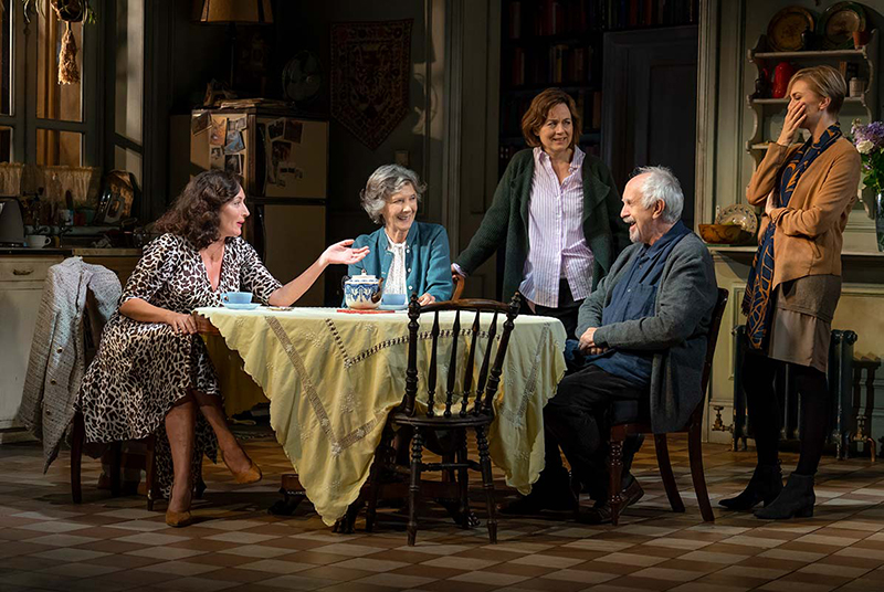
It stars Jonathan Pryce and Eileen Atkins as elderly parents André and Madeleine who are reflecting on their 50-year marriage along with, at times, their two daughters, a boyfriend to one, and a vaguely remembered friend. The twist is that as the story progresses, the audience begins to wonder if one of them is no longer alive. The drama is augmented by the lighting of Tony Award winner Hugh Vanstone and played out on a set designed by Tony Award winner Anthony Ward, who spoke to PLSN about working on the show.

Mirroring the U.K. Set
The show debuted in London in Fall 2018 before crossing the pond to the Samuel J. Friedman Theatre on Broadway. The only thing that has changed since then, says Ward, is one cast member. The set is exactly the same as when it played at Wyndham’s Theatre, one of the smallest in the West End. “We were lucky that when it came to the Friedman, it sat really happily there without us really doing anything other than reconfigure some downstage elements of the set, adding to the floor to bring it down to the front of the Friedman stage, and working out the masking,” explains Ward. “It was very, very straightforward.” The set was built in the U.K. by the workshops of The Theatre Royal Plymouth, and in the U.S. by Global Scenic Services.
The veteran scenic and costume designer (he did both on this show) has worked on previous projects with director Jonathan Kent and the British production designer Paul Hennessy, “who came into the process early, helping to incorporate practical touring solutions into the design,” says Ward. While Ward started with a more logical sense of the house, “Jonathan’s big note was that he didn’t want it to be logical. He had a very strong feeling about the idea of the corridor [in the center], that the corridor should be poetic. In the first white card design I presented to Jonathan, you saw the front door coming into the hall, and the rooms beyond, a central room. He wanted it to be much more enigmatic. You [now] don’t see the front door in the corridor, and you’re not really sure of the plan of the house.”

Ward notes that one of the key things that the cast needed to do on the first day of rehearsal was “to examine and understand the world they were going to tell the story in,” he says. “However, the play is forever taking twists and turns. Are we seeing a true memory enacted before us? Is this person alive? Are they experiencing the story in the midst of a breakdown? These questions are thrown up but are not directly answered. I hope the design reflects that idea — the main room is the crucible that ignites and supports the play, but the world beyond is an enigmatic puzzle.”
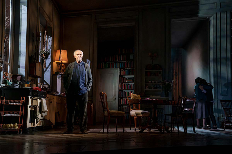
The interior space represented onstage does not follow a classic, block-like house layout. The kitchen/main room downstage is intersected by a hallway that splits in opposite directions upstage. There is also a smaller room upstage right from the kitchen, with a door (engulfed in a sea of books) leading to another room with a perceived hallway also exiting stage right from there. No front door is in view, and the implied space beyond the main room feels labyrinthine.
While Ward would have loved to have shown more space beyond the play’s central room, “I had to design it so that if you walked through one of the upstage doors at stage right or center, you virtually hit the back wall,” he says. “The design evolved through the necessity of trying to create the illusion of more rooms and space with a very limited floor plan, and a wish to defy logic. A square layout never interested us.”
Although the ceiling feels a bit high, Ward says that his intention was to “get it down to a more human scale. I actively reduced the height of the proscenium. However, the dramatic perspective, and the decision to not use any decoration on the ceiling piece, gives the room a dynamic sense of scale making the downstage room lofty and graduating to the human upstage.”
There is no specific real-life location that inspired the house set in The Height of the Storm. Ward tried to find old apartments for research and “just as a general thing looking at the geometry of what came up in the white card model. I think the house is probably mid-19th Century [in origin].”
This is a family house. The couple’s daughters, Anne and Elise, have been brought up here. “The accumulation of a family life over four decades allows the many objects on the set to tell that unspoken story,” says Ward. “The props were put together by Marcus Hall Props in London. We were mindful to make it feel as French as we possibly could — whatever that really means — and we enjoyed the haphazard nature, build up, and layering of the set dressing. The out-of-date CD player. The kitchen that has been added to, piecemeal, over time. Those things help build the character and story of life lived in the house.”
The shelves in the walls are stuffed with books, photographs are placed on various wall or refrigerator spaces, and the tiled floor feels like something that may have been added in by the family after they acquired the property. There is the feeling that the family has lived here. “The tiled floor is a design decision,” says Ward. “I didn’t want all the floor surfaces to be wooden, and yes, people do things in houses that decades later feel incongruous. However, if I lived in that house, I would prefer wood any day.”
Both the set and the parents’ clothing have a grayish blue hue to them, which comes from something Kent told Ward, that he thought the play should feel like it is happening underwater. “That sounds like a bizarre note but that was something he felt strongly about,” says Ward. “There’s something about being underwater — your senses are deprived, and one even moves in slow motion. We just wanted to bring that sort of poetry into the color of the set.”
While light comes in through the large kitchen window at stage right, the obstructed view into the outside world still feels a bit bleak. Ward notes that the garden is constantly alluded to and is very important in the storytelling.

Suggesting a Fallow Garden
“I didn’t want lots of dressing in the garden, so just with the use of bare branched trees, I try to put over the sense of a garden desiccated in a perpetual winter,” he explains. “We experimented in the model. There was something really beautiful in the shadows that were cast all over the set by the branches. It has been very difficult to achieve this effect on stage. With the right hand side of the auditorium having a direct sight line through the window into the trees and, subsequently, the light sources, there has been a lot of fine-tuning. I took the tree image and followed the idea through to having a sense of veins in a body and nerves running to a brain and introduced it onto the front cloth.”
Given the closed ceiling atop the set, the side, front, and rear angles were the avenues to get light into the stage. Lighting designer Hugh Vanstone worked very closely with Ward. “As soon as we had a white card model, Hugh came to the studio and started making a plan as to the most effective way he could get light into the set,” recalls Ward. “He wanted a goal post of lights downstage of the set, and we worked hard to fine tune the angles of the walls to get maximum throw.”
There is a lot of subtlety to Vanstone’s work on The Height of the Storm. Reflecting the emotional turmoil and fractured sense of reality of the play’s narrative, the LD intermittently fades the light off of just one person (basically, one of the parents) when appropriate to darken him or her and make them look like a ghost. As the story progresses, the narrative shifts as past memories and present day events collide, and certain people fade into the background. The strategy is brilliantly executed and hard to pull off. “I think it is excellent,” Ward says.
While there are many moments that specifically define things that have transpired in the family’s history, many others make us question when everything is taking place. The meaning of the show is opening to interpretation and likely to inspire post-performance discussion among theatergoers.
For Ward, the most challenging aspect of the show was trying to create the sense of the world beyond in such a limited amount of space and incorporating that result into different touring venues. Even for the seasoned theater vet, The Height of the Storm took some time to ease into. He remarks, “I have to confess even though I had read the script several times, I didn’t truly get it until I saw the first run through with the actors in the rehearsal room.” In the end, the set came together and has served as unsteady yet still-solid physical grounding to complement this emotionally turbulent tale.


