Tony-Winning Designers Create Moody Met Opera Premiere
From its first moments, the Metropolitan Opera’s American premiere of Marnie, an opera based on the 1961 novel by Winston Graham, provokes a sense of disquiet in its audience.
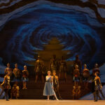
It’s hard to put one’s finger on why, exactly, as the scene takes place in an innocuous accounting office. Men and women in muted business dress go about their work, chatting with one another about their weekend plans. One woman — clearly the main character — is the only person with a brightly patterned dress and a spot of color. Nothing especially ominous looks imminent.
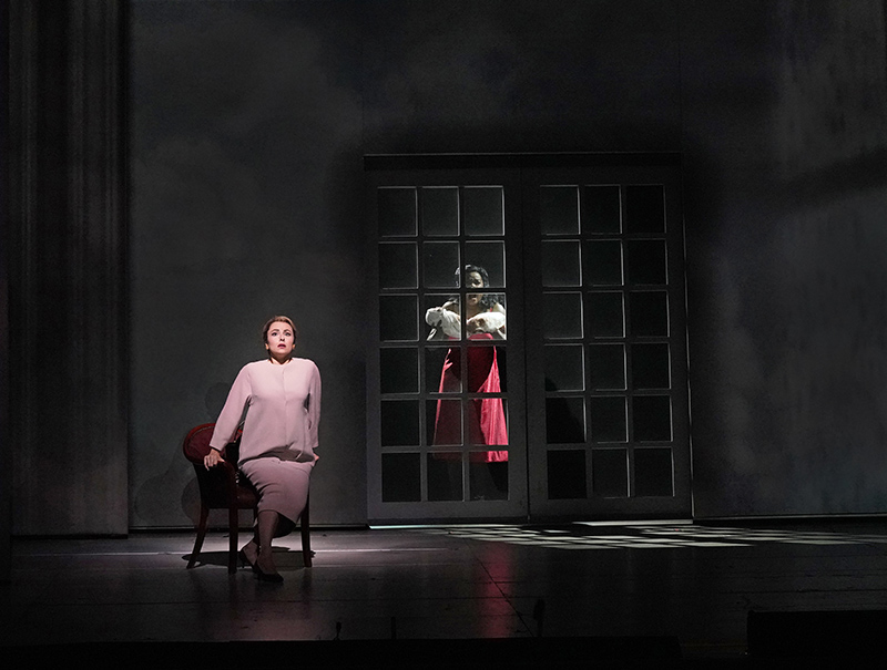
The sense of foreboding, then, must come from the lighting. Shadowy and vivid at the same time, it begins to tell us the underlying story of twisted deception. Secrets lurk in the wings as if they were additional characters. Someone’s motives are less than pure. The innocent, workaday setting may be masking a more nefarious plot.
This glimpse of what’s in store for the audience tells us a great deal about the strength of the lighting design by Kevin Adams, four-time Tony Award winner for productions including Hedwig and the Angry Inch, American Idiot, The 39 Steps and Spring Awakening. Moody and full of sinister promise, it works seamlessly with designer Julian Crouch and 59 Productions’ scenery and projections and sets the tone for what becomes an emotional ride along Marnie’s course of self-destruction.
If you have seen the Alfred Hitchcock movie starring Tippi Hedron and Sean Connery, you’ll realize immediately that this retelling of the story does not originate with the film; librettist Nicholas Wright, composer Nico Muhly and director Michael Mayer took their imagery and plot from the novel. This gave them the opportunity to delve deeper into the story and solidify Marnie’s character and motivations, while creating a dramatically fascinating piece that systematically peels away the layers of her psyche.
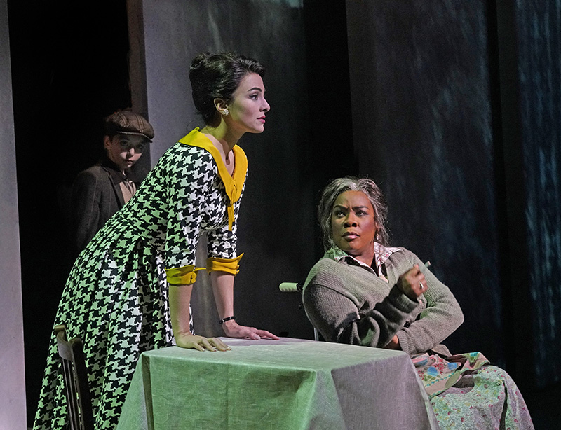
Marnie, played by powerhouse soprano Isabel Leonard, is a sequential thief who gains the trust of her employers until she obtains the key or combination to the company safe. She meets widower Mark Rutland (baritone Christopher Maltman) by chance and is hired for a position at his printing company, but before she can complete her purpose, he falls in love with her and blackmails her into marrying him. Meanwhile, we discover the twisted truth about Marnie’s upbringing, her horrid mother’s deception that propels Marnie into a life of crime, and the psychological compulsions that eventually become the young woman’s undoing.
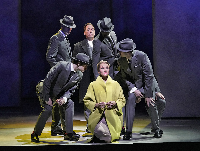
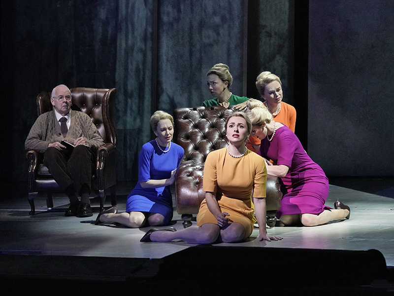
Amidst this substantial story, the creative team provides devices that make this production as fascinating as it is complex. Four lookalike singers represent Marnie’s many identities and act as her personal Greek chorus, surrounding her during each personal revelation; and a corps of male dancers in sharp gray suits and fedoras, their faces always hidden in brim shadows, provide constant reminders of her own sexual repression and vulnerability.
Adams’ approach to probing Marnie’s mental state takes us deep into the shadows, giving us hints of faces while masking motivations, until the final moment when Marnie herself is bathed in a single bright spotlight that reveals, at last, the truth of her nature. Meanwhile, projected scenery places each scene in a state of abstraction as clouds gather to shroud reality, somehow building to a visual climax as she reaches her moment of truth.
Mounting a World Premiere Opera
How does a lighting designer approach a brand-new production, especially one so multilayered and cerebral?
“It’s tricky,” Adams says in a phone interview. “I’ve done a few new operas, and you have a libretto, and sometimes you have a little bit of a tape of music, a piano or synthesizer. But it’s really hard to tell what the music is really like. All the designers and the director work from the libretto, and you plan, and you get into rehearsal, but it isn’t really until the first orchestra rehearsal that you understand the scale and the scope. And you keep your fingers crossed that you are moving in the right direction.”
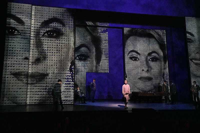
Nearly all of the scenery involves sliding panels that serve as projection screens, moving soundlessly into place and providing a sense of fluidity to the opera’s eighteen scenes. “The projections came about partly from a practical response to the requirements of the piece, having to move quickly between scenes,” says Mark Grimmer, 59 Productions director, by phone from England. “Also the graphic design of the late fifties and early sixties, the graphic style that Hitchcock used in his title sequences. We wanted something that was not too literal, a time and a place but not a literal recreation of office or domestic scenes. We wanted a fractured or a collage approach, reflecting Marnie’s fractured personalities.”
Audiences first see parts of Marnie’s face projected on the stage’s various screens, with a range of hairstyles and alterations that represent her many disguises. These came from photos shot in London of Sasha Cooke, the actor who played the lead role at the English National Opera in November 2017 (more on that in a moment). “We shot the material of Sasha, but it never made it into the London production,” Grimmer says. “We felt like we wanted to really ram home her multiple identities right at the top of the show. For the New York production, Nico had changed the music slightly, so we had room for them right at the top. There was a musical motif every time the faces appeared — a jagged, fractured phrase. Once we put them in, we had them come in several times during the show.”
The majority of the projections are not nearly so literal, however. Grimmer says that Crouch envisioned a motif of clouds from the beginning of the design phase. “All of the scenery is painted with this cloud texture,” he says. “There are those moments when Marnie and the chorus in fact go into psychological space. We used the clouds to say, ‘Okay, we’re leaving the real world now, we’re entering into Marnie’s head, with suspended animation,’ if you like.” These scenes eliminated the need for blackouts, making the action flow as seamlessly as a film.
Even with this ingenuity of design, however, the scene shifts needed a technological marvel to make them as effortless as they seemed. This came from the disguise gx 2 media server, which works with the Met’s seven Panasonic PT-DZ21K projectors to synchronize the content with the movement of the screen panels across the stage. Using Notch software, the disguise server allows designers to create “generative” content — video that renders in real time and responds to the environment. 59 Productions’ projections picked up the scenery panels as they moved onto the stage from the wings and tracked them perfectly across the stage, never bleeding around the edges, while clouds billowed and shimmered in stunning video.
“Each of those pieces of scenery had a wire pull encoder on them, which gave us X and Y positions for where the screen was on stage,” Grimmer explains. “Even when the scenery was being moved to set up for the next scene, we could keep the stage alive and have something interesting to work with, not dipping into black. The disguise media servers have really unlocked new possibilities for us. It’s very exciting to have this in the toolkit.”
Top and Sidelight Define the Space
“Most of my work in the show is the stuff on the deck and the people,” Adams says. “There are quite a few needy transitions in the heart of the opera. I worked off of Julian’s palette, and he worked off of mine, and there was a scale that we would match at times.”
Adams worked with the same team — director Mayer and set designer Crouch — on the award-winning Hedwig production on Broadway in 2014 and on Head Over Heels in 2018. “We have done a few things together, so that helps,” he says.
With the scenery providing a largely abstract representation of locations, the lighting filled in the blanks to define the space. “Mostly I used all of those sliding panels as a surface that I could light just past, so the panels would make a shadow that would define the room,” he says.
Marnie’s mother’s house became a simple square of green light on the floor, while another quadrilateral patch is all that is required to define the cramped den of Mark’s brother Terry’s home. When Marnie and her chorus visit a psychiatrist in the second act, slashes of blue light between the set panels tell us that slivers of Marnie’s bitter secret have been revealed.
The challenging thing about all those panels, however, is that they preclude any dependence on backlight to define the action onstage. “It’s all mostly top or high-top things that define the space,” Adams says. “There are some sidelight ladders we put in for all the movement fellows,” the male dancers who never assume an identity. “Usually I have some background work that I have to address with lighting. I have absolutely none of that in this production.”
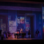
Sidelight lends some particularly striking effects to the overall design. When the cast bellies up to the bar at a local saloon after work, their faces are visible while the rest of the bar, extending nearly the entire width of the proscenium, retains the murkiness of a neighborhood pub. Early in a climactic party scene, light from the side ladders lends some foreshadowing to what might otherwise be a festive coming-out party for the new Mrs. Rutland.
The most dramatic effect, however, comes in a foxhunting scene, when Marnie rides into the fray of hounds and horses. Here projections create a splintered abstraction of horses’ legs and hooves and flushed birds with a suggestion of dust rising from the ground around them, creating visual confusion that gives us a glimpse inside Marnie’s chaotic view.
“Julian always tells the story that when he read that there was going to be a foxhunt, he said, ‘I can’t do that,’” says Grimmer. “It was the elephant in the room. We knew that we were not going to recreate a fox hunt onstage.” Muhly provided the insight that finally led to a solution: “Nico said this should really feel like you’ve put your ear to the ground and you can hear these galloping hooves. That led us to the idea of flying birds, horses’ legs, reflecting the rising tension and drama in the music.”
Against this crazy video background, the male dancers execute a complex series of movements that simulate the chaos of the hunt, their jumble of arms and legs made even more bizarre by kinetic light from the top, intersecting with the stationary sidelight.
“There’s a huge moving light rig overhead with the Met’s rep plot,” says Adams, “so that’s able to do the aerial work and specials. It’s a very minimal plot, because it’s easier at the Met not to use very much. Often there’s just a wash light that’s on; that’s a very small space. And also, if you have less lights to choose from, it’s easier in a short tech.”
Philips Vari-Lite VL1100 and VL4000 luminaires provide the moving effects from the overhead rig, creating intense, collimated shafts of light and hard edges for the defined room boundaries and other sharp imagery. Smooth color changes are almost imperceptible throughout the design, bringing subtle shifts in mood among the higher contrast effects. High End Systems’ SolaFrame 3000 luminaires pump out the 1000-watt bright white LED light and Martin MAC Viper Wash DX luminaires’ internal framing system assist in shaping and controlling the framing of light on the cast and the stage floor.
Rotating Rep = Abbreviated Tech
Work on Marnie began in England in 2017 at the English National Opera at the London Coliseum, where the opera had its debut as a co-production with the Met in New York City. This was a good way to go, Adams noted, because the Met Opera’s repertory schedule leaves very little stage time for designers to develop new work. “We had time to figure the piece out in England,” he says. “We weren’t really able to make changes to the opera there, though.” It’s common to make substantive changes to any brand-new production before its premiere and even throughout its first run, but for Marnie, the changes had to wait until its New York debut.
“The production is much clearer in New York,” Adams says. “We came up with things that tied it together a little better.” The opera opens, for example, with projections of four women’s faces on the panels staggered across the stage, establishing the concept of Marnie’s many identities. “We didn’t have that in England, and here it made all the transitions clearer — it tied them together.”
Having the time to work through the initial creative ideas in London paid off for the New York production, where time became precious.
“It was a wing and a prayer at the Met, it’s so quick,” Adams says. “We had five days on stage, from 10 a.m. to 1:30 p.m., and then they take you off the stage so they can bring in the evening show. So we had five four-hour sessions, and the cast gets four worklight days to figure out the set and the performers. Those aren’t helpful for the designers, but they’re good for the show. Again, even those days are four-hour days.”
His ace in the hole is the followspots — six or seven of them provide the bright faces among the shadows. “I’m a Broadway worker, so I like followspots,” he says.
The overall effect is nothing short of spellbinding, a production that fascinates its audiences for nearly three hours of psychological drama. Adams’ next challenge at the Met, however, will be more in the traditional realm: a grand opera production of Verdi’s La Traviata, in a lavish 19th-century setting that changes with the passing seasons.
“I have four days to light it,” he says. “Four hours a day.”
Randi Minetor is an author and freelance writer based in upstate New York.
