Marquee NYC, Steve Lieberman and SJ Lighting: The Creation of a Design Polymath
For those of us in the design and production sector of the industry, invoking the name Steve Lieberman conjures up many images of very large scale productions across the world — Electric Daisy Carnival (Las Vegas, China, and Mexico), Coachella, Lollapalooza, Beyond Wonderland, Dreamstate — the list of productions just in the electronic dance music genre goes on for days. In addition to that list of mega-festivals, most with millions-plus dollar rental packages for a few days’ worth of event, are the permanent “festivals” to which Steve Lieberman and SJ Lighting can take credit. I refer to the often constantly running internal and external permanent installations around the world that we call “clubs,” but are really more along the lines of fully immersive lighting, audio, and video installations offering adult refreshment and electric atmosphere — usually packed in as tight as occupancy laws allow due to their popularity and experiential success.
Focusing in on the hundreds of club installations that SJ Lighting has designed is a very difficult task because of the complexity, sheer number and scale, and success rate that Steve Lieberman and his team employ year-round across the world; SJ Lighting creates about 50 stages a year on average and has surpassed 250 designs for club properties across the globe. If we go alphabetically by club name alone, by the time we get to the letter “E,” the club design count is already in the dozens. For this article, we’ve jumped forward into the alphabet to arrive at Marquee New York, so the photos here are brought to you by the letter “M.”
Lieberman is what we would call a modern-day technological Renaissance designer; if we would be able to claim our own industrial masters, Lieberman and his team would be the equivalent of an electric James Turrell — broad strokes, focused statements, and 360-degree experiences. In fact, his work has been so successful across Earth with his clients and their clients that many of his projects are implemented across country borders, political boundaries, and geographical terra to bring his form of lighting/audio/video perspicacity circumferentially, repeatedly. Lieberman understands not only the systems he’s designing, but the systems of the people for which he’s designing the perfect experience.
Marquee NYC opened in 2003, founded by Noah Tepperberg and Jason Strauss, owners of the Strategic Hospitality Group. Tepperberg and Strauss then partnered with Tao founders Marc Packer and Rich Wolf to open TAO at The Venetian in Las Vegas and, in 2011, Tepperberg and Tao opened the hugely successful Marquee Nightclub & Dayclub at The Cosmopolitan resort and casino in Las Vegas, where Lieberman also lent his design expertise. A decade after opening Marquee in New York — a lengthy lifespan in an industry where many other nightclubs open and close within a year and a half — Tepperberg and Strauss returned to New York to make a $3.5 million upgrade for the venue, riding the shifting trends as featured musical artists surged past pricey bottle service as the key draw.
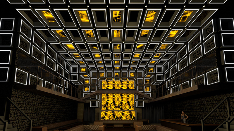
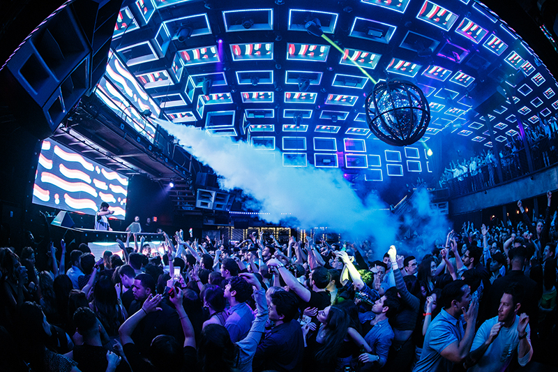
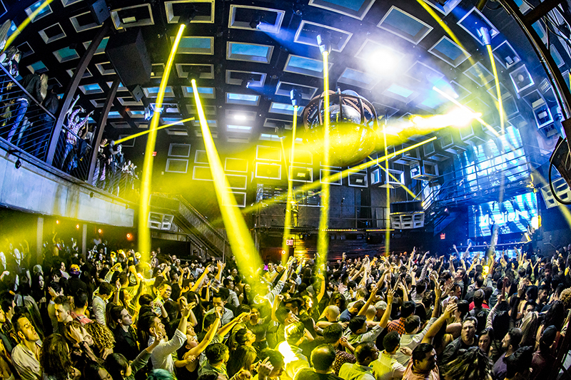
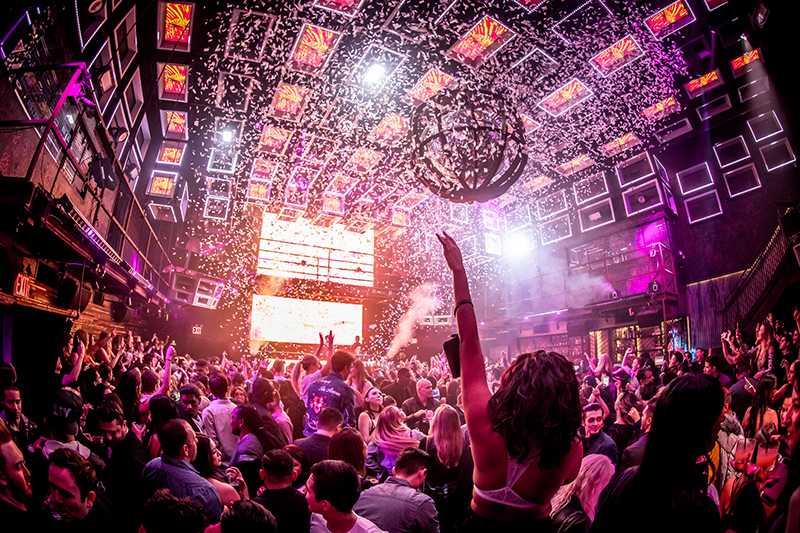
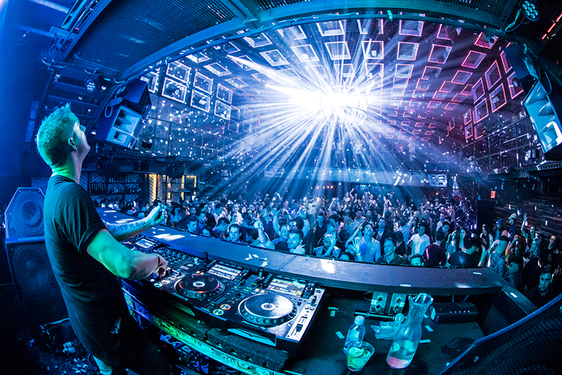
Today, upon entering, the design by SJ Lighting gives the feel of a large stack of repeating shapes that all come alive with content and color. The pattern is repeating squares and rectangles, but there is no shortage of variance with respect to constantly changing visual field and audience engagement. We reached out to Steve Lieberman to ask about Marquee NYC, life as a multi-genre designer, and some thoughts on the industry.
Steve, you’re working on projects from outdoor festivals to clubs and everything between those two points. How do you contrast the club work you do with the outdoor
festival work?
Steve Lieberman: There is a lot of crossover in those genres where the design elements do cross over, but some of the obvious ones are huge — for example, when I’m designing an outdoor festival, I may have a rental package that’s ten million dollars’ worth of equipment and staging for a one or two-day gig, versus buying a couple hundred thousand dollars of equipment for the inside of a club environment that’s permanently installed. That difference is where the sky’s the limit, so to speak — take the Electric Daisy Carnival event we did a few months back, for example — on just one of those stages we had two million dollars’ worth of equipment. That’s about average for some of the clients we have, and that’s really a huge difference between the festival environment and the install environment because you have to make very specific choices in the install environment to fit the space you’re in versus designing the space and the equipment you’re using to make the show.
Tell me a bit about how you got into the
Marquee project, and where all of that came from — the design, the look and feel, put me there in your mind.
We do a lot of work for Tao Group, and they are quite good at re-inventing themselves and updating their product. One of the principals called me up and told me that it was time to update Marquee New York, and if I was up for the task. We were, of course, but we wanted to create something that was a little more bespoke for them. There were things in the design that are standard to that product — like the caged mirror ball, that’s a Marquee standard look — so we started there and repurposed that into a central focal point.
The building itself is linear, so we followed along that same philosophy with the idea in mind of creating something more immersive. For us, getting down into the walls, and what I consider the Holy Grail, the floor of the space, were very important elements to hit for us in creating that completely immersive space and experience. We didn’t want the guests to look up and have to evaluate 20 different types of objects and their appearance. I wanted one, maybe two — and I wanted it repeated all over the walls, the ceiling, in macro strokes, big solid lines of fixtures or images. I wanted to differ from the typical night club experience of everything being overhead, shooting down on top of you, so we pushed the repeating pattern of one or two shapes into the walls as far down as we could get them to create that immersive experience.
One specific goal we wanted to achieve was hiding the moving lights from the audience as much as possible. Moving lights are great, but when you look up at the ceiling and there are a bunch of moving lights hanging down in plain view, they look like exactly that — big, black, moving boxes. We didn’t want the audience to be inundated with that shape. We wanted them to look like the product of the beam and be a part of the overall experience, with the video panels that create a huge uniform look to the room. We want you to feel rectangles and squares, the repeating pattern. The design is a cohesive pattern of rectangles and squares that go from the floor level to the mezzanine level, so that regardless of where your view is in the building, you are still experiencing that all-encompassing pattern of repeating shapes that are all in one of two ways animated, either by video on panels or LED tape, or moving beams.
We wanted grand strokes here, all together, and all cohesive as one whole room experience. I’m a big fan of math, and this design is heavily reliant on math — I think as a lighting designer, you have to excel at math. If you’re going to be a lighting designer, yeah, you’re going to need to know what Pythagoras was talking about, and you’re going to use it on a regular basis. This room was very Q*Bert in its execution, constantly changing in shading and patterns, all while keeping that structure of a rigid, repeating pattern of rectangles and squares. Just using geometry, we give the audience a constantly changing experience using math.
Asking a standard question, where and how do you come up with the inspiration for a mind-blowing amount of creative work with SJ Lighting?
Pinterest! All kidding aside, there are so many fantastic resources to use as a designer in the digital age that will give you some incredible perspective into different lines and forms, and the main way to keep your perspective on your design work fresh is to observe — observe everything in your world, everything — and continue to do so regardless of what you’re doing or where you are in the world. Obviously, the inception of the internet has given rise to lots of new tools we can use to create our work, but it’s not always been that way. That being said, we’ve come a long way from the days of me tearing images out of magazines to create idea boards. It doesn’t matter where the inspiration comes from, and it didn’t then — People magazine, Star, whatever — it doesn’t matter where the inspiration comes from if it hits you — I’d tear a chunk out of a magazine and slap it up with other ideas to get to the right place.

What are you seeing in the industry with respect to where we’re going with fixture
design and how you use the gear?
When it really comes down to it, it’s not the light, it’s the application. I think a lot of the time that we don’t ask a carpenter or builder, “Damn, you know I love that look — what saw did you use to get that cut? Makita? DeWalt?” but when it really comes down to what we’re looking for out of manufacturers in the industry, the game is the same, it’s just improving. It’s still the same game — a fixture is a fixture, it’s a moving light. Beyond being reliable, what’s it supposed to do? It shoots light out of the front, it changes color, gobos, iris, zoom, maybe it’s got a cool effects package, maybe you’ll use that effects package and maybe you won’t, but at the end of the day you just want it smaller and brighter. That’s what I want. I don’t want to have a 100 pound fixture on my rig, I want to have a 40 pound fixture on my rig. I’m not interested in seeing a huge machine up there, what I’m looking for is quality features in a quality light that doesn’t look like a huge thing up there in the way. I’m interested in the beam of light, I want to see less of the mechanics and more of the light coming from the box.
There are many times I want to use 200 pin spots and a mirror ball and put on a great show opposed to somebody who wants to fill the room with a thousand moving heads. It’s all on how you apply the tool to the trade. Lights are getting better, and they have been evolving over the last few decades, obviously — we came from discreet colored LEDs to more of a homogenized look with lenses that give a single color coming from the fixture, and we’re moving to smaller, faster, brighter, which is what I want. I love the white light engine fixtures using the existing technology we know works, and what I’m looking for is great colors, fast movement, which there are a lot of out there — good tools to apply to my trade.
Tell me about what you’re seeing in the club trend that our industry needs to take notice to improve — is there a product or application that you’re seeing a need to be met?
One thing that we’ve been doing a lot of lately are “day clubs” — DJ-driven, outdoor clubs that turn into nighttime clubs, outside in the elements. These are massive revenue generating properties that never stop operating, and the need is huge for a high-IP-rated fixture that can take a beating all day long in very austere environments. We’re typically talking about Las Vegas here, and where we are now is at the point of having to put a fixture in an enclosure, which in these very visually appealing clubs looks like an eyesore. We need more attention paid to having these fixtures be in their own IP-rated enclosure that can allow it to perform all day and all night without having to sit inside of a big climate-controlled box.
We can explain to the client that it’s [the enclosure] a means to an end, that we have to have the fixture, but we also have to protect it from getting beaten all day by the sun and the elements in order to function and have some life longevity. If we can develop something that is already in a protected shell, I think that really opens up the possibilities for design in these very popular day club environments.
These clubs are typically in places where people come to holiday — Ibiza, San Diego, Las Vegas, Miami, Mykonos, the Jersey shore, islands in South America — places where people are going on vacation to be enticed all day long, where they want to keep the party going all day and all night. We have a huge opportunity here as an industry to develop technology that is capable of performing like that.
Steve, can you give me a little bit of wisdom for people who are interested in trying to get into doing this kind of work, perhaps some knowledge on how to work successfully in the club environment?
Coming up with unique designs and coming up with stuff that looks good is a matter of not overcooking things. I’m my own best barometer, and I’m also my own worst critic. Don’t overcook things. When you look at architecture, the most successful designs tend to be the ones that have bigger, broader strokes, not too far deconstructed to not be a cohesive unit. Marquee, for example, is deconstructed into two shapes, not 40 different pieces of a major puzzle that the audience member has to re-construct in their experience.
I think bigger, more meaningful design is something you should start with before you try to deconstruct something into tiny pieces. Take for example an obelisk — you can go into any country in the world and find that shape, the obelisk. Why? It’s memorable, it’s a broad stroke. It grabs your attention. I think if you want to reach people with design, the most effective way is by giving them large statements to digest before trying to put them in front of something like a medieval cathedral with thousands of parts; even in that example, what people are going to remember the most is the spires, the shape of the wall arcades, the oculus — the large, broad strokes.
Marquee NYC
Crew
Owners: Noah Tepperberg, Jason Strauss
Director of Nightlife Operations: Michael Garten
Interior Designer: Josh Held
Visual Designer: Steve Lieberman/SJ Lighting
Production Provider/Installer: Angelo Poulos
Gear
14 Elation Platinum HFX fixtures
8 Elation Rayzor 360Z fixtures
40 Elation ACL 360i fixtures
18 Elation Protron LED Strobe
6 Chauvet Strike 1 fixtures
67 100mm x 50mm LED tiles
9 50mm x 50mm LED tiles
26 Elation DiGidot C4 Live LED controllers
1 Big order of Elation Flex Pixel WP LED tape (2,323 feet)
1 grandMA2 programming/playback wing w/custom computer
1 Madrix media server w/custom computer
1 Resolume Arena 6 software package
