Set, Props and Lighting Support the Classic Lerner and Loewe Musical
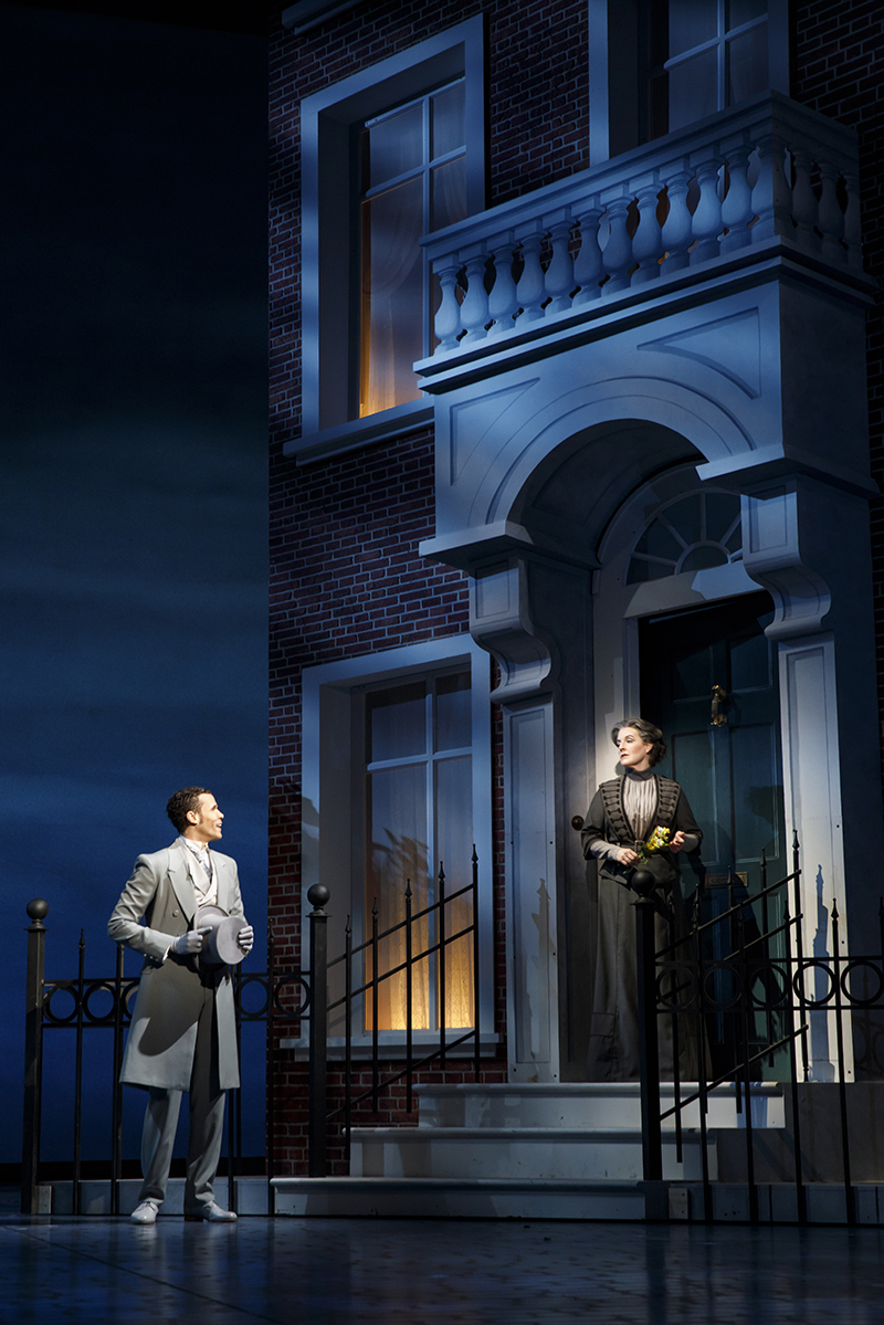
Lincoln Center Theater’s new production of Lerner and Loewe’s classic makeover musical My Fair Lady is a spirited, energetic rendition which is also updated for the #MeToo era by offering visual twists on a couple of key moments. Well directed by Bartlett Sher and co-starring Lauren Ambrose and Harry Hadden-Paton, it also features spectacular set pieces by veteran Broadway and Lincoln Center set designer Michael Yeargan. Nominated for a Tony for his work here, he wisely balances larger set pieces like building edifices, a ballroom, and the revolving interior of Henry Higgins’ house with more modest scenery involving a small pub, the Higgins house exterior and a racetrack setting.
Familiar Show, Fresh Design
“In designing a large musical like My Fair Lady, one is always trying to balance a unity of approach to the many different sets with a certain sense of freshness and surprise so that the design doesn’t become too predictable,” Yeargan tells PLSN. “As we started breaking down the scenes, we discovered that a major portion of the show happens in the study with a lot of very specific prop ‘business.’ Given the size of the theater, we felt that by making the study into some kind of revolving unit, we could open up those scenes and give them more variety. Also, for the teaching sequence, the turning gave a sense of the passage of time, almost like a clock turning, and a chance for Eliza to change costumes to enhance the effect.”
Yeargan notes that other, less lengthy scenes developed “an airier quality” with specific items defining each place. These locations include St. Paul’s in Covent Garden, the Royal Opera House, the pub for Alfie Doolittle’s scenes and musical numbers, the front facade of the Wimpole Street exterior, and “the stylized ‘Ascot Gavotte’ [number at the racetrack], which we always knew would really be about featuring, in the simplest way possible, the magnificent stylized costumes,” says the designer.
During the racetrack sequence, there is an awning that descends from the ceiling and opens for the bored, slowly moving aristocrats, enhanced by stereo sound effects of horses racing by from sound designer Marc Salzberg. The ballroom sequence that opens the second act features the entire orchestra onstage. They slide on from stage left, backed, as Yeargan describes, “by an operetta-like translucent drop of a Hungarian Embassy and a large movable staircase [at stage right] for grand entrances.”
One entire set piece was eliminated from the show — the interior of the flower market in Act II — “so we could go back to the same world which identified with Eliza and gave the scene a touch of nostalgia,” explains Yeargan. “Mrs. Higgins’ conservatory also had a lightness to it after all of the scenes that proceeded it. It also occurred to us that it was a wealthy parallel to the Covent Garden flower market.”
The Turntable Design
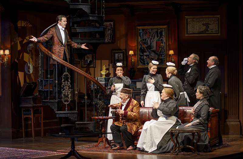
The stunning centerpiece of My Fair Lady is the rotating turntable that is 38 feet in diameter and slides downstage from its position at the back of the 70-foot-deep stage. The most complicated of all the set pieces, it went through many permutations before Yeargan and his team finalized its form. The house set is split into four sections, but not even quarters, since Higgins’ office/library dominates the set. The front foyer and the outside space are a decent size, with the bathroom/teaching room being the smallest.
“We knew that the famous bathroom scene, originally written by [George Bernard] Shaw for the ‘30’s film, was going to be included,” recalls Yeargan. “We were also attempting to make the study a really powerful space for Higgins that would totally intimidate Eliza when she arrived to ask for lessons.” They also contemplated adding in her bedroom and an adjoining, smaller laboratory room.
Yeargan says there are two main factors that influenced the spatial aspects of the design. First, the Higgins house had to turn. Secondly, the large bandstand was constructed to contain and move around the orchestra that appears onstage at the top of Act II for the Embassy Ball. “Fortunately, the Beaumont was designed as a repertory house, meaning that they would put on different plays on successive nights, as the Metropolitan Opera does in its season,” he explains. “So there is a vast amount of storage space upstage, stage left and a fair amount on stage right as well.”
The Higgins study is stored upstage. The Covent Garden units are at stage right. The orchestra ties up most of the stage left side with the tracked bandstand. The Wimpole exterior unit is also stage left, as are the pub and the Tottenham Court Road moving building units. Various moving trees and three lamp posts of various sizes in perspective are also tucked in all over the place.
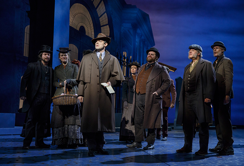
Christopher Gattelli’s choreography, particularly for Norbert Leo Butz’s [Alfie Doolittle’s] show-stopping number, also influenced the set design. “It was that number that made us redesign the pub unit so it could open up, turn around, and also become a church with a retractable steeple,” says Yeargan. “Bart [Sher], as in all our work, was involved in the design process every inch of the way.”
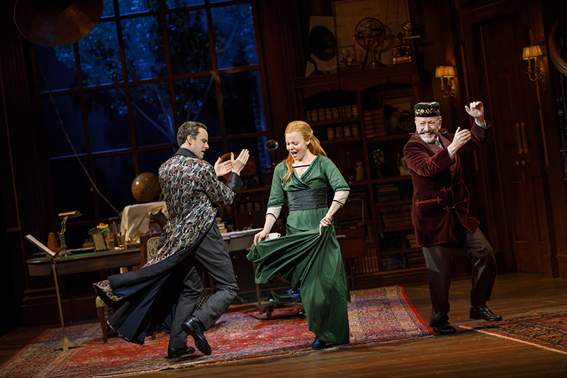
As Yeargan’s team began to fit everything together onto the turntable, they struggled to assemble it in a clear, coherent way. The breakthrough arrived when they added “a huge, over-scaled, Palladian window in the study that provided a strong light source and also gave a view of one of the lilac trees outside that linked it to the Wimpole Street exterior,” he says. “We eliminated the bedroom and found a wonderful shower unit from 1912 that became the centerpiece for the bathroom. We were able to switch it out so that that room could double as a teaching room. We also added a large spiral staircase into the study which brought the action downstage. We also created a small den by a fireplace for [Colonel] Pickering to read his London Times.”

On the opposite side of that giant room, connected by the staircase entrances at the top of each, was a “more formal stair hall” featuring a large painting by Braque from 1912, “which established Higgins as a true forward thinking gentleman. A smaller glass door to the exterior helped create a subplot between one of the maids and a London Bobby.”
Yeargan estimates that there were five versions of the Higgins’ house turntable before they settled on the one that audiences see. “The vast scale of it and the diversity of the locations made it time consuming,” he adds, noting that the many years he has spent working in opera and musical theater helped make it all happen. “There are just things one does instinctively that speed the process along and give you the courage — and I do mean courage — to trust your instincts.”
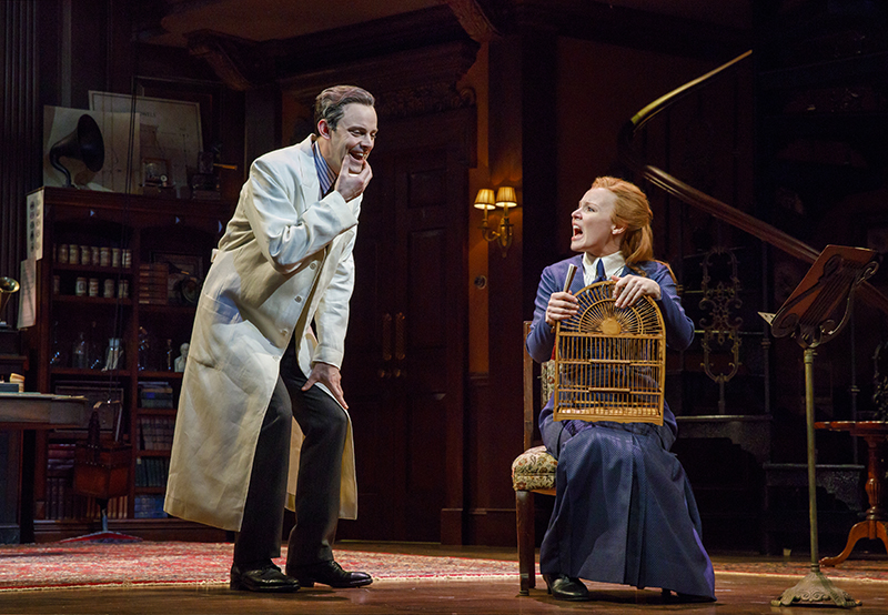
The Higgins office and library displays a wealth of diverse props and art, including books, busts, a globe, and an old-fashioned phonograph. Yeargan gives full credit to “excellent prop person” Alison Mantilla. He helped provide research, they made model props for the main pieces. Mantilla then did a lot of research for the phonograph equipment and found sources for the real items, he explains. “All of the recording machines, spools and boxes they are stored in are real period items that she found through eBay, Craigslist, and other sources. Most of the furniture did come from various antique shops that she knew, but none of them were high-end antique stores. She did an amazing job.”
Lighting the Moving Set
Lighting this rotating house set was certainly a concern for veteran LD Don Holder. He pinpoints the part that looked most challenging on paper, the musical staging in the number, “Poor Professor Higgins.”
“It featured a cinematic approach to the passage of time by revealing the action on the two-storied revolving Higgins house in a continuous state of motion,” explains Holder. “We view a short scene in one isolated location, and with each musical verse, the turntable revolves, the many rooms of the Higgins house swing in and out of view, and the full company is revealed going about their lives and daily work. So the challenge was how to light all the rooms of this house in dynamic and interesting ways while everything was in a constant state of motion. And solve it in a way that required as little time as possible to tech, given our very tight schedule in the theater. I found that diagonal backlight and low sidelight from the fourth wall, which could activate the space in exciting ways without casting weird shadows or hitting the moving surfaces unattractively, was the key to cracking this puzzle.”
This production of My Fair Lady was first discussed while Yeargan was working on The King and I for Lincoln Center Theater in 2015, but definitive plans did not emerge until a year before the show opened. From that point on, he focused solely on the show and turned down other projects because it was such an ambitious undertaking. There was no out-of-town tryout for the musical. The show was developed and evolved within the space at the Vivian Beaumont Theatre, and it was rehearsed in the theater rehearsal rooms located in the basement. Hudson Scenic (Yonkers, NY) built, engineered and painted the majority of the sets (“beautifully,” declares Yeargan), while Scenic Art Studios (Newburgh, NY) painted the ballroom translucency.
After all these years in theater, Yeargan cannot pinpoint exactly what keeps him inspired and motivated to continually work hard and design sets for lavish productions. He just seems hardwired to create, and he also enjoys teaching stage design at the Yale School of Drama. “I’m continually amazed at how the theater can speak to people and, in many cases, change the way people think,” he marvels. “The design of a play, opera, or musical is a huge part of that, though many times the work goes unnoticed. And that’s okay too. But I love it all and can’t imagine what else I would do if I weren’t designing.”


