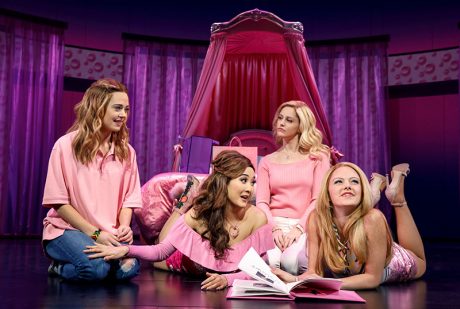
Movie-to-musical adaptations have become an overcrowded playing field on Broadway, but Tina Fey’s song and dance rendition of her hit 2004 film, Mean Girls, is an unexpected delight. Updated to reflect social media saturation and the #metoo and Time’s Up revolution, it traces the journey of an awkward teen named Cady whose family has moved her from the wilds of Africa to socially predatory suburbia. She gets swept up in the popularity of the “mean girls” at school but learns that there is a personal price to pay for wanting to stay at the top of the heap.
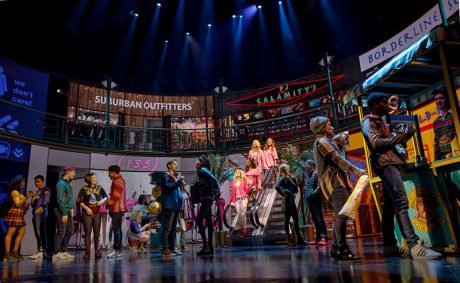
A big reason why this peppy production breezily zips through an impressive number of transitions is the video work of Fray Studios co-founders and creative partners Finn Ross and Adam Young. If Ross’ name sounds familiar, it is because he has three shows on the Great White Way right now, the others being Frozen and the two-part Harry Potter and the Cursed Child. In Mean Girls, he and Young use a two-tiered semi-circular back wall with various sliding panels and six LED screen legs to create many environments that look realistic and mesh well with the musical milieu onstage.
Ross recalls that he got the first call for the show in November 2016, but proper work on the production did not begin until March 2017 for the out-of-town rehearsals for the original production. This was held at the National Theatre in DC and ran between Oct. 31 and Dec. 3, 2017. Young adds that he was brought on board at that time by scenic designer Scott Pask, who had worked out the horseshoe staging that allowed for an LED wall intersected by five different entrances onstage, the fifth one being a hidden upstage center portal that opens for select and dramatic entrances, particularly the arrival of the three “plastics,” who are the show’s titular divas.

A Fast-Paced Narrative
Mean Girls hurtles through many different environments — bedrooms, classrooms, a mall, a Halloween party, a Mathlete tournament, and much more. The digital backdrops are enhanced by highly colorful and effective props that help to create the necessary environmental illusion for each scene. Being that Fey is a TV and film writer, the scenes are fast-paced and change often, which is not uncommon on Broadway lately. In days’ past, musicals simply went from one number to another, but now it feels like a cast is in the midst of one number while transitioning into another.
When working on Frozen, says Ross, the approach was more traditional. They would make a transition, land in a scene, play it out, then move to the next. “Everything in Mean Girls never stands still for long enough,” he observes. “It has a very particularly beautiful form of ADHD that keeps it chugging along.”
“In one of the songs that got trimmed out of the show between Washington and New York, we went to 31 locations in three and a half minutes,” reveals Young. “Every other line was just like — bang, straight into the shoe shop, then makeup store and department store. Outside her house, in her kitchen, and in her living room — relentlessly going through location after location after location.”
The showstopper that was most difficult to design for, says Ross, was the Act One scene, “Revenge Party,” which is “very specific to the beat and the music and rampages through loads of different locations over a big block of time,” he says. “We go from Halloween to Christmas, and it is choreographic and musical and fun, but it also needed to convey place and time.”
Ross adds that the only way to make the animation work the way he and director Casey Nicholaw wanted it was by locking it all down with timecode to keep it all dead on-the-beat. “When you’re in tech and you change something, and knock out five bars of music, managing all of the timecode becomes a nightmare. Luckily, our programmer, Matthew Houstle, was very, very good at that. He has a particularly brilliant mathematical brain, so he dealt with it and saved my mathematically inept brain from having to worry too much about it.”

LED vs. Projection
Although projections were initially considered for the show, lighting designer Ken Posner reportedly nixed that idea as being impractical. “If we tried to do Mean Girls with projections, that would’ve been a disaster,” concurs Ross. “We would have just given up after a few days because the brightness couldn’t be sustained at all against the stage lights. It’s a big, cheerful, shiny Broadway musical. It’s not a dark brooding piece where everything is lit with three lights and have people wandering around in artistic gloom. Don’t get me wrong — I love my European artistic gloom, I really do.”
Employing LED screens allowed them to create a richer blend of colors within the bright lighting that projections could not, especially given that bright pink is an essential ingredient to the color palette. Scott Pask also wanted to cover all the screens that form the set in pink-tinted Perspex, which muted the harshness of the LED in the theater and allowed for banding-free color.
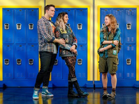
Young explains that the video content is used at times to represent the various characters’ psychology. “Art freak” character Janis has scenes that are “hand-drawn with streaky markers, and everything feels rough and unpolished,” says Young. “When our ‘Queen Plastic’ Regina is still the most popular girl in school, her ‘video worlds’ are very pink and sparkly. However, later in the show, when she’s seeking her revenge for her social exile, we shift into a ‘Bond’ inspired world which, while maintaining her color, is less pretty, more stark, and holds a harsh and aggressive energy.” Further, the social media wall show presented before each act and during the show provides a colorful tapestry of messages that are still easy to read even as they fill the video space.

Realism and Scale
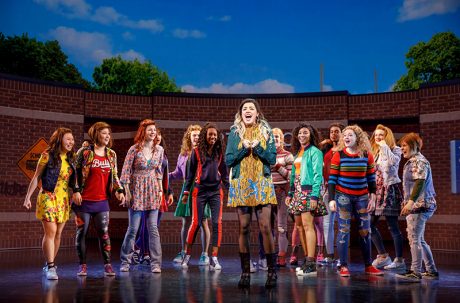
While the backdrop of the cinder block walls at school look very natural, it took the designers a lot of time to get those details right. “We were literally lit on stage with a tape measure, measuring in reality how big a cinder block would be, how big a brick would be, and how big a tile would be,” recalls Young. “I was counting pixels. You had the size that the audience would be perceiving it at and make sure it looked right. I was trying to make things look close to reality in terms of scale and color.” Both Ross and Young got a lesson in American high school aesthetics. In their native England, they do not have lockers. And in America, school colors are on display everywhere.
Young says that a big challenge was finding the aesthetic in the first place, “the base texture of everything like the cinder blocks and the bricks.” Once they got the size right, they worked out the color and other details in After Effects, then transitioned their content to the LED wall. “It was everything else like the lockers and the smaller details that were very challenging to create,” he adds. “Because when you make a piece of paper the size of a sheet of paper, you have almost no space left to put any details. It’s a compromise between reality versus information you’re trying to show. It was just dealing with the limitations of LED screens, like not being able to do clean gradients.”
The design duo has used projections for years and had not done a large number of shows with LED, so Young admits it was a steep learning curve to work out the intricacies of LED screens. “In some ways, it was very nice because you make something in After
Effects, do a template, and it pops up on stage, but not exactly the way you want it to be,” he says. “It definitely has its pros and its cons.” One of the cons being the inability to fade anything slowly with LED.”
“It was very interesting working with a director who comes from a very strong choreography background,” says Ross. “Everything is communicated in counts in that sense. We work in frames, and a frame is always the exact same duration of time when you’re locked at 30 frames a second. The count shifts constantly by the BPM of a show. It was a lot of learning each other’s languages at first, which was interesting. We just invented this Google doc where, if you knew the counts and you knew the BPM, then you could translate a count into time. You knew that four counts was four seconds 12 frames at 112 BPM or whatever.”

Video Production
A disguise media server was utilized for the show, allowing the designers to visualize everything as the production was being assembled. “That was very important for making this show happen, because by the time we arrived and started tech, we had the whole show programmed in visualization, not only to understand that it worked, but also for us to work out all the musical detail,” says Ross. “That saved us huge amounts of time in tech. It is very intuitive and intelligent when you have a dynamic environment where it’s being moved around. It makes it very easy to change how the contents works in relation to the surface without too much trouble.”
The video wall has an upper tier that is continuous, whereas there are four entrances on the lower tier along with a back entrance that appear by splitting open the wall in back. “We set up a template in After Effects, which is where we make all the content, so it shows you where all the gaps are,” says Ross. “The media server splices it up and puts it in the right place for you. You just need to be aware of where there is no tile or void. You can have a fairly good idea of what it looks like, and then you can just render and have a look at it in the visualizer of the media server to check that everything’s landing where it should be.”
The production used Unilumin Upad III 500mm-by-500mm video panels (over 650 in total) with a 3.9 pixel pitch. Ross estimates that the curved wall is 15 meters wide. The Upad panels “have all been built into an incredibly well designed set of metalwork, which ShowMotion designed,” says Young. “One of the big concerns with doing the show was maintenance and fixing things [LED] should they go wrong. It’s completely encased within the set. When you’ve got your hour and a half before the show and something is not working, you need to be able to get through everything quickly. ShowMotion and Ian, who was our technical person on the show, spent a lot of time designing the set so that every panel is accessible.” In particular, a crew member can easily take the Plexi off the front, get to a panel, and swap it out in under 30 minutes. ShowMotion also had to hide all the cabling and everything needed to make the doors run smoothly. “A lot of real engineering and design went into that.”
Hit by the Bus
One scene that mixed practical and digital scenery was the moment when one character gets hit by a bus. (Don’t worry, the event is mentioned at the top of the show.) “It’s so fast it kind of shocks and tricks you,” says Ross. “The video will start spinning behind her, and the scenic bus shoots out and just before it stops moving, we head into a dead blackout.” (The woman does go flying in digital just prior to the blackout.) “It’s lots of little things happening very quickly, which offset to make it feel it’s a succession of events. Then you’re plunged into darkness and left there for a bit. You think you know what happened, but you’re not quite sure.”
Not every scene operates on a grand scale. There are intimate book scenes that help to bridge the larger ones and help the audience further connect with the characters. “One of the hardest things which we struggled with well into previews in New York was making the space feel small,” notes Young. “There’s no physical way of closing the space down. Making the screen black looked horrible because you’re dealing with such a shiny floor. Once a screen dies, it looks like we have forgotten to do something. They have to be kept active the entire time.”
For a show that has so much technology in use, the video wall could easily have distracted from the emotional core. Thankfully, it did not. “I think what separates the men from the boys is removing all of that from the audience’s perception of it and making something feel poetic, light, alive and vibrant, and full of fun, rather than feel digital and technical,” says Ross. “It gets interesting for me when you get rid of the technology and the design and you find the poetry and the drama of it all. That’s what we’re trying to do.”


