A Balance of Lighting and Video Reflects our Modern World
“A letter that was never meant to be seen, a lie that was never meant to be told, a life he never dreamed he could have, Evan Hansen is about to get the one thing he’s always wanted — a chance to finally fit in.” That’s the premise behind this humorous musical, which would certainly appeal to anyone who ever thought they were on the outside looking in. Especially when browsing social media sites.
Dear Evan Hansen first premiered at Washington D.C.’s Arena Stage in July of 2015, moving onto a run at NYC’s Second Stage in spring 2015, before opening at Broadway’s Music Box Theatre on December 4, 2016.
Since then, the musical garnered nine Tony Award nominations, including Best Musical and Best Lighting Design for LD Japhy Weideman’s work. As such, the June 11 Tony ceremony may just make for an award-winning culmination of the show’s journey.
Directed by Michael Greif, the design team includes Weideman, scenic designer David Korins and projection designer Peter Nigrini worked closely together to bring the audience inside the social media driven reality that the main characters are tossed into.

Virtual vs. Real Connections
The story line looks at how people connect and communicate, as well as be isolated in today’s like/friend online world. It shows how they can feel isolated while also trying to navigate their everyday relationships in their lives, which can quickly spiral out of control.
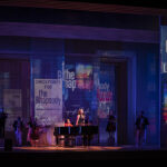
Korins’ set is a wonderful kaleidoscope of surfaces and screens, varying in size and orientation, that can move in and out to reconfigure the space. Using the height and the depth of the space, his design allows for the online digital world to be an immersive environment for the characters, which can alter as quickly as the narrative’s social media universe changes the lives of the characters.
“Everywhere you look there is video; every surface of the entire playing space can be covered by content whether projection or LCDs,” says projection designer Peter Nigrini. “To successfully tell our story, social media needed to be a visceral part of the theatrical environment. After the David created the physical environment, my job was to bring this virtual world to life on stage and give it the emotional power that so many teenagers clearly feel in their interactions with social media.”
All those moving screens, of course, meant that the lighting and projection designs had to work in concert so that Weideman could not only effectively illuminate a scene, but also helping to direct focus for the audience through the visual media.

“I think it is incredibly important as a projection designer in collaborating with a lighting designer, that you remember they have a huge responsibility to direct focus,” Nigrini says. “I have the ability to completely devastate all their efforts if I’m not paying attention. So there’s a real responsibility in both directions, to understanding the other designers’ desires but also yielding the responsibility to craftsmanship and making sure we’re all pulling together.”
Nigrini and Weideman had just that sort of a collaboration, with critics noting the ability of their respective designs to work in harmony. It is also obvious that both men communicated continuously throughout the production process.
“The lighting designer and I need to be joined at the hip,” notes Nigrini, “because if we’re not, we cannot make this whole that’s required. All the questions about palette, and also compositionally about light and dark, all remain fluid in projection design so that we can then have a conversation together.
“Japhy and I have a sort of dialogue that includes proposing choices and responding to each other’s work,” Nigrini continues. “There’s a lot of discussion that happens early on. The part that I most enjoy is when you get farther into the process, the conversation is purely a visual conversation. When we’re looking at something on stage and Japhy does X with the lighting and I do Y with the projection, that is when the conversation stops being us describing what we’re going to do and evolves into a much more nuanced conversation that happens purely in the visual realm.”
Weideman agrees. “For me, I really like to take more light out, and do more kind of sidelight and sculpted kind of looks. But it was always a balance between really making sure that we’re seeing the expression of what’s going on, on all of the actors’ faces, and yet still being able to suit the projection.

“It was always about looking at the color compositions of each scene, and making sure that the color tones in the video were relating to the lighting tones on the people,” Weideman continues. “This sounds really obvious, but again, easier said than done.
“A number of times Peter would see what I would be doing, and then he would start shifting his hues into those colors,” Weideman elaborates. “For example, in the song, ‘Sincerely Me,’ I have a lot more of these kind of saturated ambers and warm whites. He saw what we were doing with the cyc, and then he started taking all of his lettering and very quickly shifting it into those hues. It is through that kind of collaboration, you’ve got a world. It would go both ways. I would see what he was doing sometimes and start changing my color to match his projections, as well.”

Exercising Visual Restraint
With so much going on in terms of lighting and video, the design team exercised some restraint. “It could have gotten too kinetic, but I think Michael [Greif] kept us in a nice balance to not overdo it and to not over emphasize, and really allow the music and the words to stand,” Weideman says. “When it’s all going viral, that’s when Peter really does some super stunning stuff. For me, I sort of pulled back and really let it be more about digital color sidelight in a black space. By using [Martin] MAC Auras from the sides, you can get some really nice kind of steel blues, or slight green-blues that really connect with the kind of digital online world.”
To direct focus, Weideman used simple but effective choices. “Throughout the story, there are all these panels moving, but I just took and shifted one or two lights into a warmer, incandescent quality and use that to just kind of pop the actors faces in a little bit of a warm hue, while everybody else is just sort of swirling in the blue online world. That was really effective. One of the key lights that I use is the [Vari-Lite] VL3500 wash. Spotted in, and backlighting people, it’s a really powerful presence. I would use those in special moments or in songs. It’s simple, it’s not too overt.”
WorldStage provided the video package, which included media servers from d3 Technologies and Panasonic projectors. Helping Nigrini was associate projection designer David Bengali. The lighting package was completely supplied by PRG. Working with Weideman was associate lighting designer Ken Wills and assistant LD Jessica Creager.
For Weideman it is important that the design not force emotion on the audience, but instead allow it to unfold with the story and the lighting. “There’s a moment where it’s just Ben singing about how he feels like he’s tapping on the glass, and waving through a window, but not sure if anybody can really see him,” Weideman says, citing case in point. “He feels totally alone, and everybody kind of comes out, circling and swirling around him with all the panels creating the space he’s been interacting with throughout. It gets dark, and he’s isolated in spots, there’s not a lot of other light, just a little bit of sidelight. Then there’s a moment in the music where everyone freezes in a circle around him. Then there’s a hit in the percussion that snaps seven Sharpys in a circular figuration, which serves to thread everything from above. It creates this web of light beams in a circular pattern. It’s all interconnected, kind of coming from the center. It’s a nice moment when the music, the moment, the words, and the light all come together. I think Peter has moments like that as well.
“One of the hardest things for any designer is to not get in the way of the story, and yet support every aspect of it — to make sure people understand without shoving the message down their throat,” Weideman concludes. “It’s a fine balance.”


