Unique “Organ Pipe” Look Gets Additional Video Halfway Through Sell-Out Tour
“They are big, ugly, and intimidating when they are sitting in their set carts,” Jason Rothberg says of The Lumineers’ set for their Cleopatra world tour. “But once they are flown, lit and have content going through the Sceptrons, they make a beautiful transformation.”

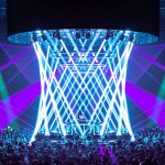
Indeed. Seemingly nondescript aluminum pipes create a cathedral-like look, contributing a near religious experience for a tour that production manager Sara Full acknowledges is a big step forward for the band. “They’ve sold out some major venues before on the shed circuit, but this is the first time doing an arena run, and the first time selling 10,000-plus tickets every night,” says Full. “I was more excited than concerned going into this run, as I felt confident band, crew, and show design were more than up to the task.”

Sooner Routhier and Robert Long designed the show, with Rothberg handling lighting director duties. “This was a very interesting tour to work on visually, because the music is so dynamic,” Full says. “One song may be an intimate guitar-and-vocal number, whereas the next is a full band number.” (Three additional touring musicians join the three members of the band on stage.) “And what really unites all the songs is the storytelling and narrative arc. A major point of emphasis was finding a way to use the visual look of the show to support and enhance those stories, and to make it just as immersive and arresting to the audience as it is on the records.”

Important to all was making sure the video and the way it was lit was done in such a way that the audience in the back felt like they were in the front. “As a part of that, I’m incredibly happy with how the B-Stage component turned out,” Full says. “It was that rare opportunity to take the overall creative vision from the artist, and work with Sooner and Robert to make it translate into something that’s even better than I think any of us dared to hope for. It amps the show up to another level every night.”

The Creative Process
Full describes the creative process as collaborative, and says it’s not uncommon for frontman Wesley Schultz and her to have a 3 a.m. back-and-forth about some aspect of the show. “It makes for a fun evolution.” The creative process overall was straightforward, with Routhier and Long taking the initial notes, sitting down with the music, and running with it from there. “The initial renders are probably 80 percent accurate to what you see on stage to this day, and the band approved the first concept they saw from them — how often does that happen?”

According to Routhier, brainstorming ensued, and the idea of “organ pipes” came up. By taking simple aluminum piping, and lighting them as well as through them, then lining them with some Martin Sceptrons, these “ugly pipes” were magically transformed into lighting fixtures. “On the front of some of the pipes we mounted Sceptrons,” she explains. “The pipes circle around and encompass a Plexiglas ‘crystal’ that has two [Claypaky] Sharpys inside, one pointing up and one pointing down.”

Routhier adds the Martin MAC Vipers were versatile, especially when used with all the washes they brought out on this tour (64 Martin MAC Quantums). “The band has a couple of songs related to water [“Submarines” “Dead Sea”], and to be able to do some water effects on those organ pieces using the Quantum Washes allowed the opportunity to go far, creatively.” A big priority for the management and the band was that they wanted to take the set to every single show, whether that be a smaller room or an outdoor festival stage, To do this, the set was constructed in two parts, upper and lower. For festivals or smaller stages, only the top part was rolled out, with the “A” set was used in the bigger halls and arenas. The band wanted as much of the set and lighting for every show, and they got it.

“It’s a very simple show; the songs do not have a lot of cues,” says Rothberg. “There is not a lot of actual fixture movement in the show. Most of the movement comes from gobo rotation from the Vipers and dimmer, color or beam effects from the Quantum Washes. Sooner has built some pretty awesome color effects. Most of the colors are deep and saturated. The looks range from big wide looks to smaller asymmetrical looks.”

Expanding the Show
Interestingly, the idea to add more video as the tour progressed was always part of the plan. “From the beginning, we had discussed the need to design to build a show that could grow with the band over the course of the record cycle, but would maintain some element of consistency, whether we’re playing an old theatre in Prague or Madison Square Garden,” Full says. “The idea was to have options to expand into as we got to the arena setting.” That meant adding a bigger video element and additional video content, partially from the design front, and partially from the band. “They had mentioned from the beginning that there were certain songs that contained a very strong visual component, in their minds, and they wanted to see that reflected in the live show. The songs that have video content were very specifically chosen by the band, and they gave a ton of input throughout the content design process. Then Andy [Reuter] did a great job of reflecting and translating those ideas into the show.”
In late October, the video aspect was increased. “The organ pipes already made the set look pretty full when paired with a series of aluminum tail downs and floor pipes, but we were looking for some kind of video background that would add to our original concept,” Routhier says. Part of the challenge was that the aluminum pipes made “V shapes” on the stage, so the video wall needed a creative approach. A masking backdrop made of vinyl and Voile fabric was used to help make the V shape fill in some of the blank space behind the organ pipes. “Andy [Reuter] did a good job making it work by adding digital masks to the analog version in front of the wall. The Sceptrons are a video product that we were already running through the media server for additional light texture. They are too low res to see any content shapes as they are so spread out from one another. Last spring, when we initially put the design into production, I had a lot of fun building simple jpegs in Photoshop over the Sceptron pixel map. Essentially, with the help of Photoshop, I could paint the set with light.”

Reuter says his approach to supplying content was different than a typical content job. “Their style is so organic, so focused on the craft of song writing and delivering a real and intimate performance, that in-your-face visuals wouldn’t fit,” he says. “Sooner had the idea of doing a heavily diffused vignette look over the LED wall to give a more organic look. With that idea, content for this type of show started to make a lot more sense. There was very little in terms of actual video footage, most of the content was abstract with vague literal references to the lyrics. Content for this show was never meant to really be noticed, but rather something that helps enhance the energy of the huge dynamic builds that are part of a Lumineers show. Adding the extra production required a delicate balance to give them a little bigger look at the right times without killing their organic feel.”
Reuter says that adding in video content on top of the pipe organ pieces that were already in place wasn’t as difficult as he initially expected. “We only did content over about half of the show, which turned out to be a very good balance, so when content was off, the pipe organs had their moment to take over visually. The pipe organ lights also served great as a lower gear on songs that did have video content. We were able to use them during the softer sections of songs as a more muted version of the content that would appear later at the dynamic peak of song.” He seems to have taken a “first, do no harm” approach: “It was a careful balance of simple and dynamic imagery being used at the right times. I knew that if the audience left remembering the video content, then I didn’t do it right. The more seamlessly it blended into the rest of the show, the better the overall outcome would be.”
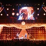
Rothberg notes that the band does not play to click, so keeping the video in sync is tricky at times. “Some of the songs only have a couple of cues, so there is not always a lot of opportunity to bring things back up to speed if they get off. My biggest battle since adding I-Mag is [lead singer] Wes’ hat shadow. His hats seem to keep getting bigger. We have tried a few solutions over the last year. Currently we have 2-by-3-inch Fresnels at the end of the thrust to help battle it.”

“A Labor of Love”
Todd LePere of Solotech was called in to help with video for the Sept. 2016 Life is Beautiful music festival in Las Vegas, and that led to them providing the video services to this tour. “I have worked with Sooner on many projects over the years, and I always love working with her and her team,” he says. “They design beautiful shows, and it’s a pleasure contributing to make their vision a reality. The video really complements the rest of the set and design, and we just fit it in the best we could,” he says. “We upgraded a few components to give them the best picture possible to accent the design.”
“As the tour grew, so did the production,” says Joe Gallagher of Gallagher Staging and Production. “SGPS built the original set for the tour, but then as the scale of the production grew, particularly with the video element, Gallagher Staging chipped in with some extra scenic items and modifications to existing pieces.” (They started with five “organ pipes” and added two more later.)

“We at Christie’s have been fortunate to work with this band for about the last seven years,” says Christie Lites’ Martin Kelley. “It’s particularly satisfying to watch them grow, especially during the last year. They must have sent me eight new itineraries since this tour started in March of 2016 as they keep switching to larger venues. It’s been refreshing to work with a young production, especially Sara [Full]. Of course, my relationship with Sooner and Robert goes back 14 years and I always look forward to working on whatever they come up with, because you know it will look good.”
In addition to the sell-out crowds, Full is also happy with the show. “It’s been a labor of love over the past year to develop it to this point, and it’s gratifying to see it all come together. It’s incredibly fun, challenging, and professionally exciting to work with a band that cares so deeply about every element of the live show, and I think that is displayed in the production we’ve put together. It all comes back to — ‘Does it make the show better?’ — and I feel that mentality has led to a high level show.” She adds it’s interesting to work with a young band suddenly playing the arenas. “I think a lot of the fans, and even industry people, don’t know what to expect, and to see them being totally swept away over the course of the show is very gratifying. We don’t want them leaving saying ‘The sound was great’ or ‘The video was great;’ we want them leaving saying ‘That show was great.”

Crew
- Production Manager: Sara Full
- Lighting Designers: Sooner Routhier, Robert Long
- Lighting Director: Jason Rothberg
- Lighting Co: Christie Lites/Martin Kelly
- Lighting Crew: Austin Bloomfield, Johnathan Contini, Kitty Hoffman, Dan Gentile, Jaye Murphy
- Video Co: Solotech/Todd LePere
- Video Content: Andy Reuter
- Set/Staging Cos: SGPS, Gallagher Staging
- Staging/Automation: Tait
- Trucking: Upstaging
- Audio: Sound Image
Gear
- 2 grandMA2 full size consoles
- 26 Martin MAC Vipers
- 60 Martin MAC Quantum Washes
- 6 Martin MAC Quantum Profiles
- 8 Martin MAC Auras
- 84 Elation 360i ACL fixtures
- 14 Claypaky Sharpys
- 168 320mm Martin Sceptrons (10mm)
- 94 1000mm Martin Sceptrons (10mm)
- 24 Martin Atomic LED 3000 strobes
- 3 Lycian M2 truss spots
- 2 MDG Atmosphere hazers
- 8 ¼-ton CM motors
- 47 ½-ton TR motors
- 48 1-ton TR motors
- 19 2-ton TR motors
- 324 ROE MC-7H (7.5mm) tiles
- 2 Barco HD20 projectors
- 3 Grass Valley LDX 80 cameras
- 1 Ross Carbonite VDO switcher
- 2 Catalyst v5 media servers
- 1 E2 screen control unit


