Will Potts has been working professionally in the industry since graduating from the Royal Scottish Academy of Music and Drama (now the Royal Conservatoire of Scotland) in 2006 with a BA in Technical Production Arts, although his first paid jobs specifically in lighting were in 2003 at The Arches, a multipurpose arts venue in Glasgow, Scotland. Here he was given the opportunity to light concerts, clubs and theatre, gaining valuable creative experience while working closely with all sorts of artists in different genres of performance.
 Since then, he’s worked as a designer in theatre and with many music acts on their live shows, but none with as much mainstream success as Sam Smith, Magnetic Man, or Disclosure. He was awarded a 2014 Knight of Illumination Award for work on Disclosure’s live show. We spoke with Potts on the recent Sam Smith tour, which has graduated from playing theaters to sold-out arenas. The tour kicked off Jan. 9 in Atlanta and traveled north, then west, through the U.S., culminating with a Feb. 4 concert in Vancouver, BC.
 “I first met Sam when he performed Disclosures’ song, ‘Latch,’ live. Sam and his managers are such great people to work with. They’ve allowed me enough creative freedom, but at the same time, they have given very good critical feedback and direction. On a creative level, its been one of the most rewarding projects I have worked on to date, and I look forward to progressing it further this year.
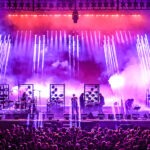
 “When starting off, I generally use good old pencil and paper, sometimes working in a more accurate orthographic style. Then I move into Auto CAD or Vectorworks and, finally, LightConverse for initial presentation visuals. For Sam Smith’s tour, I initially kept simply to a color palette during non-headline slots at festivals and small venues with limited equipment. I chose subtle colors to convey a refined, classic look as far as possible, and kept to these for each track to build a consistent live look in the campaign. In the first complete show design, I chose a striking asymmetrical design using the band’s risers to step down from six feet to one foot. Behind this, I used a white cyc cut with the same angle to color and silhouette the band. In planning for the larger arena tour in the USA, I decided that a symmetrical look would suit the larger spaces more and look more comfortable as an ensemble of musicians. This layout also allows unity in the band, and they have a great time being able to vibe off each other during the show.
 Lighting
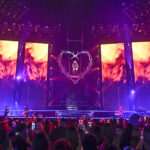
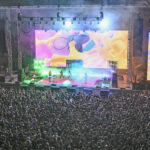
“When it came to the lighting, I wanted to achieve a rig that felt encompassing but with this didn’t have the need to fill the whole room with fixtures. It was important to me that everyone in the audience felt united and an equal part of the show, for both the big energy tracks and the most intimate parts of the show. I started drawing long curved trusses that seemed to hug the stage area and encompass the risers well, opening up from the backdrop upwards and into the crowd.
 “The [Clay Paky] Sharpy Wash 330 is one of the main fixtures on the tour. It’s my first show using them, and I’ve really enjoyed pushing them around. This is also my first design using a grandMA2 desk, which has been very useful in balancing the different fixture types. The learning curve into MA has been a steep and stressful one, I have to be honest, but every late night has been worth it! The [Vari*Lite] VL3000 is another dominating fixture on the rig. I am really comfortable with them now and I know it very well having used them so much in the past. I really like that it features three rotating gobo wheels with an excellent variation of artwork and has a CTO wheel.
 Staging/Video
“The band’s risers are quite special. I have had them custom-built by All Access and XL Video. In the design process, I decided to use a material called Black/White Perspex, which stays a high glossy black when not lit and transmits colors very well. I’m very happy with the synergy between XL’s Hybrid screen and the riser construction by All Access to allow for a complete video fascia. Both companies have also worked seamlessly together. The content is mostly simple and static and allows me to pull the entire visual picture together and balance around Sam.
 “When we started out with smaller scale shows, there were existing relationships with smaller companies in the Sam Smith team, both in the USA and U.K., that worked really well. When this particular project grew to an international, large-scale level, it made perfect sense to bring in existing contacts that could perform globally. I knew that the service and collaboration that these companies would provide was at the level required for this show.
“Sam has always exuded a strong sense of modern style and class, and this has been carefully managed in the media and press these past few years. This sense of class and personality became key in my brief. I decided to use portrait side screens and drafted in the talented Jon Shrimpton, who came recommended by several colleagues. My brief to him was to capture Sam’s glistening eyes, and although [it was] a bit of a battle to get the camera positions we needed in these sold out shows, Jon has done a terrific job. Together, we have created moments where the side screens are dominant in the look and an artistic piece on their own.
 “One part of the show I am particularly proud of is the opening sequence. Originally, the plan was to use a ribbon lift for this, but when I found out they were unreliable at times, All Access suggested their X Lift. I reveal Sam at the top of the show right in the middle of a custom printed gauze using this lift. Together with a live edit of ‘Life Support’ that we worked together on, it’s an amazing climatic start to the show and it really gets the hysteria going in the audience.”
 Sam Smith 2015 Tour
Crew
Lighting Designer & Director: Will Potts
Video Designer & Content Creator: Will Potts
 Lighting Co: PRG/Roy Hunt
Lighting Crew Chief: Andy Mitchinson
Production Electrician/Systems Tech: Chris Titman
Lighting Techs: Jason Hicks, Tom Bider, Doug Eder
 Video Co: XL Video/Gareth Jeanne
Video Crew Chief: Ted Cognato
Video Director/I-Mag: Jon Shrimpton
Video Techs: Jose David Cruz, Tim Boland, Eric Escajuri
Production Manager: Cyril Thomas
 Tour Manager: Paul Allen
Stage Manager: James Gould
Staging Co: All Access/Robert Achlimbari
Rigger: Brian Collins
Carpenter: Benjamin Ullman
Custom Soft Goods: Sew What?
Trucking: SET
Gear
Lighting:
2 grandMA Full consoles
45 Vari*Lite VL3000 Spots
32 Clay Paky Sharpys
20 Clay Paky Sharpy Wash 330s
14 Clay Paky A.leda B-Eye K20s
14 Chroma-Q Color Force 48 fixtures
8 Chroma-Q Color Force 72 fixtures
29 Molefay 2-cell linear fixtures
12 Molefay 4-cell linear fixtures
3 PRG Bad Boys (Manual & DMX-controlled as rig spots)
Video:
Radiant MC-18 Hybrid LED from XL Video (w/ built in spot LED fixtures)
Pixled F-12 LED side screens
Catalyst media server
For more Sam Smith 2015 tour photos by Steve Jennings, CLICK HERE.


