Lighting Co
Christie Lites
Venue
Various (Tour)
Crew
Lighting Designer/Director: Susanne Sasic
Lighting Tech: Jaime Carlson
Production Managers: Chris Fussell, David Wright
Tour Manager: Keith Anderson/Tom Carlson
Stage Manager: Ryan Krell/Jim Sontag
Christie Lites Rep: Ian Gordon
Trucking Co: Truck and Roll
Gear
1 MA Lighting grandMA Full console
6 Martin MAC Auras
23 Martin MAC 700 washes
14 Martin MAC 700 Spots
26 Martin MAC 101s
8 Chromlech Jarag fixtures
1 DF-50 hazer
Designer Insights by Steve Jennings
Susanne Sasic (Lighting Designer & Director)
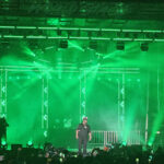
PLSN caught the David Byrne & St. Vincent Love This Giant tour in Oakland, CA, on the second leg of the U.S. run of the tour where we spoke with lighting designer and director Susanne Sasic about the show. Sasic, who’s many credits include Arcade Fire, The White Stripes, R.E.M. and Sonic Youth, to name a few tells us about this project she worked on.
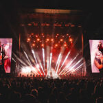
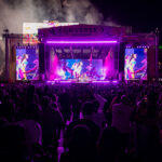
“We starting this tour in August 2012 we have done two U.S. legs, an Australian leg and are now finishing with a European run. On both U.S. legs we carried full production, Australia was local production in each city, in Europe we are carrying a floor package including dimmers and FOH consoles, with flown trusses and flown fixtures supplied locally in each city.
“David always prefers a clean, minimal stage but even more so on this tour because he wanted the eight piece horn section to be mobile with space for everyone to move all over the stage. In my initial meeting with David and Annie (St. Vincent) we talked very specifically about how the stage would be set up in terms of riser placement and the possible movements/positions of everyone on the stage. I drew up 3D renderings of different musician configurations and we discussed that before we even really spoke about lighting or any other visual elements. David brought in a choreographer who he had worked with previously (Annie B. Parsons) with the idea of having her help with some movement and this then grew into a completely choreographed show, so that the movement and formations of the individual musicians became the dominant visual feature. Both David and Annie (St. Vincent) were very involved in the initial design, but at a point stepped back and left much of the visual decision making to me. David sat with me for a run through of the band choreography at production rehearsals and had notes and comments for me, and choreographer Annie B. Parsons had some input at that point as well. Annie (St. Vincent) made additional suggestions after the first few shows. For me it has been an ideal working relationship.
“We used Christie Lites for the tour, our production manager for the initial U.S. leg had a prior relationship with Ian Gordon the rep for Christie, and there were also some logistics with where the tour began and ended that worked out in our favor to use them as lighting vendor. They had all the gear I needed and great crew people and I was very, very happy with them. It was my first tour with them and they did an excellent job all around.
“The flown lighting is a very straight forward mix of Mac 700 wash and spot fixtures. David likes to highlight individual band members and I knew that most of them would be mobile so the front truss is heavily loaded with spot fixtures. I knew we would be playing a variety of theaters, many with limited rigging points, so I designed a simple front truss and upstage truss configuration and relied upon floor fixtures for real interest. The Mac Auras are the key fixtures in the show, they create all the shadow and footlight effects and have a small enough profile to be unobtrusive lining the downstage edge. They are great for efficiently lighting the moving band members without having to wash out the entire stage with overhead light and the footlight effect is a nice contrast to David and Annie’s more straightforward overhead spot lighting. The clean, open stage was a great opportunity for large shadows on the backdrop, casting Annie’s giant shadow is my favorite part of the show. The only other tour I’ve been able to do that so cleanly and specifically was the White Stripes, and for me Annie is a guitar icon on par with Jack White, so I was happy to get to highlight her this way.
“David prefers white light and simpler lighting which was my early initial idea for the tour, but both the choreography and Annie’s request for dark moments, strobe effects and saturated color quickly changed the whole direction of the design. David is a generous collaborator and wanted Annie’s music to have the right setting, he also recognized that the choreography called for a different approach. We all thought that some visual settings and signifiers might be helpful in introducing Annie’s music to a new audience. Of course the parts of the show featuring David’s music need no such help. I am always happy to use darkness as a design element so I took the brief for more dramatic lighting as a great creative opportunity.
“As a designer, programmer and director all in one, I like programming my own shows. As much as I have specific visual ideas going in, I find that once I begin programming I stumble upon completely different ideas through trial and error so that I often wind up at a very different place than where I started. Pro programmers are too proficient for me, I like finding my way during programming even though it is not always the best use of always limited production rehearsal time!
“The whole job process as a lighting designer feels more competitive now than it once was. I think the secret is out that this is a good way to make a living! For much of my earlier career there was zero competition for the jobs I was interested in, they were so small: Sonic Youth, Nirvana, Beck, the White Stripes. Those were all clients that no one else was after when I began working with them. I’m not much for pitching, I’ve never gotten a job that way. I do get referrals, jobs just seem to make their way to me. I usually seem to be able to find the right clients, I have been very lucky. I’ve always loved music and have specific tastes, I look for projects that interest me musically first of all, with musicians who hopefully have a fairly specific visual point of view and/or some level of visual sophistication.
“I always have vague ideas of things I would like to see on a stage and keep a small notebook of sketches. Once an actual project is in front of me I start out in Vectorworks making simple 3D line renderings showing basic stage, riser, band gear and band member positions, print out many copies and then draw over them again and again until I get to something I like. Then I go back to the computer and do a 3D version of what I’ve hand drawn, maybe print out some more copies, draw over them to get further along, and then go back to the computer and spend many more hours drawing there.
“This has been one of my absolute favorite tours. I love the music, the large brass section is a rare treat, and it’s been a great opportunity to get inside of the music and create a real visual expression of musical ideas, so it’s been very satisfying! “
More David Byrne & St. Vincent tour photos by Steve Jennings at www.plsn.me/ByrneExtras


